
Should Brands Disclose AI Use? What Consumers Actually Reward
AI disclosure can chill a brand's reception or build trust. See what 408 consumers reward—and when disclosing AI use in your marketing actually helps.
Updated February 24, 2026

Rebranding can be an epic transformation — or a catastrophe your customers never let you live down. How can you avoid a spot in the Worst Rebrands Hall of Fame?
In November 2024, grocery shoppers were greeted with an unfamiliar sight: new, noticeably slimmer bottles of Tropicana orange juice. Gone was the elegant, easy-to-grasp neck. The logo was also missing its signature leaf and half the size of the old one. One critic called the new design "uninspiring" and "a brand misstep."
If you're not a juice lover, Tropicana's new packaging might not seem like a huge deal. It's the same delicious drink, right? However, outraged customers saw the change as an attempt at hiding shrinkflation, since the new bottles had 6 fewer ounces. This cautionary tale shows how poorly executed rebrands can damage trust and brand recognition, eroding hard-won customer loyalty.
Looking for a Public Relations agency?
Compare our list of top Public Relations companies near you
Of course, not all rebrands flop, as effective branding agencies can attest. When done well, these transformations can feel bold and signal a new direction for your business. A recent Clutch survey found that 98% of customers notice brand changes, and 51% like updates from their favorite brands.
So, how can you pull your rebrand off without a hitch? Start by learning from the mistakes of companies before you. We've ranked some of the worst rebrands of all time, why they backfired, and how you can avoid suffering the same fate as Tropicana.
Let's face it: There are plenty of failed rebrands, but most get forgotten quickly. However, truly terrible attempts leave lasting stains on their companies. We've created this list of the worst rebrands based on a few factors:
We've backed up our rankings with available data so you can see just how much a bad rebrand affects business. The list also highlights the red flags that appear again and again with these failures. Add these rebranding sins to your "to-don't" list.
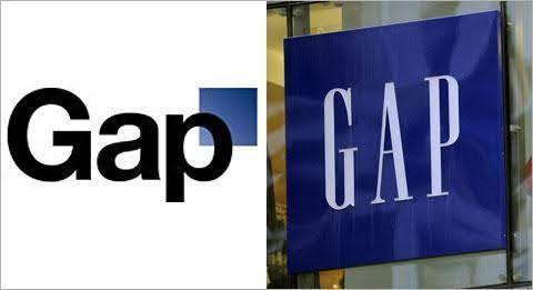
Gap's logo redesign started innocently enough. The fashion retailer wanted a more modern logo, so it swapped its signature serif font for Helvetica. It also shrunk its signature blue background into a small box and stuck it behind the now lowercase "p." Classy, right?
Nope. These seemingly small changes kicked off one of the most infamous rebranding disasters of the 21st century. Customers felt alienated by the unexplained update, their loyalty vanishing faster than a stack of half-price jeans. Soon, Facebook feeds were filled with outraged posts about the change. Journalists joined the condemnation, with one writer claiming the new logo "looks like something my pet hamster could cook up in PowerPoint."
To Gap's credit, the brand recognized its mistake almost immediately. It reversed the change within six days, and it hasn't touched the beloved logo since.
Severity of the mistake: Extremely high. Gap immediately lost all its credibility and had to completely abandon its rebranding attempt. It's an excellent case study of the perils of, as a Vanity Fair headline scathingly termed it, "corporate banality." Customers didn't ask for a modern Gap logo, and they certainly weren't happy to see it.
Lesson: Customers are nostalgic, and they don't appreciate unexpected changes. If you want to strip brand recognition, make sure your change comes with a strong narrative or product change.

We've already mentioned Tropicana, but the juice company has actually had two failed rebranding debacles within 15 years. The first scandal happened in 2009, when the company launched a more modern package for its orange juice. (Sensing a pattern yet?)
The 2009 redesign replaced the delicious orange and straw with a bland glass of orange juice. The text on the package still says "pure & natural," but the image of the juice looks artificial and less appealing than the orange. The new package also rotated the Tropicana logo 90 degrees and used a sleeker font.
Tropicana quickly discovered its audience's attachment to the original packaging. Many people failed to recognize the new version as the same juice, and those who did weren't fans of the ultra-modern, corporatized look. Within two months, sales had dropped a staggering 20%, costing the company an estimated $30 million.
It's not surprising that customers had such a strong reaction when Tropicana erased its familiar visual anchors. According to the Clutch survey, 64% of consumers notice logo updates, and 60% spot packaging redesigns. When the juice company changed both at once, shoppers were left confused and frustrated.
Severity: Extremely high. This misguided attempt at rebranding was financially devastating — and totally avoidable if Tropicana had understood its audience's connection to the brand.
Lesson: Visual anchors matter a lot to customers. If they can't recognize a product on the shelf, they might skip it entirely.

While Gap and Tropicana's rebrands have somewhat faded from public memory, the death — or rebirth, depending on who you ask — of Twitter is still fresh. Tech tycoon Elon Musk took over the social media site in November 2022 and rebranded it less than a year later. This dramatic update changed the social media platform's name to X and scrapped the charming blue and white bird logo. Musk even gleefully announced, "We're cutting the Twitter logo off the building with blow torches."
Unsurprisingly, rebranding Twitter caused widespread criticism and confusion. Advertisers felt alienated, and many users deactivated their accounts in protest. X usage declined by 23% in the first 16 months of Musk's ownership, eroding billions of dollars of brand equity.
The name change also didn't stick. News outlets frequently refer to the site as "X, formerly Twitter," and a 2023 poll found that 95% of users still call the platform by its original name.
"The most successful rebrands don't demand instant approval," explains Kristijan Binski, Co-Founder & Creative Director of Uniko Studio. "They allow audiences to grow into them, at their own pace, with trust leading the way."
Effective rebrands also explain the reason for the change. Clutch data reveals that 87% of consumers make assumptions when brands change their look. X gave no narrative to fill that gap, which is why it's one of the worst rebranding attempts in recent history.
Severity: Culturally catastrophic. This mishap demonstrates how ownership-driven rebrands can ruin years of goodwill.
Lesson: When brands have deep emotional or cultural ties, rebranding is much riskier.
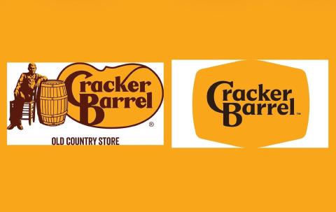
When you picture people eating in Cracker Barrel, you probably see older people and families. In 2025, the restaurant tried to appeal to younger demographics by modernizing its logo. Gone were the famous illustration of Uncle Hershel and the slogan "Old Country Store." It also replaced the rustic font with a generic one and put it inside a bland hexagon.
Like the Gap debacle, this new design immediately led to cultural and political backlash. For people in the core audience, the rebrand felt unrecognizable. Other naysayers thought the update didn't distance the restaurant enough from its outdated associations. While Cracker Barrel quickly reverted to the original logo, the backlash reportedly cost it almost $100 million in market value.
Severity: High. This botched rebranding shows how nostalgia brands can't change their identity overnight — at least, not without extensive audience research and a tightly controlled narrative.
Lesson: For brands tied to nostalgia or cultural identity, even minor updates can feel like a betrayal if the business isn't transparent. Avoid unpleasant surprises by testing messaging before the rollout and clearly explaining why you’re pivoting.

Strict dieting fell out of fashion in the 2010s as customers started prioritizing holistic wellness over the number on the scale. Weight Watchers tried to adapt to this trend by rebranding as the more generic "WW."
Half of consumers say brand refreshes feel authentic when the brand explains why they made the change, according to Clutch data. WW didn't clearly explain what its new name meant. This ambiguity left loyal members baffled and concerned that the brand was abandoning its entire premise.
"The true rebrand lies in balance, evolving without losing what made the brand trusted in the first place," explains Binski. Lose that familiarity, and customers may revolt.
Severity: Moderate. This shift confused clients and diluted the company's mission, but it eventually recovered.
Lesson: Clarity is key. A rebrand should build on your legacy and purpose, not erase them.
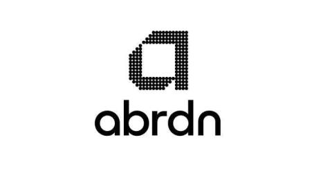
In 2021, the investment company Standard Life Aberdeen tried to become more "modern" and "agile" by renaming itself abrdn. But the vowels weren't the only casualty of this botched rebrand. abrdn also damaged its reputation, with many people ridiculing the name change online. Instead of becoming more relevant, the company became a meme. Ouch.
Severity: High. By prioritizing cleverness over clarity, abrdn lost credibility and respect.
Lesson: Changing your brand name is high stakes, so don't do it on a whim. Legacy matters.

Brand consistency matters to consumers. Nearly half (44%) say they lose trust if a brand makes updates more than once within a year, Clutch data shows. While Yahoo's rebrands aren't that excessive, it did have major updates twice in six years.
In 2013, the search engine tried to gain relevance with a "30 Logos in 30 Days" campaign. It showed off 30 variations of the company's new purple logo before finally unveiling the final, 31st version. While some people thought the stunt was innovative, others saw it as unfocused and gimmicky. Six years later, Yahoo debuted another logo that was even more purple, yet also geometric and forgettable.
According to Binski, patience is the key to a successful rebrand. "For brands with established equity, subtle evolution often signals confidence," she says. "It tells the world, we know who we are." With its frequent updates, Yahoo seemed like it was having an identity crisis, which hurt its credibility.
Severity: Moderate. Two back-to-back rebrands made Yahoo seem unfocused and damaged trust.
Lesson: Frequent rebrands make companies look unstable. Branding should establish your identity, not muddle it.
In a desperate attempt to become hip, RadioShack shortened its name to "The Shack" in 2009. Like abrdn, the transformation was widely ridiculed as out of touch, with one journalist suggesting it rebrand as "JunkShack" instead.
In 2021, the Shack mystified its remaining customers once again by randomly pivoting to a crypto platform. While neither rebrand was catastrophic, RadioShack made this list for alienating its audience twice.
Severity: Moderate. These failed rebrands were a dying brand's desperate attempts to cling to relevancy.
Lesson: Companies should rebrand when they're transforming their strategies, not as an effort to revive a failing business model.
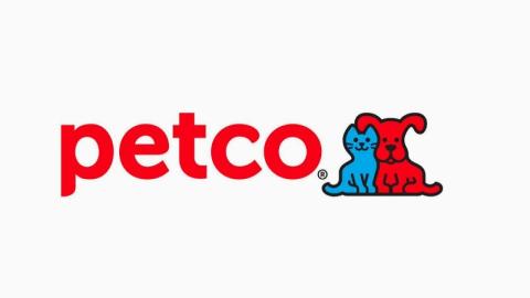

When Petco rebranded as a health and wellness company, it left something behind: Ruff and Mews. These adorable cartoon pets had been part of the logo for years, but they didn't have a place in the new, simple blue design.
Customers responded to the loss of the familiar mascots with anger and confusion. One Twitter user wrote, "Dear @Petco, Your new logo is cold and lifeless." The company later added the mascots back in a less colorful form.
This redesign is lower on our list because the logo change was just one part of an overall rebranding strategy. Still, Petco could have avoided confusing customers with better communication.
“When a company rebrands, explaining why is essential," says Binski. "Silence breeds speculation, but storytelling builds trust. The goal is to help people recognize continuity through change and understand that evolution represents positive growth.” If Petco had explained the reason for erasing Ruff and Mews, customers probably would have been more receptive.
Severity: Mild. This rebranding was only a misstep, not a full-blown crisis.
Lesson: When you remove beloved brand elements, customers may feel disconnected or upset.
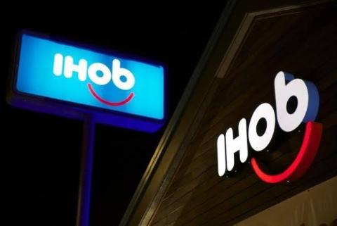
In 2018, IHOP created a stir when it temporarily changed its name to IHOb. The reason behind the stunt? Promoting a new line of burgers. Predictably, the internet immediately mocked the campaign with photos of LeBron James and other memes. However, IHOP got the final laugh when its silly marketing stunt quadrupled burger sales.
Severity: Mild. The name change was risky but had a short-term payoff, which is why it's last on this list.
Lesson: Shocking customers can work temporarily, but you should have an exit plan so you don't lose long-term brand equity.
As you read this list, you probably noticed a few red flags that appear consistently:
These missteps matter. Clutch found that 87% of consumers make assumptions when a brand changes its look, and 50% want to know the reason why. Authenticity also matters to 60%. Fail to meet these expectations, and backlash often swiftly follows.
“A successful rebrand isn't about chasing trends or aesthetics,” Binski explains. “It's about reshaping how people feel about a brand's evolution. When done with intention, it becomes the next natural chapter of a story that already feels familiar.”

As this list shows, the worst rebranding strategies often flop because they feel like an entirely new book, not a fresh chapter.
Set yourself up for success by focusing on purposeful changes, not boardroom wins. Only rebrand if your new identity is tied to a strategy or mission change, or audience growth.
Start testing your new identity as soon as possible. "Every successful rebrand should begin with an extensive presentation deck that showcases how the new identity lives in the real world," Binski suggests. "Seeing the brand applied across various touchpoints allows decision-makers to visualize consistency, tone, and impact before any public reveal."
For example, show what your rebranded packaging and Instagram account would look like, not just the new logo in isolation.
Don't assume your customers will automatically love your rebrand.
Binski recommends extensive testing before you go live: "Pilot the new direction through limited campaigns or soft launches. Test your audience's emotional reactions in real contexts. Behavioral data on how people engage, share, and respond offers far deeper insight into sentiment and readiness than words on a feedback form ever could."
Rebranding your website? Use heat mapping to measure interaction. If you're testing new packaging, simulate a shopping experience and see how many people pick it up off the shelf. These experiments tell you more than simply asking if someone likes your rebrand.
Consider easing into your rebrand instead of hard-launching everything at once. This lets you collect constructive feedback along the way.
"Taking a phased approach that combines data with real human feedback helps build confidence and momentum from within," says Binski. "The goal isn't to force instant acceptance, but to create clarity and continuity, allowing people to connect with the new identity naturally and with trust."
This could be as simple as launching a new slogan or color palette before you unveil a different logo.
Rebranding isn't inherently bad or dangerous. In fact, it's often necessary to keep businesses competitive. However, the worst rebrands rankle customers and erode trust. It's an expensive lesson to learn.
Stay on your audience's good side with thoughtful, well-tested updates. Check out these 10 rebranding examples that broke the rules and won for more ideas on how to launch a successful rebranding campaign.
Not sure where to start? Consider hiring a branding agency for expert guidance. Professionals can work with you to revamp your image without losing your core identity or turning off customers. Best of all, they'll help you avoid becoming one of these case studies — or worse, another internet meme.