

Updated February 24, 2026
The best rebrands of the last decade prove that a new visual identity can reshape public perception and accelerate growth. Here’s how to apply these lessons to your company.
Old Spice’s 2010 rebrand was one of the riskiest in recent memory — on paper. The legacy brand suddenly shifted its marketing to appeal to a younger audience with surreal humor. This move was risky, but it paid off incredibly well.
Rebranding can be a powerful growth lever when it’s authentic and tied to strategy and audience insight. According to new Clutch survey data, 92% of consumers agree that rebrands can be necessary. But for every Old Spice, there are dozens of counterexamples.
Looking for a Public Relations agency?
Compare our list of top Public Relations companies near you
This article breaks down the rebrands that broke convention, yet strengthened trust and helped companies grow. Whether you work with a branding agency or redesign your image internally, this article provides the examples and best practices you’ll need to make it work.
The selection criteria for our best rebranding examples include strengthened recognition, measurable business growth, modernization, and execution at the right strategic moment.
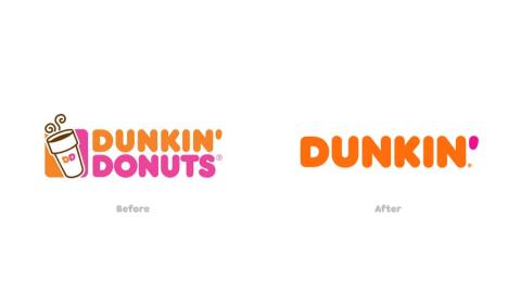
In 2019, Dunkin’ dropped “Donuts” from its name to modernize its identity and reflect the company’s shift toward beverages and a broader menu. The new messaging reinforced the brand’s legacy, using phrases like “America Runs on Dunkin’,” but also represented a strategic shift forward, as beverages are more profitable for Dunkin’ than all other menu items.
The company combined its name change with a visual refresh to reinforce its new identity. The shift updated Dunkin’s core branding visuals to help the company capture attention today without losing the brand equity it has built up over years of operation. The name change worked because it came with a new visual identity and connected to how people already thought about the brand.
Quincy Samycia, Founder of The Branded Agency, explains how to maintain this delicate balance while updating your company’s branding: “At The Branded Agency, we say: ‘Don’t be boring.’ But that doesn’t mean chasing every fad. It means staying historically grounded in your narrative while being meaningfully contemporary.”
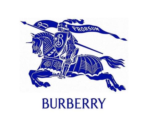
In 2023, Burberry restored its classic serif logotype and revived the knight emblem after years of minimalist branding. Analysts viewed the shift as a return to authenticity, craftsmanship, and the company’s British heritage.
Instead of chasing the hyper-minimalist look that was dominating luxury fashion, Burberry leaned into its own historical DNA, connecting its campaign to British heritage with nods to roses, England’s national flower, and Trafalgar Square, among other cultural touchstones. It aimed to connect the campaign to what it means to be British today. As Samycia puts it, “A rebrand built on real insights resonates; one built on ‘let’s look like everyone else’ feels shallow.”
Burberry followed that advice to a tee, eschewing modern minimalist trends for a style that connected to its customers’ heritage. The lesson? Returning to your brand’s roots can be more authentic — and effective — than chasing trends.

Old Spice completely repositioned itself in 2010, moving from a mature target audience to younger men, with a fresh design enhanced by humor and shareable storytelling.
Before 2010, young men tended to view Old Spice as the brand their fathers and grandfathers used. The company’s new identity shifted that perception and led to an explosion in revenue. Just six months after launching its rebrand, Old Spice sales were up 125% year over year.
Young consumers who once saw Old Spice as outdated began to view it as a cool, relevant choice for their grooming needs. It’s a great example of the kind of impact a redesign can have when paired with viral marketing targeting a specific demographic.
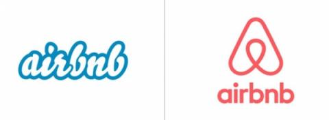
Airbnb introduced its Belo logo in 2014, along with a comprehensive update to its global identity and a more unified product experience. With these changes, the company aimed to show its maturity, having evolved from a quirky startup to a global hospitality platform with hundreds of thousands of listings.
The branding and platform changes helped Airbnb communicate its core values around community, safety, and human connection to the market. This set the stage for the next era of growth.
Samycia notes: “If your promise, business model, or culture has shifted substantially and the identity no longer reflects who you are becoming, then modest tweaks won’t align with purpose, product, and brand performance.” Airbnb’s shift is a lesson in the value of updating not just a logo but an identity to reflect an evolving underlying value proposition. In this case, that meant emphasizing trust and reliability through a new logo and messaging.
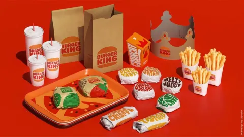
Burger King flipped the script with a retro-inspired identity in 2021 that spotlighted real ingredients and ongoing product updates. It redesigned its logo, typography, and color palette to communicate warmth and a return to “real food.”
Visual updates should reflect genuine business changes, or consumers are likely to dismiss them. Samycia adds: “We counsel clients to start by showing what you do differently now and then tie that into why your identity changed.”

Skims faced initial backlash over its first name, “Kimono,” which critics called cultural appropriation. The mayor of Kyoto even wrote Kim Kardashian a letter, asking her to consider changing the name.
Instead of digging their heels in, the team behind Skims listened to the feedback and changed the company’s name to better align with the market’s expectations. This was a critical step in Skims’ journey toward the $5 billion valuation it has today.
Listening to your audience is part of smart branding. Instead of doubling down on an identity that wasn’t working, Skims pivoted quickly to maintain momentum and stay connected with its target consumers.
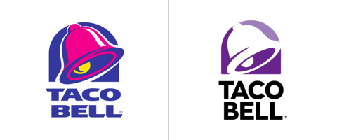
Taco Bell updated its branding in 2016 to be sleeker and more modular. This came at a time when the fast-food chain was investing in app-based ordering, drive-thru optimization, and “Cantina”- style stores in urban centers.
The new identity emphasized adaptability to align with these investments. The modular palette maintained brand recognition across touchpoints while giving individual restaurant teams the room to tailor visual identity to match their setting.
The popular chain has grown consistently ever since. It’s had just one negative same-store sales quarter since making the change in 2016. Other factors contributed, but the shift to a modular, customizable visual identity was a key step in Taco Bell’s evolution.

Barbie and its parent company, Mattel, faced decades of criticism for promoting a narrow set of beauty standards in the popular toy line-up. That shifted in 2023 as the company prepared to release the first Barbie movie and update its visual identity.
Barbie launched a bold, self-aware campaign that promoted modern values around inclusivity and humor. It reframed the brand through updated messaging in the film and its activations.
The repositioning had a powerful impact — Barbie experienced a 27% jump in doll sales in the quarter after the movie’s release. Mattel credited the film and its marketing strategy with reversing its sales decline and reigniting interest in the Barbie brand.
Updating Barbie’s visual identity was a small part of a larger strategy. But it played a crucial role, helping customers intuitively understand that this was a new era for the popular toy brand.

In the early 2000s, Lego was in trouble. The company had spent years investing in theme parks and specialized playsets, drifting away from its focus on open-ended building and imagination-driven play.
Sales dropped sharply, and the company responded by returning to its roots. It invested heavily in Lego fan communities, revived classic sets, and positioned the brand as something parents could share with children.
The shift involved updating the logo and the company’s visual identity. Over the next decade, Lego’s sales rose by roughly 900%.
The lesson is timeless, even decades later: Purpose-led rebrands don’t always need to introduce something new. Nostalgia and returning to what worked in the past can be an effective strategy for strengthening loyalty across generations.
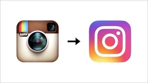
In 2016, Instagram retired its original Polaroid-style camera icon to reflect the platform’s evolution beyond simple photo sharing. Its new logo was a more modern take on the camera icon, showing evolution without sacrificing the brand’s history.
Users were already using Instagram to share videos, connect with friends, and socialize. So the simple Polaroid-style icon no longer reflected the brand’s true value proposition.
The new logo updated the company’s identity to match what the brand has already become to users, as video views were expanding substantially. It also created a more consistent experience across companion apps, which reinforced Instagram’s branding even off the main platform.
Updating to match current market sentiment isn’t always the right move. But when done thoughtfully, it can help you appeal to new audiences and strengthen existing loyalty.
Customers tend to respond best to brand refreshes that feature some of the above elements. For example, according to Clutch data:
Samycia summarizes the biggest takeaway for marketers: “The why matters; consumers sense authenticity or the absence of it. We’ve seen brands shift tone or identity without shifting business behaviors, and the reaction is often ambivalence or skepticism.”
Customers want to see actual business updates reflected in new branding. When you update your identity without updating your offerings, results tend to decline.
Pulling off a successful rebrand isn't easy. In fact, most rebranding strategies fail just in the preparation stage, some of the worst rebrands have become infamous internet memes.
However, this four-step process you can help you create a rebranding campaign that works for your business. The first rule of a successful rebrand is aligning how you look and sound with what you’ve actually become as a business. That means connecting identity work to strategy, product, customer experience, and culture.
Before you start mocking up new logos and color palettes, it’s important to understand how customers view your brand today. This will help you identify how far you can push change without breaking trust. It’s why layered research is so important.
Samycia’s team starts with identity monadic testing, which measures recognition, distinctiveness, and favorability across several branding ideas. Practically, this means asking users questions like:
The goal of identity monadic testing is to find routes that maintain core brand recognition while improving differentiation and appeal. You’ll compare survey results across identity options to see which is most favorable for your business goals.
The next step is equity and commitment modeling. Not all customers will react to a change in the same way, and it’s important to understand how those differences influence perception.
Samycia says, “Our experience aligns with research showing that strongly committed customers react more negatively to drastic changes.” So, if you have a highly loyal base, a radical shift may offer more risk than upside. You essentially need to figure out how committed your audience is to your current branding before deciding how much to push your new identity in a different direction.
Finally, Samycia recommends behavioral simulation. “We’ve used mock digital ads, landing pages, and packaging prototypes to simulate what change will do to engagement, click-through rates, and average order value.” Testing behavioral changes in this way connects what customers say to what they do, which isn’t always the same thing.
By the end of this layered research process, you should be able to answer the following two key questions:
Once you have this information, you have the foundation of a rebrand that can transform the business.
Even with a layered research process, changing your identity all at once can be risky. It’s smarter to use pilot tests to roll out your rebrand in controlled environments so you can see what resonates and what doesn’t.
Samycia advises: “If you can, soft launch the new identity in one geography, channel, or product line. Track key metrics (recognition, sentiment, retention) and compare to your baseline. This gives actionable feedback with lower risk.”
What matters is comparing performance before and after the change in a measurable way. You could do that via web traffic, conversion rates, repeat purchases, social engagement, or app usage, among other factors.
You can pilot your rebrand communication strategy alongside the phased rollout. Be sure to explain why you’re changing, what’s staying the same, and how the update reflects real business evolution for the best results.
Quantitative metrics like click-through rates and conversions are crucial for measuring progress. But they don’t tell you how people actually feel about your new identity or whether you’ve hit the right emotional tone.
Samycia says, “We ask internal teams and external audiences: What does our brand stand for now? What does this change say to you?” These questions track sentiment in a way that raw numbers don’t always capture.
To track sentiment around your rebrand effectively, focus on:
There will always be supporters and detractors for any brand update. The key question is whether people understand why you changed and can connect that identity to your value proposition. Negative sentiment is a strong signal that refinement is needed.
At this point, you’re ready to fully commit to your new brand or refine the approach based on feedback. Samycia says, “At The Branded Agency, we ask if new identity + behaviors outperforms old identity + behaviors by X (where X is defined by the client).”
Set a benchmark, measure performance before and after, then refine as much as it takes to reach your target. Your goals might include:
The goal is to treat your identity as a living system and tune it over time as these metrics evolve.
A successful rebrand is ultimately about connecting a new visual identity to changes customers can recognize in your products or offerings. If you have a rebrand in the works, consider partnering with branding agencies that specialize in strategic evolution.
They can connect your visual update to consumer behavior and tangible business outcomes for a more measurable, productive refresh.


