7 Tips For Designing Web Forms
Clutch surveyed 502 web users about what they actually want from form design. Here are 7 data-backed UX principles that reduce abandonment and improve...
Updated May 27, 2026

Your product page design influences consumer trust and impacts the likelihood that a user will buy your product. Clutch surveyed over 400 consumers to understand what design elements matter the most to them and how e-commerce businesses like yours can convert buyers.
Before they ever click "purchase," shoppers are weighing whether your brand feels credible, your product feels worth the price, and your site feels trustworthy.
A product page is a dedicated page that gives shoppers all the key information about a specific item for sale — and it's the most important page on an e-commerce site. It's where shoppers evaluate and ultimately decide whether to buy.
Looking for a Web Design agency?
Compare our list of top Web Design companies near you
To better understand which product page design features are most likely to convert users, Clutch surveyed over 400 consumers to see what stands out. Here's what we found.
During the online shopping experience, the human eye instinctively follows predictable scanning paths. For unfamiliar brands, shoppers rely on trust-building information before making a purchase. Nearly a quarter (23%) say customer reviews are the first thing they check, followed by brand credibility signals (22%), price details (17%), and product descriptions (17%).
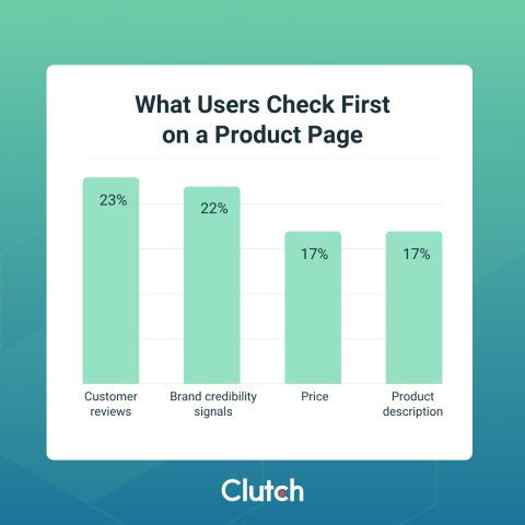
After those four items, shoppers move on to photos, discounts, and shipping information.
Since scanning patterns are habit-based and predictable, design your product page template so that the first four elements are instantly visible, scannable, and trustworthy. If the shopper has to hunt for them, they likely won’t bother.
By aligning your product page with the way visitors naturally scan content and incorporating proven web design principles, you can create an experience that inspires trust and confidence.
When it comes to converting first-time site visitors, these are the 9 design elements your product pages need most.
Most people rarely think about a website’s page frame, as it’s easy to take for granted. In your web layout, the page frame comprises the design elements that remain fixed while the central body content changes from page to page. These static elements generally include your fixed header with logo and navigation, as well as your fixed footer.
If you’re wondering why your page frame is so important, consider that 38% of shoppers told Clutch that outdated or unprofessional design alone is reason enough for them to abandon an unfamiliar site. This means your website’s visual credibility acts as a proxy for your brand’s credibility. Without those visual signals of trustworthiness, your brand itself loses trust.
As an example, compare a polished brand’s product detail page (PDP) with a generic Shopify product page template. In under three seconds, shoppers can infer a great deal about the brand behind the page. A thoughtful brand, such as Allbirds or Glossier, designs its page frame to communicate premium quality, custom curation, and excellent customer service.
On the other hand, a brand that sticks with a generic template as its page frame essentially implies lower perceived value, mass-market sourcing, and an overall less-than-trustworthy brand.
During page frame design, aim for:
Additionally, designers should avoid Y2K stock graphics or anything else that evokes memories of the “Wild West” era of the internet. These scream amateur web design and outdated technology, neither of which speaks to modern brand credibility.
It's essential to include photos of your product on your product page. According to Clutch data, 64% of shoppers said that missing or substandard product photography is an immediate deal-breaker on an unfamiliar site, more so than any other visual feature.
When it comes to professional hero photos of your product, use:
It's important to remember that in 2026, shoppers are increasingly AI-savvy, and AI-generated product imagery is nowhere near as slick as some might think. When a shopper detects AI imagery on a product page, it instantly erodes trust. Investing in actual photo shoots is well worth the cost for that reason alone.
There’s nothing more powerful than word of mouth, and that’s true even in an age when you can shop without ever speaking to another human being. Social proof is a compelling psychological shortcut to building trust and reducing purchase anxiety.
Customer reviews are the first thing users look for when they visit an unfamiliar brand's product page. If there’s no indicator of the product’s popularity or rating above the fold, you’ve effectively buried your strongest conversion asset.
For best results, place the product’s star indicator, star rating, and review count — for example, ★★★★★ 4.8 (2,431) — directly under the product name, and make the review widget clickable to jump directly to the full review model. Showing the score alone is not enough; it’s just as important to show your review count, as volume conveys legitimacy.
Although it might sound like a good compromise to hide ratings below the fold or even in a dedicated tab, it's better for users to easily find reviews.
Brand credibility signals were the second most common element shoppers noticed on product pages for unfamiliar brands, cited by 22% of survey respondents.
These include:
You don’t need to display a wall of badges. In fact, overdoing it can come across as self-aggrandizing. The ideal design move here is a slim, restrained credibility bar, either near the product title or just below the “add to cart” (ATC) button. This is a horizontal strip on a website — usually near the top of a page or just below the hero section — that displays trust signals like client logos, media mentions, certifications, awards, or "as seen in" badges. The goal is to quickly establish legitimacy and build confidence with visitors before they scroll any further.
For instance, Quince product pages include a credibility bar that features review ratings, a summary of the reviews, and images from real customers.
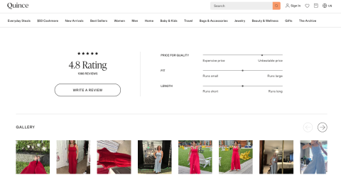
This information helps buyers feel confident that they'll receive a product they will be happy with, and therefore are more likely to make a purchase.
Whether a product fits into a shopper's budget is one of the biggest factors in their decision to buy. That's why unclear or hard-to-find pricing is another major deal-breaker for consumers (68%). Further, 57% of survey participants said they’ve abandoned a recent purchase because shipping costs were hidden until the end of the checkout process.
Austin Mallar, CTO and Lead Tech Specialist at Canadian AEO Agency Longhouse, recommends showing the customer the total, or at least shipping estimates, as early as possible. “Unexpected fees late in checkout create distrust, even if the fee is reasonable,” Mallar says. “Customers can handle fees. They react poorly to surprises.”
Here’s how to design your product page to avoid late-checkout dropouts:
A nasty surprise at the end of checkout is likely to result in an abandoned cart and damaged trust in your brand. Price transparency is the best way to prevent that.
When sizing up an unfamiliar product, 17% of survey participants said they immediately zeroed in on the product description.
The consumer doesn’t want to read a novel about the product, but they do want pertinent details. On your product page, best practice is to include:
Use the “above-the-fold” test to determine if your product description passes muster: Can a shopper understand what this product is and who it’s for in 10 words?
Shoppers don’t just want polished marketing visuals;, they want evidence that feels grounded in real experience. While professional imagery signals quality and intent, user-submitted content seems more authentic and trustworthy.
User-generated content (UGC), such as customer photos, serves as social proof and can be leveraged throughout the product page experience.
Examples of brands that capitalize on UGC include:
Consider designing your product page with an embedded UGC gallery below the product description. Source photos from review submissions or a branded hashtag, and be sure to tag each photo with the customer’s name and the product variant pictured.
Even if you include product ratings and review count above the fold on your PDP, you should also provide more details deeper on the review page. You could add a star rating that links directly to the customer reviews section so shoppers can quickly read them.
Our study demonstrates the importance of this addition. Of the shoppers surveyed, 25% said they'll abandon a site when they can’t find reviews or social proof on a product page. Authentic reviews, as it turns out, are the single most persuasive content you can add to your PDP.
Some design choices that put your reviews to work for you are:
Although intentionally allowing negative reviews to surface may seem counterintuitive, doing so actually increases conversion. How? Showing negative reviews tells shoppers that your brand is authentic and trustworthy, thereby increasing the credibility of your positive reviews, too.
understand this pain point well. Clutch found that 63% of shoppers will leave an unfamiliar site if it doesn’t provide visible contact information.
Having to hunt for a contact method tells the customer that the brand doesn’t want to hear from them, which reads as, “This brand doesn’t take accountability.”
Design your product page deliberately to avoid the misperception of questionable credibility. You might add:
Bonus tip: A Q&A module featuring real customer questions performs a dual role, handling objections while also serving as social proof.
By the time a shopper reaches checkout, they’ve already made the trust decision, which ultimately happens on the product page. Your PDP is your brand’s first impression. If it lacks the nine elements outlined above, you’re asking first-time site visitors to take a leap of faith without proving why they should.
As our survey proves, most of them won’t. And why should they?
Rather than asking for blind faith, design your product page around these essential trust-making elements. They don’t need to be expensive or time-consuming. They only need to happen before your next potential customer abandons their cart.