Web Design Trends That Convert
Boost your website’s conversion rates and engagement with these top 2025 web design trends.
Updated April 30, 2026

Maximalism, experimental navigation, microinteractions, and motion graphics are defining web design trends in 2026 — and the brands leaning into them are the ones that people actually remember.
In 2026, top brands are rethinking how they present themselves online.
Plain white pages and safe layouts aren't cutting it anymore. To make their websites stand out, web designers are creating unique experiences with bold visuals, motion graphics, and navigation that pulls people deeper without making them think twice.
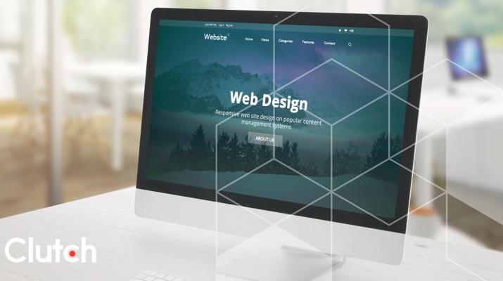
Looking for a Web Design agency?
Compare our list of top Web Design companies near you
Here are the web design trends that top brands are using and how to make them work for you.
For more than a decade, every website had a lean layout and tons of white space. Most pages had barely any text and usually stuck to tame black or blue fonts. It didn't matter if you were shopping for mattresses or researching dog food. Everything looked the same.
Now, web designers are shifting away from minimalism and towards "intentional messiness,” or maximalism. This looks like:
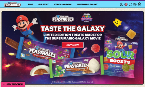
Forget about muted color palettes and ultra-safe layouts. Trendsetters go for high-contrast color combinations that pop on the screen. For example, Feastables uses an eye-catching blue and pink color scheme. These fun colors make the entire site feel like a Candy Land board game — perfect for a chocolate company.
Oversized typography is in, too. It stands out when people scroll, so you don't have to worry about them breezing past your message. Layered sections also add visual interest to sites.
Why such a dramatic shift? It's harder than ever to capture consumers' attention. According to the 2025 Digital Experience Benchmarks report, mobile users spent an average of 2:21 minutes per session. That doesn't give you much time to make an impression.
Unexpected color shifts or oversized text interrupt the expected pattern. This disruption encourages users to pause and engage with your content rather than passively scroll.
Aura Bora is a great example. This sparkling water company uses colorful illustration hero sections to organize its website. These bold headings are much more engaging than standard textual headers.
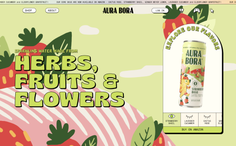
It also has a lively visual theme that stands out from traditional e-commerce templates. The top hero image rotates between vibrant yellow, green, purple, and red, matching the color of the cans. This alternating color scheme continues as you scroll down the page. It feels bold and energetic, yet deliberate. Plus, the site is still incredibly easy to navigate.
That's the key: your site can be maximalist, but it still needs to be professional. To pull it off, you need a strong hierarchy and intuitive structure. You should also test your site with actual users to make sure your intentional messiness doesn't feel like, well, a mess.
Forget about boring static pages. Innovative sites are using more interactive, scroll-based navigation systems. These features often reveal information as the user moves along the page, as though they're hunting for treasure.
For example, Gourou Indian Food highlights menu items when you hover over them. Spinning blue graphics appear on some buttons, drawing the eye to key locations.
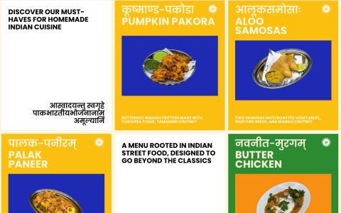
When you click "menu," illustrations of the restaurant's signature dishes flood the page, before dropping away to reveal the menu. Every aspect feels dynamic and immersive, but it's still easy to order and find information.
Experimental navigation can also look like:
Interactive menus that shift or animate when the user hovers over them
Lusion is one brand that's resurrected trailing cursors from the 1990s. If you move your mouse across the page, a faint shimmering trail follows your path. Necessary? No, but it's definitely fun to play with.
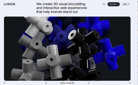
Experimental navigation features like this can turn ordinary browsing into a unique experience. When visitors hover over your buttons to see what animation pops up or giggle at a silly cursor effect, they're more engaged. They're also more likely to remember your brand later.
Another perk is that these smaller, more subtle details shape how the experience feels. They help users associate your brand with play and curiosity. Over time, these positive associations can have a huge impact on your reputation.
The best part is that these features don't sacrifice usability for visual appeal. Of course, you'll need to test each feature carefully to ensure it works on both desktop and mobile.
Online interaction doesn't have to be a one-way street. Microinteractions let you react back when visitors engage with your site. They're small animations that pop up when users behave in specific ways.
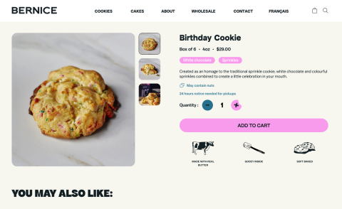
Bernice's Bakery uses microinteractions to celebrate conversions. If you adjust the quantity on their product page, the plus or minus sign turns into a cookie with a bite taken out. Blue or pink confetti also appears, making each purchase feel like a mini party. It's a simple way to build anticipation for the actual cookies.
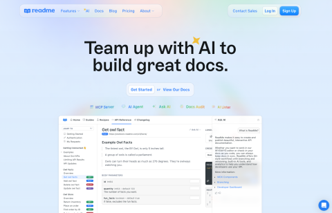
Another excellent example is Readme. The site's owl mascot appears at the top of the login and sign-up forms. When the user clicks the password form, the owl covers its eyes. This animation is a playful way to show how much the company values privacy.
Microinteractions delight visitors and encourage them to hunt for more animations around your site. They also build trust by giving instant feedback. When confetti explodes on the screen, cookie shoppers know they've successfully added a dessert to their cart. These small touches make your site feel more thoughtful and add up to a better experience.
You don't need to replace all your photos with flashy videos to get attention. Consider adding motion to static images instead.
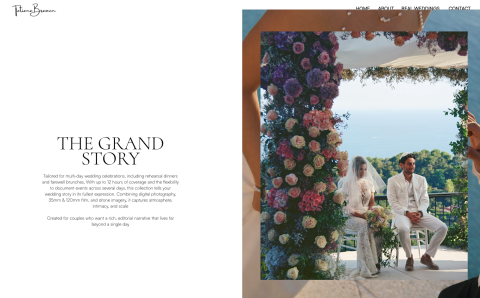
Tatiana Braoun, a wedding photographer, uses a central image of a couple on their wedding day. As you scroll down the home page, the image flips to reveal a photo of Braoun. Near the bottom of the page, two more images zoom in as you scroll. I am running a few minutes late; my previous meeting is running over.
Such effects used to require heavy-duty coding. Now, you do it yourself with a no-code or low-code platform like Wix, Squarespace, WordPress, or Shopify. According to a recent Clutch survey, approximately 75% of small businesses use website builders like these. AI can also help you automatically design the layout, write content, and personalize your site for each visitor.
That makes it easy to experiment with visual effects like these:
These features help you spice up your static content. Even small bursts of motion can keep visitors engaged longer and boost conversions. For instance, someone who admires the visuals on Braoun's website may decide to hire her for their wedding.
Brands have been creating mobile-responsive designs ever since the first smartphones hit shelves. However, many are now going deeper with mobile-first thinking.
In 2025, over 63% of web traffic came from mobile devices. Additionally, Adobe estimates that 56% of holiday transactions took place on a smartphone that year.
That means over half of customers are discovering, browsing, and ordering directly from their phones. And on a palm-sized screen, there's no room for friction. If your site takes ages to load or has a glitchy checkout form, visitors will probably go somewhere else.
The shoe company Allbirds has mastered mobile-first design. Its mobile experience is clean but not minimalist. There are plenty of pictures of its stylish products, with carousels for easy browsing. If you scroll through the product pages, subtle animations add pops of motion. The site also has bold call-to-action buttons sized perfectly for thumbs.
Getting around the Allbirds site is easy, too. Everything loads quickly, and the menus give you plenty of options to help you find what you need. These features may have once given sites a competitive edge, but now they're the bare minimum.
The lesson: Don't get too caught up in desktop design. Sure, it's bolder and more expressive than ever, but you still need a frictionless mobile site. Otherwise, you risk pushing away anyone who prefers to shop with their smartphone.
Web design trends for 2026 are all about experimentation and creativity. Leave behind minimalism with maximalist effects like microinteractions and eye-catching typography. These extra touches will intrigue your visitors and make your entire site feel more intentional.
Of course, that doesn't mean good web design should feel chaotic. To convert users, you still need consistent branding and clear, relevant imagery. Intuitive navigation is also key. After all, visitors can't buy anything if they can't find your checkout page.
Interested in redesigning your website? Search for industry-leading web design agencies on Clutch.