
Should Brands Disclose AI Use? What Consumers Actually Reward
AI disclosure can chill a brand's reception or build trust. See what 408 consumers reward—and when disclosing AI use in your marketing actually helps.
Updated March 31, 2026

Your brand doesn’t need to shout to stand out — sometimes, the right color does all the talking. In a world where customers make snap judgments in seconds, your brand palette can be your most persuasive storyteller.
Connecting feelings with a brand lets companies communicate their values and goals on an emotional level. Every single branding element must be intentionally chosen to successfully evoke those intended emotions from their audience.
One brand decision that can't be taken lightly? Colors.
Looking for a Public Relations agency?
Compare our list of top Public Relations companies near you
Colors communicate messages to audiences:
This is a strong marketing strategy that influences how customers perceive a business.
This article will delve into the principles of brand color psychology, which is the study of how colors influence human behavior and emotions. Plus, get access to our free Brand Color Psychology Cheat Sheet at the end.
By choosing the right colors for your brand identity using the principles of color psychology, you can trigger strong emotions in your customers and stand out among your competitors.
Color branding psychology examines how different colors affect people on an emotional and occasionally physical level. It explores how triggering specific emotions through color influences how people interact and make decisions around people, items, or organizations.
Because colors in branding psychology can create effective and persuasive experiences, marketers, designers, and branding experts all use color psychology in their fields.
Think of a popular brand like Netflix or Starbucks.
Odds are, you saw a flash of Netflix red or Starbucks green before you recalled their logo or mascot. This shows how choosing a memorable color can increase brand recognition.
Marketing color psychology also impacts the feelings customers connect with your company. For instance, yellow logos often create a sense of positivity.
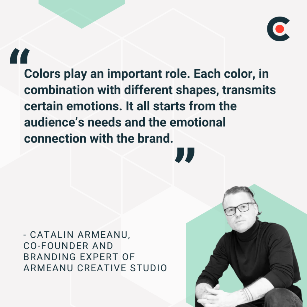
“Colors play an important role,” states Catalin Armeanu, Co-Founder and Branding Expert of Armeanu Creative Studio. “Each color, in combination with different shapes, transmits certain emotions. It all starts from the audience’s needs and the emotional connection with the brand.”
Let’s take a closer look at the effects of color psychology for marketing.
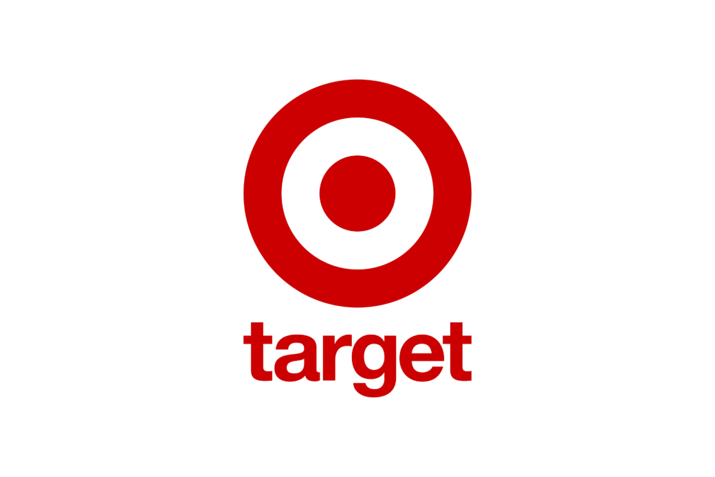
Red colors create a sense of urgency and boldness, as well as heightened energy and passion. Target’s red bullseye logo communicates the store’s sense of confidence.
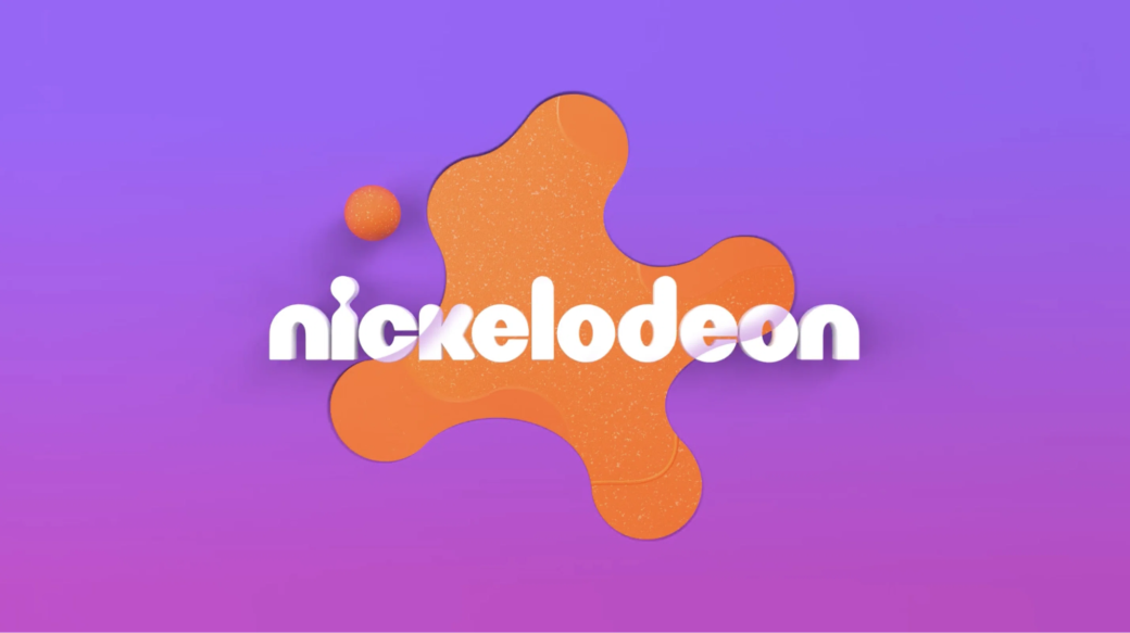
Orange branding shows enthusiasm, friendliness, and playfulness. It’s no coincidence that kid-friendly network Nickelodeon uses orange in its logo.
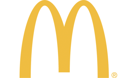
Optimism, warmth, and cheerfulness are linked with yellow. The golden (or yellow) arches of McDonald’s provide a warm welcome to its customers.
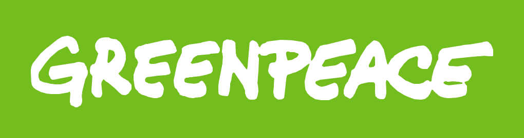
Companies associated with environmentalism, like Greenpeace, use green in their branding as the color is synonymous with growth and nature.
Ever wonder why computer companies like IBM and HP use blue in their logos? Blue denotes trust, stability, and professionalism.

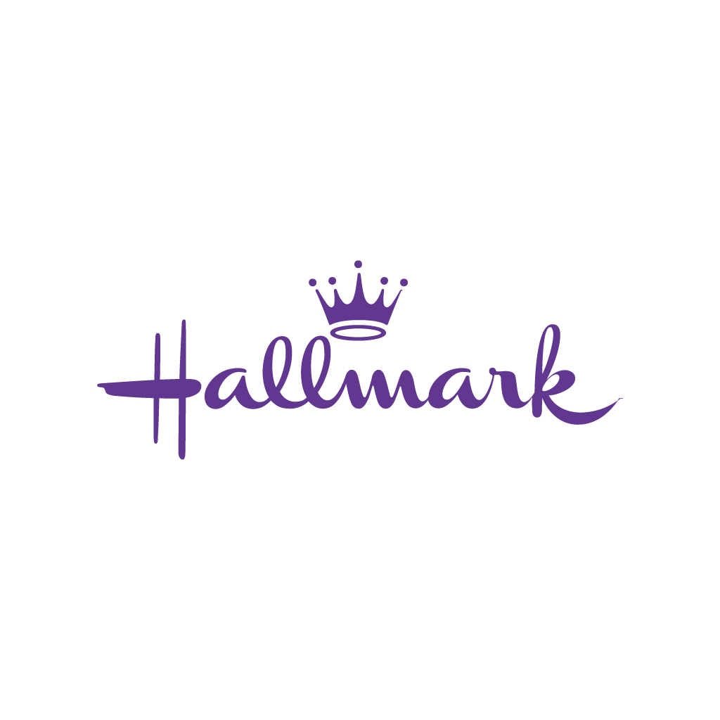
Historically associated with royalty, purple still triggers a sense of luxury, creativity, imagination, and wisdom. Hallmark uses purple in its logo — along with a crown to further emphasize royalty.
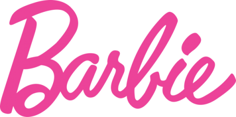
Often considered a feminine color, pink also brings feelings of compassion, youthfulness, and playfulness. The iconic Barbie logo uses a bright shade of pink to show its link to girlhood and imagination.
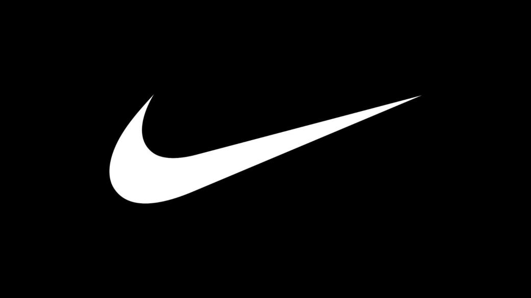
Clean, pure, and simple, white is the go-to color for brands that value clarity in their messaging. Nike uses white to emphasize simplicity, focus, and performance-driven minimalism across its branding.
Less stark than black or white, gray conveys neutrality, maturity, and professionalism. Established luxury car brands, such as Lexus and Mercedes, use gray in their logos.

Black clothing conveys sophistication, elegance, and authority — which is why athletic apparel brand Lululemon uses it in its design. According to Paul Bies, President of Mystique Brand Communication:
“The use of sleek black, deep red, and greys supports [Lululemon’s] high-end, performance-first persona. It doesn’t just say ‘fitness,’ it says ‘premium mindset.’”

Companies use brown to convey a sense of dependability and stability. The chocolate maker Hershey’s uses brown to denote the comfort of chocolate as well as tradition and rustic warmth.

When choosing your company’s brand colors, branding color psychology is just one tool in your marketing kit. Understanding your customers and standing out from your competitors is also essential.

“I think of [color psychology] like dressing the brand for the role it’s meant to play,” states Bies. “If you’re a calm, trustworthy guide, you’re not showing up in neon green. But you also need to avoid wearing the same outfit as everyone else in your space.”
Here are some steps to take when using color psychology for branding.
What core values do you want to communicate through your color choices? What emotions do you want your audience to feel when they interact with your business?
If your business promotes environmental practices, a green logo keeps that top of mind for your audience. On the other hand, if you want to keep customers energized, red might be a better choice.
What are your target demographics? Age groups, genders, and geographic locations all narrow down the colors that resonate with your audience. A young female base might respond best to a pink logo. Audiences in colder climates might appreciate warmer earth tones.
“Small entrepreneurs often choose their brand color based on personal preference, without considering their audience or the emotional connection they need to create,” stresses Armeanu.
Different cultures also have their own meanings for colors. For instance, green represents environmentalism and luck in Western countries. However, in South America, green symbolizes death. If your target demographics are in this region, you may need to rethink your brand colors.
How well do your logo colors stand out in your market?
If you use the same shades and colors as your competitors, your customers may not form a strong association with your brand. Adam Bird, Director of Strategy at Deksia notes, “Color selection starts with differentiation. If it looks like a competitor, it fails before reaching the market.”
However, you don’t want to deviate too far from industry-specific color preferences. These are the colors people focus on when they look for your type of business.
“Differentiation sets the boundaries, and emotion determines the direction within them. The right choice does both at once: it stands out and feels right,” states Bird.
Additional reading: "5 Brand Identity Strategies to Help Your Business Stand Out"
Once you select potential brand colors, conduct A/B testing to see how your target audience responds. Test different shades of the same color to see how well they draw in customers and help you stand out.
“Shade can have a significant impact,” admits Armeanu, “We test colors in different contexts, and, in some cases, we test them with focus groups.”
To make full use of your color palette, incorporate digital tools like Adobe Color. This will help you generate sample palettes to fine-tune your brand colors to the gradient you want.
Your brand colors will ideally represent your company long-term, so choose the right colors to build your brand identity. Keep the following tips in mind:
Just because other businesses are using black in their logos doesn’t mean you have to. And when neon yellow is having a comeback, don't feel pressured to add it into your brand color palette. Focus on colors that represent your brand’s long-term identity rather than short-lived fads.
Effective logo design color psychology often means using a mix of primary, secondary, and accent colors that work well together.
“We sometimes use complimentary colors to differentiate the design,” states Armeanu. “If you find a good harmony between colors, shapes, and messaging, you can set new trends.”
To create this harmony, follow effective color strategies:
Each color you choose for your brand palette should have a clear purpose. Beyond evoking desired emotions, they should attract attention and make it easy for others to see your brand.
“Many brands pick colours based only on emotion — like choosing red for excitement — but forget to test how it looks on a phone or against a background,” warns Bies. “That’s like buying a flashy jacket without checking if it fits. Looks great in theory, doesn’t work in practice.”
Remember: you’ll be using the same color palette across all your branding materials, so make sure they look good in multiple settings. Create mock-ups of your website, logo, business cards, and other materials and check to see how the colors work with each other before settling on your choices.
Branding agencies understand brand color psychology and how it applies to marketing. They can leverage this knowledge to align your color palette with your goals and values. In addition, they can find opportunities to help you stand out among your competitors.
“Color psychology plays a role but is just one piece of the puzzle,” states Bird, “[Branding agencies] typically consider the emotional tone the brand needs to evoke, the audience’s cultural context, and the competitive landscape. The goal is to choose colors that feel right, signal meaning, and create memorability. When created and used properly, a bold hue can say more than a tagline.”
Using color psychology in your branding strategies lets you create bold logos that communicate your business values to clients on an emotional level. Selecting the right colors helps you stand out from your competitors, influence customer decision-making, and expand your brand awareness.
Ready to choose colors that connect emotionally with your target audience and communicate your brand identity? Clutch can help. Our leading marketplace connects you with the top branding companies to promote your business. Get a jump start by downloading our free Brand Color Psychology Cheat Sheet below and start building a better brand identity today.
Ready to choose the right colors for your brand?