
Social Proof Placement: Where to Put Reviews, Ratings, and UGC for Maximum Conversions
Where you should be placing customer reviews, ratings, testimonials, and UGC to actually move the conversion needle — from the homepage to the product...
Updated May 29, 2026

Development, testing, packaging — you’ve put a lot of time, effort, and money into creating your products. But if your e-commerce website isn’t user-friendly, customers may never even add them to their cart.
The product page is a make-or-break point in the buyer’s journey. A Clutch survey found that 84% of consumers reported that website design affects their shopping decisions. Eighty percent will abandon a site that they don’t like, even if they want the product.
Many design blunders can deter customers, from blurry product photos to confusing return policies. Drawing on Clutch data, this guide offers 12 practical recommendations for improving your product page design so you can win over more buyers and increase your revenue.
Looking for a Web Design agency?
Compare our list of top Web Design companies near you
Customers tend to trust product pages that look modern and professional. Just think about it — would you rather enter your credit card details in a well-designed site, or one that looks like it was built by an amateur coder in 2003?
For Steve Pogson, Founder and Digital Strategy Lead of First Pier, eliminating clutter is key: “We recommend brands resist the urge to over-design or overstuff.”
“On Shopify, you have the flexibility to build beautiful, high-performing pages,” he continues. “But that doesn’t mean you need ten sections of storytelling before someone can hit ‘Add to Cart.’ Less is more. Prioritize speed, hierarchy, and helpfulness.”
This is why many businesses hire professional web designers. They have the skills to be able to accurately assess what’s working and where you’re losing customers to help you enhance your product page as strategically as possible.
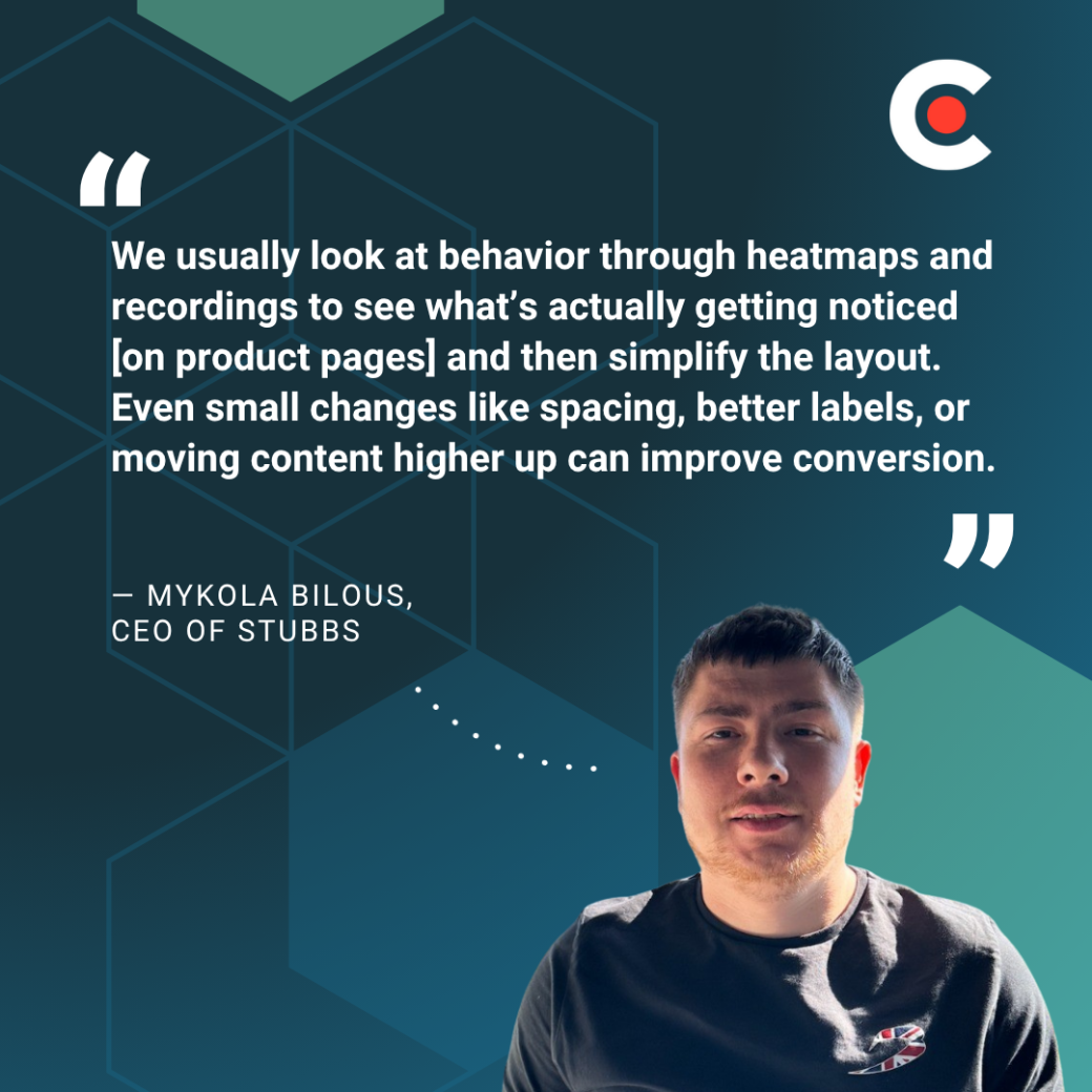
For example, Mykola Bilous, CEO of Stubbs, details his agency’s process, saying, “We usually look at behavior through heatmaps and recordings to see what’s actually getting noticed [on product pages] and then simplify the layout. Even small changes like spacing, better labels, or moving content higher up can improve conversion.”
Best practices:
Resist the urge to design a unique page for every product or switch layouts. Such inconsistency is a red flag for visitors, making your site feel unprofessional or even downright sketchy.
Pogson explains, “If some pages have reviews, sizing info, or shipping details and others don’t, it erodes trust and leads to cart abandonment.” For example, if some products have review sections but others don’t, customers might assume you’re hiding complaints.
Avoid this issue with a uniform product page design. “Establish a consistent page template with just enough flexibility to highlight what’s unique about a product — without breaking the flow,” suggests Pogson. “Keep it intuitive and consistent, then enhance it with the right signage and helpful cues.”
This strategy also makes it easier for customers to browse products. Instead of figuring out how to navigate inconsistent pages, they can quickly compare items.
Best practices:
Shoppers want to know what they’re ordering, but don’t bombard them with technical specs.
Valentina Chiriacescu, Chief Commercial Officer of Ecommerce Today, shares, “Overwhelming people with too much product info and no clear call to action” is a common mistake. Consider using collapsible sections to hide the nitty gritty details.
Many webpages also have “missing or buried product benefits,” says Vladyslav Teplynskyi, Founder of Teplin. “Don’t just list features, sell the ‘why.’” He suggests placing value-driven copy up top.” For example, REI’s product pages begin with a short paragraph about each item’s benefits.
Best practices:
Customers like to clearly see what they're buying. Poorly designed product pages often have “pixelated photos, poor lighting, or no scale/context,” Teplynskyi observes. These images paint your products in an unflattering light and can even make your business seem suspicious.
Teplynskyi recommends investing in “professional images or user-generated content.” For instance, invite customers to submit photos of themselves using your products for social proof.
Best practices:
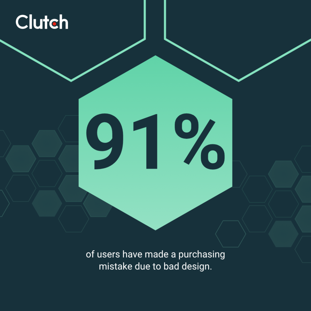
The majority (91%) of shoppers say they’ve made a mistake when buying online due to a poor product page design or layout. For example, a customer might not realize that a bike is too small if you bury the dimensions at the bottom of the page.
These errors damage trust and leave customers fuming. Plus, they lead to more returns, which eat into your profits.
Best practices:
Before buying products from a new site, 45% of shoppers read reviews, and 18% feel frustrated when they can’t find any social proof about something for sale.
However, you can’t just place reviews anywhere and call it a day. “Reviews help build trust, but only if they’re placed where people naturally look for them,” advises Bilous. Be sure reviews are placed in a typical position within your product page, such as near the top of the product details, so users can easily reference them.
Best practices:
Buying a new product is always a gamble, especially for people who aren’t familiar with your brand. Without a clear return policy, they might decide not to risk ordering.
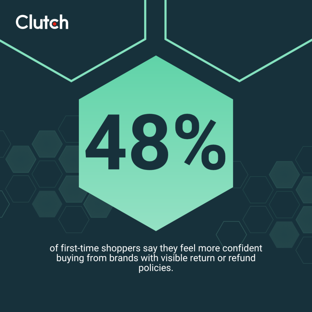
About half (48%) of first-time shoppers say they feel more confident buying from brands with visible return or refund policies. That way, they can trust they’ll get their money back if they’re not satisfied.
Best practices:
Many people are wary of sales language that feels clickbait-y or untrustworthy. For instance, 34% of customers say the phrase “Today only!” makes them mistrust a product
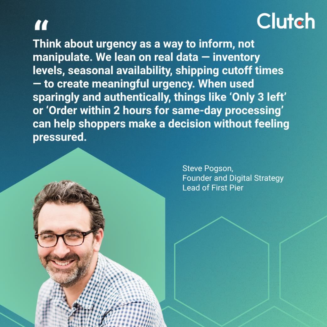
“Think about urgency as a way to inform, not manipulate,” Pogson recommends. “We lean on real data — inventory levels, seasonal availability, shipping cutoff times — to create meaningful urgency.”
Of course, that doesn’t mean you can’t provide honest updates about your products.
Pogson shares, “When used sparingly and authentically, things like ‘Only 3 left’ or ‘Order within 2 hours for same-day processing’ can help shoppers make a decision without feeling pressured.”
In other words, focus on facts over trying to stir up emotions.
Best practices:
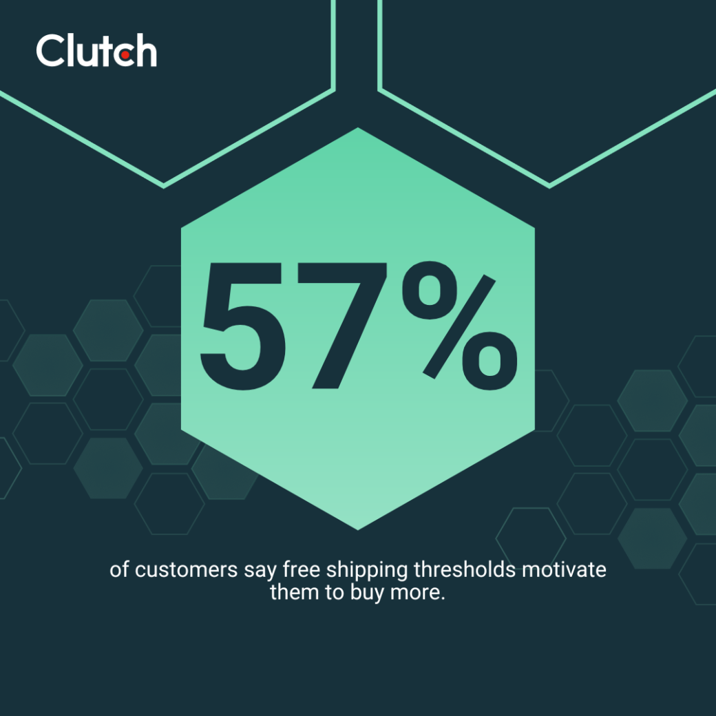
There’s nothing worse than getting slapped with an outrageous fee on the final checkout page. A notable 44% of online shoppers say surprise shipping costs are their biggest pet peeve, and 67% have abandoned a cart because of high shipping fees.
These hidden expenses can hurt your reputation and make clients feel like you’re taking advantage of them. On the other hand, offering price transparency can boost your sales.
Best practices:
A customer’s momentum can immediately vanish when they realize that an amazing product isn’t available. But that doesn’t mean you need to lose them.
Pogson says, “The key is not to treat out-of-stock like a dead end — it’s a pause, not a stop. And it’s a great opportunity to deepen engagement.”
Setting up back-in-stock alerts will help maintain your audience’s interest. Many platforms let you add email or SMS signup forms to product pages.
“For example, Shopify makes it easy to capture those emails and trigger a campaign or flow when the item is available again,” Pogson explains. “That email often becomes one of the highest converting messages in your lifecycle marketing stack.”
He continues, “Depending on volume and product type, we’ll also segment those users and offer early access or a timed discount when the restock goes live.” A simple 20% off coupon, for instance, can revive a buyer’s interest in a half-remembered product.
Best practices:
The best product pages are easy for mobile users to navigate. As Teplynskyi puts it, “It’s important to minimize scroll fatigue and prioritize what actually matters for conversion.”

Best practices:
About 29% of shoppers feel annoyed by slow-loading sites. And if your product pages take 10 seconds or longer to load, you might lose 50% of your visitors (ouch).
Best practices:
Customers don’t give second chances to poorly designed or stressful sites. Win them over by creating helpful and trustworthy product pages.
As Pogson puts it, “The real key is clarity. The best product pages make it easy for the shopper to say ‘yes’ — without needing to scroll endlessly or open five tabs.”
Use these 12 strategies to build trust and encourage customers to spend more time on your site.
Need help creating great pages? Check out Clutch’s directory of top web designers for expert guidance.