

Agentic Commerce Is Here – How To Optimize Your Website for Sales
Agentic commerce is changing the digital shopping experience. Learn how to update your site for it and improve your bottom line.
Updated December 11, 2024

Both one-page and multi-step checkouts have pros and cons that will make a difference for your e-commerce store’s success. Figure out which one you should use in this article.
The success of any e-commerce store can be measured by the number of conversions it earns. And, the conversion ratio is directly proportional to the checkout experience.
The easier the checkout, the more conversions you can expect. After all, no one likes to deal with complicated stuff that doesn’t make sense.
Looking for a Web Design agency?
Compare our list of top Web Design companies near you
The debate revolving around single and multi-page checkout has been around for a while. Both approaches have their own merits and demerits.
In this article, we will be comparing both methods to help you decide which one is right for you. Let’s get going.
A one-page checkout brings together all the checkout steps on a single page and allows users to complete their purchase swiftly and easily.
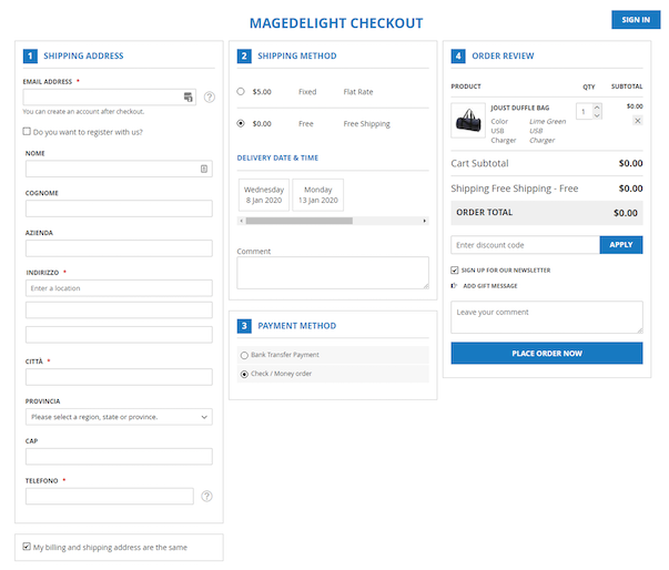
As Magedelight’s checkout shows, this method aims to accelerate the checkout process while minimizing cart abandonment.
When it comes to checkout, speed is extremely important. A multi-page checkout takes about 1:40 minutes to complete a purchase. That’s a lot of time for someone to leave your store without completing their purchase.
However, if you bring all the steps onto a single page, the checkout time reduces to just 53 seconds. The fewer the pages, the faster the checkout and more conversions.
One-page checkout can significantly reduce the time it takes for completing a purchase. Customers can enter all the required details with just a few clicks.
This approach makes the checkout experience seamless and takes away uncertainty from the process.
When customers get to see all the checkout steps on a single page, they know where they are heading. Customers will find it easier to navigate through the entire flow and complete the purchase without a hitch. Moreover, a one-page checkout accelerates the checkout process in a subtle way.
When all the steps are on a single page, customers are very unlikely to leave the checkout without completing their purchase. A single-page checkout significantly minimizes bounce rate.
While a one-page checkout is meant to simplify the checkout experience, it can also be counterproductive if you need to present a lot of information.
Thus, before you squeeze down all the information onto a single page, check if this approach would work well with your store. The last thing you want is to overwhelm your customer at the most important step of a buying cycle.
If you’re fond of Google Analytics and use that service for analyzing your pages, a single-page checkout setup won’t help.
With a single-page checkout, it’s hard to tell at which step the customer abandoned the process. However, with a multi-page checkout, you can easily check which page the customer left the buying cycle.
There are several e-commerce giants already using a single-page checkout model for various reasons.
You can learn from them and refine your checkout experience to match your customers’ needs. Let’s quickly look at how brands use single-page checkout on their stores:
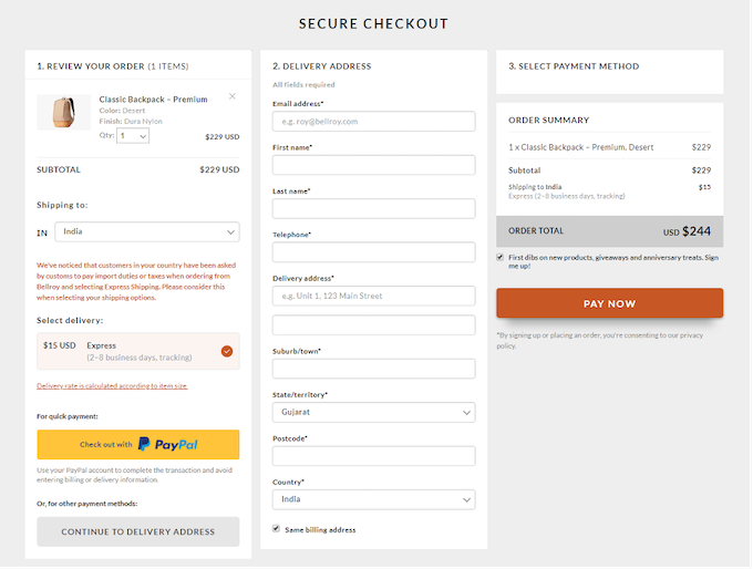
Bellroy managed to boost conversions by squeezing its lengthy checkout process on a single page. As you can see, the checkout flow is intuitive and provides all required information in one place.
Notice the numbers embedded in each step. The neat layout adds more ease to the checkout experience. There is little to no room for returning or abandoning the purchase.
Here’s another exemplary one-page checkout comprising all the steps on a single page. Look at the way it is structured. The step-by-step process makes buying both easy and fun.
Moreover, it is super fast and snappy. You can move from one step to another without a hitch. All the steps are numbered to make the process seamless and intuitive.
Essentially, a multi-page (or multi-step) checkout breaks down the entire checkout process into unique steps and pages. Customers have to go through all the pages in order to complete their purchase.
With a multi-page checkout, your customers can verify the details they fill in at every step. This gives them a sense of certainty and avoids any human errors.
Moreover, a multi-page checkout also allows customers to review their order before swiping their credit cards.
When you have multiple pages, it’s easy to analyze performance through Google Analytics.
For instance, you can easily check which page most of your customers are abandoning their carts. Once you know this, optimizing the page gets much easier.
Often times, the first step of a multi-page checkout collects the primary information of a customer.
This means, in case the customer leaves the checkout process without completing the purchase, you still have their contact details to send them follow-up emails regarding their order.
You want checkout to be as fast as possible. The more time your customers spend in the process, the higher the chances of cart abandonment are.
The reason a lot of companies don’t prefer a multi-page checkout is because the entire process can be exhausting.
A multi-page checkout cannot be considered best from a UX standpoint. This is mainly because a customer has to go to and fro to make even the smallest changes to their details.
For instance, your customers may have to surf several pages if they want to change something in their address or add a note.
Myntra has smartly implemented a multi-page checkout to their website. Their layout is clean and intuitive.
Notice also, they have clearly displayed the steps at the top of the checkout page. This leaves no room for confusion or backing out.
The largest e-commerce giant across the globe, Amazon, also uses a multi-page checkout on their store.
Remember the last time you shopped on Amazon? You might have noticed the checkout was quick and seamless. They also allow you to review your order before placing it.
Despite all the pros and cons, both a single-page and multi-page checkout is used by a few of the world’s top brands.
Choosing one over the other can be hard. You need to make a lot of calculated considerations before implementing one in your store.
If you are having a hard time deciding which one can be ideal for your business, you may consider consulting your e-commerce service provider.