Social Proof Placement: Where to Put Reviews, Ratings, and UGC for Maximum Conversions
Where you should be placing customer reviews, ratings, testimonials, and UGC to actually move the conversion needle — from the homepage to the product...
Updated May 29, 2026

A great user experience is the key to a successful website. It requires a balance of aesthetics, functionality, and accessibility. Avoiding common web design mistakes early on helps improve engagement, conversions, and competitive advantage.
Have you ever wondered what makes a website truly outstanding? Things like a website loading quickly, looking really nice, or being super easy to use can leave you amazed. But all of these are nothing but a part of a superior user experience. And what do you do to achieve an amazing user experience for your website? You have to avoid common web design mistakes.
As business owners, we have all experienced the sinking feeling when we see high bounce rates that lead to low conversions. We may not recognize it at first, but with time, we learn about them.
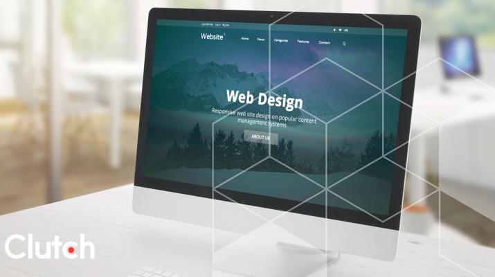
Looking for a Web Design agency?
Compare our list of top Web Design companies near you
However, it’s too late to do anything about it as it has already affected our business. So, it's important to identify these web design mistakes early to reduce their negative effects. Before we discuss the biggest web design mistakes, let’s explore the importance of UX design.
It is easy for us to confuse website usability with user experience. Although usability is a part of user experience, it is not the complete picture. User experience is much bigger than that.
Jesse James Garrett, who wrote The Elements of User Experience, says that user experience has five main parts: Surface, Skeleton, Structure, Scope, and Strategy. These are like layers that work together to make a website easy and enjoyable to use.
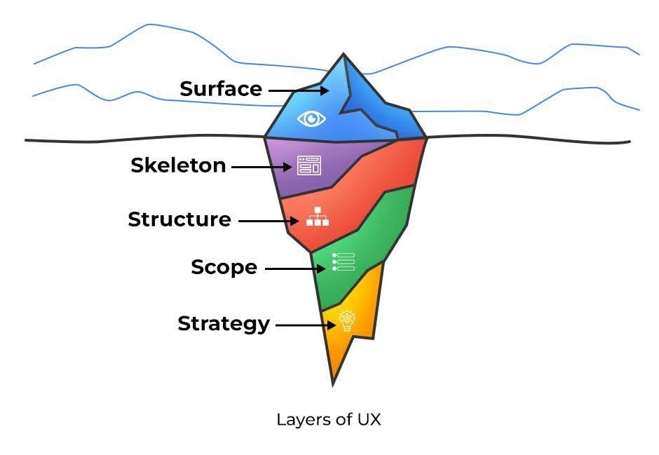
Let’s look at these five layers briefly to understand user experience better.
All these layers work together to make an exceptional user experience that impresses users.
Now that we understand what UX is, let's explore its importance.
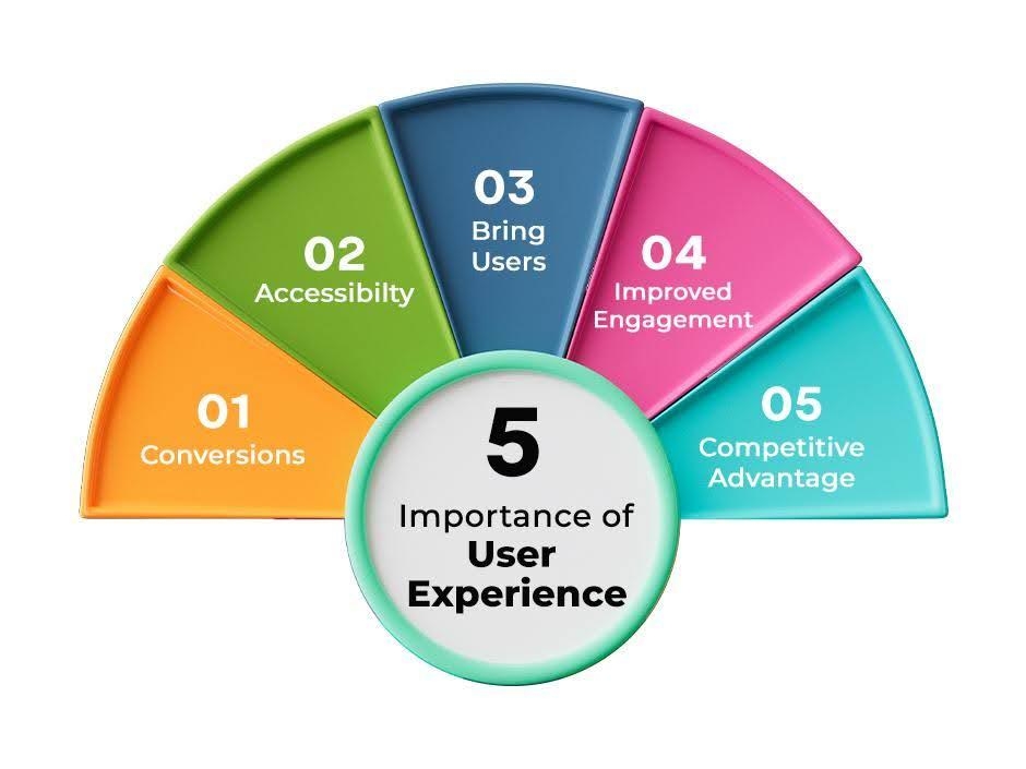
When users are impressed and satisfied with your website, they will probably make a purchase or sign up for your service. So, a superior user experience boosts conversions for your business.
Suppose a user with a disability visits your site. However, he/she cannot access certain functions due to his/her disability. A good UX ensures your site is accessible to all. This inclusivity effectively expands your audience, providing satisfaction to everyone.
If users enjoy being on your website, it will bring them back over and over again. Not only that, they will probably recommend your website to their friends and family who need a product that you sell.
A good user experience makes people feel positive about your business, even if they’re visiting for the first time. That’s because when a website is easy and nice to use, people often think the products are good too. The users will be more loyal to your business in this case. This increases the quality of engagement and user interaction.
You are not the only one selling the product that your user needs. There are other players in the market. So, an exceptional user experience can make you stand out among your competitors.
Suppose you land on a website that makes boring things playful and interactive. This will evoke positive emotions among you that will make you admire the website design. Not only that, but it will even make you come back to the site if you want to buy something similar to what they are providing. Expert web design makes using a website easy and fun, turning normal visits into something people enjoy and remember.
For instance, 404 or "Page not found" is a section that no one wants to visit. But what if we tell you that you can make a web design that will make this section interesting? You can even redirect the user to a page that you want them to visit.
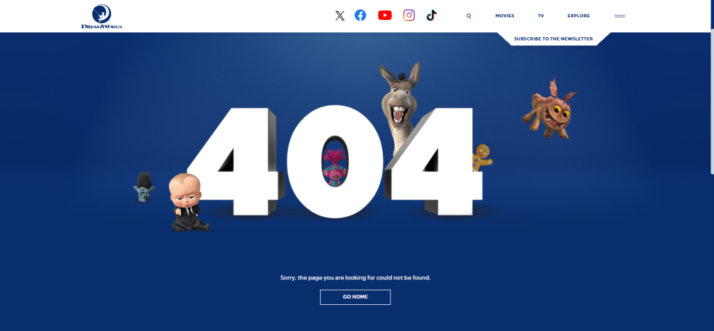
Let’s see the screenshot of DreamWorks Studios' 404 (Page Not Found) page. Can you see how interactive and engaging the page is? It did that by including famous characters from its popular animated movies. They even designed a button to let users go to the home page.

On the contrary, see this example. This is the kind of 404 error page nobody wants to land on. The colors, fonts, layout, and even the contrast on this web page don’t look good or work well. Do you think you’d like to visit this site in the future? You can if you want to, but most of us will not!
This is how web design can make or break the user experience of your website.
By now, you probably know the cost of a bad web design when it comes to user experience. So, avoiding these web design mistakes early can help you build a solid foundation for your business. Let’s explore some of these mistakes along with the tips to work on them.
Think of this: You went to a website to buy something. The website looks amazing. However, when you try to navigate the site, you face problems finding the product you need. It doesn't matter how beautiful this website looks; your inability to find the product you need will frustrate you.
This is a major problem that impacts the user experience negatively. Conversely, the site is easy to use with easy navigation. But when you land on the website, the site looks awful. No matter how much functionality it provides, you will not check them and leave the site. After all, the first impression is the last.
So, balancing the look and functionality is important for an exceptional user experience.

For instance, let’s take this website. It looks quite good. However, when observed in detail, the layout is cluttered and overloaded with information. Also, the contrast is low, with tiny fonts, which affects the website's functionality.
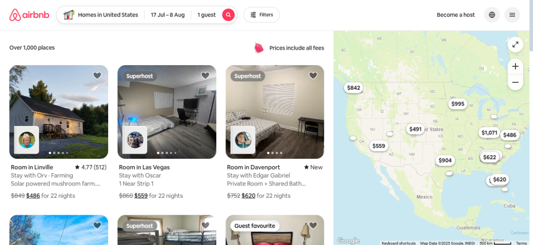
On the other hand, Airbnb strikes a fine balance between its appearance and its offerings to users.
Nothing frustrates the user more than unnecessary pop-ups as soon as they land on your site. Instead of quickly finding the information or product they want, users get hit with annoying pop-ups before they even start using the website.
We aren’t saying all pop-ups are bad. However, you have to be cautious about their placement and design and avoid using forced pop-ups.
When it comes to pop-ups, you have to know when and how many to include. It is advisable to stick to one pop-up per page. You will also have to ensure that the pop-up doesn't take up the entire screen. They may affect the user experience by serving as a barrier when visitors try to access information.
This is one of the most common web design mistakes and one of the bad UI/UX design choices. Great web design works well not just when everything goes right, but also when something unexpected happens.
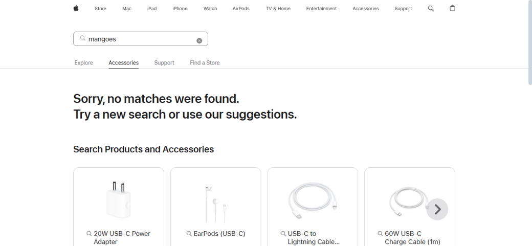
Take Apple's example. Can you see how they handled the empty space (called the in-between state) by offering helpful tips or suggestions?
So, you should consider the end, the beginning, and the in-between state. For instance, let’s suppose that a visitor is signing up for a free trial of your product. If the process goes smoothly, the user will go from the sign-up page to the success page. But bumps do happen on the road. So, you have to consider:
Always consider the complete user experience. Even if mistakes pop up during the customer journey, they will be welcomed with an outstanding user experience.
We understand that you want to provide complete information about your products to users. This will allow them to make an informed choice. So, it’s tempting to use as much information as possible. But this is one of the major web design mistakes that businesses make.
This excessive information may overwhelm users. They will find it difficult to digest too much content in one go, so they will leave your website to find the product online.
Let’s see this example. Can you see how haphazard this site looks? All the elements are unevenly distributed across the homepage. Plus, the information is excessive without any structure.
Now, see this one! There are not too many elements on the homepage, and it has a minimalist design with important information placed at the correct locations.
Let's face the fact that poor web design practices can only be avoided by expert web design services. Making web design mistakes is normal. However, these mistakes are not self-evident facts but human errors. Instead of waiting for these blunders to cross your path, you should be proactive from an early stage. This way, you can anticipate them and avoid them in advance.
So, the baby step you need to take is to inform yourself about these mistakes. Take note of these pitfalls, accept them if you've made a mistake, and take proactive steps to resolve them quickly.
Remember that a great user experience is at the core of any product’s success. To make your business successful, prioritize addressing these web design mistakes.