
How AI Is Reshaping Customer Support
Companies are rapidly adopting AI for customer support, but consumers aren't impressed by chatbots that can't solve their problems. Clutch surveyed 422...
Updated April 22, 2026

AI-driven interfaces aren’t new anymore. They’re baked into the stuff people use every day, like email, music, maps, and internal tools.
But just adding a model doesn’t change much on its own. What matters is how your product behaves around it.
Looking for a Artificial Intelligence agency?
Compare our list of top Artificial Intelligence companies near you
You start noticing it when you ship. Autocomplete that feels helpful gets used. The version that jumps in too early gets ignored. Summaries that save time stick. The ones that miss context get re-read, then avoided.
That’s where UX actually matters.
If the interface makes the AI feel predictable, even if it’s not perfect, people keep using it. If it feels random or opaque, they don’t. Doesn’t matter how strong the model is.
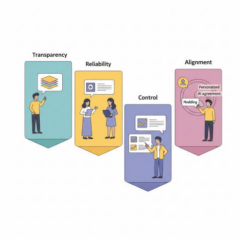
Trust, transparency, control. Those aren’t principles you write in a doc. They show up whether the feature is on or off.
Trust isn’t about whether the system is smart. It’s whether someone feels safe relying on it.
You see it in small behaviors:
Most people don’t give AI many chances.
The hesitation is real. Pew Research found people are more concerned than excited about AI in daily life. That shows up directly in product usage. You can feel it in the first session.
Reliability, accuracy, safety, those are baseline. But what actually builds trust is consistency.
NIST’s framework talks about validity, reliability, safety, privacy, and accountability. In practice, users don’t think in those terms. They just notice when something feels off.
And when it does, they stop trusting it. Fast.
Transparency sounds straightforward until you try to implement it.
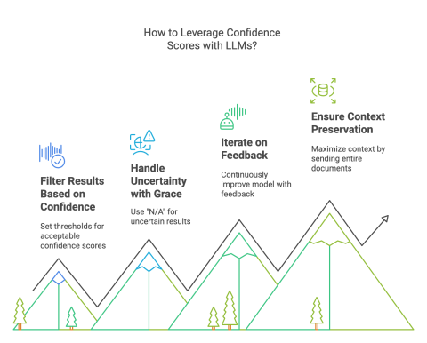
Showing a confidence score doesn’t help most people. Dumping a technical explanation is worse.
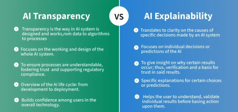
What works is tying the system’s behavior to what the user is trying to do.
Sometimes it’s just a small link: “Why am I seeing this?”
Sometimes it’s a short note: “Generated by AI, review before sending.”
Those tiny moments matter more than long explanations.
The tricky part is how much to show.
Too little, and it feels like a black box. Too much, and people ignore it.
Progressive disclosure works because it matches how people actually behave. Most users want a simple answer. A few want to dig deeper. You give both, without forcing either.
Explainability tools like LIME can help behind the scenes, but what the user sees still needs translation. Otherwise, you’re just moving complexity around.
This is where most AI features either stick or fail.
If the user feels like the AI is doing things to them, they pull back.
Control doesn’t mean exposing every setting. It means making sure the user can steer outcomes without friction.
In practice, that shows up in a few places:
At the start:
During use:
That same principle shows up outside software, too.
When someone’s customizing something like blank t-shirts, they don’t want the system making decisions for them; they want guidance they can accept, tweak, or ignore. The moment it feels like the outcome is being decided for them, engagement drops off.
After the fact:
And then there’s data control. People care more than they used to.
If they don’t understand what data is being used, or feel like they can’t opt out, they hesitate. Even if everything else works.
The best systems don’t overwhelm users with control. They just make it obvious that control exists.
Automation is useful right up until it isn’t.
You feel it when something goes wrong silently. That’s where trust breaks.
In lower-stakes tools, people tolerate aggressive automation. In high-stakes contexts, finance and healthcare, they don’t.
That difference becomes obvious in environments where mistakes carry real consequences. In areas like medical negligence, decisions can’t rely solely on automation, even when the underlying systems are highly capable.
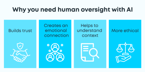
The expectation is accountability, traceability, and the ability for a human to step in, question, and override before anything moves forward.
Design has to reflect that.
Preview-before-apply is one of the simplest patterns that works. Let people see what will happen before it happens.
Confidence cues help too, but only if they’re meaningful. If everything looks equally “confident,” users ignore it.
Intervention points matter more than people expect:
If those aren’t obvious, users either over-rely on the system or stop using it entirely.
Regulation is pushing toward more human oversight, especially in higher-risk systems. But even without that pressure, the UX needs it.
Some products got this right early.
None of these is over-engineered. That’s the point.
The hard parts show up quickly once you ship.
Adrian Iorga, Founder and President of Stairhopper Movers, runs operations in which plans must adapt quickly to real-world conditions.
He says, “Good systems help us get most of the way there, especially when it comes to planning and coordination. But what really makes things work is having the flexibility to adjust in the moment. When you combine strong systems with experienced people who can make quick decisions on the ground, that’s when everything runs smoothly.”
Hallucinations are obvious. One bad output can undo the trust you spent weeks building.
Explanations can also backfire. If they sound convincing but aren’t accurate, users get misled. That’s been flagged in explainability research; plausible explanations aren’t always faithful.
Bias and fairness don’t stay theoretical either. You see it in recommendations, rankings, and visibility.
If you’re not actively checking datasets and outputs across different user groups, it slips through.
Privacy is another pressure point. People want to know:
If the answers aren’t clear, they assume the worst.
What helps:
A few shifts are already happening in the world of AI.
More processing is moving on-device. That changes expectations around privacy and speed.
Multimodal inputs such as voice, images, and touch are becoming the norm. That makes interfaces feel more natural, but also harder to explain. You can’t rely on text alone anymore.
Agents are getting more autonomy. That’s where UX gets tricky again.
If a system is planning and acting, users need to see:
If those aren’t obvious, people won’t trust it.
Provenance is another emerging need. As generated content becomes harder to distinguish, users want signals that tell them what’s real, what’s AI-generated, and where it came from.
Expectations are rising, too. People don’t want generic explanations anymore. They want explanations that match how much they already understand.
This work isn’t optional. You can ship a strong model and still fail if the interface doesn’t support it.
The truth shows up in whether people keep using the feature or quietly turn it off.
If you’re evaluating vendors or tools in this space, platforms like Clutch can give you a clearer picture of how teams actually perform in real projects, not just how they present themselves.