
Will AI Replace Graphic Designers? The Fear vs. The Facts
AI is revolutionizing graphic design, but is it replacing designers? Clutch research reveals what businesses actually think, and what designers need to...
Updated May 25, 2026

The terms logo and icon are used interchangeably, but they represent different things in design.
A logo is the mark people connect to a brand. It appears on packaging, ads, and products to build recognition. An icon works inside a product or website. It signals an action or feature and helps people move through an interface without stopping to read. The decision comes down to purpose. Use a logo when you want visibility and identity. Use an icon when you need clarity and navigation.
Logos and icons are both visual elements employed by brands to provide optimal services to customers. However, each component has very different ideal use cases that result from its key benefits.
Looking for a Graphic Design agency?
Compare our list of top Graphic Design companies near you
A logo is built for brand recognition. It ties a company name to a simple mark through color, shape, and type. Businesses use logos on products, packaging, and websites so people can quickly recognize the brand. According to The Manifest, consumers tend to notice logo changes before they pick up on new slogans or colors, which shows how much weight a logo carries in brand identity. Clutch’s brand identity guide expands on this point, noting that logos often become the shorthand for a company’s larger story.
Logos rely on basic elements, but trends shift over time. Color signals meaning — blue is still linked with trust in the tech sector — but designers also play with shape and typography to reflect modern values. The 2025 Logo Trend Report from LogoLounge points to flatter forms, bolder type, and simplified icons within logos. Looka’s review of logo trends echoes this, showing how brands adapt their logos to stay current without losing recognition.
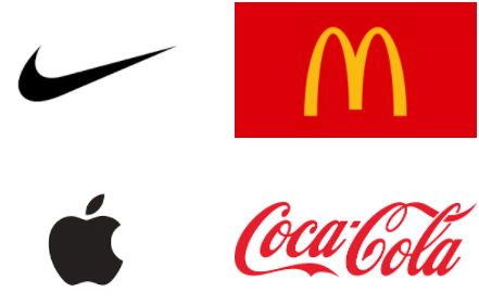
4 Memorable Logos Examples
Additional resource, ‘The 7 Logo Characteristics and Make a Logo Great.’
Icons play a different role than logos. They are small graphics that help people act inside a product or site. A paper plane for “send,” a trash bin for “delete,” a magnifying glass for search, and three stacked lines for a menu are familiar examples. Because users process visuals much faster than text, icons reduce friction. When they fail, frustration builds. A 2018 study found that 88% of people avoid websites after a bad experience, highlighting the importance of clear icon design.

Axialis describes icons as functional images that represent an object or action in a digital system. They are not meant to be one of a kind but should feel familiar across platforms. Current trends reflect that purpose. Design Shack points to clarity, consistency, and scaling as priorities. Design Centered adds that animated icons and evolving imagery are becoming more common, keeping navigation intuitive while giving interfaces more energy.
Even so, some icons pick up brand meaning. Apple’s logo doubles as a toolbar icon on its computers.
Facebook’s thumbs-up is not the official logo, but it has become inseparable from the brand. These examples show how the line between logos and icons can blur, but the core distinction remains: logos build identity, icons support usability.

Icons are a part of almost every website, but their role changes with context. On mobile, a magnifying glass nearly always indicates search, and the three-line menu has become shorthand for navigation. Social media relies on simple shapes to drive interaction and engagement. The thumbs-up on Facebook signals a “like,” while Twitter’s arrows indicate sharing via retweet.
In work software, icons persist even when the objects they reference are gone. The floppy disk remains the marker for “save,” and younger generations still learn it as that function even though most have never seen a floppy disk. Apple uses its own logo in the Mac toolbar as a system icon, turning a brand mark into a control. These examples highlight how icons help people act without reading, drawing on recognition built across years of repeated use.
Logos give people a quick way to recognize a company. They help one brand stand apart from another and often become the first detail a customer remembers. In reviews, buyers often mention a logo before they mention other design features, which shows how much weight it carries. A strong mark also works across channels, from business cards to websites, maintaining a consistent identity across touchpoints.
Logos do not scale well in every context. Fine detail can disappear on small screens or app icons, making them harder to read. They also offer little help inside digital products, where users need clear symbols to act quickly. A logo may stand for identity, but it is not designed for navigation.
Icons support movement through a product. A magnifying glass for search or a trash bin for delete tells people what to do without extra text. They help users who may face language barriers or reading challenges, and because the same images appear across many platforms, they can be recognized almost instantly.
Icons are less effective for brand building. They are designed to be familiar rather than distinctive, which means they rarely set one company apart from another. Without context, an icon can also be misread. A symbol that looks clear to designers may confuse users who are less familiar with the convention. These limits show why icons are strong for navigation but weak as standalone brand markers.
Logos and icons serve different purposes. A logo anchors brand identity and builds recognition on packaging, ads, and digital channels. An icon, by contrast, supports usability by guiding people through tasks and helping them move through a site or app. Both are visuals, but one speaks to identity and the other to function.
The way they are created also reflects this difference. Logos are often developed through long design cycles, with heavy input from marketing, executives, and sometimes external agencies. The goal is to capture the values and positioning of a company. Icons are usually handled by UX or product teams. They are tested for clarity and speed and refined based on user feedback.
Data points to the same distinction. Consumers notice when a logo changes, which shows how closely they tie it to a brand’s identity. Icons are judged on usability. If navigation feels confusing, most users will leave the site, no matter how strong the branding is.
Logo projects often sit with branding agencies or outside design partners. They take longer because executives and marketing teams want a say, and the end result is meant to last. Icon work usually falls to UX groups inside product teams. Sets are built, tested in live interfaces, and changed when users struggle. One is a slow, high-stakes process; the other is faster and tied to everyday use.
Logos need to work at many sizes, from billboards to social media thumbnails. Detail that looks sharp on print can blur on a phone screen. Vector formats such as SVG help preserve clarity, while raster formats like PNG are often used for icons. Icons, by design, are simple enough to hold their meaning even at very small sizes.
Keeping logos consistent is straightforward. Most companies publish brand guidelines that spell out color, spacing, and placement. Icon governance looks different. Teams maintain libraries with names and usage notes so the same symbols show up in every app or platform. Both approaches exist to prevent confusion, but the rules and ownership structures are not the same.
A logo is best when the goal is recognition. It belongs on packaging, websites, business cards, and marketing collateral as a symbol for the company itself. Seeing the same symbol in each place builds trust and familiarity.
Icons work inside products and interfaces. They guide people through actions like search, delete, or share. On a mobile app, icons reduce clutter by replacing words with simple, universal graphics.
Some contexts require both. A company website may feature the logo at the top for brand identity, while icons handle navigation and calls to action. Knowing the difference helps teams decide which visual supports the task at hand.
Deciding whether to lead with a logo or an icon depends on goals. If the aim is brand recognition, the logo should take priority. It represents the company in the market and signals credibility to customers, investors, and partners.
Distribution channels matter too. Logos carry weight on websites, ads, and packaging. Icons add value inside apps, dashboards, and digital tools where usability comes first. Matching the asset to the channel prevents confusion and keeps the design purposeful.
Stakeholders also matter. Marketing leaders push for logo visibility, while product teams emphasize usability. A framework that accounts for both helps avoid conflicts.
One way to do this is with a simple decision table. In one column, list the context — marketing, product, internal tools. In the next, record which visual to use — logo, icon, or both. This makes trade-offs visible and creates a shared reference for teams.
Logos and icons need to be handled carefully in digital layouts. Logos should be sized to remain legible without dominating the page. Vector formats like SVG preserve clarity across different screens. Icons work best when kept simple and scaled consistently within an interface.
Accessibility is part of the process. Both logos and icons should include alt text so screen readers can describe them. Designers also need to maintain strong color contrast and provide text labels when an icon’s meaning may not be clear on its own.
Technical details matter. Favicons should be supplied in multiple sizes to cover different browsers and devices. App icons often have strict specifications, so exporting in the right format prevents distortion. Testing across breakpoints ensures both logos and icons respond well on mobile and desktop, avoiding issues with scaling or alignment.
A side-by-side comparison makes it easier to see how logos and icons differ in practice. Teams often need a quick reference when debating what to use in a project, and a table highlights the trade-offs clearly. The categories below cover purpose, workflow, scalability, file formats, and governance. Reviewing them together helps align branding and product decisions before design work begins.
| Factor | Logo | Icon |
| Purpose | Brand identity, recognition, trust signal | Usability, navigation, accessibility |
| Design process | Agency-led, marketing and executive input | UX-driven, tested with users, product team owned |
| Scalability | Can lose clarity at small sizes | Built to hold meaning at small sizes |
| File formats | Vector (SVG, EPS) for flexible scaling | Vector (SVG) or raster (PNG) for interfaces |
| Governance | Brand guidelines: color, spacing, placement | Icon libraries with naming conventions and updates |
Most companies benefit from keeping both a master brand mark and a consistent icon system. The logo anchors identity and gives customers something to recognize across packaging, ads, and digital channels. Without it, brand recall drops quickly.
Icons play a different role. They make digital products easier to use by guiding navigation and actions. A clear library of icons ensures consistency across apps and platforms. Together, a strong logo and well-managed icon set cover both sides of the design need: branding and usability.
Logos and icons are not interchangeable. A logo builds recognition and trust, while an icon helps people act quickly inside a product. Both matter, but the work in different ways.
For procurement managers and marketing leads, the action items are straightforward. Keep a logo that is stable and protected by brand guidelines. At the same time, support product teams with an icon library that is easy to maintain and extend. Reviewing both on a regular cycle ensures alignment between brand identity and usability.
Yes, but context matters. Some companies use their logo as a system icon, like Apple in its Mac toolbar. The risk is legibility. A detailed logo can lose clarity at small sizes, so teams should test whether it still works in icon form or if a simplified version is needed.
A brand doesn’t need endless variations. The goal is a set that covers common actions without creating overlap. Some products may only need a few dozen; larger platforms may run into the hundreds. What matters more than the number is control. An icon library with clear names and simple rules keeps teams from designing the same thing twice and ensures the same symbols show up wherever users interact.
Vector files such as SVG or EPS are best for logos because they scale cleanly for print and digital. Icons often use SVG for crispness in interfaces, with PNG as a fallback for compatibility. Both formats ensure clarity at different sizes.
Not always. Logo design often sits with branding or agency partners, while icons are usually handled by product or UX teams. Collaboration is important. Marketing wants brand consistency, and product teams need usability. Clear ownership avoids gaps.