
Should Brands Disclose AI Use? What Consumers Actually Reward
AI disclosure can chill a brand's reception or build trust. See what 408 consumers reward—and when disclosing AI use in your marketing actually helps.
Updated May 25, 2026

Want to build a brand identity that works everywhere? Here's one key piece to the puzzle: One logo can't do it all.
Does your logo look great on your website but falls flat on social media? Or does your app icon feel disconnected from your overall brand? If you're struggling with creating a consistent and cohesive brand identity across platforms, you're not alone. Many businesses hit this exact roadblock—discovering that a single design isn't flexible enough to meet every need.
That's where brand symbols come in. But before deciding whether you need a logo, a symbol, or both, you have to understand how they’re different and how top brands use them strategically.
Looking for a Public Relations agency?
Compare our list of top Public Relations companies near you
This article will break down the difference between logos and brand symbols with clear examples, expert advice, and tips to help your brand show up consistently and confidently across every channel.
A logo is your company’s full visual identity, typically including text and a symbol. For example, Nike’s logo features its trademark swoosh and company name.
A brand symbol is a simplified, standalone graphic that represents the brand without words. It’s like seeing Nike’s swoosh instead of the swoosh and company name.
Adam Bird, Director of Strategy at DEKSIA, explains the differences in marketing terms: “A logo is the recognizable ‘face’ of the company, for quick recognition and visual consistency. A brand symbol conveys what the brand stands for, representing the brand’s values or story, functioning more as a vessel for meaning than as a ‘face.’”
The best way to understand the difference between these two concepts is with some examples. Below, we compare seven of the most widely known logos with the companies’ brand symbols.
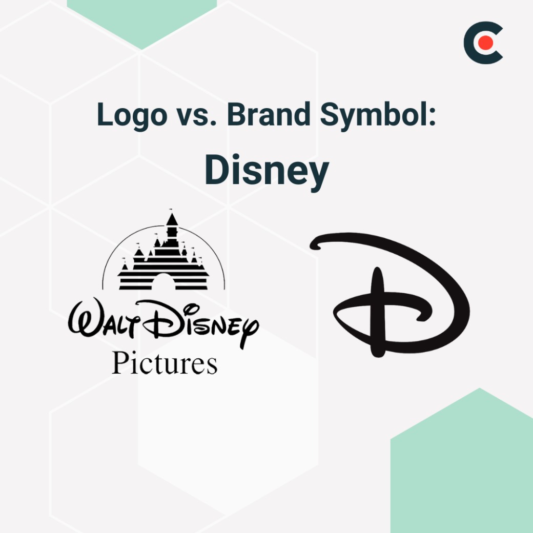
Disney uses its logo, featuring the full company name, on movies, product packaging, and official documents. The company uses its “D” symbol on app icons, park branding, and film openings.
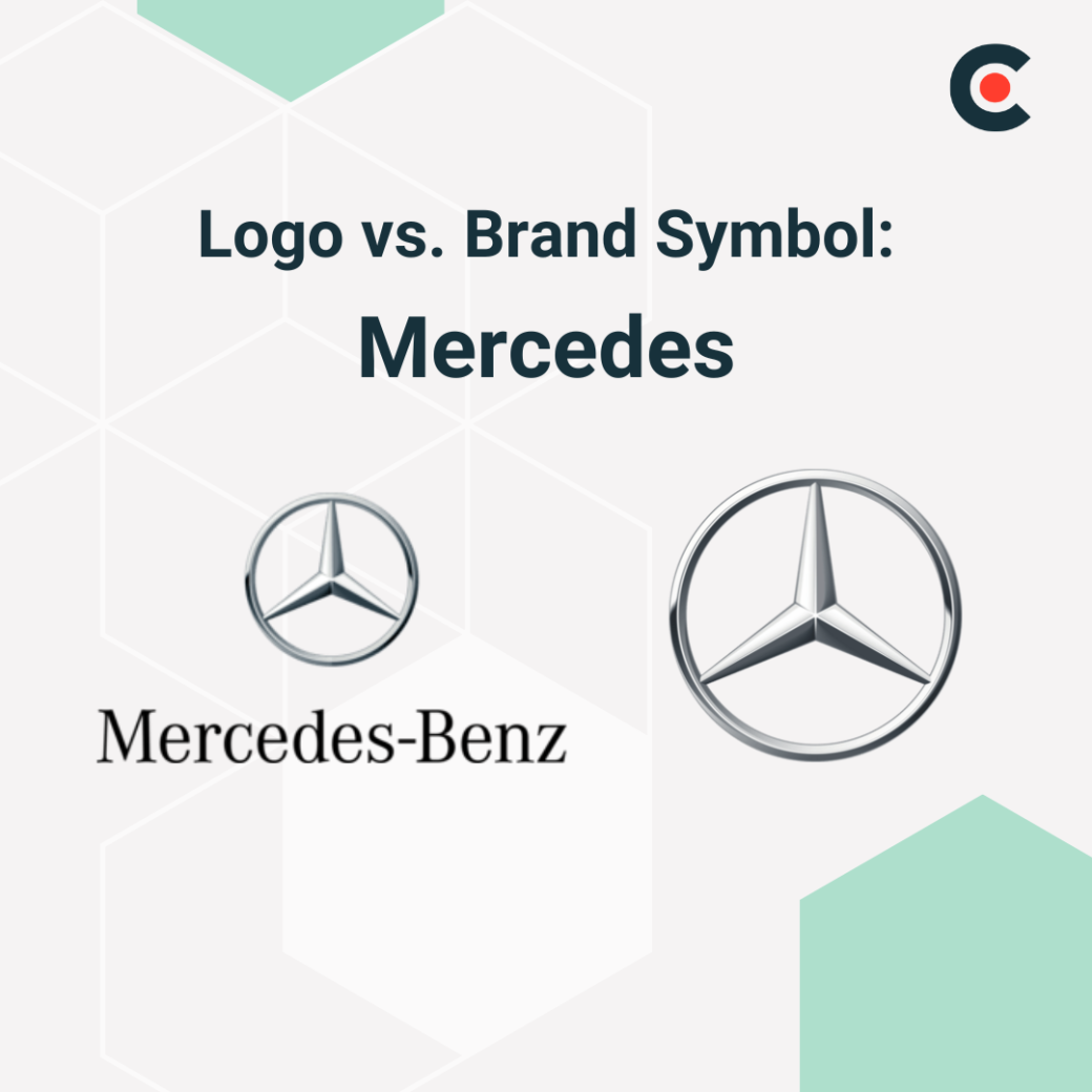
Mercedes favors its logo in print and digital ads, car manuals, and its website. However, the German carmaker uses its symbol on car hoods, steering wheels, and its mobile app.
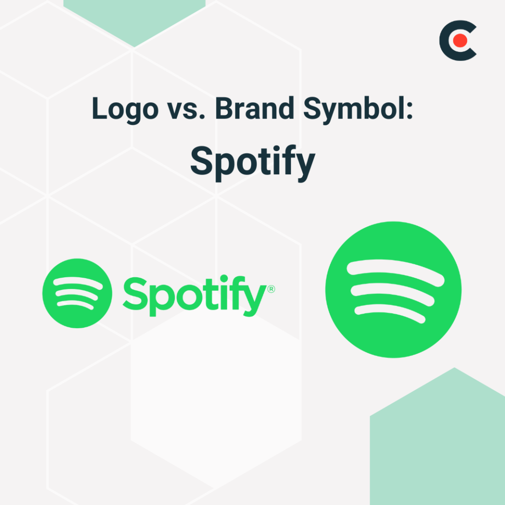
Spotify uses its logo on ads and partnership content. It favors this in settings where it’s trying to target new users. The company uses its symbol as an app icon and for its social media accounts.
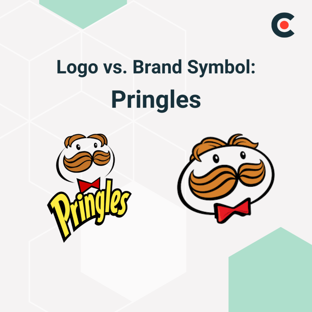
Pringles' symbol is just its logo without the brand’s name. It uses the full logo in ads and favors the symbol for social media avatars and mobile apps.
Lululemon uses its full logo in formal branding and store signs. However, it puts just the symbol on clothing and tags, favoring the cleaner style in fashion-forward settings.

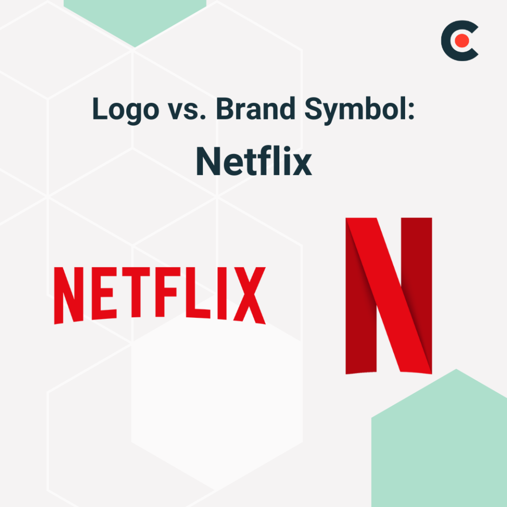
Netflix uses its full word logo in official trailers and marketing. But it favors the red “N” on app icons and social media.
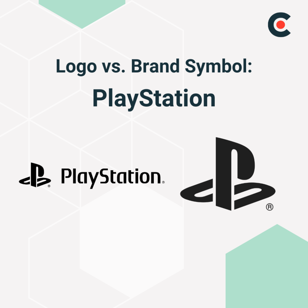
PlayStation’s logo is a staple on packaging and game intros. The company uses its standalone symbol on merch, controllers, and game startup screens.
As the above examples show, there are similarities across industries in how marketing teams leverage logos and symbols:
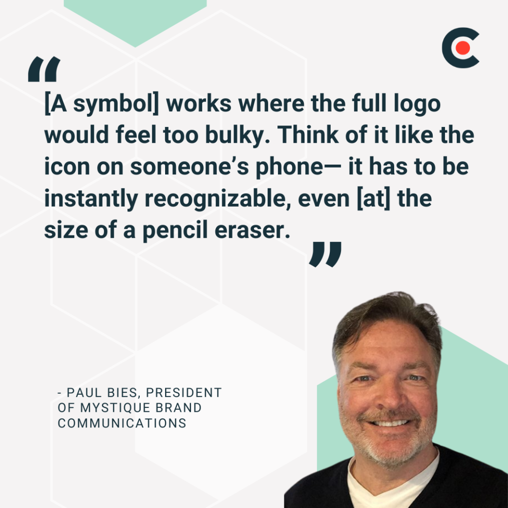
Paul Bies, President of Mystique Brand Communications, explains the unique role of symbols well: “[A symbol] works where the full logo would feel too bulky. Think of it like the icon on someone’s phone— it has to be instantly recognizable, even [at] the size of a pencil eraser.”
As Bies explains, logo designers use symbols to improve brand recognition across tiny touch points. Logos, on the other hand, are better for formal materials where introducing the whole brand to the viewer is essential.
If you’re still trying to decide between a symbol and logo (or logotype vs. logomark), consider creating both. Most brands use this approach because having a flexible brand identity system is valuable.
It helps a company “fit in” across all the unique touch points where it reaches consumers, from social media to the silver screen. Branded symbols are part of a responsive branding strategy, which is a critical component of connecting with leads from different backgrounds.
Lee Sturgess, Founder and Creative Lead of Polar, says, “A logo and a brand symbol should work together, but also independently.” Put another way, your logo and symbol should relate to one another but also be distinct enough to differentiate your branding across channels. Think of how Disney’s famous “D” symbol is part of its broader logo, just like Nike’s swoosh symbol is part of its logo.
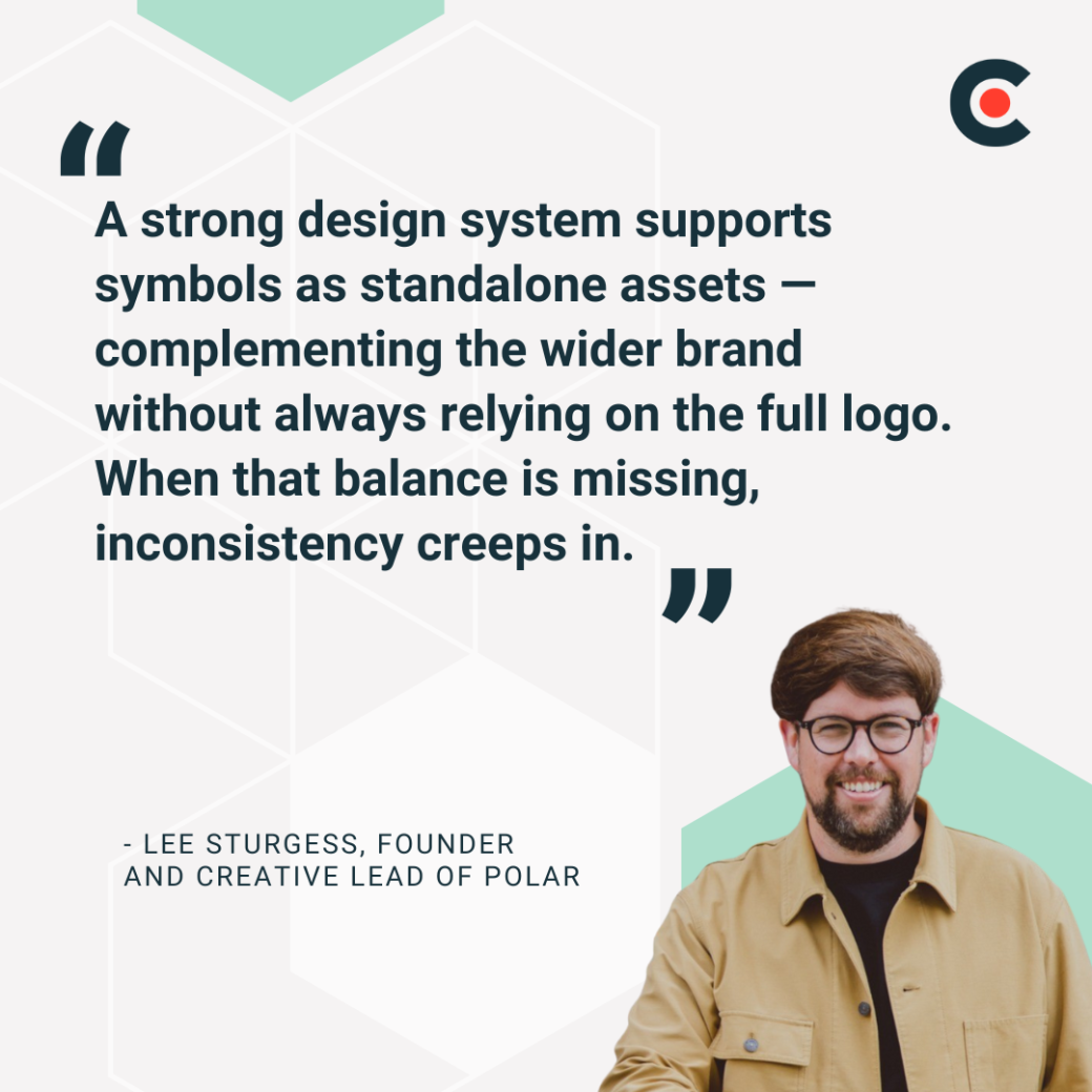
Ultimately, maintaining some level of consistency is essential. You want customers to recognize your logo and symbol as two expressions of one brand identity. Sturgess stresses this: “A strong design system supports symbols as standalone assets — complementing the wider brand without always relying on the full logo. When that balance is missing, inconsistency creeps in.”
Now that you know the differences between a branded symbol and a logo, you’re ready to start designing. You can begin that process by reviewing a few best practices. Both your logo and branding symbol should be:
As long as your designs fit these criteria, you’ll know that you’re moving in the right direction. But it’s also worth exploring some individualized best practices for each type of brand asset.
The purpose of a logo is to establish a brand name and an associated personality in the viewer's mind. When designing yours, it’s important to start with a strategy. You might research your industry to see what visual styles are common and how your brand could stand out. You’ll also need to define your brand voice and understand its mission to bring those ideas out in your design. You should also think about how the logo will be used. For example, it may be shown in color and black & white. You’ll need a design that’s easily recognizable in both formats to avoid confusion.
Let’s see what our experts have to say:
Brand symbols convey the same meaning as your logo in a smaller format. Many companies take an element from their logo and reimagine it for use as a symbol.
For example, Netflix’s famous “Red N” symbol is just the first letter of the company’s logo. Similarly, Spotify’s audio icon, which it uses as a symbol, is the start of its full logo. Brands do this because it helps each visual asset reinforce the other. When a company sees Netflix’s logo, they get familiar with the “Red N” and recognize it faster as a standalone symbol. This kind of circular connection improves overall brand recognition.
Our experts have also shared their best practices for creating brand symbols:
Let’s wrap up with a few remaining tips for the creative process.
Every business needs a logo, and the vast majority need symbols, too. If you don’t have either yet, there’s no reason to wait before starting the design process. These visual assets will help you establish a brand identity, build a reputation in your industry, and become more memorable to customers.
That being said, you may want to start with your logo. This gives you more space to capture your brand’s full essence. Once you have a logo that you’re happy with, you can work to miniaturize the concept for use as a symbol (without just making the logo smaller and calling it finished).
Starting your creative process with strategy questions can get your design team thinking in the right direction. You could ask:
All that’s left to do at this point is start designing. You should take the values and differentiators you find and try to condense them into a visual form. Be sure to seek feedback from many people to get a well-rounded perspective on your designs as they evolve.
Logos and symbols for brands deliver value in the short and long term. Having both will keep you flexible now, ready to appeal to consumers across channels as diverse as billboards and app icons. Having the right visual assets ready can make today’s marketing campaigns more impactful.
Over the long run, these visual assets will build up brand equity. That can translate to higher profit margins, better conversion rates, and more loyal customers, among other benefits.
The largest and most successful companies in the world don’t just have logos or symbols; they have both. Following the same strategy can help your business appeal across every channel, connect with a larger audience, and build long-term equity to support bottom-line profitability.
The next step is getting started with the design process. You can begin brainstorming internally, but you may want to bring in an experienced logo design agency to get a logo and symbol that truly reflect your brand.