
Reading Comment Sections Before a Crisis Hits
Comment sections flag brand problems days before the press does. The signals worth watching, the habits that catch them early, and what to do when one shows...
Updated October 21, 2026

An effective call to action tells your audience what to do next, explains the value of that action, and leads to a destination that delivers what you promised. Use these nine elements to assess your CTA’s wording and offer, then test whether it produces the outcome you want.
A call-to-action (CTA) is a prompt, such as a button, link, or short phrase, that asks someone to take a specific next step. Place it where it helps the reader act, whether that is after an explanation, beside an offer, or at the end of a page.
The goal of your CTA is to get your lead to perform a specific action, whether it's contacting you directly or providing their email address.
Looking for a Digital Marketing agency?
Compare our list of top Digital Marketing companies near you
In my role at Stevens & Tate Marketing as Internet Marketing Director, I’ve created countless CTAs for our clients and used A/B testing and analytics to identify the elements of a successful CTA. You can use this article to learn how you can craft effective CTAs for your business.
Consider these nine elements when creating an effective CTA. Choose the ones that fit the offer; every CTA does not need a discount, deadline, number, or emotional appeal.
Command verbs incite readers to take action.
Command verbs give clear directions. For example, "buy," "download," "get," or "call," are all clear and concise verbs that tell the reader what you want them to do.
Command words provide direction to the reader so that they know exactly what their next steps should be.
Pair the verb with a specific object: “Download the guide” explains more than “Get it.” Keep button copy short enough to scan and use nearby text for details about the offer. W3C’s guidance on link purpose explains why readers need to understand a link’s destination from its wording and context.
Choose a tone that fits the offer and your audience. Enthusiasm can be appropriate for a sale or event, while a business consultation may call for more direct wording.
Instead of relying on “call us for more information,” name what the conversation offers: “Discuss your project” or “Ask about available homes.” If you use wording such as “save money now,” explain the savings nearby and confirm that the offer is accurate.
You can also use sentences that generate excitement or emotion. For example, a real estate agent’s CTA might be "Let us help you find your dream house today!"

An exclamation point can convey excitement, but tone alone does not establish effectiveness. Compare wording with a clear next step and measure the completed action, rather than assuming that more enthusiasm means more clicks.
Give your audience an incentive to click on your CTA.
Whenever you try to persuade someone to do something, they will generally want to know what's in it for them. Why exactly should they click your link or contact you now? Telling them what to do in an enthusiastic manner will only get you so far. To really encourage your audience to follow your CTA, you need to provide an incentive.
Give your audience a reason to click on your CTA link by offering free resources such as an eBook, whitepaper, or estimate for your services. Incentives such as these give audiences a reason to follow your CTA.
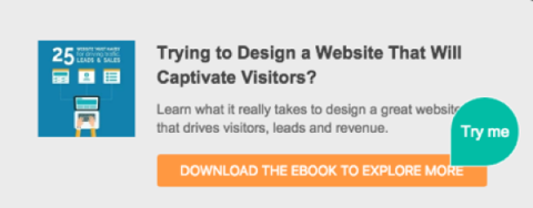
The ebook example below pairs a red button with an action verb. Name the resource in the CTA so readers can tell what the click offers.

If a download requires an email address or a form, make that requirement clear before the click and explain what the person will receive. Present newsletter enrollment separately from access to a resource so readers understand what they are choosing. Match the incentive to their needs instead of adding a free offer by default.
State a deadline or availability limit only when it is real. For an event, give the registration deadline; for a promotion, show the actual end date and any relevant conditions. A reader should understand what changes if they wait.
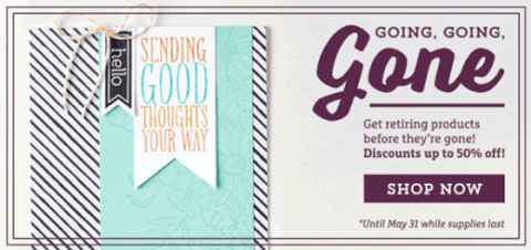
The example below combines a May 31 end date with “while supplies last.” If you use this pattern, make the deadline and availability accurate.
Avoid resetting countdowns or creating artificial limits on an otherwise unlimited download. When an offer has no deadline, use a clear next step and explain its value instead of manufacturing urgency.
Use numbers when they make the offer more concrete. A price, discount, page count, or session duration can tell readers what to expect, provided the detail is accurate.
For example, “Download the 10-page checklist” communicates the resource’s scope if it is actually 10 pages. Check that every number in the CTA matches the offer and any stated conditions.
Use phrases that help reduce the risk your audience might associate with CTAs.
Many people hesitate before clicking a CTA because they don’t completely trust companies. For example, they might be scared of getting tricked into signing up for a service that they have to pay for.
Address the specific commitment the reader is making. Use “no obligation” or “no credit card required” only when those statements are true. For a trial, explain its duration, whether payment details are needed, and what happens when it ends.
Place this support copy beside the CTA rather than squeezing every condition into the button. Clear terms let readers assess the offer without relying on broad claims such as “risk-free.”
Choose a next step that fits how much the reader knows and what they are ready to do. A visitor learning about a service may need “View service options,” while someone comparing providers may be ready for “Request a quote.” A purchase CTA belongs with enough information to assess the purchase.
Use one visually prominent primary action for the page’s main purpose. Offer a less prominent secondary action when it serves a different readiness level, such as viewing pricing before requesting a demo. Words such as “now” or “today” are optional; they do not replace a clear reason to act.
Tell your audience why they should follow your CTA.
Highlighting your CTA’s benefits is a bit different than providing an incentive. If you offer an incentive, you will still need to highlight its benefits by telling your audience what they will get out of redeeming the incentive.
For example, imagine that you are offering a free consultation. What is the exact benefit of your free consultation? A free consultation could still be worthless if it doesn’t solve a problem or provide a benefit.
Language such as "learn how you can qualify for a mortgage by calling us for a free consultation today" can help you highlight the benefits of the incentive you are offering.
The ad below uses several action phrases around a credit-score offer. Notice how the surrounding copy explains the offer; the CTA label should still make the immediate next step clear.

You will want to give your audience a reason to take advantage of your incentive. Emphasizing that your offer is free helps to motivate users.
Without helping your audience understand your CTA’s benefits, they will have little reason to follow through.
Tell readers when and how they will receive the offer. Provide immediate access when you promise it, and disclose any delay before they submit their information.
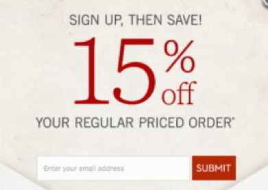
If your CTA promises “Sign up to receive a 15% off code today,” deliver the code on that schedule and show any offer conditions before signup. If delivery takes longer, say when the code will arrive before the person opts in.
For an immediate download, confirm that the destination or confirmation email contains the promised resource. For a service request, state a response window your team can meet. A quote that needs review can still have an effective CTA if the reader knows what happens next.
These are adaptable wording examples, not results from tested campaigns. The stronger version makes the next step more specific, but use it only when the destination and offer match.
| Goal | Generic CTA | More specific CTA and support |
| Resource download | Learn more |
Download the checklist Use support copy to state whether a form is required and how access is delivered |
| Service inquiry | Contact us |
Request a project quote Describe the details needed and the expected response time |
| Appointment booking | Get started |
Book a consultation Show the duration, cost if any, and available times before confirmation |
| Email enrollment | Sign up |
Get the monthly newsletter Explain the topic and actual sending frequency |
| Product selection | Buy now |
Add to cart Use when the click adds an item; reserve purchase-confirmation wording for the final purchase action |
Place the CTA beside the context needed to make the decision. On a longer page, repeating the same primary action can give readers another opportunity to act after they review details. Check that a mobile layout keeps the offer, button, and relevant terms readable without covering other content. Shopify’s CTA guide also emphasizes distinct design and purposeful placement.
Check the interaction as well as the appearance. W3C’s WCAG 2.2 addresses text contrast, keyboard access, visible focus, link purpose, and target size. Use descriptive labels, readable contrast, and controls that are easy to activate; check keyboard navigation and the label announced by a screen reader. A brand color or a larger button alone does not demonstrate accessibility.
Choose a primary success metric before changing the CTA. For a quote request, that might be completed qualified inquiries; for a download, it might be completed resource requests. Optimizely’s guidance distinguishes the primary metric that decides success from secondary metrics used to understand the result.
Write a hypothesis, such as “Naming the resource in the button will increase completed downloads.” Randomly assign eligible visitors to the current and revised version, keep assignment consistent, and change one element at a time when you want to isolate its effect. Confirm that each version reaches a working destination and that completed actions are recorded correctly.
Plan the sample and decision rule before launch using the statistical method your testing tool supports. Optimizely’s sample-size calculator illustrates how baseline conversion, the effect you want to detect, and statistical settings affect the sample needed. There is no universal visitor count or test duration that fits every CTA. If traffic is too low for a conclusive test, use usability checks and report the result as inconclusive.
For a page test, define CTA click-through rate as unique exposed visitors who clicked divided by unique exposed visitors. Define completed-action rate as unique exposed visitors who completed the target action divided by unique exposed visitors. Report both for the same test period and audience, and inspect lead quality or purchases as appropriate. More clicks with fewer qualified completions is a reason to examine the journey, not automatically select a winner.
Your CTAs can support capturing leads when the requested action fits the audience and the destination delivers the offer. Start with a clear action and a credible benefit, add relevant support copy, and use urgency only when it reflects a real condition.
Review the complete journey from CTA to confirmation. Test meaningful changes and judge them by completed actions and lead quality, rather than assuming that any particular phrase will persuade everyone.