
What 25 Years of Design Projects Taught Us About What Clients Actually Need
That moment changed the way we ask questions at the start of a project. Twenty-five years in, the work has touched organizations of every kind: enterprise...
Updated May 25, 2026

Logos is among a company’s biggest assets, but how much should they invest in it? There are no standard prices for logo design because it will always depend on varying factors. Review all of the points your business needs to consider when preparing a practical logo design budget.
Logos should be a top priority for any startup or for businesses planning to undergo rebranding. Undermining the value of well-designed logos can hinder your brand from getting the attention and recognition it needs.
Compelling logos can help brands become more memorable and allow them to stand out even on crowded shelves or in grocery stores. It’ll be everywhere as the business grows — from business cards to billboards.
If you’re running on a tight budget, it can be tempting to download free logo makers and simply use logo templates to save resources. But that’s not the way to go!
Yes, you can use plenty of free tools to avoid spending a dime, but the personal and professional touch of an experienced logo designer hits differently.
For most small business owners and startup founders, determining how much to spend on logo design services can be tough. This detailed guide will help you assess all the factors that go into the final price tag and help you prepare an appropriate budget for your project.
Connect with the leading logo design agencies on Clutch and get the most our of your budget.
Before anything else, the first thing you need to know when drafting a budget is what goes into it. Understanding the scope of a logo design project can help you get an idea of how much you should spend and what to prepare for.
When you hire a dedicated logo designer, you can expect them to guide you through the following steps:
There are a lot of things going on in logo design. It’s not a simple process of combining fonts and symbols. The entire process is systematic, disciplined, and meticulous.
Of course, not all businesses have the same experience when designing a logo, but consider these steps when considering what goes into hiring an agency and budgeting.
There’s no definite answer to how much logo design costs, but the first step to preparing a budget is understanding your business and defining your objectives for your logo.
For this first stage, you can consult your leadership team or marketing head and ask for help outlining your priorities. The best way to accomplish this is to ask yourself crucial questions.
Do you only need a simple logo? Or do you need a top-to-bottom logo and branding packaging? Creating an entire logo and branding package will cost more than simple designs.
Do you need an entirely new logo? Or do you only need to refresh it? Designing from scratch will typically cost more than refining and updating your existing logo.
How do you intend to use the logo? Will you need IP protection? Understanding your objectives and setting your priorities will not only help you create a budget but will also allow you to communicate your project clearly with designers when you consult with them.
The timeline for your project indicates how much you should spend on it.
Typically, businesses that hire a full-service agency understand that it’ll be a longer turnaround time because those service providers go through extensive processes when designing a logo. They allocate sufficient time for proper market research, sketching, and revisions.
Moreover, businesses that need tighter turnaround times tend to go with freelancers who can work and deliver quickly. High-end agencies can do that too, but hiring them for rush projects can come with additional fees.
As you sit down with your team to discuss the ideal timeline for your logo design project, remember that factors such as the type of logo and the number of revisions also influence it.
Unless you have an internal graphic designer, you’ll most likely need the expertise of a logo design service provider.
Experienced logo designers know different design methodologies, types of logos, and software. Hiring them can give you peace of mind and ensure you get the unique logo you need for your brand.
Consulting freelancers and agencies on how much your project will cost will give you the most definite answer.
With the priorities and timeline you’ve outlined, describe the scope of your logo design project to them. They can give you an estimate or quote based on your requirements.
When you inquire about their fees, make sure you ask for details on their pricing structure, the scope of their services, and how many revisions they offer.
One of the most common ways to reduce costs when hiring a logo designer is to find an off-shore partner. Rates in locations such as North America and Western Europe are usually higher than in Southeast Asia or Eastern Europe. You can get the same scope and service by hiring outside your area.
As mentioned, a professional logo design agency typically delivers more than just a logo. An example of additional costs is the top-to-bottom branding packages or brand guidelines they can develop for your logo.
Moreover, fonts can also contribute to costs. Yes, there are countless free fonts available on the internet, but you can’t use those to create a commercial logo.
If a client needs a font, they must purchase it and get the licenses to legally use it on their logo. Failing to acquire proper licenses can lead to headaches and even lawsuits.
Experienced logo designers sometimes avoid licensing troubles by creating a bespoke font for their clients. That custom font will be part of the overall branding package, but will also cost more to create and refine — it’s the approach most favored by bigger and more known brands.
One of the biggest questions when it comes to logos is do you need to file for a copyright or trademark — the answer is always yes.
As a business owner, it’s your responsibility to protect your business in every way possible, and that includes intellectual property protection.
To give better context, a trademark secures your business from competitors that intend to confuse your customers by infringing on your logo. Meanwhile, copyright protects your logo design against unfair, unauthorized, or outside use and copies.
Some logo design agencies offer IP filling services or assistance, but most freelancers don’t. If they don’t provide assistance, then you can opt to hire a lawyer to handle the process.
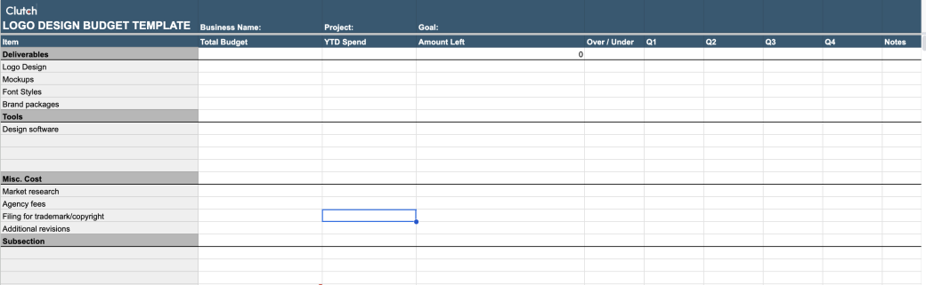
Download our logo design budget template.
Logo design projects don’t have to cost an arm and a leg. Regardless of hiring a well-known agency or freelancer, make sure you know where your money is going and what you should be getting.
Here are the main factors that influence logo design pricing:
Be sure you weigh each one carefully when preparing a practical budget for your project.
Your logo should communicate your values, qualities, and message. Great logos are a source of pride, trust, and integrity for businesses. It’s the face of your brand, and it’s what customers remember at the end of the day.
Investing in high-quality logo design is a must, but you don’t need to spend a good chunk of your resources on it. Knowing all the processes that go into logo design services and the factors that affect costs will help you prepare a realistic budget.
Work with a reliable and proven designer to help you transform your ideas into a great logo. Match with the top logo designers on Clutch by maximizing the filters we’ve prepared and reading the client reviews we’ve collected.