
Social Media Privacy: How Social Media Apps Are Collecting and Using Your Data
Explore the types of data social media platforms collect, how they monetize it, and what users can do to better protect their privacy.
Updated December 18, 2025

Learn how to create better iPhone apps for your customer base and attract more potential customers.
In this article, we offer important tips for businesses that want to develop iPhone apps. We will outline key aspects of better app development, such as app purpose, target audience, design, aesthetics, performance indicators, and cost.
iPhone apps are indispensable assets for both personal and business purposes, which is why companies should make apps that suit specific customer needs. App development, however, requires a great deal of planning and execution.
Looking for a Mobile App Development agency?
Compare our list of top Mobile App Development companies near you
Here are 10 tips that small businesses should follow to create a successful, customer-friendly iPhone app.
The first step in developing an app is formulating a mobile strategy. Figuring out the business and customer requirements for the app helps solve the most important issue: motivating customers to download the app.
Many iPhone users expect apps to meet specific needs, so developers should clearly define which needs an app will meet. It is a good strategy to understand competitors’ apps and determine how your app can perform better or offer more value to the customer. Outlining the specific purpose of the app simplifies the development process.
The hardest part of app development for any business is to define the target audience of its app. Understanding the target audience is difficult, as it requires determining people’s interests, as well as the volume of possible customers with similar interests and requirements. This task can be quite tedious, as it requires extensive market research.
You must avoid developing an app without a specific target audience. This may lead to faulty design and features if you are trying to reach too broad an audience; many customers may not appreciate apps unless it caters to their specific needs.
After determining your target audience, figure out the type of app you have to develop.
For example, it is good practice to target premium iPhone customers with higher purchasing capacity if you are developing high-end apps. If you are a high-end retail store, it is important to include popular features, such as tailoring or express shipping, in order to cater to your wealthier target audience.
Jewelry store Tiffany & Co., for example, allows users to make in-store appointments on its app.
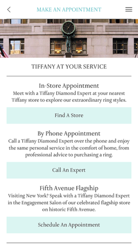
This gives app users an easy way to take the next step in the purchasing process.
Uniqueness is a key ingredient in an app's commercial success. User experience is crucial to an app's success, and users should be able to interact with the app without any hassles and complexities. That's why app developers need to keep the app design simple and user-friendly.
Apps must not only be faster and better but also more powerful and differentiable from other apps in order for users to appreciate them.
Tinder is an example of an app that is simple to use. It allows users to easily browse key facts about another person, like hobbies, and indicate interest by simply "swiping right." This unique feature makes Tinder into a distinct dating app, since a person no longer has to be matched with people of similar interests, as on other dating websites. Instead, users just swipe, then chat.
Reshaping features you've already made, like content and visuals, to fit mobile lets customers recognize your brand. Develop your app with resources from channels that already exist, and you'll create an app that projects a similar look and feel as the rest of your brand.
For example, Amazon makes interactions between its website and app seamless. Users can add an item to their cart on the website and then purchase it from their cart on the app.
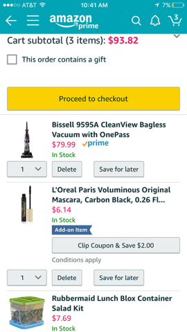
This allows customers to recognize your brand and return to either your app or website to easily make a purchase.
iPhone developers need to focus on the final product. The entire development process should focus on end users and how these users will interact with your app. The average attention span of consumers is just eight seconds, so your app must provide excellent, easy-to-navigate design in order to keep users hooked.
For example, Snapchat provides various filters and features like "snap stories," which all function together in an intuitive way that any user can understand.
In order to cater to consumers, your iPhone app must support multiple versions of iOS. Supporting multiple versions widens the reach of your app, which allows you to gain more users.
For example, Facebook Messenger has over one billion app downloads and supports multiple iOS versions in addition to the Android platform. Messenger always updates with the release of a newer version of iOS to retain its user base.
Your iPhone app needs to be both fast and reliable, and the download time of the app must be no more than a few seconds. Anything longer and you may lose users.
An iPhone app must be high-performing and meet customer requirements of agility, speed, and flexibility. If an app is not high-performing, users will lose interest and eventually delete it.
WhatsApp is a good example of a high-performing app. It provides great communication features without any significant lag. Users can interact with each other in various modes, such as texts and video calls, and also send each other images and videos along with documents and their location. WhatsApp seamlessly performs all these functions, which is why it is one of the most popular messaging apps in the world.
You must thoroughly test your app for bugs before releasing it to customers. If you don't do this, users may dig up issues within your app, which could affect your company's credibility.
If an app fails the first time customers use it, they are unlikely to return to the app; handling various bugs and issues before launch can prevent this.
A/B testing, in which a company releases two different versions of the app to two different groups, can test an app's success. By measuring the groups' responses, the company can gauge which version is most likely to succeed.
Focus groups can also help you find and overcome issues with your app.
Price is a crucial part of your iPhone app's success. While a free app sounds enticing, it may not be good for your business, especially if you are offering a unique, premium service.
The best way to determine app price is to gauge the development time, development cost, and features of the app. All these factors drive the cost of the app.
A good way to levy the cost of an app is to offer an in-app purchase screen that effectively communicates additional features users can get if they pay a price.
Candy Crush is a great example. If users run out of gold bars, they can purchase more rather than wait for the supply to be replenished. The purchase gives avid users a way to keep playing.
Apple’s App Store is filled with iPhone apps that boast about their features and functionalities. In order to beat the competition, you must decide on a promotional strategy to make your app sound just as alluring as any other.
If you expect customers to buy your app just because you think it's great, but you haven't put work into convincing users, expect disaster. If people don’t know about your app, they won’t download it. You must spend considerable time on promotion strategy to reach more customers, which will, in turn, increase profit margins.
For example, companies can use social media marketing to market their app. This allows social media users to learn about the app and helps convince prospective customers to download it.
These tips are the result of years of experience dealing with iPhone app development.
Keeping these tips in mind while in the development process can help you create better iPhone apps for your customer base and also attract more potential customers.
Harsh Kushwah is an experienced technical blogger for Endive Software, which specializes in iPhone app development.
See full profile