
How to Build a UX Strategy That Drives Real User Engagement
A UX strategy is a long-term plan for creating user-friendly digital experiences by aligning design, content, and technology with business goals.
Updated June 4, 2026

A conversion-centered design system works because it reduces hesitation systematically, turning clearer, faster, and more trustworthy user interactions into measurable business outcomes.
The Obama campaign's testing work became famous because the changes were so small and the impact was so large.
One experiment reportedly lifted signups by more than 40% simply by changing the hero image, tightening the layout, and rewriting the CTA copy.
Looking for a User Experience agency?
Compare our list of top User Experience companies near you
Nothing about the flow became more complicated or innovative. It just became easier to trust, easier to understand, and easier to act on.
That is the core idea behind conversion-centered design.
Conversion-centered design (CCD) is simply a way of building interfaces where every important element has a job tied to a measurable outcome.
At its best, CCD creates interfaces that feel intuitive to navigate.
Once design decisions are consistently tied to KPIs, teams can build components and systems that support those outcomes by default.
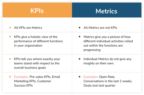
Not every metric deserves equal attention. Teams often track too much and prioritize too little.
The metrics that usually expose real UX problems are the ones tied directly to user movement:
Those numbers tend to tell you where friction actually exists.
The relationship between design and KPIs is rarely abstract once you look at recordings and user behavior long enough.
You start seeing patterns quickly. People hesitate at pricing tables that overload comparison logic and abandon forms after hitting avoidable validation errors. Mobile visitors leave because the primary action is buried under visual clutter.
Research supports this pretty consistently:
Once teams start mapping interface decisions directly to those outcomes, the conversation changes. You stop debating whether a button looks cleaner and start asking whether users are actually completing the task faster.
These seven CCD principles force teams to think operationally instead of aesthetically.
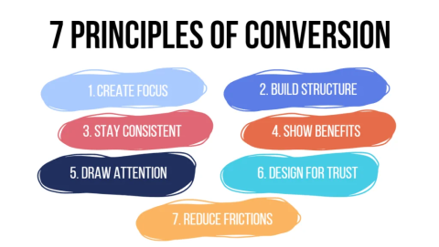
These principles shift the conversation away from whether an interface merely looks polished and toward whether it actually helps users complete important tasks with less friction.
Most pages try to do too much.
One strong action almost always performs better than five competing ones. Especially on mobile, where visual hierarchy collapses faster than teams expect.
Pricing pages are a good example. If every plan looks equally important, users stall. Strong CCD systems intentionally create emphasis around the recommended path.
A surprising amount of conversion loss comes from broken expectation chains.
An ad promising feature comparisons should not land on a generic homepage. A “book a demo” CTA should not lead to a form asking exploratory discovery questions before users even understand the product.
Users notice disconnects immediately.
Zaheer Dodhia, CEO of Hummingbird International, works in international logistics, where broken expectation chains create operational problems very quickly.
Dodhia says, “One of the fastest ways to lose trust is making customers feel uncertain about what happens next. In logistics, that usually shows up as vague delivery expectations or disconnected tracking updates.
In product design, it happens the same way when the interface promises one thing, and the next screen creates confusion instead.”
This one matters more than teams think.
Interfaces fail when they force interpretation. “Commence your journey” sounds polished in a workshop and performs terribly in a real flow compared to “Create account.”
The same applies to forms. Inline validation, helper text, visible password rules, predictable formatting. These are not cosmetic improvements. They remove decision friction in moments where users are already uncertain.
Supporting elements should reinforce the primary goal, not compete with it.
If the page goal is booking a demo, the testimonials, imagery, navigation emphasis, and copy should all support that action. Teams often lose conversions when they introduce unrelated messaging halfway through the flow because multiple stakeholders want visibility.
That fragmentation adds cognitive load fast.
Trust signals work best at the exact moment users hesitate. Not buried in a footer nobody reads.
These factors consistently reduce abandonment by lowering perceived risk at the decision point.
Healthcare platforms are a good example because trust gaps immediately affect completion behavior. In areas like testosterone replacement therapy, users tend to abandon flows quickly if pricing, eligibility requirements, medical oversight, or next steps feel vague. Clear process explanations and visible credibility signals usually matter more than aggressive conversion tactics.
Nielsen Norman Group has documented this repeatedly in trust and usability research.
They found that users trust websites more when pricing, policies, contact information, and process details are disclosed clearly instead of being hidden behind additional steps, vague messaging, or gated flows.
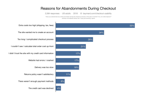
Unexpected shipping costs, hidden taxes, mandatory account creation, or even a vague next step after clicking the CTA can kill completion rates just as users are ready to commit.
Jared Spool’s famous “$300 million button” example still holds up because it exposed a very common problem: businesses adding friction that benefits internal systems more than users.
Guest checkout solved that by removing an unnecessary barrier.
The conversion itself is rarely the finish line.
Especially in SaaS.
Post-signup onboarding, integration prompts, setup checklists, and activation guidance usually determine whether a conversion becomes retention or churn.
A clean signup flow that leaves users confused still fails commercially.
Conversion improvements usually come from component behavior, not homepage redesigns.
Primary actions need an unmistakable hierarchy.
Action-first copy consistently performs better because it reduces ambiguity. “Start my trial” communicates ownership and outcome faster than vague alternatives.
Contrast matters too. Especially on mobile, where the weak hierarchy disappears under scrolling behavior.
Usually, teams optimize for data collection instead of completion.
Reducing fields helps, but structure matters just as much:
Baymard’s checkout research continues to show how strongly form complexity affects abandonment.
Hick’s Law still shows up constantly in real interfaces. More options slow down decisions. More fields increase hesitation. More branching paths increase exits.
Simple beats clever here almost every time.
Spacing, hierarchy, and proximity shape behavior more than teams admit.
Users scan before they read. The visual structure tells them what matters first.
Fitt’s Law becomes especially obvious on mobile flows. Larger, closer targets reduce interaction friction dramatically.
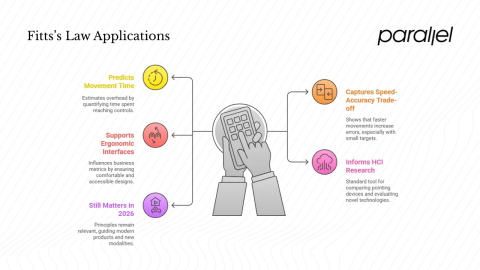
Tiny tap targets and crowded layouts still destroy mobile usability on otherwise polished products.
Placement matters more than existence.
A trust badge hidden in the footer does almost nothing. A guarantee beside the CTA can materially change completion behavior.
The same applies to testimonials and policy messaging. Timing is the difference.
Good interfaces reduce uncertainty continuously.
Loading states or success confirmation are tiny details until they are missing.
Then users start double-clicking buttons, resubmitting forms, refreshing pages, and creating preventable support issues.
Teams still underestimate how much speed affects trust.
Slow interfaces feel unreliable long before users consciously identify why.
That is why small performance gains often produce disproportionately large business impact. Faster interactions make flows feel easier, even when nothing else changes.
The tooling stack matters less than consistency, but some patterns help repeatedly:
The important part is operational consistency. Not the tooling itself.
Once multiple teams start shipping independently, conversion logic fragments quickly.
One team prioritizes clarity. Another adds competing CTAs. Eventually, the product feels inconsistent even if the colors still match.
Strong CCD systems document why components exist, not just how they look.
That usually means:
The important shift is this: the design system becomes operational guidance, not just a UI kit.
Phil Santoro, Co-Founder of Wilbur Labs, works with teams to build and scale digital products across multiple categories.
Santoro says, “Design systems start breaking down once every team begins interpreting conversion goals differently.
One product optimizes for lead capture, another for feature discovery, another for onboarding speed, and suddenly the experience feels fragmented even though the components technically match. The operational layer matters as much as the visual layer.”
That changes the quality of decisions teams make under pressure.
A lot of CCD work fails because teams measure too late. The KPI should be defined before the screen is designed.
Otherwise, teams end up retrofitting metrics onto interfaces that were never optimized for a specific outcome in the first place.
Component-level instrumentation helps enormously here. Standardized event naming makes analysis cleaner later. Things like:
That consistency matters once experimentation volume increases.
A/B testing works well for meaningful changes to interactions, but guardrail metrics matter just as much. Pushing conversion while increasing refunds, support tickets, or churn is not an improvement.
And analytics alone rarely explain enough.
Session recordings, surveys, usability testing, and customer interviews usually reveal the why behind the numbers. That context is where the best iteration decisions come from.
Personalization is moving closer to the component level now.
Not just personalized landing pages. Personalized trust signals, onboarding states, CTA language, support prompts, and defaults based on user intent or behavior patterns.
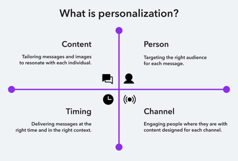
Some systems already dynamically adapt UI states as users progress through tasks.
Experimentation infrastructure is changing, too. More teams are shifting toward real-time allocation systems and faster testing cycles rather than long, static experiments.
At the same time, privacy constraints are forcing cleaner first-party data strategies and more transparent consent patterns.
That tension will shape much of CCD's work going forward.
The opportunity is real. So is the responsibility.
The teams that consistently improve conversion rates are paying attention to friction at the component level and systematically fixing it.
Over time, that consistency shapes activation, retention, support load, and the overall trustworthiness of the product.
For teams trying to connect UX decisions more directly to business outcomes, working with partners who understand both design systems and performance measurement makes a significant difference.