
How to Build a UX Strategy That Drives Real User Engagement
A UX strategy is a long-term plan for creating user-friendly digital experiences by aligning design, content, and technology with business goals.
Updated June 26, 2026

Good chatbot UI design means putting the right buttons, messages, and escape routes in front of users at exactly the right moment. When it works, users get answers fast. When it doesn't, 49% of consumers say chatbots are frustrating — and 87% still can't resolve their issue without a human, according to a recent Clutch survey.
You land on a website and need a quick answer. The chatbot appears, you type in your question, but it repeats the same scripted response. After a few tries, you feel stuck and start looking for a way to reach a person. We’ve all been there, and we all know how that tiny moment can turn a simple task into a headache.
Chatbots promise fast help and fewer tickets, but they actually rank among the top frustrations in a buyer's digital journey.
Looking for a User Experience agency?
Compare our list of top User Experience companies near you
A recent Clutch survey found that nearly half of consumers find chatbots frustrating, and most say they still need human assistance to fully resolve their issues. At the same time, 81% expect AI to solve their problem in less than five minutes.
For brands, that gap between expectations and reality can have a direct impact on conversions, trust, and customer loyalty.
This article breaks down exactly why chatbots annoy users and provides practical ways to design chatbot UX that is a help rather than a hindrance.
Chatbot UI (user interface) is the visual and interactive layer users directly see and touch: the widget launcher button, message bubbles, quick reply buttons, the input field, typing indicators, and any images or carousels. It's everything that determines whether the chatbot looks trustworthy and is easy to use before the user types a single word.
Chatbot UX (user experience) is broader. It covers how users feel during the interaction — including tone, response accuracy, conversation flow, and whether the bot ultimately solved their problem.
The distinction matters for diagnosing what's wrong. If users abandon your chatbot because they can't find the "talk to a person" button, that's a UI problem. If they find it but leave feeling dismissed because the bot repeated unhelpful answers, that's a UX problem. Most chatbot failures are a mix of both — and fixing them requires addressing each layer deliberately.
Clutch survey data illustrates the split: 55% of consumers dismiss AI tools that interrupt their browsing session — that's driven by UI (widget timing and placement). Meanwhile, 45% say they receive irrelevant answers — that's a UX and AI training failure. The sections below treat both.
To design a good chatbot experience, the first step is to understand what causes user frustration in real sessions. The triggers are often simple and fixable. These common pain points have a simple UX fix that can improve the user's journey right away.
When a bot repeats itself, answers the wrong question, or ignores the page’s context, it can feel like you might as well be talking to a wall.
Users want to feel understood and acknowledged. Unfortunately, in the Clutch survey, 45% of consumers say they receive irrelevant answers when communicating with a chatbot for support. As a result, the user feels dismissed, and their trust in the company begins to erode.

How To Fix It:
That quick validation reduces the sense that the system is talking past the person. It also lowers the risk of the user abandoning the session and opening a support ticket anyway.
A common failure pattern looks like this: The bot gets confused, asks if the visitor wants to start over, and then loops back into the same narrow suggestions. Users feel stuck and out of control. This means wasted time and greater frustration.
How To Fix It:
As Alex Osmichenko, Founder and CEO of IT Monks, puts it, “Set up the chatbot to direct the user to a human assistant when needed.” That simple path prevents loops from turning into exits.

Also, when you design the flow, define clear confidence thresholds. If the model falls below that threshold after one short retry, route to a human support agent or open a contact form. This small design choice restores control and protects your brand from needlessly long customer support conversations.
Voice and tone in the chatbot UX can also break user trust. Overly chipper, robotic, or stiff replies send the wrong signal when someone is stuck.
How To Fix It:
The goal is to guide the user to the next step with clear, direct language. Polite warmth helps, but only after the bot can do the task. As CEO and Founder of Flow Ninja, Uroš Mikić advises, “Give it a job first, and then help it build a personality.”
Helpful phrasing keeps things short and action-driven. For example:
The first response sets a goal and offers a clear solution. The second one sounds bureaucratic and slow.
Today, customers often expect near-instant replies. In fact, in the Clutch survey, the main reasons people said they like chatbots are availability at all hours (45%) and quick answers (40%).
However, expectations sour when the session crawls or ends with “Sorry, I don’t understand.”
The mismatch between expectation and reality shows up in reported frustrations:

How To Fix It:
Design the chatbot UX to answer quickly and move the task forward. Both speed and clear next steps build user confidence. When the bot hesitates or stalls, people question the whole system and look for a person.
These six UX mistakes often ruin the chatbot experience for users. There are a few patterns you can look for to identify them before deploying an effective fix.
If your chatbot pops up before the user is ready, you're already annoying them. Auto-start popups often interrupt browsing and are quickly dismissed. In the Clutch survey, 55% of consumers say they dismiss AI tools that interrupt their browsing session, meaning the proactive popup hurts more than it helps.
How To Fix It:
A better approach is an opt-in nudge that appears when intent is clear, such as on pricing or checkout pages, or when a user dwells on a help article.
Use event-based triggers that feel helpful rather than pushy. For example, open the bot with a small prompt after someone scrolls through two-thirds of a returns policy or after they paste an order number into a form.
Rigid scripts break as soon as a user gives an unexpected answer. A narrow response your chatbot expects does not reflect the way real people phrase the same goal.
How To Fix It:
The answer is not to add more features, but to train the chatbot system with more relevant data.
As Osmichenko suggests, “Train the chatbot using the information published on the website and the company’s documentation, which are regularly updated with the latest information.” Pair that training with adaptive intent recognition, and the bot becomes far more resilient.
Also, design the fallback responses carefully. Keep the message short, and add a clear button to chat with a support team. That protects the user experience and avoids the “loop of doom” pattern.
Walls of text can increase cognitive load and cause fatigue. When people chat with a bot, they want the next clear action, not a long, confusing response.
How To Fix It:
Osmichenko stresses that “The answers should be digestible, allowing users to request an expanded reply whenever they need more detail.” Use progressive disclosure that starts with the brief version and lets the user expand for the full answer.
A practical pattern is a few-line cap for the initial reply. Then offer “Show steps” or “See details” buttons that reveal more. That structure respects the user’s time and keeps the chat tidy.
A cramped chat window with dense copy, tiny buttons, and no spacing makes even good answers feel heavy. This pain point worsens on mobile devices, where screen real estate is tight — and since 60–70% of web traffic comes from mobile, a chatbot UI that wasn't designed for small screens is failing most of your users by default.
How To Fix It:
Strong chatbot UI design addresses the interface layer specifically:
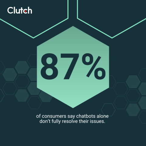
In the Clutch survey, an outstanding 87% of consumers say they cannot fully resolve their issues without human help, and 81% of consumers say AI support has made it harder to reach a human agent when they need one.
The frustration often continues even after escalation. Among consumers who were transferred to a human agent, 47% were annoyed by having to repeat their issue, 16% cited long wait times, and 13% said the agent lacked context from their previous conversation with AI.
Ultimately, if the chatbot UX hides “Talk to a person,” users could abandon the session and your brand entirely.
How To Fix It:
Good chatbots don’t hide this option. Instead, show it upfront in the UX. Osmichenko suggests, “Whenever a customer feels like a human agent could provide better assistance, there should be a ‘contact support’ option.” You can add that option to the chat header menu and keep it accessible with one tap.
If the chatbot is unsure, it can say so and route to a person with context attached. That move keeps trust intact, even if you hit the limitations of AI chatbots.
Unfortunately, 85% of consumers say they've had to repeat or rephrase a question at least once for AI to understand their request. When customers have to spend time restating the same issue, the convenience of AI quickly gives way to frustration.
“Good AI support should understand context, remember what I’ve already told it, and ideally be able to take action on my behalf,” says Abhijith HK, the CEO and co-founder of Codewave. “If I have to keep repeating myself or jumping between systems, something’s broken.”
Nothing kills customer confidence like repeating information multiple times across chatbot, form, and agent. If the chat does not pass context to the human, the user doesn't feel valued.
How To Fix It:
Solve this issue by connecting the bot to your customer relationship management (CRM) and account systems. That way, the handoff includes the conversation, page context, and key identifiers. That continuity turns the bot into a customer support teammate rather than a gatekeeper preventing human interaction.
Fixing the experience requires fixing the interface. These are the core chatbot UI components and the design decisions that make or break each one.
The launcher button is the first thing a user sees. If it blends into the page, too small to tap, or appears at the wrong moment, users never open the chat.
Every message should be scannable in under three seconds.
Quick reply buttons reduce response friction and increase flow completion. They are the highest-impact UI element for conversion.
When your AI takes 1–3 seconds to respond, a typing indicator (animated dots) prevents users from assuming the chat is broken.
The chatbot UI is also the right place to set expectations about what users are talking to.
Clutch survey data shows 90% of consumers want websites to disclose when they use AI.
The most effective UI pattern: a single line at the top of the chat window — "This assistant is powered by AI" — with an optional "Learn more" link. This small UI decision builds trust before the first message.
Fixing chatbot UX is not about a single tech solution. It’s about setting expectations, writing in a human voice, building trust, and giving people a way out when they need it.
Clarity in your bot’s first message reduces confusion and saves time. Mikić recommends, “Tell users upfront what it can do and offer a couple of one-click starters.” A short intro, such as “I can help with order tracking, returns, and product info,” sets the scope and promotes fast success.

Set a response-time promise, too. If a human handoff may take a few minutes, say so. That simple line manages expectations and preserves trust during the wait.
UX writing is how the system earns user permission to guide the next step. So, avoid robotic phrasing and focus on useful, calm language. “I can walk you through that step by step” feels far more human than “Follow the provided instructions.” That shift makes the exchange feel like teamwork rather than another support ticket.
To keep tone consistent across teams, write a short voice guide for the chatbot with examples of “Do say” and “Avoid.” Train the model and the content team on these patterns and review transcripts regularly.
People notice when they are chatting with AI, and many want to know that upfront. In the Clutch survey, 90% of consumers want websites to disclose when they use AI.

Osmichenko recommends that “The best way to provide a disclosure is through adding a line like ‘This assistant is powered by AI’ at the beginning of the interaction. Additionally, you may consider including a ‘Learn more’ link to provide explanations of the AI tool’s capabilities, its limitations, the source of its knowledge, and other relevant details.”
This simple disclosure pattern can help mitigate transparency and trust issues.
Offering clear options could also lower user frustration. One such way is providing a visible way to reach a person. A friendly prompt such as “Do you want me to connect you to a person?” keeps the flow moving and respects the visitor’s time.
Mikić adds that “When it’s unsure, it should admit it and hand off cleanly to a human or a form; this will keep dead ends and user frustration to a minimum.”
Reduce friction in the handoff, too. Pass the chat transcript, include the page URL or the product SKU, if present, and confirm the expected wait time. That way, the user doesn’t need to repeat details.
Personalization should serve the task at hand. In the Clutch survey, 47% of consumers say AI-powered recommendations feel generic, and 29% say personalization feels intrusive. The takeaway is to keep personalization contextual to the current session and goal rather than deep behavioral tracking. A simple example is pulling the order number from the page context when someone is viewing their account orders.
Also, make it clear what the assistant can and can’t access so visitors understand how the system uses their data.
Human-focused chatbots on websites do more than reduce support tickets, such as:
As a result, websites see lower abandonment, higher customer satisfaction, and clearer attribution for assisted conversions.
In the Clutch survey findings, consumers see AI as helpful when it saves time and simplifies tasks. When the opposite happens, frustration sparks.
Prioritizing UX is the only way to keep automation aligned with outcomes that your business cares about, such as repeat purchases and net revenue retention.
There’s also a risk case for poor chatbot UX. Public examples show how fast things can escalate when a bot misleads a customer. The Moffatt v. Air Canada case in 2024 established that a company remains liable for information provided by its on-site chatbot.
Accurate content, proper training, and a quick path to a human are no longer just best practices. They are necessary legal safeguards.
On the other hand, we’ve seen plenty of examples where thoughtful chatbot user experience design delivered value.
The lesson is not that every company should copy these examples. It’s about picking a small set of high-value tasks, designing for them, and keeping the human path open.
The worst AI chatbots fail because the UX ignores human needs like control, clarity, and speed. The fix is practical.
If your chatbot is frustrating users, now is the time to rethink the experience. Explore vetted UX design companies in the Clutch directory to upgrade your website’s chatbot experience and protect trust with every interaction. Partner with a top-rated UI or UX agency to create chatbot UX that feels natural and efficient.