
How to Build a UX Strategy That Drives Real User Engagement
A UX strategy is a long-term plan for creating user-friendly digital experiences by aligning design, content, and technology with business goals.
Updated February 3, 2026

Most “You might also like” boxes still push instead of help. When recommendations feel generic, it hurts sales and brand image. With an AI engine, you can shift this experience to timely, relevant picks that earn user trust and conversion.
Ever clicked into a product page and watched the screen fill with pop-ups and the same “You might also like” card you ignored a few visits ago? That kind of one-size-fits-all nudge feels more like a sales pitch than support.
Artificial intelligence (AI) recommendation engines are now the top use case for 47% of digital platforms, and the promise sounds great — more relevance and higher conversions. However, the reality often turns out differently. In a recent Clutch survey, 80% of consumers said AI product or service recommendations can help in some way. Yet 47% still describe them as generic, 37% as pushy, and 29% as intrusive.
Looking for a User Experience agency?
Compare our list of top User Experience companies near you
A supportive recommendation engine should use empathy, timing, and transparency to guide choices rather than pressure people. This article walks through practical user experience (UX) design and copywriting techniques so your AI-powered product recommendations feel like real help, not a hard sell.
Before jumping into fixes, let's understand the patterns that break trust and stall conversions.
Shoppers notice when recommendations always float higher-priced or sponsored products to the top. That strategy erodes trust and may even result in cart abandonment.
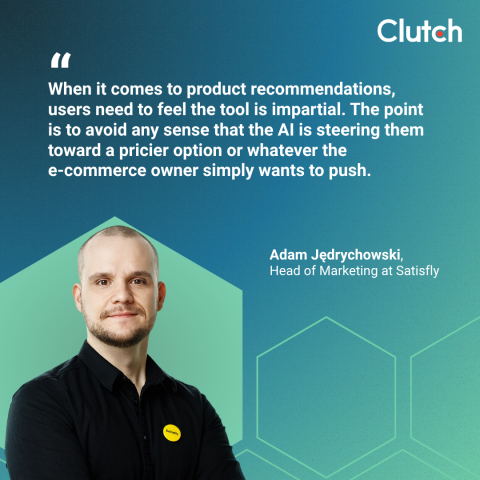
As Adam Jędrychowski, Head of Marketing at Satisfly, puts it, “When it comes to product recommendations, users need to feel the tool is impartial. The point is to avoid any sense that the AI is steering them toward a pricier option or whatever the e-commerce owner simply wants to push.”
If customers believe the AI recommendation engine is optimizing for the store’s margin instead of their needs, they exit rather than explore.
When recommendations keep showing the same items across visits and categories, it looks like the system isn't learning. The Clutch survey found 47% of people get frustrated when suggestions feel generic. Repetition tells a shopper the engine doesn't improve from signals like pages browsed or recent comparisons. That experience is not only unhelpful for users, but it also doesn't convert a sale for the website.
A helpful recommendation engine should orient around what a shopper is likely to value next, rather than giving the same recommendation card for everyone.
Pop-ups that interrupt browsing come across like ads, not advice. The Clutch survey reports that 55% of consumers dismiss AI tools that interrupt their session. This data ties much of the frustration to intrusive timing and placement, reinforcing that disruption kills intent, and can cause a decrease in core metrics like task completion rate and user satisfaction.
A simple timing change often helps, such as showing complementary items after a shopper adds to the cart rather than mid-scroll. Brands like Amazon commonly position “Frequently bought together” near add-to-cart buttons, which aligns with user intent and reduces the sense of interruption.
There's a line between useful and invasive. When an AI-powered recommendation engine cites overly precise information, it can trigger privacy concerns.
In the Clutch survey, 35% of users flagged data privacy as a frustration point with AI recommendation systems. That's a reminder to be selective with the data you display and to explain the why when it helps.
Now let's shift from drawbacks to patterns that work. The common threads are clarifying intent for users and giving them control.
In the Clutch survey, 33% of customers appreciated it when introduced to new options through AI-powered recommendations, and 43% liked suggestions that saved time.
These trends point to a simple principle: Frame the artificial intelligence recommendation engine as a guide that expands choices or reduces effort.
A few examples of this principle in practice include:
Sometimes, you can find inspiration from different industries. For instance, streaming platforms offer a model of supportive recommendation at scale. Netflix clearly emphasizes how its recommendation system reflects what someone might want to see next.
Those are design choices that position recommendations as navigation aids rather than banners yelling for attention.
People dislike feeling stuck with suggestions they did not ask for. Give simple controls that let people dismiss, refine, and filter recommendations.
John Griffin, CEO of Spiral Scout, advises teams to “explain the reason for the suggestion in plain non-technical language, limit the list to a few strong options, and let users dismiss or refine.”

Giving control to users helps both the user and your AI recommendation engine. When people can hide a bad suggestion or tune the inputs, your engine learns faster, and click-through rates improve because the experience feels collaborative.
Context guides when and where to help. The best placements come after meaningful user actions like finishing a product view, adding to cart, or pausing on a category page.
Booking.com built a culture of experimentation around these moments and showed how subtle context cues can lift conversions without shouting. That model translates to retail and B2B e-commerce storefronts that want supportive pacing instead of constant noise.
Copywriting matters as much as algorithmic accuracy in AI recommendation engine responses. This is because copy drives perceived value.
The tone should sound like a knowledgeable assistant, not a command. So replace generic phrases with language tied to the task:
Clear wording fitting the context can be more effective than mere tech feature additions.
You've seen how supportive engines guide choices and build trust when they match user context and use helpful language. These UX and copywriting tactics turn those ideas into a recommendation block that feels helpful by making small, disciplined choices.
Clarity about AI use is essential, with the Clutch survey showing that 90% of customers want websites to disclose the use of AI.

Even simple labels like “AI-suggested based on your browsing” plus a short “How this works” page can help set expectations and lower anxiety.
“Best practice and tip is if content is AI-generated, label it and link to a short policy page that explains data use and human review,” recommends Griffin. This habit supports brand trust and aligns with rising expectations for AI labeling across industries.
Limit recommendations to three to five highly relevant options to prevent choice overload. Smaller curated sets often outperform endless carousels because they feel intentional and prevent analysis paralysis.
As Jędrychowski notes, “Recommendations must be extremely specific. The engine has to capture individual needs. For example, a premium-fabric T-shirt with an athletic fit and higher-cut armholes.”
Remember that recommendations must always relate to the user action at that moment.
The tone should mirror the purchase context:
Use brand guidelines to keep copy consistent across templates. Consistency earns trust by preventing jarring tonal shifts between marketing pages and AI blocks.
Add a short reason under each recommendation. Phrases like “Suggested because you viewed X” or “Recommended based on your cart” make the logic visible, which helps people understand the connection between items.
Likewise, avoid mystery suggestions that look like tracking without purpose.
Build feedback loops into the product. Griffin stresses, “We always log accepts, dismisses, and refines so the system learns from real user interaction/behavior.” If people dismiss an item repeatedly, suppress it quickly so the user experience feels responsive. Over time, you get a supportive AI recommendation engine that adapts based on user feedback.
Changing recommendations from pushy to helpful doesn't require a giant shift on day one. But it needs a clear plan and a few decisive choices.
Before tweaking algorithms, look at the tasks customers are trying to do. Decision support, discovery, comparison, or bundling products each call for different UX patterns.
Jędrychowski captures it well, stating, “Focus on where AI tangibly solves user problems.” That means mapping the top "jobs to do" and aligning the AI recommendation system to those outcomes.
Shopify’s documentation lays out an effective recommendation engine example. It frames product recommendations as a way to make discovery easier and to increase sales by placing the right items in front of people at the right times. Basically, if you set a user goal first, the revenue will follow.
Before your engine goes live, confirm the technique matches the job:
Hybrid systems can give you the flexibility to keep suggestions fresh without losing precision when data is thin.
Build guardrails for explainability, opt-outs, and escalation. For example:
The goal is a system that performs well and stands up to scrutiny.
Algorithm plus human empathy produces the best experience. Most teams benefit from expert talents to shape the placement, pacing, and phrasing of recommendations.
Designers help ensure recommendations appear where they support the customer journey, not where they interrupt it. Copywriters can translate model outputs into language that feels natural.
This collaboration puts AI-powered recommendations in context and reduces user friction.
A supportive AI recommendation engine should boost long-term business goals rather than quick clicks. To do so:
When recommendations help customers reach their goal faster, sales naturally follow.
Looking for partners who can bring that mix of UX rigor and practical AI to life? Explore a vetted list of leading firms in the Clutch directory. Hire a top-rated UI and UX design agency today and work with the team that fits your tech stack and business needs.