
Social Proof Placement: Where to Put Reviews, Ratings, and UGC for Maximum Conversions
Where you should be placing customer reviews, ratings, testimonials, and UGC to actually move the conversion needle — from the homepage to the product...
Updated January 8, 2026

More than half of the industry leaders are making avoidable website accessibility mistakes that erode user experience (UX) and create legal risk. Are you making the same ones?
A recent Clutch survey found that 62 out of 95 major websites missed elements of WCAG 2.2 AA compliance, which sets legal requirements for accessibility. CMOs and brand leaders can't afford these lapses. They not only neglect a large market share of customers, but these mistakes compound across buying journeys and checkout flows.
This guide breaks down the three most common web accessibility issues and shows how to fix them fast to improve your website's usability and conversion rate.
Looking for a Web Design agency?
Compare our list of top Web Design companies near you
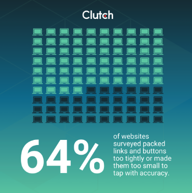
Mobile traffic and app-like interactions shape buyer journeys across industries. Yet the Clutch survey revealed that 64% of sites packed links and buttons too tightly or made them too small to tap with accuracy.
As Alex Doda of Abruptive Studios put it, “Tiny buttons or links, small font sizes, or too closely spaced elements can make a mobile site unusable.” Weak touch targets can get users hitting the back button instead.

Touch precision drops under motion, glare, or stress. Add motor or dexterity impairments, and a simple action like expanding a menu becomes guesswork. Users miss buttons, hit the wrong one, and abandon a page or shopping cart out of frustration.
That bounce shows up in analytics as a conversion problem, but the root issue is physical interaction. WCAG 2.2 formalizes this with Target Size Minimum at Level AA. The success criterion sets a baseline of at least 24 x 24 CSS pixels or equivalent spacing so controls can be activated without pinpoint accuracy.
There is also a brand signal at stake. When a menu item overlaps or an icon is too small, the interface feels careless. You don't want that perception following you into product demos or procurement reviews.
Touch targets become reliable when size and spacing align with practical human factors. Before getting into specifics, align on a mobile-first test routine across design, QA (Quality Assurance), and content, so changes stick. Then work out the basics:
Even small adjustments can make a meaningful difference in UX and conversions. Teams that standardize a touch target token in their design system reduce issues that often arise later.
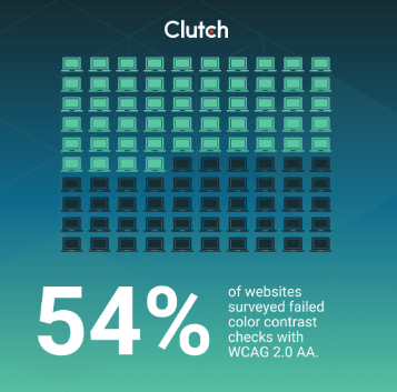
Color choices carry the brand, but they must carry legibility, too. Clutch data shows 54% of surveyed sites failed color contrast checks with WCAG 2.0 AA.
Low contrast makes content unreadable for users with low vision or color blindness. It also makes interfaces feel unpolished.
Lukasz Kaczmarek, CEO of Osom Studio, states it plainly: “[When] text is hard to read, [it] increases abandonment, especially on mobile and in bright conditions.” WebAIM’s 2025 study found low-contrast text on 79.1% of top sites, with an average of 29.6 instances per page.

Most teams can fix contrast issues quickly without sacrificing brand identity. Treat it as a brand governance update rather than a redesign. Here are a few recommendations:
Here's a simple best practice that works well: Build a small internal page with all the chosen components, then run automated scans and spot checks there. When any team requests a new campaign color, you already know if it plays nicely with text and UI elements across the system.
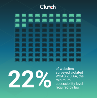
ARIA attributes for HTML are designed to enhance a website's accessibility and can lift an interface when used correctly. But they can also break a page when roles and labels go sideways. In the Clutch survey, 22% of sites violated WCAG 2.0 AA, the minimum accessibility level required by law.
Screen readers rely on accurate roles, states, and relationships. Critical ARIA errors break screen reader functionality. That prevents customers from even basic site functionalities such as adding to cart, opening filters, or submitting forms.
Moreover, these errors could lead to a legal liability risk, such as in the Robles v. Domino’s case. In 2019, the Ninth Circuit allowed a blind customer’s Americans with Disabilities Act (ADA) accessibility lawsuit over Domino’s website and app to proceed. The Supreme Court declined to intervene, which kept the case alive and put brands on notice. Settlements and orders that follow these cases force remediation and eat into the budget that would be better invested in growth.
Here are a few key recommendations:
It's better to pair semantic HTML with ARIA. Keep regression tests as usual, and schedule regular screen reader checks on real devices so changes do not drift between sprints.
The most common web accessibility issues are fortunately straightforward to fix, and you can quickly see positive impacts in the form of lower abandonment and better sentiment in usability studies.
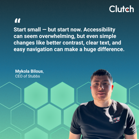
You don't want to wait to get these benefits. As Mykola Bilous, CEO of Stubbs, advises, “Start small — but start now. Accessibility can seem overwhelming, but even simple changes like better contrast, clear text, and easy navigation can make a huge difference.” The early wins build momentum and keep teams engaged.
Moreover, accessibility fixes are a brand growth lever as much as a risk check. Addressing these common accessibility issues raises compliance scores quickly, boosts usability, and strengthens trust with high-value buyers who multitask across devices.
“Accessibility aligns with brand trust and long-term equity. Companies that prioritize it demonstrate they value all users — not just the average one,” says Žiga Fajfar, Co-Founder of Flowout. That is the kind of flywheel that marketing leaders care about.

A few pragmatic checkpoints help keep progress steady:
These small, smart tasks can have a substantial positive impact on your website's success.
Discover how these top brands are handling their website accessibility.
There is a real cost in waiting. Every week that passes with broken mobile tap zones or ARIA errors on your site raises the odds of customer complaints and legal action, on top of lost sales.
An experienced web designer can quickly fix common accessibility issues and keep brand identity intact. This approach reduces rework and protects the brand while keeping creative standards high.
Ready to hire a reliable partner? Find a vetted list of top web designers on Clutch. Browse the directory and shortlist partners who make websites with accessibility features a part of your brand identity.