
4 Workflow Web Application Examples That Nail User Experience
For UX beginners aiming to optimize their digital workflow, web applications help bridge the gap between the web browser and mobile app experiences.
Updated June 3, 2026

The length of your checkout process, CAPTCHAs, two-factor authentication, and forced account creation could be hurting your checkout conversion rates. Learn more about how you can streamline the checkout process, according to Clutch survey data.
You keep a close eye on your sales numbers, but it’s much harder to count almost-buyers. According to a new Clutch survey, 84% of shoppers regularly walk away from the checkout line, leaving many online shopping carts abandoned.
Tracking the checkout conversion rate can help you see how effective your process really is. It’s the percentage of shoppers who enter checkout and complete a purchase. While the abandoned cart rate focuses on drop-offs, this metric counts completed sales.
The checkout conversion rate is more specific than the site-wide conversion rate, which shows how many visitors overall make a purchase. For example, 40% of people who reach checkout may buy something, but only 15% of site visitors make a purchase.
Most brands treat checkout as a single decision: to buy or not to buy. In reality, though, customers make several micro-decisions before they pay. Along the way, there are five points where they tend to quit.
If you’re not paying attention to these moments, you could be losing sales. Drawing on new Clutch survey data, this guide teaches you how to smooth friction and improve your checkout conversion rate.
Customers might be willing to stand in a long line at a store, but they’re much less patient online. Almost half (47%) of shoppers say 3–4 steps is their absolute limit before they’d consider abandoning the checkout process.
Many e-commerce businesses haven’t gotten the memo. The average checkout asks for 21 form fields, which is around 7x as many as customers want to deal with. Even optimized checkouts usually have 8-12 fields.
From a business perspective, all this data may seem necessary. After all, you definitely need customers’ payment details and shipping addresses. You probably also want them to create an account, give you a phone number, and write delivery instructions. And while they’re here, why not have them sign up for your email newsletter? Before you know it, your checkout has ballooned out of control.
Resist the urge to turn checkout into a survey. Austin Mallar, CTO and lead tech specialist at the marketing agency, Longhouse Branding, says, “I usually recommend three to four clear steps: cart review, shipping details, payment, and confirmation.”
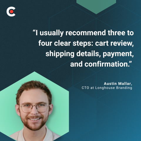
He continues, “The number matters less than perceived effort. A single long page can feel heavier than a few focused steps. Each step should have one purpose, clear progress indicators, and no unnecessary decisions. Checkout should feel predictable from start to finish.”
It’s all about making your customers’ lives easier. When they don’t have to put too much effort or thought into checkout, they’re more likely to go all the way to the end.
When they’re excited about a purchase, the last thing customers want to do is click a photo of a bus or drag a puzzle piece. Yet many checkouts still require CAPTCHAs before payment submission.
CAPTCHAs were designed to prevent bots from filling out online forms. In practice, they often stop humans, too. That’s especially true on mobile, where image-grid puzzles are often unreadable or too small to tap. If users aren’t fast enough, reCAPTCHA v2 timeouts can lead to failed submissions.
These obstacles can quickly annoy even your most loyal customers. In fact, shoppers will only tolerate around one second of friction before drop-off climbs sharply. A single failed CAPTCHA attempt can delay checkout by around 5 to 15 seconds. That might be enough to make people think twice about purchasing.
Shopper frustration mounts if they also need to sign in to an account or verify their identities via text. MojoAuth’s Passwordless Conversion Impact Report 2026 found that each authentication step reduces conversions by 10-15%.
You don’t need to abandon all your security measures, but there are alternatives to traditional CAPTCHA that will impact conversion rates less. Switch to invisible methods for stopping bots, such as:
These tools don't require any shopper interaction, so they don’t delay checkout.
CAPTCHAs still has a place, though. Reserve hard puzzles for suspicious activity, such as 100 orders from the same device within a minute.
If you must use a visible challenge for humans, be strategic about it. Put the CAPTCHA at the beginning of the form, so shoppers encounter it before they’ve put effort into filling out fields. That way, they can restart easily if something glitches.
Businesses often require SMS two-factor authentication (2FA) at checkout. From a cybersecurity perspective, it makes sense. You don’t want anyone to hack into a shopper’s account and order $3,000 worth of T-shirts or software. However, it can disrupt the entire purchase flow.
Users must leave the tab to find a code or track down their cell phone. If they get distracted by a work email or a crying child, they might never come back. Or their session may have expired by the time they return, so they give up.
The biggest risk comes when you layer 2FA on top of other authentication steps. Let’s say you require shoppers to log in with their email, enter a password, drag a puzzle piece, and then complete 2FA.
Just reading that list of steps is tedious, and users are less likely to convert than if your checkout process was just a two-step flow. As Corbado reports, 19% of users have abandoned a purchase because they forgot their password. More steps equal more opportunities for hiccups like these.
Don’t verify your customers’ identity every time they check out. That will only cause unnecessary friction.
Instead, verify at high-risk events. For example, you might require 2FA when shoppers use a new device or change their address. You could also verify for expensive or unusual orders, such as $1,000 worth of dog food. That helps strike a balance between convenience and safety.
If your shoppers have accounts, consider replacing SMS 2FA with passkeys or magic-link authentication. These methods let users quickly log in with biometrics, a face scan, or a one-time URL. It’s much faster than entering a code or trying to remember a complicated password.
Want to stick with SMS for now? Use the WebOPT API on mobile to prefill the verification code as soon as it is delivered. That way, they don’t have to leave the tab open to read their text messages and copy the code.
Account fatigue is real, especially for one-off purchases. Two in five (41%) consumers said they’ve abandoned a checkout specifically because a site required them to create an account before buying.
Forced account creation often fails because it asks the user to make a long-term commitment: an account, with yet another username and password to remember. Meanwhile, they’re just trying to buy something quickly. If they’re a first-time customer, they may not even know if they’ll return yet.
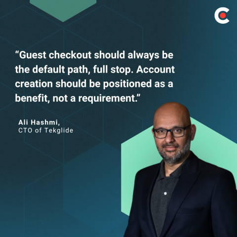
Ali Hashmi, CTO of Tekglide, notes, “Guest checkout should always be the default path, full stop. Account creation should be positioned as a benefit, not a requirement.”
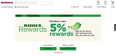
Consider adding a brief message about the perks of setting up an account. Kohl’s, for instance, offers 5% rewards for members and a special birthday gift.
Alternatively, ask them to create an account later. Hashi shares, “The most effective approach we implement for clients is a post-purchase account prompt. After the order is confirmed, the customer is shown a single-click option to save their information by setting a password. At that moment, they are already satisfied, their guard is down, and the value proposition is obvious: faster check out next time, order tracking, exclusive offers."
He continues, “Framing it as ‘Save your details for next time’ rather than ‘Create an account’ also makes a measurable difference in uptake.”
Make guest checkout the default. Instead of asking shoppers to create an account upfront, offer it as a one-click upsell after they’ve already completed their purchase. That way, it’s not a barrier to checkout.
You can also replace traditional passwords with passkeys, magic links, or social login. People are often more willing to create accounts using these methods because they don’t need to invent new credentials. Popular vendors like Stripe, Shopify, and Amazon already do this.
Finally, never force shoppers to recover a forgotten password before they can check out. Let them still buy the product with a guest account, and gather the information you need to recover their account along the way.
Credit card numbers are long. Typing all these digits on a phone is often the longest single input in a typical checkout. And if a shopper accidentally taps the wrong number, they have to start over.
Even a few seconds of friction costs sales. Google found that conversions fell by 32% on mobile when page load time increased from 1 to 3 seconds.
Form completion is no different. Customers favor speedy payment systems that don’t require them to type in their card numbers. For instance, Stripe reports that stores that offered Apple Pay saw an average 22.3% increase in conversion and 22.5% revenue lift.
Make digital wallets the primary payment method for mobile users. Encourage them to check out with Apple Pay, Google Pay, Shop Pay, or PayPal Express. These systems save their payment details for faster processing.
Your site should also offer camera scanning on browsers that support it. Users hold up their cards in front of their device cameras, and the information autofills in the checkout fields. It’s incredibly convenient.
Of course, manual entry isn’t always avoidable. Make it easier by offering single-line numeric input that automatically formats as the user types. Real-time card detection and a dedicated numeric keypad for mobile users also speed things up.
And skip the billing address, unless the processor genuinely requires it for address verification service (AVS). For many wallets, it’s redundant.
The average checkout has 21 fields, and the address block usually takes up about half of them. And often, there are redundancies. For instance, you don’t need to ask for the state if the customer inputs their zip code.
Baymard reports that "the average large-sized ecommerce site can gain a 35.26% increase in conversion rate through better checkout design." By optimizing address forms, you can pare down your checkout process to eight to 12 fields.
Of course, that’s not necessarily true for international businesses. Different postcode formats and address line conventions may require extra fields. Plus, some countries have provinces, while others have states. Testing your address forms for multiple locales will help you make sure your form accommodates all customers.
Typing in a long address takes too much time for busy shoppers, and every redundant field is a micro-decision. Speed it up by using a tool like Google Places or Loqate for address autocomplete. That way, users can fill in one field instead of six.
You can also auto-derive the city and the state from the ZIP or postal code. Collapse them into hidden fields, so users can still tweak them if something goes wrong. You can also use a + tab to hide optional fields, such as Address Line 2 and Company.
Localize addresses, too. Make sure your website formats them to match the shipping company's requirements, rather than simply translating a U.S. form. This saves time for international shoppers, because they don’t need to fiddle with the forms.
Use inline validation on blur to flag errors next to the field, rather than listing them in a banner after submission. That lets customers fix mistakes right away instead of reloading the page.
These days, sparking interest in your products isn’t always enough. You also need to make it easy for people to buy them. If you throw obstacles, such as CAPTCHA puzzles or a lengthy address form, customers may not follow through.
Avoid this issue by pinpointing issues that make customers more likely to abandon their cart. Then improve each micro-decision one at a time, until users can glide through your checkout process with ease. When you remove friction, customer satisfaction and checkout conversion rates will go up. And so will your sales.