
How to Build a UX Strategy That Drives Real User Engagement
A UX strategy is a long-term plan for creating user-friendly digital experiences by aligning design, content, and technology with business goals.
Updated May 27, 2026

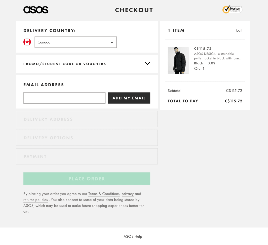
Is your clunky checkout design costing you conversions and eating into your profits? With 80% of shoppers saying they’ve abandoned a website due to poor design, you can’t afford to have a poorly designed checkout flow.
The design of your checkout page could have a larger impact on conversions than you think. According to Clutch data, 80% of shoppers have abandoned a website due to poor design, even when they wanted the item.
Many factors contribute to this, but poor checkout design and flow are a significant cause. In fact, research shows the average large e-commerce site could see a 35% increase in conversions just by making checkout design changes.
Looking for a User Experience agency?
Compare our list of top User Experience companies near you
This guide will help you find and fix the issues holding your conversions back, with an overview of 15 UX mistakes that cause friction at checkout.
Clutch surveys reveal that 84% of consumers consider a website’s design when choosing whether to shop on it. Your checkout process is an underrated aspect of this, which means it can have a direct impact on profitability.
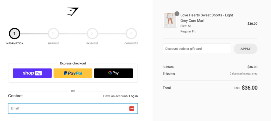
So, how do you streamline your checkout design to increase revenue? You eliminate mistakes, errors, and design flaws one by one, from making guest checkout easy to find to accepting more payment options than basic credit and debit cards.
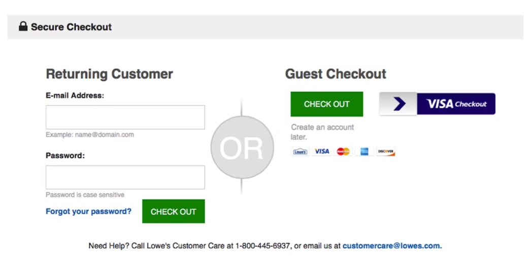
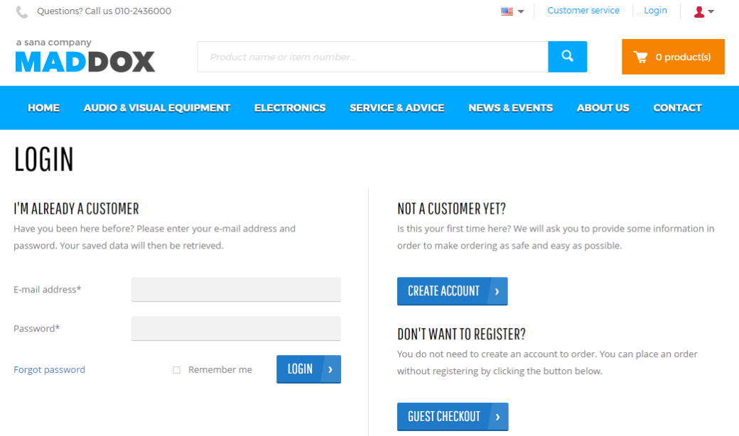
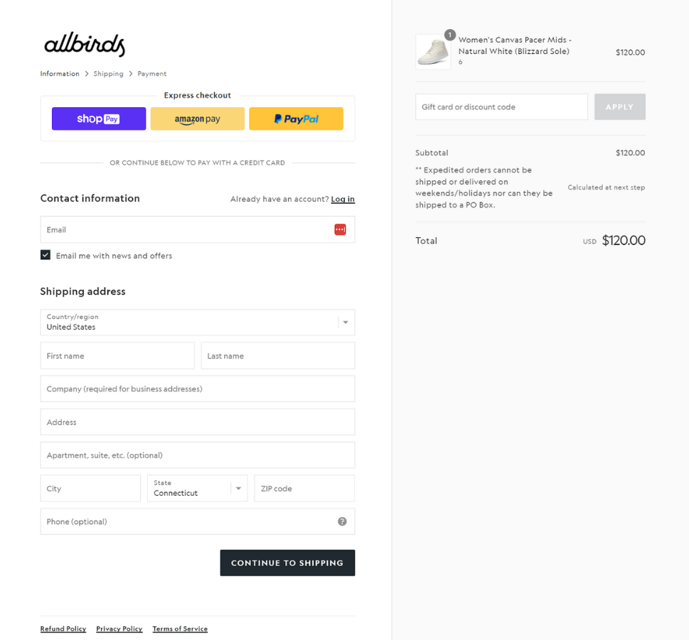
First, make sure you offer a guest checkout option. One in five shoppers has dropped out of a checkout process when forced to create an account. You don’t want that impacting profitability.
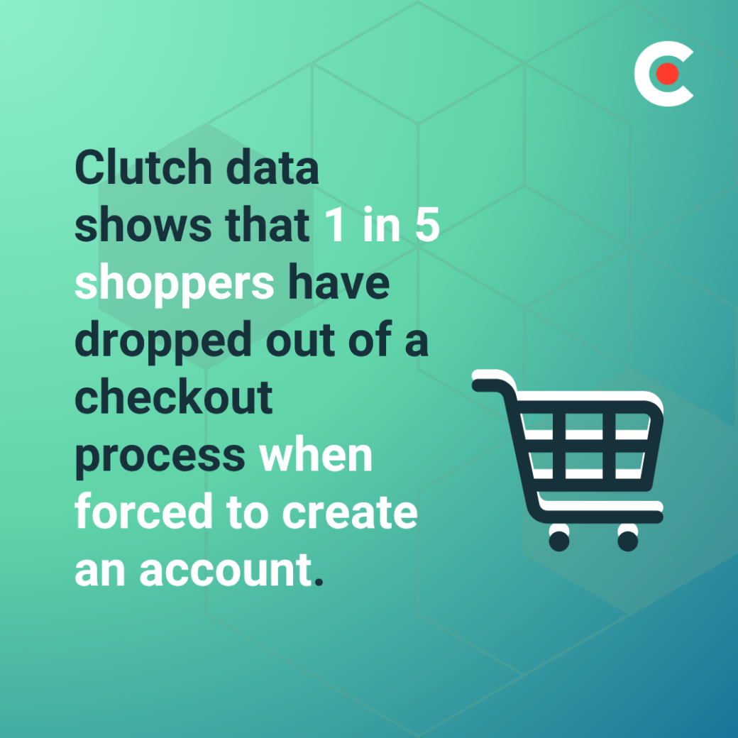
So, make guest checkout a prominent choice on your checkout screen. This way, you won’t lose sales because of a hidden guest checkout option or no option at all.
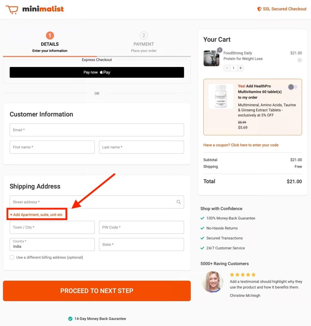
When people are interested in creating an account, you should make it as easy as possible for them to do so. That means not requiring much information beyond a username and password.
You may also want to keep your password rules simple so it’s easy for people to create credentials they can remember.
One way to make account creation easier is by offering social logins through Google, Apple, Facebook, and other platforms. You can also make password creation easier by:
The key is to make sure customers who create accounts can do so easily and remember their credentials when they return. Otherwise, you could see higher bounce rates as people forget how to log into your store and abandon their carts rather than go through the tedious task of resetting their passwords.
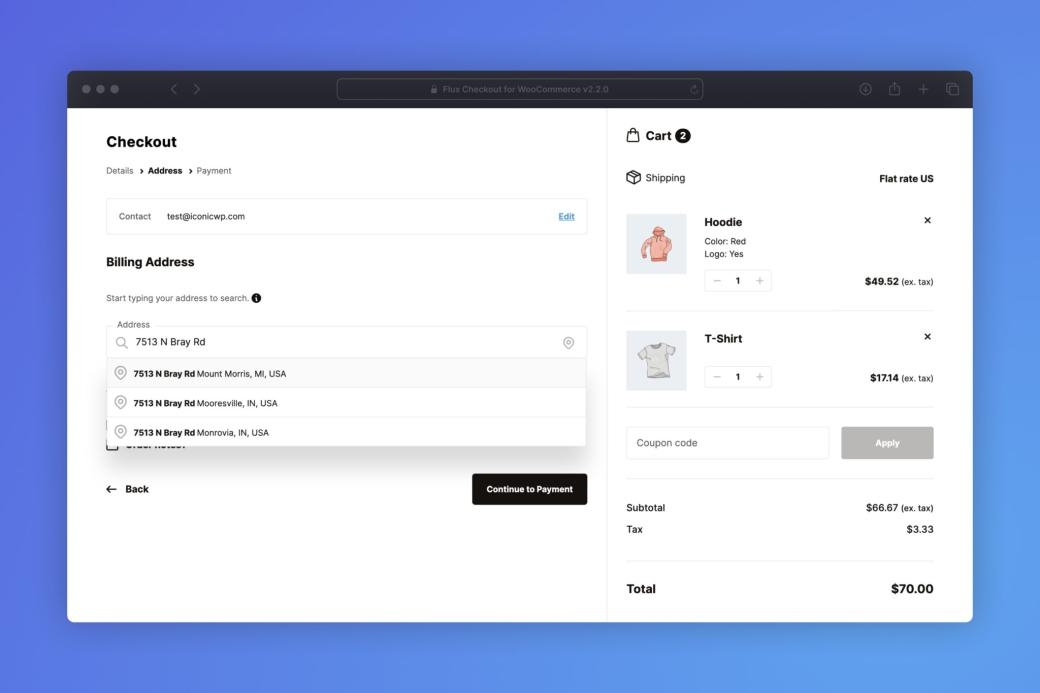
Next, look for ways to adapt your checkout flow to the individual user. Your design should be dynamic, taking into account elements like the user’s device and location. You can also use smart form-filling, autofill, and location-based defaults to personalize the checkout experience further.
Adding these elements to your page won’t just improve clarity for the user; it can also increase checkout speed. With an adaptable checkout flow, you can turn your website into a convenient place for customers to purchase what they need, which may lead to increased loyalty.
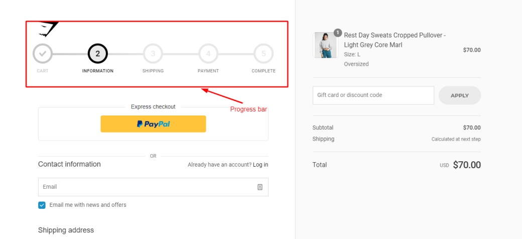
When checking out, users want to know how many steps they have left before completing the process. When a site doesn’t include any indicators for this, like “Step 2 of 3” near the top of the page, it makes the shopper feel less secure and more likely to abandon the cart.
The solution is to add a clear progress bar or step indicator to your shopping experience. This tells buyers exactly what to expect and increases their confidence in your brand as you deliver on your promises step-by-step.
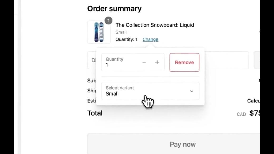
It’s also important to make quantity selectors clear and easy to use. You don’t want shoppers accidentally purchasing the wrong amount and associating their frustration with your brand.
So, instead of asking users to manually click or tap small fields, give them a large plus or minus button to instantly add or subtract quantity. This is easier for them to see and use, resulting in more accurate orders and higher levels of brand satisfaction.
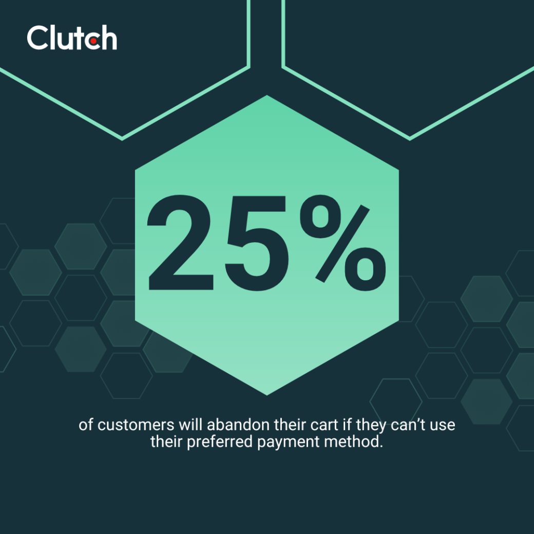
The number and type of payment options you accept matter. Clutch data shows that 25% of shoppers have walked away from a transaction because their preferred payment method wasn’t accepted. Limited options frustrate customers and increase their likelihood of purchasing the products they need elsewhere.
To make it easy for your customers to complete their purchases, go beyond debit and credit cards to also accept:
There are typically few downsides to adding new payment options to your store. It’s better to offer as many as you think would be useful, not just the options that receive the most volume.
It’s also worth anticipating common errors in the user experience and systematically eliminating them. The more of these you can stop in advance, the more streamlined your checkout experience will become for end users.
One common error is delayed credit card validation. A user inputs their card information, goes through the whole checkout process, and only finds there was an error once they hit submit. This wastes time, causes frustration, and can lead to abandoned carts.
You can fix the problem by:
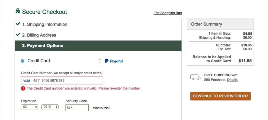
Next, review your input formatting to make sure it’s clear for shoppers. Unclear formatting rules lead to user errors, failed submissions, and lost sales. You can avoid this by including placeholder text and format examples next to each field.
For example, don’t just ask for their birth date; clarify that you want it in (MM/YY) format. You may also want to show validation feedback as users type. This can help them find and fix issues in real-time instead of at the end of a long checkout process, which can cause frustration.
When users can’t tell which checkout fields are required, it’s bad for business. Some will waste time filling everything out and get frustrated when they realize it wasn’t required. Others will miss something critical, create more friction for themselves, and potentially associate a lack of clarity with your brand.
That’s why Vlad Teplin, Founder of Teplin, recommends “hiding optional fields behind dropdowns.” You can also use clear labels, like “(optional)”, next to fields that aren’t required. It could even be helpful to group optional fields into expandable sections to reduce the clutter on your checkout page design.
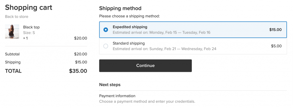
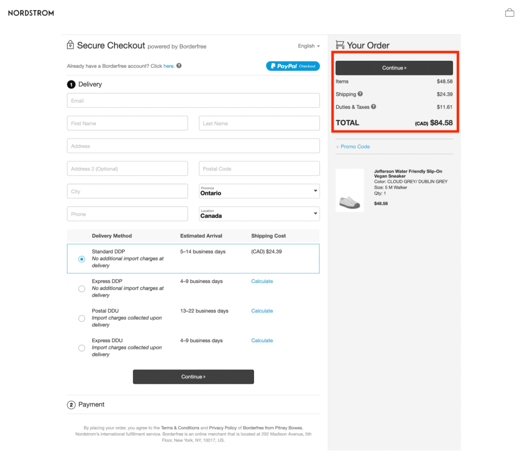
Finally, shoppers want to know when their order will arrive and how much they’ll pay for shipping before completing a purchase. If you don’t offer this, they may prefer to buy from another merchant who can offer them the clarity they want.
You can avoid this error by:
There are still a few lingering issues worth reviewing before completing your checkout design optimization. Here are five to consider.
Hidden fees that appear late in the e-commerce checkout process are one of the main reasons users abandon carts. In fact, Clutch data shows that 44% of shoppers consider unexpected shipping costs an online shopping pet peeve.
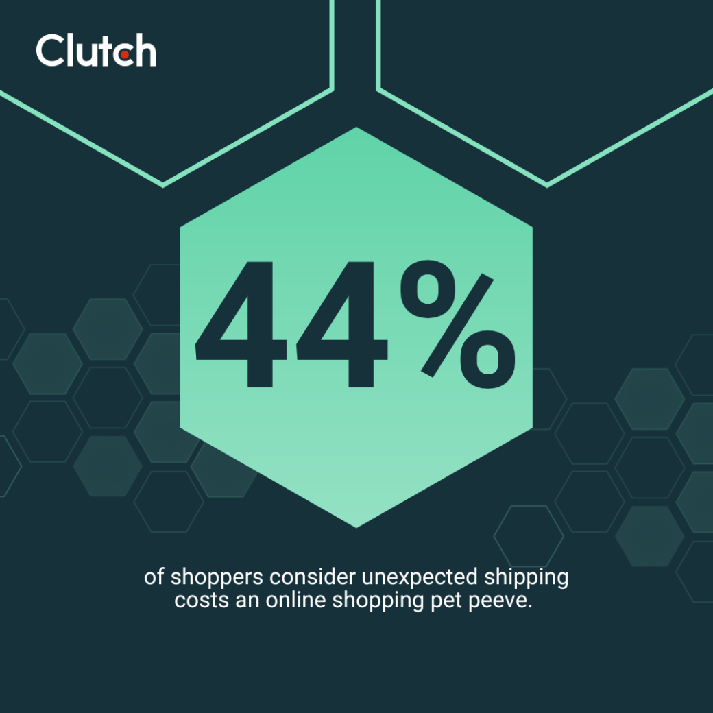
To avoid this, show a clear cost summary at the beginning of the checkout process. You may also want to include a shipping and tax estimator on the page for extra clarity.
Your goal should be to make your checkout page as transparent as possible for the customer. You want them to think of your brand as a partner they can rely on to give it to them straight, even when doing so might discourage a sale.
You may lose a few transactions in the short term by sharing your full fee structures, but doing so typically improves how people view your brand. This can lead to lasting gains in loyalty that more than make up for today’s lost revenue (if any).
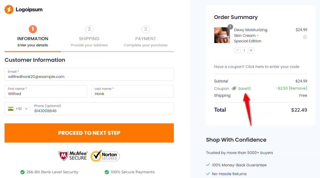
When a customer expects to save money with a promo code and that code doesn’t work at checkout, it can dramatically increase the odds of them abandoning their cart. Clutch data backs this up, with 37% of shoppers saying they have left the checkout when a promo code didn’t apply. When you make customers guess why the code failed instead of giving them a clear reason, it can exacerbate the frustration.
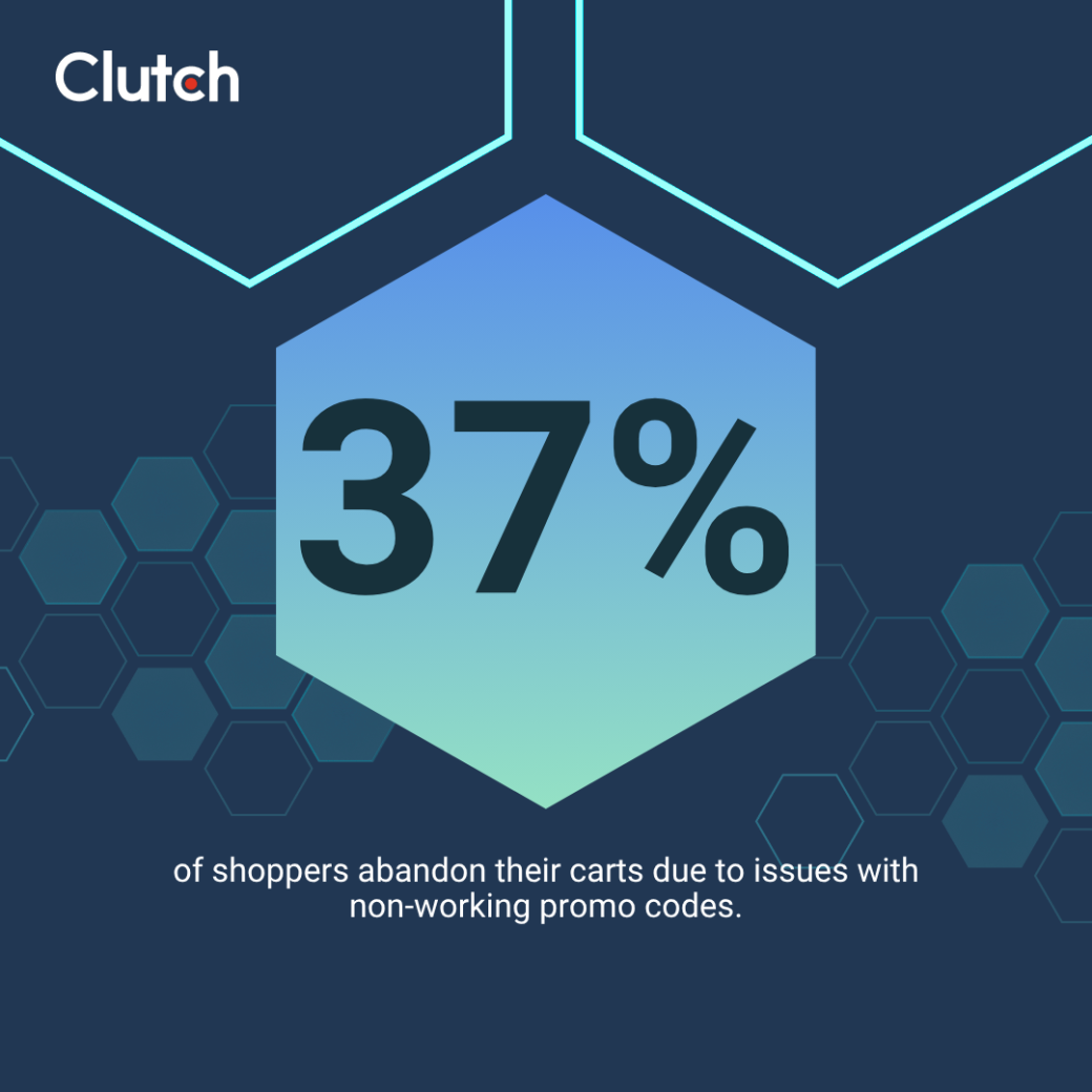
Fix this problem by validating promo codes in real time. Share clear error messages with descriptive reasons when a code doesn’t work. It may even be worth automatically applying codes for which users are eligible. This may cost you a little money today, but it could create loyalty that brings additional value to the company in the long term.
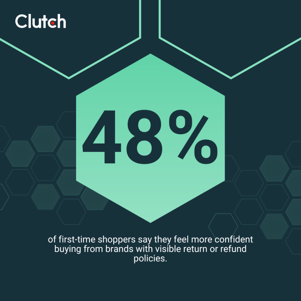
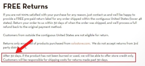
It’s important to include your refund and return policies on the checkout page. Customers want reassurance that they’ll be able to return the product if it doesn’t work out. Of the people we surveyed, 48% said seeing a return or refund policy increases confidence when buying from a website for the first time.
If you don’t have these policies prominently linked near the checkout buttons for them to review, shoppers may hesitate, abandon their cart, and never complete the purchase.
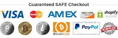
Next, make sure you have visible trust signals on your checkout page. According to Clutch data, 60% of shoppers say seeing trust badges makes them confident buying from new sites.
Customers may question whether their card information and personal data will be safe when they don’t see elements like:
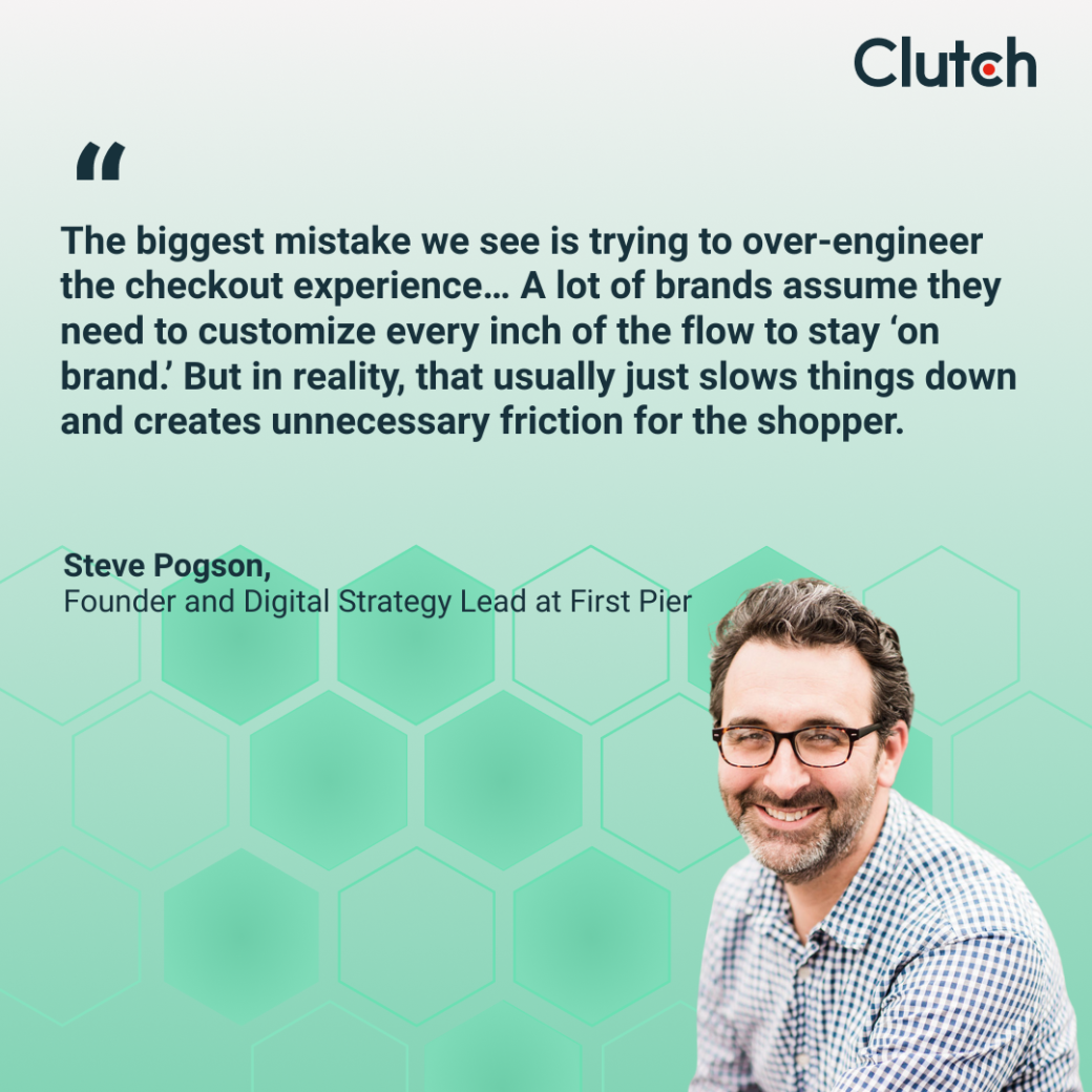
Finally, make sure your checkout design is up to date with the modern aesthetic and consumer trends. Steve Pogson, Founder and digital strategy lead at First Pier, explains:
“The biggest mistake we see is trying to over-engineer the checkout experience… A lot of brands assume they need to customize every inch of the flow to stay ‘on brand.’ But in reality, that usually just slows things down and creates unnecessary friction for the shopper.”
So, don’t overcomplicate your design. Instead, try to use:
It could even be worth reconsidering the template you’ve been using. For example, Pogson says, “At First Pier, we specialize in Shopify for a reason—its native checkout is one of the most trusted, recognizable, and optimized checkout experiences on the internet. It’s fast, secure, mobile-friendly, and familiar to millions of shoppers.”
Adopting a template like Shopify’s checkout design will instantly help shoppers trust your checkout process. This might be all it takes to improve your cart abandonment percentage.
No matter how well designed the rest of your site is, checkout is where revenue is made or lost. It may seem like a simple page with a simple design, but minor errors can compound, create hesitation in consumers, and lead to lost sales.
You can avoid that fate by optimizing your checkout design for today’s customer. Consult with a UX design agency that can leverage its expertise to optimize your brand’s checkout experience.