Will AI Replace Graphic Designers? The Fear vs. The Facts
AI is revolutionizing graphic design, but is it replacing designers? Clutch research reveals what businesses actually think, and what designers need to...
Updated March 31, 2026

With millions of podcasts competing for attention, your podcast cover art is often the only thing standing between a new listener and the scroll. These 10 examples show exactly how to make it land.
Podcasting has exploded in popularity, and with millions of shows competing for attention, standing out is harder than ever. One of the simplest ways to do it? Creative podcast cover art that stops listeners mid-scroll.
Whether you're launching a new podcast or refreshing an existing one, these 10 examples will show you exactly what great podcast cover art looks like, and what makes it work.
Looking for a Graphic Design agency?
Compare our list of top Graphic Design companies near you
Here are 10 of the most creative podcast covers out there:
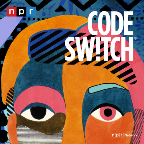
Hosted by journalists Shereen Marisol Meraji and Gene Demby, Code Switch is a podcast that dives into important conversations that affect society. From politics to history, Code Switch is an amazing podcast that honestly spotlights culture and meaningful topics. Its cover art is intriguing and eye-catching. Right off the bat, you can tell that it’s a podcast about culture and society.
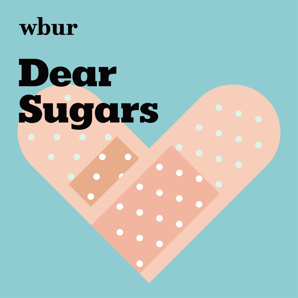
Produced by WBUR and hosted by Cheryl Strayed and Steve Almond, Dear Sugars is an impactful podcast that’s not afraid to talk about relationships and to directly connect with its listeners' hearts. The beautiful symbolism represented by the bandages forming a heart speaks volumes about the podcast.
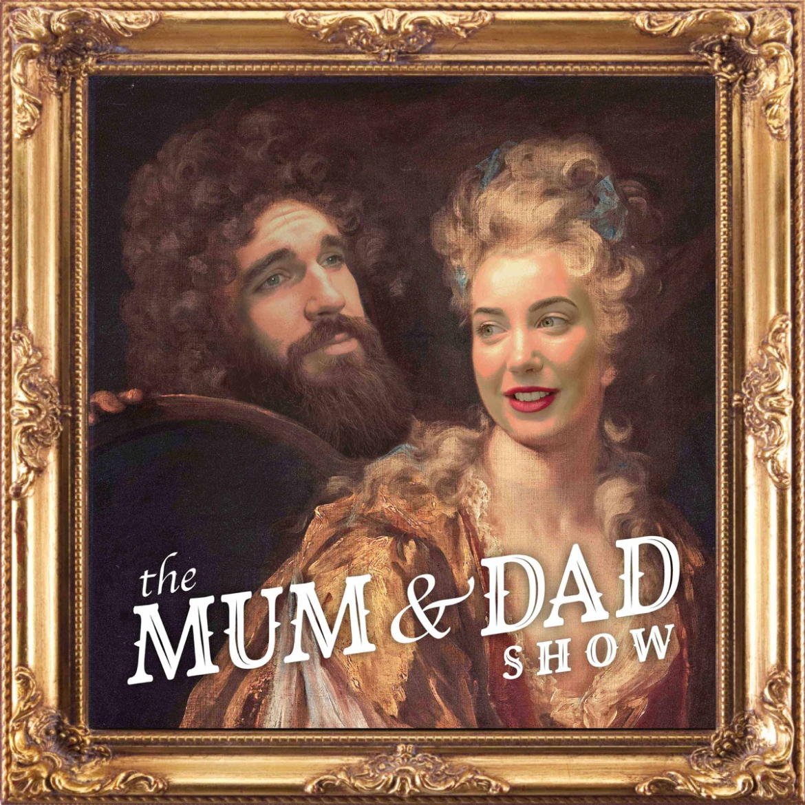
Tackling everything from relationships to feminism, The Mum & Dad Show is a podcast hosted by Clare and Isaac Butterfield. The podcast is funny, personal, and relatable, and its cover art captures the tone of its content.
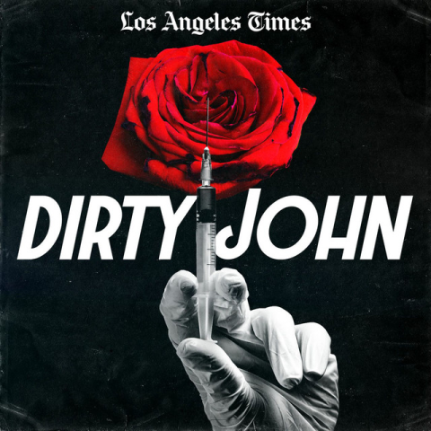
Dirty John is a true crime podcast that tackles the tale of John Meehan, nicknamed “Filthy”. Narrated by Christopher Goffard, the chilling podcast explores the exploits, abuse, and deceit. The cover art captures these ugly themes in a beautiful way. The last episode of the podcast was released in 2018, but its cover art still stands out for its simplicity, legibility, and sophistication.
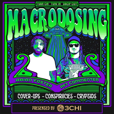
The cover itself immediately encapsulates what Microdosing: Arian Foster and PFT Commenter is all about. The podcast is about conspiracy theories, dark stories from the deep web, and all sorts of conundrums,and you can see that right away from its unique, thought-provoking, and head-turning cover art.
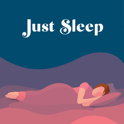
Bedtime stories aren’t just for kids, and the Just Sleep podcast is the perfect podcast to help adults relax and drift off to sleep. The cover art is recognizable, straightforward, and simple, working great for its genre. The design isn’t busy. Instead, it flows gracefully and calmly. It shows how much the designer thought of the concept and the target audience when creating the artwork.
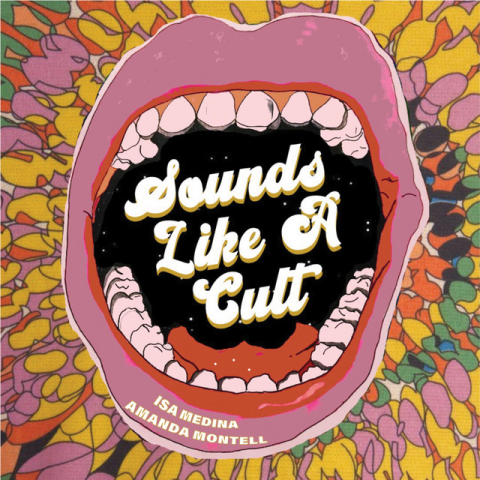
Co-hosted by Isa Medina and Amanda Montell, Sounds Like A Cult is literally what it sounds like. The podcast explores modern-day “cults” that people follow, from astrology to beauty pageants. Just like its premise, the cover art is striking, intriguing, and memorable. The design pretty much speaks for itself.
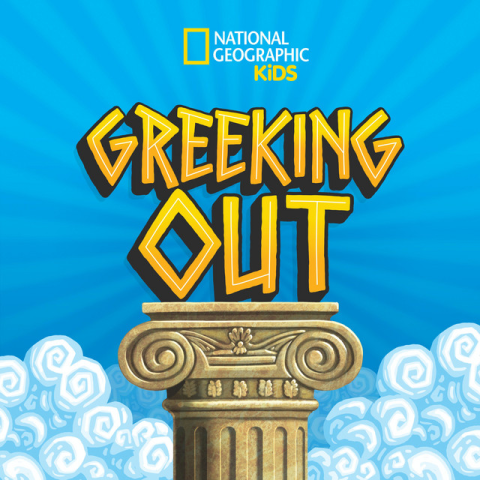
Targeting kids from ages 8 to 10, Greeking Out is a fun and informative podcast that retells the stories of famous Greek myth heroes and gods. The cover art is brilliant, using vibrant colors that kids will immediately gravitate to and elements that reflect Greek excellence. It’s perfect for its category and its target audience.
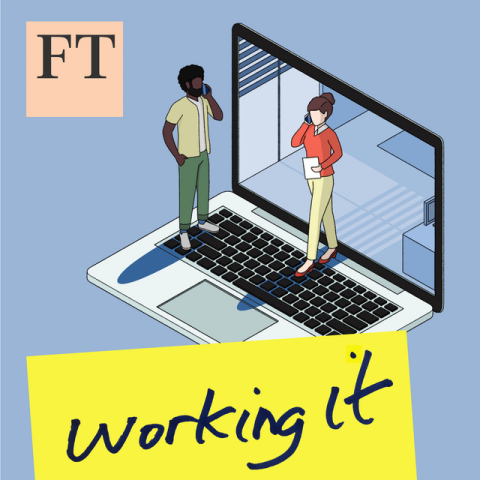
Working It is Financial Times’ award-winning podcast that takes a deep dive into the post-pandemic trends that currently move the global job market. Hosted by Isabel Berwick, every episode analyzes and breaks down relevant topics and stories that personally connect with young working professionals. The cover art for Working It is clean and easy on the eyes. You can instantly tell what the podcast is about, but it’s not too boring that it fades. The artwork is relevant and not misleading for its target audience.
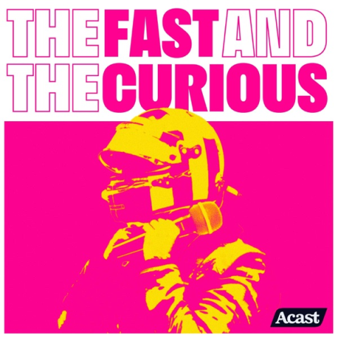
The Fast And The Curious isn’t related to a certain movie franchise, but it also talks about fast racing cars, F1 in this case. Hosted by Greg James, Betty Glover, and Christian Hewgill, the podcast regularly features world-class drivers and team principals. The cover art is punchy and exciting, using a bold font with a color-blocking palette.
There’s this famous saying that “pictures are worth a thousand words”, and that’s literally what sums up why covers are important. You can write an excellent description for your podcast, but potential listeners won’t read it if they don’t gravitate toward your cover art — after all, it’s the first thing they’ll see when they search for new podcasts on Spotify and Apple Podcasts.
Podcast artworks are like business cards — they’re important to attracting new listeners and showcasing what type of content you do. Just like business cards, they carry the weight of first impressions.
Spending time conceptualizing and designing your cover art is worth it. Just like with logos, movie posters, and book covers, podcast cover art should ultimately be what catches people’s attention.
Well-designed podcast cover conveys a sense of professionalism and credibility. In contrast, poorly designed cover art that looks like a generic template can give the impression of lower-quality content.
Great podcast cover art doesn't happen by accident. Whether you're designing it yourself or working with a professional, knowing what goes into a strong cover will help you make smarter decisions from the start.
Before you open any design tool, make sure you're working with the correct specifications. Both Spotify and Apple Podcasts require cover art to be a square image between 1400 x 1400 and 3000 x 3000 pixels, saved as a JPEG or PNG. Designing at 3000 x 3000 from the start gives you the most flexibility and ensures your artwork looks sharp across all platforms and screen sizes.
The tool you use will largely depend on your design experience:
Your cover art will often appear as a small thumbnail — sometimes no bigger than a postage stamp. A common mistake is designing for a large screen and forgetting how it looks when scaled down. Test your design at small sizes early and often. As a rule of thumb, if your podcast title isn't readable at thumbnail size, simplify.
Looking back at the examples above, a few patterns stand out among the strongest covers:
DIY tools can get you far, but there's a ceiling to what templates can do. If your podcast represents a brand, business, or professional endeavor, investing in a graphic designer is worth it. Whether it’s a freelancer or a graphic design agency, a professional will bring creative direction to help you land on a concept that truly reflects your podcast's identity rather than one that looks like everyone else's.
Nailing the cover art for your podcast is a must. The truth is, people will see your podcast cover first, which plays a crucial role in convincing them to listen to your content. We always say that don’t judge a book by its cover, but nearly everyone is guilty of doing just that — the same principle applies to podcast cover art.
Ultimately, focus on showcasing your brand and what your podcast is about. After all, no listener wants to be misled by cover art that doesn’t reflect the content they thought they would get. Your podcast cover art is a valuable investment. In fact, it’s as significant as the recording equipment you have.
Working with a reliable graphic designer can take the burden of creating cover art off your shoulders. Work with one of the best graphic design agencies ranked on Clutch today.