
Should Brands Disclose AI Use? What Consumers Actually Reward
AI disclosure can chill a brand's reception or build trust. See what 408 consumers reward—and when disclosing AI use in your marketing actually helps.
Updated March 31, 2026

The right brand color palette makes your business recognizable and noticeable. Create a color scheme that attracts the right customers.
If I tell you to guess the names of soft drinks from their brand colors, would you be able to do that?
Red and white? Coca-Cola
Looking for a Public Relations agency?
Compare our list of top Public Relations companies near you
Blue and red? Pepsi
Green and yellow? 7UP
That was easy, right? That’s the power of colors, if done right.
Brand colors make your brand instantly recognizable and noticeable. The right brand colors can give customers a positive impression and can even help increase sales, while the wrong ones can have a reverse effect.
That’s why choosing your brand colors and creating a distinct color palette is such an impactful decision when designing your brand.
But most entrepreneurs and web designers find this very challenging. They are not sure how to create a distinct brand color palette that makes their business stand out, and they easily get lost in the vast spectrum of colors on the color wheel, unable to decide which colors to use.
Here are three steps to create a brand color palette, along with tips to help you at this crucial stage of brand design.
Your brand’s color palette will include one or two primary colors and secondary colors for accents. To start the color palette design process, choose the primary color based on brand color psychology.
Color psychology examines how different colors affect people’s thoughts and even behaviors. It explores how triggering specific emotions through color influences how people interact and make decisions around people, items, or organizations.
Because colors in branding psychology can create effective and persuasive experiences, marketers, designers, and branding experts all use color psychology in their fields.
Here are some primary colors and how they are perceived.
Yellow invokes positivity, happiness, cheerfulness, optimism, joy, playfulness, and warmth.
It’s a very attention-grabbing color and can also represent caution.
It’s usually not recommended for brands targeted towards men, as they perceive it as a childish color.
If you want your brand to radiate youthful energy, yellow is a great option.
Blue is perceived as trustworthy, loyal, dependable, secure, and stable. This is why it is the primary color used by banks and financial institutions, as well as by social media sites such as Facebook and Twitter.
Blue is also the most preferred color of men.
The color of nature, green symbolizes balance, peace, and harmony. It is associated with growth, freshness, health, healing, nature and eco-friendliness.
Darker green is associated with money and wealth, while light green has a calming effect.
Purple is the color associated with luxury, royalty, and nobility. It also symbolizes creativity, mystery, and fantasy.
The color of fire and blood, red symbolizes excitement, action, adventure, passion, love, vigor, and energy.
Red is also known to stimulate appetite, which is why it is often the color restaurant chains use.
Orange is often associated with creativity, enthusiasm, youth, warmth, energy, joy, sunshine, and cheerfulness.
There is more to pink than a girly and feminine feel. Pink gives brands a modern, luxurious, and youthful look.
Brown will make your brand appear rugged, masculine, and serious. It also symbolizes security, structure, and protection, which is why it is often used by construction and law companies.
Black, the most sophisticated color of all, symbolizes seriousness, authority, and control. It also gives a slick, modern, and luxurious look.
After considering brand color psychology in your search for a primary color, research which colors your competitors are using. The goal here is not to necessarily copy your competition but to understand the visual landscape your brand exists within. .
Look at 5–10 direct competitors and note their primary, secondary, and accent colors. Then, look at the patterns.
For example, eyewear brands like Warby Parker and Eyeglass World both rely on blue, but use accents and styling to create very different brand feels. If certain colors (like blue) appear frequently, that may signal audience expectations or industry norms.


From there, decide whether you want to align with those expectations or intentionally stand apart.
You don’t need to differentiate solely through your primary color. Secondary and accent colors often provide the most room for distinction, even when brands share similar foundations.
Again, the goal isn’t to blend in among your competitors, but to understand the visual conversation already happening and decide how you want your brand to participate in it.
Lastly, after you have picked your primary color and considered your competition’s brand colors, it’s time to gather inspiration from your surroundings.
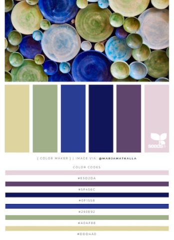
Luckily, there are many design websites that can give you a good dose of inspiration. You just need to keep looking until you find something that truly resonates with your brand. Here are some resources from where you can gather inspiration:
Don't be afraid to use other brands or resources to get inspiration for your color palette.
The right color for your brand varies based on your customers, competitors, and style.
You can choose your main color based on color psychology, replicate what your competitors are doing, and gather color inspiration from mediums such as Pinterest.
The color of your brand will be how customers see you. It’s important to choose wisely. Work with a top-rated branding agency to create a brand color palette that aligns with your vision and stands out from the competition.