![How to Make a Budget for Print Design [With Template]](https://img.shgstatic.com/clutch-static-prod/image/resize/715x400/s3fs-public/article/d593c4d0f16292c1f26270424626b50f.png)
How to Make a Budget for Print Design [With Template]
Discover how to prepare an effective budget for your print design needs through this piece.
Updated March 24, 2026

Your ad only has a second to make an impression, and most fail to do so. These advertisement design principles will help you capture more attention and drive more clicks.
People scroll through hundreds of ads every day, most of which never get a second glance. The problem isn’t usually the offer — modern targeting platforms are exceptionally precise. More often, people just don't find it attention-grabbing.
Consumers don't visit social media or their favorite website to learn what you're selling. In fact, most would rather avoid it. That’s why only 3% of consumers admit to never skipping an ad.
Looking for a Graphic Design agency?
Compare our list of top Graphic Design companies near you
Designing more engaging ads makes a real difference. According to a Clutch survey, graphic design has the biggest impact on advertising performance, outranking every other marketing channel. It’s no coincidence, then, that businesses hire designers more often for marketing assets (46%) and social media content (44%) than any other verticals.
Good advertisement design in 2026 is about stopping the scroll and communicating value instantly. These nine principles will show you how to make it happen, with real-world examples from high-performing brands.
Advertisement design is the process of creating visual assets used in promotional campaigns. That includes:
It's about more than making something that looks good. Every visual choice, from layout and color to typography and imagery, either contributes to or detracts from the ad’s ability to grab attention and drive action.
Good advertising design needs to strike a balance between:
The difference between an ad that converts and one that struggles often comes down to how effectively it combines psychology, visual hierarchy, and clarity. The nine principles below explore what that means in practice.
Your ads compete for attention in some of the most crowded environments imaginable: social media feeds, search results, and highly optimized websites. If a viewer can’t understand your ad in a second, that’s often all it takes to lose the opportunity.
You can design for the first second of viewership by featuring:
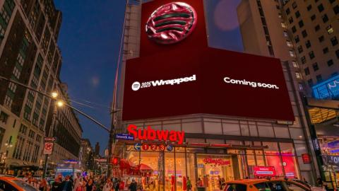
Example: Spotify’s 2025 Wrapped campaign uses high-contrast color blocks and a single piece of short, bold text. Its use of a single dominant visual and contrast helps the company’s message land before the viewer consciously processes it.
One of the most common mistakes in advertisement design is trying to communicate too many ideas at once. Ads just aren’t the place to do this. Save that for your blog posts or social feeds.
The most effective ads are built around one clear product, value proposition, and call-to-action. This decreases the level of conscious engagement needed for the consumer to absorb your core takeaway.
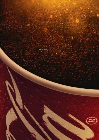
Example: Coca-Cola’s “Taste the Feeling” print ads lead with a single product visual that directly conveys the intended feeling of drinking Coke. It only features one small piece of copy with the tagline. The image itself is the key takeaway.
Visual hierarchy is the process of guiding the viewer’s eye through the ad in a deliberate order. A typical hierarchy could be:
You can use these tools to control where people’s attention goes when they see your ad:
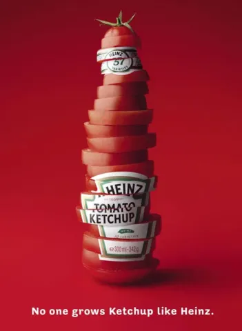
Example: This Heinz print ad leads the eye with a recognizable bottle shape carved from a tomato. There’s no guesswork or clutter, just a compelling image and a tagline underneath it for context.
In busy feeds, contrast is what helps ads stand out from all the other content a user sees. When everything looks similar, it doesn’t pull the eye or grab attention as well.
Some of the most effective ways to create contrast in ad design include:
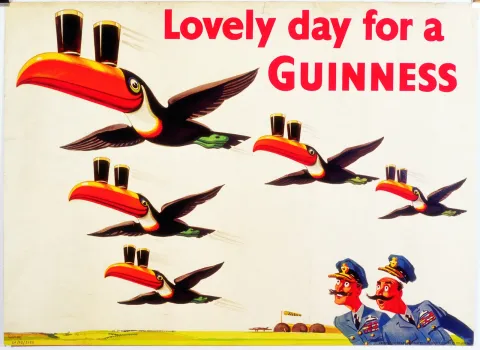
Example: Guinness’s “Lovely Day” campaign uses contrast very well. The dark pints pop against the bright background, creating visual tension that immediately draws the eye to the product.
There are meaningful differences in user demographics and expectations across platforms. For example, an ad that excels on LinkedIn would likely struggle on TikTok. Designing for the specific platform you’re targeting is a key requirement of effective design:
Example: When Airbnb relaunched Experiences in 2026, it built social-first vertical videos tailored for Instagram, TikTok, and YouTube. This connected with how users move through those platforms naturally — matching expectations, not forcing another format on a disinterested audience.
Typography is often an afterthought, but it deserves real consideration. It affects the ad’s tone, readability, and ability to grab attention. Best practices include:
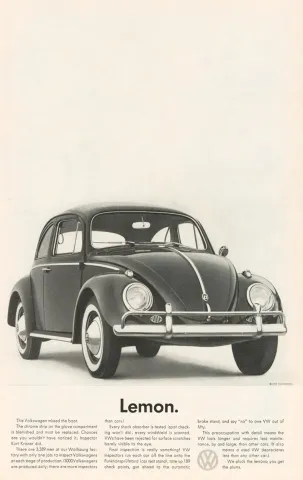
Example: Volkswagen’s classic “Lemon” ad is one of the most studied uses of typography in advertising history. It’s a single word in plain sans-serif font to match a clean product photo and no visual clutter. Everything down to the typography supports Volkswagen’s goal of signaling honesty and simplicity.
The goal in paying for an ad is to get viewers to take some action. And how do you communicate to viewers what to do after seeing your ad? With a compelling CTA. Otherwise, you may grab attention but still fall short of expectations.
Effective CTAs are:
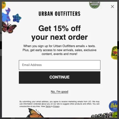
Example: Urban Outfitters' 15% off ad includes a strong, obvious call to action in the form of an email field and a large “continue” button. It’s a good example of making a CTA that stands out visually.
Brand consistency builds trust and makes campaigns more memorable. That’s why the most effective ads reinforce “who” the brand is. Every visual choice in an ad impacts how the consumer sees you, so it’s important to align those with the type of business identity you’re hoping to convey.
Follow these brand guidelines for visual identity:

Example: Apple has long been the gold standard in maintaining a cohesive brand identity. The company’s privacy-focused ads in the 2020s use a similar format and typography to its earliest iPhone advertisements back in 2007.
Even the most effective designers rarely draft the perfect ad on the first try. A/B iteration is critical. So be sure to test:
Example: Airbnb continuously A/B tests its ad creatives across markets, optimizing over time as performance data evolves. This helps the company stay connected to emerging consumer preferences and avoid wasted ad spend.
Understanding design principles isn’t always the same as being able to execute them. Knowing when to bring in professional help can be just as important as knowing what makes an ad work.
According to a 2026 Clutch survey, businesses increase their investments in professional support most commonly when:
At these business inflection points, the cost of weak creatives is highest. Working with a professional graphic design agency can help your team execute at the level high-stakes campaigns require.
Great advertising results from deliberate decisions about visual hierarchies, contrast, clarity, platforms, and more. The nine principles in this guide give you a framework for evaluating where your ad creatives succeed and where they fall short.
Whether you’re refining an existing campaign or designing one from scratch, applying these principles consistently should lead to better results. If your business is at a key inflection point, hire a graphic design agency to bring these principles out at the highest level.