
Where Are the Most Online Scams?
Online scams are everywhere. From social media to your inbox, learn the biggest threats on the most common platforms and how to spot key red flags.
Updated June 30, 2025

The same thing goes for any SaaS business: sign-ups from leads ultimately lead to paying customers. Hence, the sign-up through a free trial method is essential for success.
Updated 08/31/2022
The numbers don’t lie. Statistics show that the free trial method trumps other practices. As per a Totango report, over 16% of companies get more than 50% of their new customers from free trials.
Looking for a Digital Marketing agency?
Compare our list of top Digital Marketing companies near you
Unfortunately, most SaaS marketers and entrepreneurs struggle with this. In simpler words, giving a free trial is only half the battle won — and everyone is doing this. The bigger challenge for businesses is to get website visitors to sign up for the trial.
If you are facing the same situation, this article is for you. In efforts to make your lead generation easier, these 5 tried and tested tips will help drive more sign-ups to your SaaS website.
Before diving into how to boost your sign-up conversion rate, we should first discuss conversion rate optimization as a practice.
Conversion rate optimization (CRO) refers to the practice of attempting to increase the percentage of conversions from users of your website or mobile app. Similarly, conversions are the desired action you want users to take when visiting your site or using your app.
In the context of SaaS sign-ups, conversion rate optimization would have the goal of increasing the number of visitors to your website that end up signing up for a subscription to your SaaS software.
CRO should fit swimmingly within your business’ larger digital marketing strategy. Through your other digital marketing efforts, you should have a number of mature marketing channels with which you can drive users to your site and encourage them to sign up for your service.
There are a number of ways to circulate this call to action (CTA) to your target audience:
This strategy will require you to secure click-throughs from your target audience. However, because you will be pulling from users who have chosen to follow your social media pages or opt-in to an email list, the strategy should drive more qualified leads to your webpage.
Just like any other digital marketing optimization discipline, CRO requires active tracking and analysis of relevant metrics to truly have an impact on your business.
When converting from a free trial to a paid subscription, experts have found that the average conversion rate is around 25%. Anything above that is considered a good conversion rate, whereas anything below has room for optimization.
In the e-commerce field, sign-up conversions can be more challenging to secure. Research has shown that only 7% of e-commerce site visitors will sign up for an SaaS free trial. Within this 7%, 36% are able to be converted to qualified leads and 27% end up becoming sales.
As a part of this benchmarking, you and your team should optimize the entirety of your site to drive as much traffic to it as possible and make it easy to navigate for anyone who visits.
These actions should help both your landing page conversion rate and website conversion rate, which in turn will help your sign-up conversion rate.
To track any KPIs that are relevant to CRO, you and your team can use a web analytics tool such as Google Analytics. This will allow you to pull data and statistics in real time so that you and your team can make actionable decisions that will influence the overall viability of your site.
After reviewing sign-up conversion rate optimization at a high level, increasing your SaaS sign-ups may seem like an intimidating pursuit. However, with some tweaking to your strategy you should be able to see high conversion rates in no time.
Here are 5 ways you can boost your SaaS sign-up conversion rate:
Confused about how to better your business’ SaaS sign-ups? Read on for an in-depth visualization of how to do so.
Looking for help with you SaaS conversion rate? Hired a trusted CRO optimization team on Clutch.
Your sign-ups will increase when you show that people are using your products and are happy with it. That is called social proof.
But as a startup, showing social proof in the form of impressive numbers may not be possible because you do not have that many clients.
So instead of displaying numbers, ask your best clients to give genuine testimonials and product reviews. Go ask your customers for feedback.
Additionally, you can get featured in reputed online magazines and publications that your target audience refers to.
You can place their logos on your website, landing page, or in your marketing material for everyone to see.
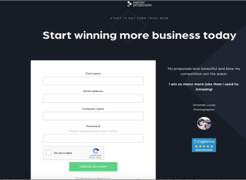
A proposal management software, Better Proposals, uses product reviews from Capterra, a software reviewing firm, and displays them on their sign-up page.
Knowing that they are in safe hands could compel website visitors to sign up for your free trial.
The conventional trick is to provide visitors with a relevant and intriguing incentive to sign up for your SaaS product’s free trial.
The incentive could range from offering free templates, e-books, white papers, access to an exclusive group on Facebook or an email course, or even a consultation over Skype.
The project management tool Monday allows users to download a free work-plan template when they sign up for the free trial.
When the gated offer adds value, it goes a long way in boosting the sign-ups. Invest in building an incentive or a gated resource that screams at the visitor to be accessed.
Your visitors will want to know how the product helps them, even before they sign up for the free trial. They will want to know if the fields on your form are worth filling and worth their time.
Show your visitors what they would receive after signing up. This can be in the form of sharing the benefits and value proposition instead of merely listing the features.
An explainer video, auto-playing GIFs, or screenshots can demonstrate your product, along with its use cases. If a video is not possible, even high-quality screenshots can showcase the power of your product.
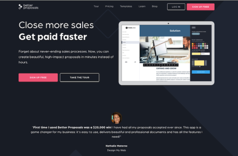
Better Proposals has a section called “Take the Tour” beside the signup tab. This directs the visitor to a landing page that has social proof use cases, benefits, and the integrations highlighted.
Let your visitors see if the product matches their requirements. Show them that your product is beginner-friendly and intuitive to encourage them to sign up.
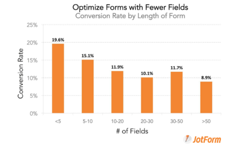
Test the length of the form field instead of assuming that shorter forms have a higher conversion rate on your sign-up page.
As seen in this JotForm study, the conversions are not the same.
For businesses that need to collect more information from customers, a longer sign-up form makes more sense. A shorter form isn’t always the best.
For example, GetVoIP, a business VOIP provider first asks the visitor to answer some questions before asking for their contact information such as email and phone numbers.
This could be based on the number of employees, features needed, geography, and budget. Then the visitor is directed to the right product sign-up.

Run A/B testing to know the length of forms that work the best for your business.
With mobile audiences growing at an unprecedented rate, designing the form for a mobile-first experience makes your sign-up form easy to fill. It helps to remove unwanted fields.
Having a mobile-first experience forces you to think of user interfaces such as setting default options for certain fields or keeping the form labels above or to the left.
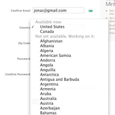
Imagine having to make your US-audience scroll through 160 countries to select the United States in the form.
Furthermore, you can make the form completion easier by taking advantage of mobile capabilities. For example, why ask for their location when they can share that information by using GPS via a single click?
When you design forms you should take into consideration that the spatial orientation varies depending on the device being used.
With a large number of users browsing your website and filling the sign-up trial through their mobile device, design your form based on their needs. The advantage is that you will improve the sign-up experience for every user.
The ultimate goal is to make sure you reduce the fiction to boost your sign-ups. Sign-up forms are the interface between your SaaS business and potential customers.
Make the signing-up experience better in order for your conversion to improve. Higher conversions through the free trial sign-up form leads to more customers, new business deals, and a successful online presence.
You can connect with the best conversion rate optimization agencies on Clutch.