
Agentic Commerce Is Here – How To Optimize Your Website for Sales
Agentic commerce is changing the digital shopping experience. Learn how to update your site for it and improve your bottom line.
Updated February 27, 2026

When people browse a website, they expect easy navigation, modern design, and relevant content. Clutch surveyed more than 600 users to learn which website features people value most, and the results show that clear pathways to information consistently outrank flashy trends. Easy-to-use menus, compelling visuals, and trustworthy content make the difference between a quick bounce and meaningful engagement.
For B2B decision-makers, these findings go beyond user convenience. The features highlighted in this research — navigation, design, content, visuals, social integrations, and blogs — directly influence how buyers evaluate potential partners online.
Companies that make it simple for visitors to find answers, check credibility, and connect with the right resources demonstrate an understanding of
their audience. Those practical touches give prospects more confidence when deciding who to contact and which providers are worth serious consideration.
Looking for a Web Design agency?
Compare our list of top Web Design companies near you
Looking for a web design partner to implement top website features? Team up with a top-rated web design company on Clutch.
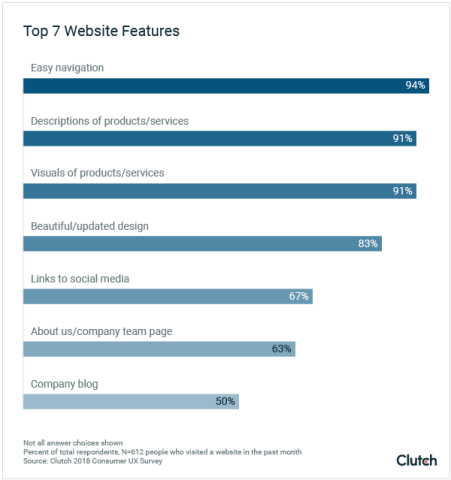
Clutch’s survey of more than 600 users highlights the website features that matter most. Nearly everyone (94%) values easy navigation, while 83% cite an attractive, up-to-date design as a key factor. Content quality is equally important: half of users say they will not return if information is irrelevant. Product visuals and descriptions carry almost the same weight, with 91% rating both as useful. Beyond core site content, two-thirds of respondents (67%) appreciate links to a company’s social media profiles, and 50% find blogs helpful for ongoing insights.
People spend a significant amount of their work and leisure time browsing websites, and they’re beginning to question the internet’s impact on their lives. Because people may spend less time online, businesses must make the most of the limited time they have with their audience.
One in three people (33%) will spend 1-3 hours online every day for leisure.
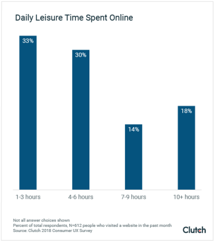
Almost two-thirds of people (63%) spend 4 or more hours a day browsing the internet for leisure. On the high end of the scale, approximately 1 in 5 people (18%) spend 10 hours or more browsing online. On the low end, 4% of people spend less than one hour of their free time browsing websites every day.
Between browsing the internet for leisure and using it at work, people spend most of their day online. Studies show that excessive screen time can be detrimental for adults. Social media websites, in particular, are facing backlash for their habit-forming design and disruption of quality, in-person social connections.
It’s now commonplace for studies and mental health services to recommend reducing screen time to improve quality of life.
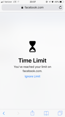
To pre-empt a wave of anti-screen sentiments among consumers, companies like Apple, Facebook, and Instagram are making it easier for users to break the addictive cycle of their apps and devices.
Apple’s latest iOS update, for example, allows iPhone users to limit the time they spend on certain apps and websites. When users reach the time limit, the software blocks the app or site.
The backlash against the most popular websites and the rise of “digital wellness” may result in challenges for businesses looking to attract people to their websites.
Jordan DeVries is UX director at BraveUX, a UX design company in Washington D.C. He believes digital wellness could lead to a decline in website browsing.
“Customers who might have come across your website in passing may not be there anymore,” DeVries said.
Still, he sees the potential for digital wellness to benefit businesses.
“On the other hand, customers limiting their time on, say, Facebook may be hungry to fill that void, leading them to sites they may not have visited otherwise,” DeVries said.
Customers who want to limit their time on websites and social media platforms may direct their attention to other sites, opening an opportunity for businesses to expand their content’s reach.
Incorporating the top website features people want will help companies stand out in the increasingly limited time they get with people browsing online.

Consumers surveyed stated that they look out for these website features most when surfing the web.
People prefer websites that are easy to use and navigate.
Almost everyone (94%) believes easy navigation is the most useful website feature.
If visitors cannot find what they need, they will leave even if the content itself is strong. Menus, page layouts, and search tools have to make sense immediately.
Clear navigation also encourages people to stay longer. A search bar at the top of the page helps them locate answers without needing to dig. Breadcrumbs, the small links that show where you are within a site, let people backtrack easily. These details make a site feel structured and predictable.
For B2B buyers, navigation can determine whether they keep exploring or move on. Someone reviewing agencies may have only a few minutes between meetings to check services, pricing, or past work. If those details are buried, the chance to connect with that buyer is lost. Putting case studies, service pages, and contact options in obvious locations makes it easier for prospects to continue evaluating.
Even large websites like Amazon prove that a high volume of content does not have to be overwhelming. Their layered menus and strong search tools let people go straight to what they want. B2B companies can take the same approach by keeping menus simple, giving buyers direct paths to key resources, and making the next step clear.
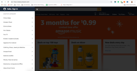
On its homepage, Amazon presents options for users to navigate and explore the site. By making menus easy to access and darkening the rest of the screen, people can focus on shopping categories and bypass the tempting offerings on the home screen.
Businesses should follow Amazon’s example and prioritize functionality and navigation for their users. Not doing so could mean losing potential customers.
Trendy web design elements can attract your target audience to your site. Beautiful and appealing designs enhance website content and establish a good reputation for your brand.
In the Clutch survey, most people (83%) think that a beautiful and updated appearance on a website is useful.

A modern look matters, but design only works if people can still find what they need. When a trend complicates navigation, visitors are more likely to leave.
Flat design, skeuomorphic design, and rich design have all shaped websites in recent years. Flat design relies on clean, two-dimensional shapes and bright colors. Skeuomorphic design copies the look of physical objects, while rich design adds depth and tactile cues. Each approach has strengths, but none works well if users cannot tell what is clickable or important.
For B2B buyers, design is more than appearance. A site that feels dated can raise questions about a company’s attention to detail. On the other hand, a site that hides menus or labels for the sake of a trend can hinder the buyer’s progress. Professional service firms often gain more trust with simple layouts, clear fonts, and enough white space to guide the eye.
Flat-ish design blends the clean look of flat design with the usability cues found in rich design. It keeps simple shapes and colors but adds small details such as shadows, gradients, or rounded corners so that users can still tell which buttons, links, or forms are interactive. This balance allows a site to look modern while remaining easy to use.
Clutch’s survey found that 50% of users won’t return to a website if the content is irrelevant, which puts content at the center of how people judge a company online. Design might get someone to a page, but it’s the quality of the content that will truly shape credibility.

For B2B companies, content needs to provide knowledge that is trustworthy — with proof. Clear product/service descriptions, case studies with data, and blog posts help potential clients weigh their options. A company website that demonstrates examples of past work, educates potential customers, and shows measurable outcomes helps guide buyers through their decision-making process.
User-journey mapping helps teams place this content where people expect it. A first-time visitor might start with an overview of services. Someone further along will want pricing details or client references. Structuring pages around these steps saves buyers time and builds trust.
Content planning should happen during design, not after. Teams that leave placeholders often end up with layouts that do not fit real material. Sharing draft articles or service pages during design ensures the final site reinforces the company’s message. That approach keeps the focus on information that matters and helps establish authority across the site.
Clutch’s survey found that 91% of people value both product descriptions and visuals when they visit a site. Buyers want to see the details in writing and confirm them with images. Relying on one without the other creates an incomplete experience .
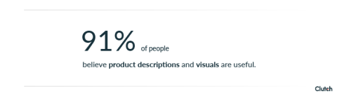
Text explains what a company offers, from service breakdowns to technical specifications. Visuals show how that offer works in practice. A B2B agency might list service tiers alongside screenshots of recent projects. A manufacturer might provide dimensions in text and then show the product from multiple angles. When both are present, visitors have the context they need to make informed decisions.
Layout plays a big role in how people take in this information. Pages that crowd text and images together can feel overwhelming. White space helps separate elements so users can scan quickly. Large images paired with short paragraphs make content more approachable without diluting the message.
Mobile use raises the stakes. On smaller screens, long paragraphs and stacked visuals can slow people down. A mobile-friendly layout typically includes one image per row with a concise description and a clear action. That way, users on phones and tablets get the same clarity and focus as desktop visitors.
Calls to action turn visitors into leads by showing them the next step. Instead of leaving a user to guess where to go, a CTA button or link gives a direct instruction. Common examples include “Request a Demo,” “Download the Guide,” or “Contact Sales.” Clear wording tells buyers what they can expect when they click, which reduces hesitation.
Placement matters as much as phrasing. CTAs that appear near service descriptions, case studies, or pricing pages meet visitors at the right moment in their research. A well-placed button on a B2B site might invite a prospect to book a consultation right after they read about a specific solution. If CTAs are buried at the bottom of long pages or hidden in drop-downs, the opportunity to capture interest is lost.
Design also plays a role. Buttons need to be visible without overwhelming the rest of the page. Consistent colors, enough white space, and concise text make CTAs easy to spot and act on. The goal is not more buttons, but strategic placement that supports user intent.
CTAs guide B2B buyers through the funnel by offering a path for every stage. Someone in the awareness stage might be drawn to “Learn More.” A prospect comparing options might want to “Download Case Study.” A ready buyer will look for “Schedule a Call.” Mapping CTAs to these stages helps companies support buyer decisions from discovery to conversion.
With most people now browsing on their phones, mobile responsiveness is no longer optional. A site that looks polished on a desktop but clunky on a smaller screen risks losing users before they read a single line of content. Responsive layouts that adjust to different devices keep the experience consistent and accessible.
Steve Vest, senior user experience designer at Small Footprint, notes that small choices make a site easier to use. White space helps separate content so pages are easier to scan. Large images combined with that spacing break a page into natural sections. On mobile, the same ideas apply but with tighter constraints. Menus should collapse into a simple bar, and layouts should rely on one column instead of multiple for better readability.
Touch-target sizing is another mobile-first practice. Buttons and links that are too small or packed together frustrate users on touchscreens. Spacing them properly and testing across devices reduces errors and creates a smoother experience.
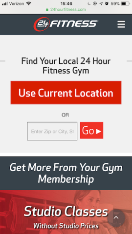
A clear example comes from 24 Hour Fitness. On its mobile homepage, the company limits visuals to one large image, places a menu bar in the corner for navigation, and highlights a single form where users can find the nearest gym by entering a zip code. This pared-down, responsive layout delivers what users need without distractions.
Security and reliability are no longer background concerns. They shape how buyers judge a company online. Sites that ignore these areas risk damaging credibility instantly.
SSL/TLS certificates are the baseline. Modern browsers alert users when a site is not secure, and that warning can be enough to end the visit. Data protection rules raise the stakes further. In Europe, GDPR compliance now drives major spending, with mid- to large-size firms reporting average costs of about $1.3 million according to Clutch’s State of Web Design in 2025. That figure shows how central privacy has become to digital trust.
Reliability also depends on compatibility and backups. A site that fails to load properly in Safari or Firefox sends the wrong signal about attention to detail. Regular cross-browser testing helps catch issues before buyers do. Backups are equally important. Automated systems and offsite storage reduce downtime and protect content if something goes wrong.
Accessibility is now part of the same conversation. Clutch’s State of Web Design in 2025 found that 96% of sites fail WCAG checks, and more than 4,600 lawsuits were filed in 2023 alone. Buyers expect compliance, and legal action shows what can happen when companies fall behind. Adding accessibility and reliability features is not just a safeguard — it is a way to show professionalism and readiness to work with serious clients.
Once visitors land on a site, they look for ways to connect. Clear contact details are the simplest sign of trust. A phone number, email address, and office location show that a company is real and reachable. Hiding these details behind multiple clicks adds unnecessary friction when trust is most fragile.
Real-time support can make the difference between a bounce and a lead. Chatbots or live chat provide quick answers to common questions, especially for prospects comparing multiple providers. A chatbot can handle simple requests like pricing ranges or service hours, while live chat gives buyers a direct line to a sales or support team when they are ready to move forward.
Feedback forms are another way to keep the conversation going. Short, focused forms let companies capture questions or concerns without demanding too much time from the user. Responses can inform both sales follow-up and site improvements.
Simplified login and registration flows also matter for companies with gated content or client portals. Long, multi-step processes deter users who just wanted to download a white paper or case study. Streamlined forms, social login options, and clear password reset tools reduce drop-offs and keep engagement high.
Personalization adapts content to match who the visitor is and what they do on a site. For B2B firms, that can mean showing different calls to action for new visitors and returning ones, or recommending resources based on pages already viewed. The purpose is to match content with the stage of the buyer journey.
Analytics provide the signals that make personalization possible. Tracking clicks, time on page, and completed forms shows where users engage and where they drop off. Dashboards bring this information together so teams can see patterns clearly and decide what to adjust.
When these tools work together, websites become more responsive. A visitor who reads several case studies might see an invitation to schedule a consultation. Someone still browsing service pages could be offered a downloadable guide or checklist instead. Measuring how users respond to these variations allows companies to refine their approach over time.
This process removes guesswork. Instead of redesigning based on preference or opinion, teams rely on data. The result is a site that feels more relevant to buyers and provides stronger engagement across the funnel.
An About Us page is often one of the most visited sections of a B2B site because buyers want to know who they might be working with. A strong page does more than recap company history. It explains the mission, introduces key team members with their credentials, and highlights verified reviews or case studies from past clients. Putting these elements together gives prospects a clearer picture of the people and values behind the business, building trust early in the buyer’s journey.
To make these insights easy to scan, add a table that compares each feature (navigation, design, content, visuals, calls to action, mobile responsiveness, technical trust, support tools, personalization, social media, blogs, and the About Us page) by its impact on engagement, SEO, and conversion. A side-by-side format helps readers quickly see which features influence user experience the most and where to focus resources.
No website feature is free of trade-offs. A page that loads quickly often achieves that by cutting back on large videos or design effects. That helps with speed but may limit how rich the site feels. Personalization can add relevance for a visitor, but it requires collecting user data and handling it carefully. Blogs are valuable when they are active, yet an outdated blog can leave the opposite impression.
Compliance also sets boundaries. Rules such as GDPR require clear consent for cookies and transparent policies around data use. Accessibility standards expect basics like alt text, readable contrast, and navigation that works without a mouse. Security is part of the same picture. SSL certificates and reliable backups are now table stakes. Addressing these areas during the design process makes it easier to avoid problems later and gives buyers more reason to trust the company.
Clutch’s survey highlights the features that matter most for today’s users: navigation, content, and design all remain the foundation of a good site. Visuals and mobile layouts strengthen the experience, while security, compliance, and clear support options build trust. When all of these features work together, companies can create a website that feels both credible and easy to use.
For B2B firms, this is about winning the trust of the buyer. Your website is often the first step in the evaluation process. If your website is reliable and the messages are clear, it signals to your client that you will be too. Companies that prioritize the features people value most put themselves in a stronger position to engage decision-makers into buying.
Clutch’s survey found that navigation, design, and content are the top priorities for users. For decision-makers, these features signal whether a provider can communicate clearly and make information easy to access. Visuals, calls to action, and mobile layouts also carry weight because they affect how quickly a buyer can evaluate services. Together, these features reduce friction and help buyers compare options with confidence.
Usability and transparency play a direct role in vendor selection. A site that makes service details, case studies, and contact options easy to find builds trust during the evaluation process. Clear calls to action and support features show that the provider is ready to engage. When buyers encounter broken links, slow load times, or missing information, they are more likely to question the firm’s reliability.
Small companies can start with the basics: clear menus, updated content, and consistent contact information go a long way and cost very little. Free or low-cost design templates and affordable SSL certificates cover many needs. As budgets grow, more advanced tools — like live chat or personalization engines — can be added step by step. The key is to make early changes that improve usability right away, then layer in extras over time.
Websites work best when they are reviewed on a regular schedule. Many firms do a full check once a year, but analytics can point to updates sooner. If reports show that users are leaving forms unfinished or bouncing from key pages, it may be time to adjust navigation, content, or layout. Technology changes also drive reviews. New browser versions or updates to privacy rules can create issues if a site is not kept current.
Some protections are now standard. Every site should run with a valid SSL certificate and have a system for regular backups. Clear privacy notices and basic data-protection policies are also expected. For firms that handle sensitive data, secure login tools and clear encryption practices add another layer. These measures reassure buyers that the company takes security seriously and reduce the risk of disruptions.
Clutch surveyed 612 people from the U.S. who visit at least five websites a day.
Sixty-three percent (63%) are female, and 37% are male. Survey respondents varied in age:
Sixty-five percent (65%) of respondents browse on Chrome, 18% use Safari, 5% use Firefox, 1% use Internet Explorer, and 10% use something else.
Respondents were from the Midwest (23%), Northeast (15%), South (41%) and West (19%).