Social Proof Placement: Where to Put Reviews, Ratings, and UGC for Maximum Conversions
Where you should be placing customer reviews, ratings, testimonials, and UGC to actually move the conversion needle — from the homepage to the product...
Updated May 27, 2026

Every website is composed of different parts or elements, including headers, navigation menus, images, videos, calls-to-action, and various content sections. These parts of a website shape how visitors interact with your content, influence user experience (UX), and directly affect search engine optimization (SEO).
When you consider that 81% of retail shoppers conduct online research before they buy, just having a functional website with a homepage isn’t going to cut it. Your website needs to be fast, attractive, useful, and well-designed. Each web page and various parts of the website all play a role in guiding visitors, improving engagement, and driving conversions.
This guide walks you through the 14 most important parts of a website page, why they matter, and how you can strengthen these various website parts to benefit from each:
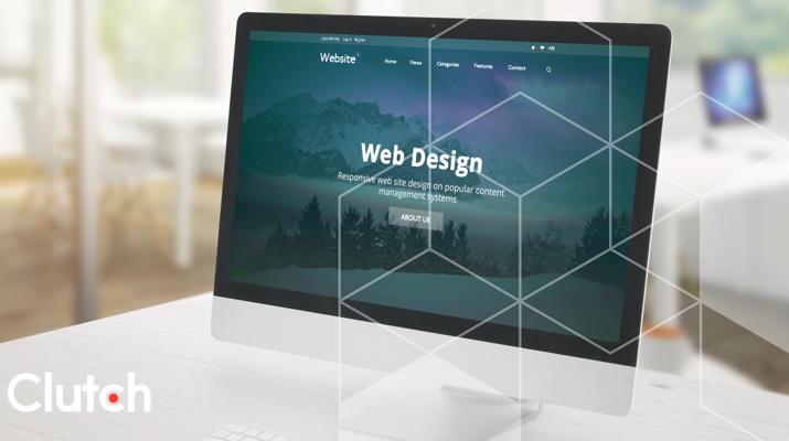
Looking for a Web Design agency?
Compare our list of top Web Design companies near you
Read on to find out which parts of a website design are important to your company's online success.
The homepage is the entry point for most site visitors and sets the tone for the entire website. It’s your front door, so to speak. A cluttered homepage can overwhelm and confuse, while a structured homepage helps visitors orient themselves so they can take action.
An effectively structured homepage typically includes a hero section with a headline, subhead, and call-to-action, along with streamlined navigation that helps users quickly find what they need.
Additional homepage elements can include featured highlights such as product or service overviews, testimonials, or case studies. These act as decision-making triggers, reinforcing credibility and nudging visitors toward conversion. For e-commerce, this could be a featured product grid; for a SaaS platform, it might be a demo request or free trial banner.
Every element on the homepage should serve a purpose by building trust, reducing friction, or guiding users toward the next step.
Above-the-fold content is the first thing users see without having to scroll, making it one of the most valuable areas of real estate on a webpage. This space is crucial for engagement, bounce-rate reduction, and SEO signals like dwell time.
When it comes to maximizing this valuable webpage space, keep these best practices in mind:
Navigation is key to an effective website strategy: Studies and statistics show that web pages with poor navigation elements or no navigation tools are more likely to make users “bounce”, i.e., leave the site without visiting any other pages or sections.
The most important website navigation tools and elements you can implement include:
| Navigation Tool | Function & Importance | Do’s | Don’ts |
| Main Menus | The primary roadmap for your site, helping visitors quickly understand and find key pages. Crucial for usability and SEO crawlability. |
|
|
| Dropdowns | Groups related pages under a single parent link, reducing clutter in main menus and guiding users into content. |
|
|
| Sidebar Patterns | Provide secondary navigation for sections like blogs, knowledge bases, or e-commerce filters, helping to browse large content sets. |
|
|
| Micro-Navigation Utilities | Small but essential links to important functions, like search, login, cart, or language toggles, that improve accessibility and usability. |
|
|
Etsy, for example, has a clear, distinctive search box at the top of every page, easily accessible for visitors to use.
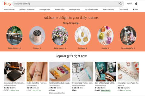
Source: Etsy
There's also a menu across the top of the page with different categories, letting users quickly and easily jump from one section of the site to another.
Your webpage's title and headers announce what the page is about, providing clear, direct information to the user:
On-page section headers provide content organization and hierarchy, easing readability and scanability. Ranging from the H1 (the overarching title) all the way down to H6, (the smallest/lowest subsection), these titles are like your page/content outline, following a logical, sequential order. Apply them based on your content structure and never skip levels (e.g. going from your H1 main title and then suddenly down to an H3 sub-point).
Backlinko, for example, effectively leverages headers to clearly communicate the subject matter of its content.
Source: Backlinko
Besides helping users navigate and find content, titles and headers can also help search engines (and therefore SEO) through title tags.
Title tags are HTML code applied to web page titles, making them clickable headlines that appear in search engine results and the browser tab. They tell search engines what a page is about, directly influencing rankings and click-through, making title tags some of the most important on-page SEO elements. Optimize title tags by keeping them under 60 characters so they display fully, place the most important keywords near the beginning and avoid keyword stuffing or repeating, and make each title unique to its page. Including your brand name at the end can also strengthen recognition without distracting from the core message.
Hire a web development company to help build different parts of your website.
Breadcrumbs function much like a website’s navigation menu, showing site visitors where they are located on your website.
These location-based breadcrumbs can be used to navigate from one page to another within the website, following the site’s hierarchical structure. For example, a breadcrumb trail on a consumer electronics website might look something like this: “Home > Electronics > Televisions.” This shows the site user their path from the homepage to the web page displaying TVs for sale.
Besides providing a navigation path, breadcrumbs can display the “attributes” or characteristics of a particular web page and the items on it. For example, “Home > Electronics > Televisions > 4K TVs > Sony” narrows the items displayed on the web page to 4K TVs made by Sony. These attribute-based breadcrumbs are primarily used on e-commerce sites.
Both location- and attribution-based breadcrumbs also help Google “navigate” your website. Implementing schema markup, like “BreadcrumbList,” communicates your site’s structure to search engines, helping them interpret and better understand the relationship between your site’s web pages, making connections between website content and your business details. This positively influences website authority to strengthen SEO and improve site visibility in relevant search results.
Every web page needs to feature substantive website content. If it's a blog page, for example, the body content of the page will be the main text that makes up your blog posts. On a product or service page, you may have some body text describing its value or introducing visuals.
Besides being relevant, this content/copy should also be readable, helping site visitors easily absorb and act on the information provided. Clear, well-structured text (e.g. short paragraphs, descriptive subheadings, bullet points, and plain language) keeps users engaged, improves accessibility and skimmability, and reduces bounce rates. It can also help SEO and boost rankings, as search engines favor content that demonstrates strong user engagement signals.
Body content is also crucial to your site's SEO. 75% of users never navigate past the first page of Google search results, demonstrating the value of using body content to directly answer search queries and target valuable keywords.
In targeting keywords, avoid keyword stuffing that overuses keywords. Instead, keywords should be a natural part of the content, integrated strategically into key areas like the title tag (H1), headings (H2, H3), the introduction, meta description, URL, and image alt text. Keywords should signal relevance to search engines, while maintaining readability for users, providing genuine content value.
Website images and videos are important for capturing attention, breaking up text, and keeping visitors engaged so that they explore more website pages. High-quality photos and videos make content more relatable and appealing, helping you better connect with audiences, especially younger users who expect visually rich experiences.
This means you need to optimize visuals for the best performance and user experience. Images and videos that load quickly improve user experience, lower bounce rates, and can even boost search rankings. Compressed file sizes, responsive formats, and proper alt text ensure media enhances engagement rather than slowing the site down.
For example, Nectar features a visual breakdown of its main product – mattresses – with interactive elements that allow the user to learn more about each layer of the mattress and the overall design.
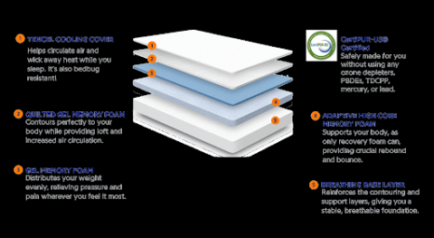
Source: Nectar
When combined with small snippets of text to explain the image, this visual representation of the product becomes both engaging and informative.
Images and videos can create a user-friendly website layout that attracts all types of users to your platform. Ensure they’re accessible to all users through the proper use of alt text, written text that clearly describes and explains an image's content and function.
Alt text helps maintain the user experience, displaying image information even if an image fails to load or can’t be seen by the user. Screen readers read alt text aloud to describe images and convey their meaning, making it crucial for website accessibility. It also supports SEO by giving search engines context about what an image represents, helping visuals appear in search results and driving additional traffic. Effective alt text should be concise, descriptive, and relevant without keyword stuffing.
Calls-to-action, or CTAs, are crucial parts of your website because they enable site users to take the next step with your business, move into your sales funnel, and, hopefully, convert from website visitors to customers.
CTAs are commonly placed on buttons and use clear, action-driven phrases like “Start now” or “Buy yours.” The most effective CTA buttons stand out visually so website visitors can’t miss them. Think bold buttons driving users toward a specific action and clearly indicating what will happen when the button is clicked.
Clear, action-oriented language in CTAs guides visitors and reduces drop-offs. If the CTA is vague or the button design doesn’t stand out, users are likely to scan past it, leading to lost conversions. Strong, direct verbs like “Sign Up,” “Start Your Free Trial,” or “Get Quote” set clear expectations and encourage immediate interaction.
Forms tied directly to CTAs are the most effective and work best when they’re simple, intuitive, and focused only on the information needed. Best practices include keeping fields minimal, labeling them clearly, ensuring accessibility, and placing a prominent CTA button that tells users exactly what will happen next. Streamlined forms not only improve completion rates but also create a smoother user experience that builds trust.
9. Blog Component
Blog pages are for content marketing, SEO growth, and customer engagement. Adding a blog component to your website can help attract organic traffic with content that answers common questions and showcases expertise.
Each post should follow a clear structure: headline, introduction, scannable subheadings, supporting visuals, and a call-to-action at the end. Internal links to related posts or product pages help distribute traffic and authority across the site, strengthening SEO.
Your blog publishing frequency is key. Consistent posting (whether weekly or monthly) builds trust with readers and signals freshness to search engines. Old, outdated blogs erode credibility.
Broken or missing links happen, and when they do, a 404 page displays to site users. This can be annoying and embarrassing, but instead of showing a generic error message, a custom 404 page can guide users back to relevant content, protect SEO value, and provide a branding opportunity.
When it comes to site SEO, 404 pages ensure broken URLs don’t pass negative signals. For UX, they reduce bounce risk by giving visitors options to continue exploring.
Effective 404s include brand-consistent messaging, search functionality, and links to popular pages like the homepage, blog, or contact page. Adding a touch of persona
Your domain name is your digital address, and its structure influences brand recall and SEO. A clear, short, keyword-relevant URL (e.g., “example.com/services”) improves usability and ranking potential.
Hosting quality also matters. Speed, uptime, and server reliability directly affect both search visibility and user satisfaction. A site that’s frequently down or slow to load risks losing trust and conversions.
When choosing hosting, evaluate uptime guarantees (99.9%+ is standard), scalability options, and security features like SSL certificates. A strong foundation here ensures your website can grow without bottlenecks.
Accessibility ensures that all users, including those with disabilities, can fully interact with your site. It’s a legal consideration but also a usability and inclusivity best practice.
Key techniques include using Accessible Rich Internet Applications (ARIA) markups for screen readers, making interactive elements keyboard navigable, and applying Web Content Accessibility Guidelines (WCAG) to ensure your website is readable, understandable, and navigable for all users.
Ensure website accessibility with this checklist:
Google’s Core Web Vitals measure real-world user experience and website performance based on three key metrics. Focus on these performance metrics to improve your website’s Core Web Vitals score and, ultimately, Google search rankings.
| Metric | What It Measures | How to Improve |
| LCP (Largest Contentful Paint) | Loading performance | Optimize images, use a CDN, enable lazy loading |
| FID (First Input Delay) | Interactivity | Minimize JavaScript, defer non-essential scripts |
| CLS (Cumulative Layout Shift) | Visual stability | Set image dimensions, reserve ad space, use font-display swap |
Monitoring these metrics with tools like PageSpeed Insights or Lighthouse ensures your site remains fast, interactive, and stable across devices.
Most internet users browse websites via their smartphones. Designing your site as mobile-first ensures accessibility and usability across all devices.
Mobile-first means starting with a simplified mobile layout and progressively enhancing it for larger screens. This responsive design adapts a single content layout to multiple screen sizes fluidly, whereas adaptive design uses predefined fixed layouts tailored for specific screen sizes. While adaptive design provides greater UX control, responsive is preferred for easier scalability and its SEO benefits.
Follow this checklist to ensure mobile responsiveness:
Building an effective website doesn’t mean you have to have all of the most important parts of a website at once. Instead, identify and implement the page elements that align most closely with your business goals and improve them systematically.
Start with foundational pieces like homepage structure, navigation, and above-the-fold content, since they influence first impressions and bounce rates the most. Then, refine technical aspects such as Core Web Vitals, hosting performance, and mobile responsiveness to ensure a smooth, consistent experience across devices. Use analytics to track which areas of your site drive results and prioritize updates accordingly, such as improving your 404 page to retain visitors, adopting structured data for better visibility, or enhancing your blog for SEO.
By approaching each website element with intent, you’ll not only create a stronger user experience but also support long-term growth.
Effective homepage structure should contain and highlight key sections, including hero section, navigation, value highlights, and trust signals like testimonials or case studies. Each of these sections or zones should move visitors closer to a decision by showcasing benefits, reducing friction, and offering clear next steps.
Above-the-fold optimization starts with a clear, benefit-driven headline supported by an engaging image or video. An accompanying CTA (e.g. “Get Started,” “Book a Demo”) should appear before site visitors can start scrolling. Image compression and efficient code can reduce load times, impacting Core Web Vitals and SEO rankings.
Include common schema types: Organization (brand identity), Breadcrumb (site hierarchy), Article (blogs and news), and Product (e-commerce listings). Keep markups consistent with visible content for better indexing and enhanced SERP features and test with Google’s Rich Results Test.
A mobile-first site begins with responsive design, which uses fluid grids and images to adjust the content layout based on screen size for a consistent user experience across all devices. This offers greater scalability over adaptive design, which typically uses fixed layouts based on specific screen sizes.
Tap target standards for interactive elements (e.g. buttons and links) should be at least 48 x 48 pixels (px) to allow for accurate finger tapping without inadvertently hitting adjacent elements.
Use testing tools like Google Mobile-Friendly Test or Chrome DevTools to validate layouts and interactions on multiple devices.
Google’s Core Web Vitals measure real-world site performance based on three main metrics: LCP (loading speed), FID (interactivity), and CLS (visual stability) They strongly influence both rankings and user satisfaction as slow loads, delays, and/or shifting layouts frustrate website visitors. \
Optimizing images, reducing JavaScript, and reserving layout space for ads and media can improve performance and Core Web Vitals scores.