Web Design Trends That Convert
Boost your website’s conversion rates and engagement with these top 2025 web design trends.
Updated May 29, 2026

Improve your marketing and ad campaigns with high-quality landing pages. Follow these tips to create effective landing pages that convert.
It takes only a few milliseconds for a user to form a first impression, and first impressions are everything in business and sales. To convert customers, these first impressions are vital. This is why digital marketers and web designers leverage landing pages to improve the success of their campaigns.
A landing page is the web page that a visitor “lands” on after they click on an ad or link. They are standalone pages that are specifically designed to support a marketing or advertising campaign with the goal of converting visitors to leads or customers.
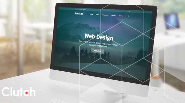
Looking for a Web Design agency?
Compare our list of top Web Design companies near you
So why should you create a landing page for your campaigns? Can’t you just use an existing page on your website?
The truth is that your homepage likely isn’t the best at converting customers. Effective landing pages include targeted messaging and images that are more likely to convert users than existing pages on your website.
To get the most out of your campaign efforts, creating eye-catching and persuasive landing pages are essential.
Use these landing page tips to get the most out of your digital marketing efforts.
While it may be tempting to use one landing page for all of your marketing efforts, the best way to convert users is to focus on just one offer. This can be anything from a discount or a specific product offering to a lead capture form.
By focusing on just one offer, companies can target specific audiences more effectively and have a stronger impact.
Your landing page should have one clear call-to-action and include messaging to encourage users to complete that action.
When a user clicks on an ad or a link, they have certain expectations largely due to the content they clicked on. Whether it was a link in an email campaign or a search ad, the user wanted to learn more for a reason. Make sure you deliver.
To increase conversions and prevent users from clicking away, it’s important for the messaging on the landing page to match the rest of the campaign. Otherwise, visitors to your page may be confused or disappointed by the landing page.
For instance, if a development company starts an email campaign to promote their artificial development services, but the landing page highlights the company’s app development portfolio, users will be more likely to click away after initially going to the landing page.
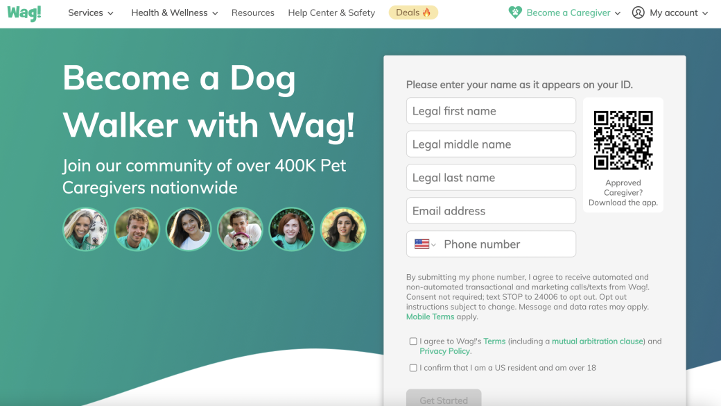
Headlines get more attention than any copy on the page and, as a result, are an important part of communicating with viewers.
It is the first thing that a viewer will see when they come to your landing page, so capture their interest quickly to prevent them from clicking away.
In just a few words, you should be able to appeal to viewers by outlining the benefits of the services or product you’re promoting. Highlight points that mean the most to viewers. Not sure what that is? Test it by launching several landing pages with different messaging to see which performs best.
The ‘fold’ refers to where the browser window ends, cutting off what users can see on the page before scrolling. Content that is above the ‘fold’ of a website is immediately visible when a visitor lands on the page, whereas content that is below the fold requires scrolling.
The content above the fold is the first thing that visitors see when they land on a webpage and, therefore, is essential to capturing your audience's attention. Generally, users only spend a few seconds on a web page, so it’s important that you keep your call-to-action (CTA) at the top of the page.
CTAs guide users towards desired actions, such as making a purchase, signing up for a newsletter, downloading an app, or engaging with content — essentially, the purpose of your landing page.
Users are more likely to notice and act on CTAs that are prominently displayed in their initial view, increasing conversions and achieving your desired outcomes.
Pro Tip: CTAs with these design elements are more likely to catch your audience’s attention and convert them:
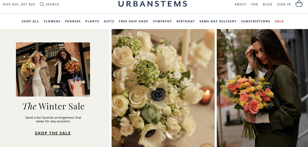
Images are absolutely necessary for your web design. In addition to making your landing page look more appealing, high-quality images and videos are persuasive tools. Haven’t you heard an image is worth a thousand words?
If you’re trying to promote a product, this is the perfect opportunity to highlight quality photos of your offerings. Service providers, however, can showcase their portfolios, add client testimonials, and more to capture their audience’s attention.
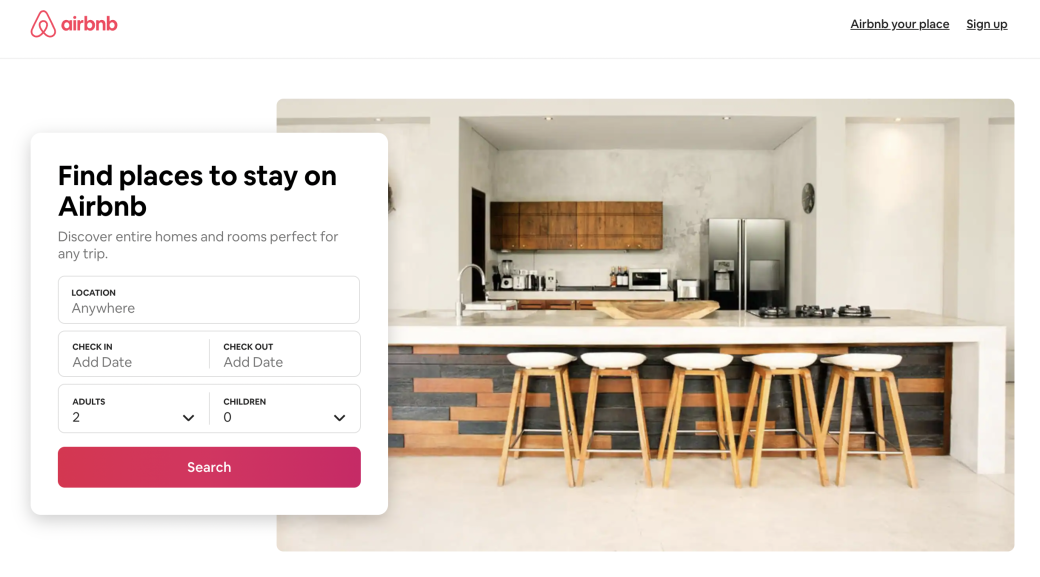
As discussed, landing pages should be developed with a singular goal. Navigation features, exit links, and other CTAs simply increase the likelihood of users clicking away from the landing page.
To get the most out of your landing page, let it stand alone.
While it’s tempting to add links to your homepage and other distractions, your landing page will perform better and have a higher conversion rate if you exclude them.
Copy is important because it effectively communicates with users, builds your brand, persuades potential buyers, helps your business connect emotionally with clients, tells stories, improves search visibility, and drives customer actions.
However, that doesn’t mean that you need to add a lot of text to your landing page. In fact, you should do just the opposite.
Using clear and concise language to ensure your message is easily understood by your audience. You can break up your copy into shorter paragraphs, use bullet points, subheadings, and formatting techniques to make it easy for readers to scan and find the information they need.
Finally, be sure to test your landing page – first when launching to make sure that the page is operational, then again later. A/B testing can help you identify ways to improve your landing page and increase conversions.
A/B testing, also known as split testing, is a method used to compare two different versions of a webpage. It involves dividing your audience into two groups and exposing each group to a different version (A and B) of the content. The goal is to identify which version generates a higher conversion rate, click-through rate, or desired outcome.
For instance, you can test multiple headlines or different images to determine which one is more likely to get a user to click on your CTA. This data can inform your decision-making and help you appeal to your audience more effectively.
By building a unique landing page for your campaign, you can increase your conversion rate significantly.
To get the most out of your efforts, be sure to focus on just one goal. Then, ensure that your copy and images help inform users about your primary offering. Benefit-driven headlines, relevant images, and prominent CTAs can drive buyers to convert. Finally, be sure to test your landing page regularly to improve your campaign.
With these tips in mind, your landing pages will help you attract potential customers and generate leads.