
The Real Cost of Your MVP in 2027
AI made code cheap, but not software that holds up. See how MVP cost drivers have shifted and why human validation and taste are now what you’re really...
Updated August 19, 2026

When building a website or program, having a user interface (UI) specifications document ensures that all the essential elements are included and that they operate as intended. This blueprint will also prevent errors that may be difficult to correct after launch.
A UI specifications document (UI spec) tells developers exactly how every screen in a product should look, behave, and respond to user input. It bridges the gap between a designer's vision and a developer's implementation — reducing back-and-forth, catching errors early, and keeping everyone aligned before a single line of code is written.
This guide covers what goes into a UI spec, the design principles that should inform it, and a step-by-step process for creating one.
Looking for a Software Development agency?
Compare our list of top Software Development companies near you
A UI specifications document is a written blueprint that describes the visual and functional requirements of a user interface. It defines the layout of each screen, the rules for how elements display, and how the system responds to user actions.
UI specs sit between wireframes and development. Wireframes show rough layout. UI specs add the detail: what happens when a user hovers over a button, what error message appears when a form field is left blank, what text label goes on each icon.
Product managers, UX designers, and developers all use UI specs to stay aligned throughout a project.
A detailed UI specifications document makes it easier to develop a website or app because it specifies the elements and features that should be present, so the developer has a clear overview of what the website will look like as an initial mockup or template.
Without a UI spec, developers interpret designs on their own. Minor assumptions accumulate into major inconsistencies — and fixing those inconsistencies after development starts is expensive.
A detailed UI specifications document gives development teams:
The more complex the application, the more a UI spec pays off. Having a detailed description and layout of the web elements within a UI spec can help developers see where errors or problems may pop up. It also gives developers a better idea of how users will interact with the website or app.
Additional Reading: ‘UX Design vs Web Design: Key Differences’
A great web design can have a huge impact on your lean ecommerce brand or business’s credibility, the amount of time people spend on your site, and the likelihood they will make a purchase.
As a result, creating a beautiful website with an intuitive UI is essential to growing your business online.
In 1990, usability experts Jakob Nielsen and Rolf Molich established ten foundational principles for interface design — later expanded into Nielsen's 10 Usability Heuristics. These principles don't describe what to put in a spec document, but they should inform every decision you document there. A UI spec built on these principles produces interfaces that are intuitive and error-resistant.
Expanding on the eight golden rules of interface design, they determined 10 ways web developers can improve the usability of a website. Here’s what you need to know.
Read this: ‘Five Elements of UX Design’
Explore the ten UI specs that all developers should look for within a design system.
The system status should be highly visible and easy to understand. Users should quickly be able to understand system operations with little difficulty.
Additional Reading: ‘What are Annotated Wireframes & Why Use Them’
Information should be presented in a logical order. Concepts used should match user expectations and mirror real-world experiences.
Explore our directory of product design experts.
Redo and undo options as well as any backward steps allow users control and freedom. Ensure that any iterations have an ease of control within any points of interaction design for users.
Make sure that elements like graphics and terminology are consistent across all platforms. By following industry and internal standards, you can avoid confusion and potential issues, and it makes crafting your requirements specification much easier.
Error prevention involves eliminating and flagging actions and elements that may cause issues. When done properly, this reduces the chances of the user becoming frustrated while using the application.
Focusing on recognition over recall minimizes cognitive load. Employing easy to recognize elements makes it easier for users to navigate the page.
For example, a camera icon immediately tells the user that clicking on it will allow camera access and allow them to take a picture.

Source: Apple
Specific typography can also guide users through your design if they’re simple.
By streamlining the users’ workflow, you can enhance user experience.
Achieve navigation efficiency by using function keys, abbreviations, hidden commands, and so on. You can improve flexibility by offering customization options that allow users to tailor the interface to their needs and preferences.
Avoid clutter. Display only what is necessary and remove other unnecessary and distracting elements. Not only do they hinder the user from absorbing vital information, but they may also affect the speed of the page or application storage size.
Consequently, minimalism has become popular over the last few decades, especially in tech. It can be recognized by the use of skeuomorphic designs and white space.
Apple has led this design revolution by focusing on simplicity in their app design, layouts, and even their website.
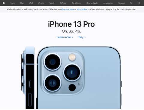
Source: Apple
Notice how the site uses white space to emphasize their newest product. At the same time, their horizontal bar menu makes it easy for users to find the information they're looking for on the Apple website.
State error messages in simple language. Make sure each message explains what happened, how it happened, and what can be done.
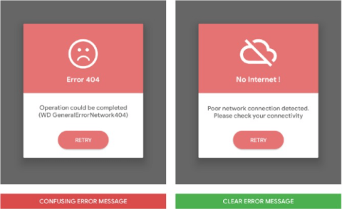
Source: UX Design
When possible, avoid using technical terms or too many acronyms. The text should help users recognize, diagnose, and recover from errors.
There are times when a user encounters a problem that may need a specific type of solution as well as documentation.
Ensure that users could easily locate the element or button should they require help. Instructions should guide users through each step to resolve the problem.
Each UI spec document should have the following elements to help use cases:
Following these elements will assist with usability testing.
Create a visual overview of the screen, specifically the layout for each page. It should show what a user will see on the completed website. A screen overview can be done on paper, a Word document, or other software.
Make sure to label each section clearly. Include a detailed description of the elements included in each section.
Display rules determine how elements are sorted and which are displayed at certain times. For example, only the dimensions of an item appear when hovering over an image. The page shows more details when the user clicks on the image.
Determine whether it would be helpful to include certain messages in certain conditions. Know what these messages would be and ensure that they would be clear and easy to understand.
Evaluate the included links, signs, and icons on the page. It should be clear where they lead to or what they do. Ensure their consistency, especially with signs and icons, to avoid confusion.
Specify font families, sizes, weights, and line heights for every text style used in the interface. Document your color palette with hex codes and define when each color applies: primary buttons, secondary buttons, error states, disabled states, and backgrounds.
For every interactive element — buttons, form fields, dropdowns, toggles — document all possible states: default, hover, focus, active, disabled, loading, and error. This is where most implementation errors originate. Developers who encounter an unspecified state will invent their own solution; that solution will be inconsistent across the product.
Not every screen requires a full UI spec. Prioritize complex screens with conditional logic, multiple user interaction paths, or edge cases. Simple static screens can be documented briefly. Trying to spec everything in equal depth slows teams down without improving the product.
Start with a wireframe or annotated mockup. Tools like Figma, Sketch, or Google Slides work here. The visual overview doesn't need to be pixel-perfect — it needs to show layout and component placement clearly enough that a developer can build from it.
For each element on the screen, answer: when does it appear? When is it hidden? What triggers a state change? Write these as explicit conditional rules, not design assumptions. "Show the error state when the field is left blank on submit" is a spec. "Handle errors appropriately" is not.
Include every piece of text the user will see: labels, placeholder text, error messages, success messages, empty states, tooltips, and helper text. Writing copy in the spec catches missing content before development starts — not during QA.
Document where every link goes and what every icon does. Note any icons that need labels for accessibility. Specify navigation behavior: does clicking a button open a modal, navigate to a new page, or trigger an inline action?
For every button, form field, dropdown, and interactive component, list all states and what they look like. Reference your design tokens or style guide where they exist. If a state isn't specified in the doc, assume it won't be implemented consistently.
A UI spec is only useful if it reflects what the team has agreed to build. Walk through the spec with developers, designers, and the product manager before handing it off. Resolve ambiguities in the document — not in Slack threads during development.
Understanding your user’s needs and expectations is the most important aspect of creating a UI specification document. A website or program need not be complicated for it to be effective. A simple, easy-to-navigate page is more appealing than a complicated and confusing one.
When making a UI specification asking whether an element is essential before thinking of including them is a good practice. Focus on including functional requirements before adding non-functional ones. Avoid the use of complicated terminology, especially when it comes to instructions and guidelines.
Teams that have a UI specification document in place will have seamless product management that will lead to successful, visually-appealing projects.
Additional Reading: