7 Tips For Designing Web Forms
Clutch surveyed 502 web users about what they actually want from form design. Here are 7 data-backed UX principles that reduce abandonment and improve...
Updated July 28, 2026

The B2B and B2C sales process is extremely different — and their web design should be too. This dives into the key differences between B2B vs B2C web design and what actually drives conversions.
Business owners often see a website redesign as just another branding exercise. But for companies selling to other businesses, that approach misses what actually drives conversions.
Unlike business-to-consumer (B2C) websites, which focus on driving quick purchasing decisions, business-to-business (B2B) websites need to support a longer, more complex buyer journey, one that may stretch over weeks or months and involve people who never even land on the homepage.
Looking for a Web Design agency?
Compare our list of top Web Design companies near you
This guide explains what makes the B2B buyer journey fundamentally different, how that affects B2B website design, and tips for building a solid B2B website that makes consumers want to work with you.
When you're marketing to consumers, the usual goal is to move someone from "interested" to "purchased" as quickly as possible.
But B2B is a different game entirely. You're speaking to multiple stakeholders, including end users, department heads, procurement teams, and sometimes even legal and compliance reviewers, each with different priorities and questions. You're also detailing specialized products or services, and building trust long before a prospect is ready to contact your sales team.
This complexity creates a unique challenge for web designers: How do you capture attention while educating visitors, demonstrating expertise, and providing the depth of information buyers need to evaluate options?
No matter how beautiful a homepage is, it will lose serious buyers to competitors whose sites build confidence if it doesn't answer buyers' questions.
This is why the visual playbook that works for B2C doesn't always work for B2B. A consumer site might rely on large product photos, promotional banners, personalized recommendations, and a streamlined one-click checkout, all designed to shorten the distance between "browsing" and "buying." A B2B site that tries to force the same urgency usually erodes trust, because buyers evaluating a potential vendor relationship aren't looking for a flash sale; they're looking for evidence that you understand their problem and can help them solve it.
So B2B web designers should prioritize content that helps buyers understand their products, compare vendors on the criteria that matter, and evaluate the risk of getting the decision wrong.
HubSpot is one of the clearest examples of how B2B companies should use content in their web design.
Instead of pushing visitors toward a "Contact Sales" button the moment they arrive, HubSpot's site is built around education and guided discovery, helping them understand problems and possible solutions through blogs, free templates, certification courses, interactive tools, and in-depth resources.
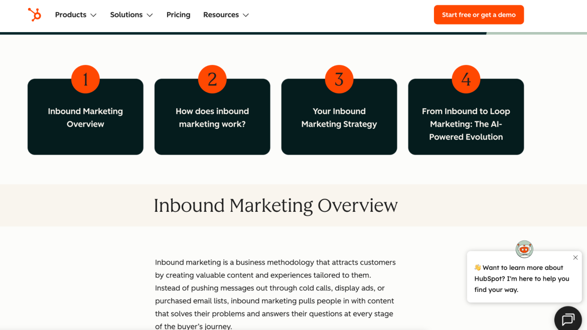
This content supports buyers at different stages of the journey, whether they're just starting to research a type of software or running a final-stage comparison between two or three finalist vendors.
For example, a visitor in the early research phase might land on an educational blog post, while a visitor closer to a decision might use a comparison tool or download a buyer's guide.
By meeting people at each stage with the right format or content, HubSpot reduces friction and addresses objections long before a salesperson ever gets on a call. Sales conversations that do happen are shorter and more productive because the buyer arrives already educated.
This doesn't mean B2B companies should copy HubSpot, though. The takeaway is that they should treat content strategy and information architecture as design decisions from the start, rather than bolting them on after finishing visual design.
Even though B2B website design places greater emphasis on content strategy and information than visuals, traditional design choices still matter for establishing credibility.
These choices refer to the foundational elements that shape how users experience a website, including typography, spacing, color, imagery, consistency, and visual hierarchy. While content plays a larger role in B2B purchasing decisions than it does in many consumer markets, these design fundamentals still affect whether visitors perceive a company as credible and professional.
This is especially important for B2B companies, because B2B buyers are often evaluating vendors they may rely on for years. Before speaking with a salesperson, prospects frequently use a company's website as an early indicator of its expertise and reliability. A confusing layout, inconsistent branding, or outdated visual design can unintentionally create doubts about the company's attention to detail, even if its products or services are strong.
Color is one example of how traditional design choices affect perception. According to a Clutch survey, 46% of consumers say blue is their favorite color to see on a website, making it one of the most widely preferred colors for business sites. Blue is also strongly associated with trust, stability, and reliability — exactly the qualities a buyer is trying to assess.
That same Clutch research found that 39% of consumers say color is the most important visual element of a website, and 21% will leave a site if the colors feel overwhelming or poorly chosen. In other words, color isn't a cosmetic afterthought; it's a factor that actively drives people away or keeps them engaged.
This is why the most effective B2B websites tend to favor restrained, professional color palettes, often centered on blues and neutral tones, to reinforce authority and dependability. However, color is only one part of the overall design experience.
Consistent typography, generous whitespace, and a clear visual hierarchy all make complex information easier to scan and understand, especially for enterprise buyers who often need to compare product features, review technical specifications, or evaluate case studies.
Similarly, consistent branding across landing pages, product pages, and resource libraries reinforces the impression of a well-organized company that pays attention to detail.
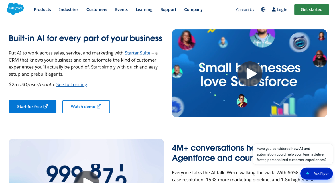
For example, Salesforce’s website uses a clean, professional design paired with a consistent blue color palette, reinforcing the company's emphasis on trust and stability.
Navigation deserves far more attention than it typically gets, especially for B2B companies that offer multiple products, services, or solutions across different industries or use cases.
Unlike most consumer websites, B2B companies rarely sell a single product to a single audience. A software provider, for instance, may serve clients across healthcare, manufacturing, finance, and government simultaneously, while offering separate solutions for IT teams, executives, and procurement departments. This means visitors often arrive on B2B sites with very different goals and expect navigation that reflects their specific needs.
Accordingly, B2B sites should organize navigation around customer problems or industries, so diverse visitors can quickly find what they’re looking for without digging through nested menus or guessing which category their need falls under. The longer it takes someone to find answers, the more likely they are to leave and continue their research with a competitor instead, especially when that competitor is only one open browser tab away.
Logical page hierarchies are also essential for B2B websites with complex offerings. Instead of placing every product or service at the same level, create a clear structure that helps visitors understand how different pages relate to each other.
For example, a technology provider may organize its site around broader solutions, the industries it serves, specific products, and supporting resources so that buyers can move naturally from general information to more detailed research.
Search functionality gives visitors a dedicated way to find information across a website, typically through a search bar that scans pages, resources, documentation, and other content. By making important resources easier to find, search functionality reduces frustration and helps buyers continue their evaluation process with greater confidence, particularly for B2B companies with extensive resource libraries, technical documentation, or multiple solution pages.
Finally, internal links are valuable because B2B buyers often need to review multiple types of information before making a decision. For example, someone who discovers a blog post through search may then explore a related case study, review pricing information, or download a buyer's guide before contacting sales. By connecting these resources through relevant internal links, companies can encourage visitors to continue their research on the website rather than returning to a search engine or a competitor's site.
Ultimately, an effective B2B website isn't measured by how it looks in a portfolio. It's measured by how well it supports the way real buyers evaluate solutions. This means designing around trust, clarity, and the long, multi-stakeholder path that enterprise purchases take:
When those elements work together, a B2B website goes from being a static brochure to what it should be: a tool that actively drives buyers to work with you, not just browse your site.