
How to Build a UX Strategy That Drives Real User Engagement
A UX strategy is a long-term plan for creating user-friendly digital experiences by aligning design, content, and technology with business goals.
Updated April 10, 2025
As the online market continues to evolve, businesses need to invest more in understanding their users and creating products that actually matter to them. Earn a better ROI on your UX design with these tips.
Updated August 26, 2022
Many people mistakenly undervalue the importance of a great user experience (UX). Yet, a great UX design is essential for retaining users, attracting new customers, and improving your brand’s reputation.
Looking for a User Experience agency?
Compare our list of top User Experience companies near you
Therefore, UX design is the last place developers should cut back on spending.
Still, convincing company leaders to spend more on their UX design is tricky, especially because it’s difficult to measure the impact of a great UX.
This article will outline how to calculate the ROI of a UX design project and how you can get the most out of your investment.
Companies that have improved their UX design can calculate the return on their investment by taking the difference between new revenue and old revenue to calculate the increase revenue. Then divide the increase in revenue by the cost of the investment to get the ROI. After that, they should multiply the result by 100 to get a percentage.
ROI= (Revenue Increase /Cost of Investment) x 100
For example, if an app development company invested $1,000 in redesigning their user experience, and they generated an additional $4,000 in revenue afterwards, they would calculate their ROI like this:
ROI= (4,000/1,000)x100
ROI=(4)x100
ROI= 400% Increase
To maximize the potential of your website, focus your UX design strategy around your users and their needs. These tips can help you get the best ROI out of your UX design.
User-centric design means adding value to the user's life by offering beautiful solutions that solve their problems and serve their needs.
A beautiful solution not only empowers people but also evokes positive human emotions. Every second spent on your platform should make users feel more connected to your products and services.
A recent study shows that 70% of products fail due to lack of user acceptance. Businesses can avoid this by conducting tests that measure the website or app’s usability.
For example, when we were asked to design an app that aimed at empowering the farmers’ community, we had to develop a plan and think about how we would craft solutions for farmers. This app was conceptualized to help the Indian farmer community optimize their resources and maximize their yields and profits by utilizing the information and attributes provided on the app.

Farmrise informs farmers about the market price of their yield in their local and nearby markets and connects them directly with buyers, eliminating the need for middlemen. It acts as a one-stop solution for all their needs.
To create this mobile tool for farmers, we asked ourselves:
It took us three months to conduct intensive on-site research to gain a better understanding of the people who would be using the app.
Even though conducting this type of research and testing took time, it paid off and studies show that investing in usability testing can save up to 50% of wasted development time.
Here are a few design elements that can help you keep your users engaged.
Interactive interfaces are a hot topic among mobile app designers. In this approach, a mobile app interface should provide meaningful experiences based on key concepts such as user control, personalization, responsiveness, or real-time interaction.
The easiest way you can achieve an interactive interface is by including animations such as:
For example, markers of progress can be made more interactive, as presented in a post from web design platform Codrops:

Notice how this download progress bar is not the usual straight line. Instead, it’s built on the effect of an elastic movement, while also keeping the download percentage visible.
These design elements help app providers offer the highest level of responsiveness a user expects from a mobile experience.
Since mobile users are looking to get to the desired outcome in as few steps as possible, minimalism should be the guiding principle of your approach with app UX.
Each mobile app page should contain a single main action.
Next, base your design on the principle of least effort. For example, users who are navigating your login screen might perceive it as a burden if it requires too many fields or steps, increasing the risk of abandonment.
A minimal interface can reduce the risk that your app will overwhelm users, but make sure you don’t go overboard. Some common missteps include:
Not only do hidden menus or gesture-based navigation almost double the ‘discovery’ time on a platform, but they also extend the time a user needs for task completion.
Similarly, top/bottom or sidebars are still the solution most users are familiar with, so unless you know for a fact your audience values UX innovation, stick to the tried-and-tested option.
Minimal design should make your app easier to use – not more confusing.
To meet a user’s expectations, you have to understand how their mind will react to stimuli.
This is what is called neuro design, the research branch dealing with “basic principles of vision, memory, and decision.”
Key neuro design principles include:
All of these approaches help re-engage users’ fickle attention spans.
This strategy is called “design for interruption.” It helps users pick up where they left, addressing their fear of missing out while also fueling their feeling of control.
For example, Memrise, a language learning app, uses a ‘design for interruption’ approach. When users return to the app after time away, they’re reminded of their progress:
The app shows where you are within the learning process, making it very easy to visually assess progress.
Users can also see an overview with progress bars for all levels of the courses they’re taking.
This gives them a better sense of control through engaging visual cues.
Neuro design principles provide accessible design elements that deliver better mobile UX.
More people use mobile devices than ever before. Providing a great Mobile UX, therefore, is essential to attracting web traffic and pleasing users. Yet, most beginner entrepreneurs struggle to understand how mobile users differ from desktop users.
When designing a mobile app, the primary goal is to optimize all experiences in the interface to accommodate the way users navigate it – by tapping.
For instance, if a CTA button doesn’t have the proper dimensions it won’t be easily ‘tappable,’ which brings confusion or aborted action on the user’s part.
To provide great mobile UX, your app should have finger-friendly buttons or tabs with:
These elements will ensure that your app is easy for users to tap, scroll, and engage with.
Additionally, you should test your app before releasing it by asking questions like:
The answers to most of these questions will be covered if your app functions within the “natural thumb zone,” an area that covers one-third of a mobile device’s screen. It’s the surface over which a user’s thumb doesn’t need to stretch or change grip.
Here’s how it looks like on different iPhone screens:
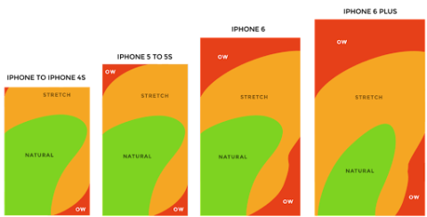
Source: scotthurff.com
CTA buttons like “Subscribe” or “Try It” should be placed within the green area.
Conversely, actions like “Delete” should be placed in less reachable parts of the screen. This way, users are less likely to trigger an accidental action that could lead to aborting the key task they should perform inside the app.
For example, we used these design principles while creating Gobu, an on-demand platform developed in React Native, the framework used to create apps for both Android and iOS. Users can browse according to the type of service they need – such as sports venues, salons, and many more.
Notice how the slider section is placed in the natural thumb zone, with the arrow located within the thumb’s reach so it is easily accessible at all times.
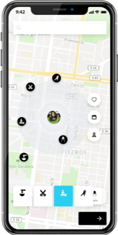
Other actions users can take within the platform such as favoriting, scheduling an appointment, and adjusting profile settings are also easily accessible from the right side of the screen – still within the natural thumb area.
This design finds a convenient compromise between prominently displaying the main menu features and giving the navigation as much screen space as possible.
Once users schedule an appointment, the UX remains optimized for the natural thumb area.
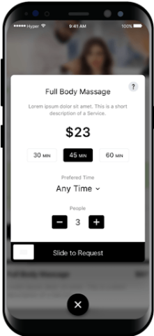
The central elements, including session duration, preferred time, and number of participants, are located at the center of the screen. This way, users can easily complete their request using just one slider.
App developers can use these tips to optimize UX for iPhone or Android.
Overall, entrepreneurs should keep user experiences specific to mobile devices in mind while designing their apps.
How will you know your design is effective after you launch? By tracking metrics such as star ratings, reviews, and average session time on the app, you can discern whether or not users find the app helpful.
For example, our app boasts of a 4.4-star rating on Google Play and the average session time on the app has increased by 11% within 3 months of its launch.

From these metrics, we can see that users have responded positively to the app.
Businesses that pay attention to their star ratings and how long users are staying on the app can get a sense of what works well and what needs to be improved.
While an app should be aesthetically pleasing, it should also function smoothly: UX design and functionality go hand in hand.
A functional app works well and is intuitive to the user.
When developing an app, start with what is absolutely necessary and then work your way up from there – extravagance can be added over time.
While making crucial business decisions it is critical to identify and satisfy the basic need first and later look into add-ons that would be desirable.
Creativity and business acumen complement each other: Businesses cannot grow without systematic processes that focus on design-led thinking. It is only through this process that businesses can scale, grow, earn higher profits, beat competition, and empower their users.
A good design not only empowers the users but also businesses by taking into account the near future growth and designing for the same.
For example, app developers at Lollypop designed Deccan Herald (DH), a revered news portal in South India, and aimed to create a design that would encourage increased readership and user engagement.
We spent two months researching the business and the users’ needs and behavior and decided that DH would benefit from:
We adopted a unified design language to design a complete library of assets defining more than 24 color sets, widgets, cards, and styles to allow DH more flexibility and add more news verticals without having to redesign from scratch.
As a result, DH saw an increase in readership, page views per visitor, and time spent on site 6 months after the redesign launched.
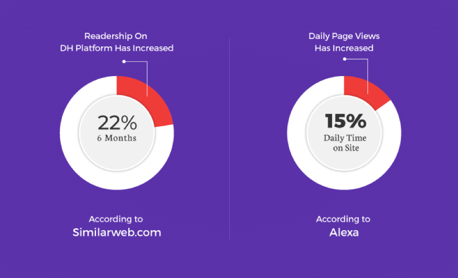
Readership increased by 22% and daily time spent on site increased by 15%.
Designing with scalability in mind can help businesses plan for future growth and see immediate returns.
UX design should be the first priority of any business looking to create a user-friendly, successful, and scalable platform.
For every dollar invested in UX Design, the return is 100 Dollars - Businesses can use the benefits of user-first design to improve their returns on investment, connect with their target audience, and leave room for growth.