
Updated February 11, 2026
The user experience (UX) matters more for smartwatches than almost any other digital product category. Their small and variable screen sizes, limited input methods, and constrained attention windows leave little room for error. Most interactions are brief, but they still need to communicate meaningful health insights to the user.
At the same time, expectations are rising. According to a Clutch survey of nearly 400 wearable users, consumers prioritize experiences that make data easier to understand and more immediately useful.
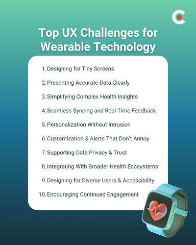
To meet these expectations and stand out in a competitive market, UX teams struggle to overcome a variety of issues specific to wearable technology. Here are 10 UX challenges based on Clutch survey data and insights from real users.
Looking for a Mobile App Development agency?
Compare our list of top Mobile App Development companies near you
Search for wearable app developers on Clutch.
One of the most common UX limitations for wearable apps is their variable but small screens. A layout that works well on one model can become unreadable on another.
This forces teams to limit the information they share to only that which is most essential for the moment. However, users still need to be able to access deeper health context when needed. UX designers need to clearly present data and features so it's easy to access without overcrowding the interface. Some of the best ways to do that are:
For example, imagine designing a heart rate screen. If you were following the principles above, you might focus on elements like:
Be sure to test your designs across small screen sizes on which they may be displayed to account for screen differences between models.
28% of wearable users prioritize accurate and timely data, and 25% value easy-to-understand dashboards. That’s why the best apps cover both bases by offering accurate data in intuitive formats.
It's not enough to perfect data collection and syncing. Even the most accurate and up-to-date information can lose value when it’s presented in a format that’s easy to misinterpret. Poor labeling and inconsistent visuals can introduce confusion into the smartwatch experience and discourage habitual use.
To overcome this, UX teams must find new ways to translate complex data into digestible insights. This means using plain language, providing visual cues where appropriate, and offering deeper contextual explanations only when they are necessary.
Today’s wearables collect vast amounts of data, but users want better answers to their most important questions. Design teams struggle to turn continuous streams of biometric information into actionable insights for end users.
It’s easy to overwhelm users with complex graphs, frequent notifications, and statistics that deliver minimal value. This often leads to disengagement, as users stop trying to interpret (and eventually stop checking) metrics they don’t fully understand or trust.
For example, some wearable apps show sleep data in dense line charts alongside a variety of additional metrics such as heart rate variability and respiration scores. Trying to share all of these details on a single screen would make information harder for users to interpret and act on.
Accurate and timely raw data is just the beginning. Users need summaries that explain their data to them, highlight trends, or connect back to a health goal they’re pursuing.
In the Clutch survey, 13% of users named seamless syncing as a key priority for their wearable devices. Users expect health information to sync automatically between their phone, smartwatch, and other devices.
UX challenges can arise when syncing gets delayed or fails. When data is incomplete, users start to question the accuracy of the entire system. Poor error-handling processes can compound the problem, leaving users unsure whether the issues are temporary or systemic.
Syncing can and will fail as a natural part of usage, so effective smartwatch UX accounts for imperfect connectivity. That means showing clear status indicators and clean error messages with transparent explanations for frustrated users. These elements keep trust in your product high when real-time feedback isn’t available.
In keeping with expectations for other technology, 7% of surveyed users value personalized recommendations in wearable technology. However, individual relevance can quickly turn intrusive when suggestions are excessive or poorly timed.
This is another area of wearable UX where finding the right balance is key. You’ll want to share proactive insights that support users as they work toward their goals. However, reminders and nudges should be infrequent and timed intelligently based on usage data.
Users should also have control over personalization. Some consumers prefer more frequent recommendations than others. The only way to keep everyone satisfied is to give them all the ability to customize personalized alerts to match their individual preferences.
Clutch’s survey found that 5% of users value customizable alerts and notifications. However, their true impact extends far beyond that percentage. Poorly designed alerts with limited customizations are a primary driver of disengagement and wearable fatigue.
When users receive too many alerts in short succession, they're more likely to mute notifications entirely. However, if they receive too few alerts, it can decrease the perceived usefulness of your app.
UX teams can help users find their own optimal balance for alerts by offering granular control over how frequently they appear. To overcome this challenge, create simple settings options that let users fine-tune alerts by type, thresholds, and timing, among other criteria.
Data privacy may not be the top-ranked UX feature for wearable users, but it remains an important piece of long-term adoption. Clutch data reveals that 7% of users explicitly value privacy controls, but concerns around data security extend beyond this.
Wearables collect deeply personal health data, and any ambiguity around how that information gets handled can quickly erode trust. That’s why it’s important to design transparent consent flows and clear permissions prompts, so users can customize how much data they share and monitor your policies. Clear explanations with opt-ins reinforce your brand’s credibility without adding too much friction to the average wearer’s experience.
Wearable users increasingly expect their data to move seamlessly across platforms. According to the survey, 8% value compatibility with third-party apps like Apple Health, Strava, and MyFitnessPal, but integration adds complexity.
Beyond technical connectivity, users need clarity about where their data originates and how often it syncs with other apps. Poorly designed integrations create confusion and duplicate records across platforms, which can lead to disengagement.
Effective wearable UX makes these integrations feel more intentional. Try to add elements such as clear labeling, a consistent visual language, and simple connection-management dashboards to help users understand their integrations without introducing unnecessary complexity.
Another UX challenge is that wearable apps today must serve a wide range of users with varying health goals. This is difficult when working with small screens and limited input methods.
For example, while most users may be fine with your default font size, a subset may prefer larger text with stronger contrast between elements. Adding customization options can account for these differences.
Many of today’s wearables also include accessibility-minded features like voice assistance and haptic feedback. These support quick, glance-based interactions while expanding accessibility for those who need additional context.
Finally, sustaining engagement over time is one of the most difficult challenges in wearable UX. While 15.34% of users value goal and progress tracking, retention depends on more than badges and streaks.
Users often disengage when feedback feels repetitive, irrelevant, or intrusive. For example, overuse of gamification can create short-term spikes in activity, followed by long periods of disinterest. Effective UX focuses on meaningful progress updates over constant stimulation.
Key engagement strategies include:
These features often provide more value to users than streaks and badges. They ensure the wearer learns something meaningful each time they check the watch instead of receiving frequent alerts that don’t really mean anything to them.
Today’s wearable devices generate incredible volumes of data. To transform that information into actionable insights that drive ongoing user engagement, you need a strong UX layer.
Teams that solve these UX challenges will deliver experiences that feel more personalized and relevant. This encourages the kind of habitual usage that creates brand loyalty, which is the first step to achieving success in this competitive market.
When done well, UX can accomplish more than making your brand stand out visually. It also has the power to drive long-term adoption and increase trust and retention, supporting your company’s bottom line.
