
The Product Design Process Explained From Start to Finish
Learn how the product design process works from start to finish, from user research and ideation to prototyping, testing, and launch.
Updated September 14, 2026

A four-tier system for telling people when an AI answer deserves their trust, when it deserves a second look, and when it needs a human in the loop before anyone acts on it.
An interesting case happened in June 2023. A New York lawyer filed a legal brief citing several court cases that turned out not to exist. He utilized ChatGPT to find supporting precedent. The tool gave him the citations he needed. The biggest flaw is that nobody on his team checked before filing. As Seyfarth Shaw stated, the judge sanctioned him. His firm was featured on national news for the wrong reasons. The Mata v. Avianca case became the legal-tech vendor now brings up unprompted, whether the client asks or not.
Over the next nine months, a different kind of AI failure appeared in a Canadian courtroom. Air Canada's chatbot told a grieving customer he could book a full-price ticket and apply for a bereavement discount afterward. The catch is that it wasn’t the airline’s policy, and he got no discount. As CBC News reported, a tribunal ruled that Air Canada was responsible for what its own chatbot told him, full stop.
In the first case, a person trusted an output he had every chance to double-check and question. In the second, a person trusted an output that isn’t supposed to be questioned at all. Neither interface told the user what kind of moment they were in.
These are the kinds of problems that surface when teams ship AI features. It has a name: silent overconfidence and visible distrust. Most products end up optimizing for one and, ironically, produce both.
Silent overconfidence happens because of the same visual treatment an AI-generated answer gets as a fact-checked one. Same font, same placement, same tone of authority. Everything on the screen looks perfect, or close to it, so users don’t look for seams.
Looking for a User Experience agency?
Compare our list of top User Experience companies near you

Visible distrust is the overcorrection. In most cases, when a team gets burned once, a series of things happens. They wrap every output with disclaimers, warning banners, and confidence percentages nobody asked for. As expected, users tune it out, just as people do with constant alarms. The one important warning gets ignored with the ninety that didn’t.
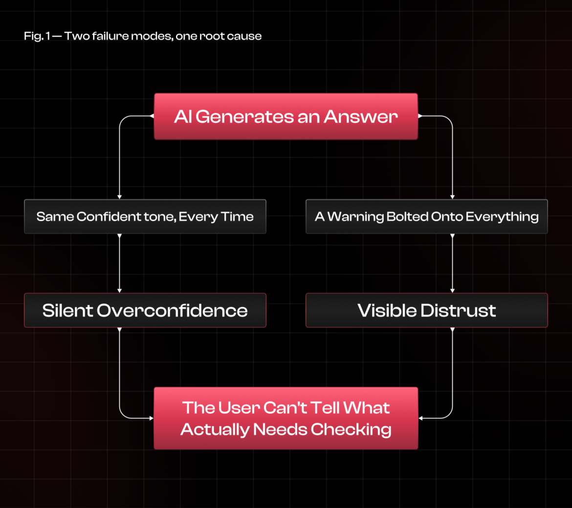
In most cases, a team ships the AI answer first, gets burned in the process, and then reacts by placing warnings everywhere instead of building a system that tells low-stakes guesses from the high-stakes ones. The result is a product that is overconfident in some spots and overcautious in others, sometimes on the same screen.
If we look at the numbers, “87 confident” is where the team mostly lands. It reads as precise, but in practice, it changes almost nothing. Here’s the truth: people are bad at probabilities, especially when it comes from a system they have no way to check. Once an AI system sounds authoritative, users tend to get complacent rather than double-check it against the tool’s actual record on that task. Slapping a percentage on the answer doesn’t break the habit. It just dresses up the overconfidence with decimal points.
What actually moves the needle is a signal, not a score, something specific that tells the user how much to trust this particular moment, rather than something that can be manipulated. “Based on 3 sources you haven't opened yet." "This section couldn't be verified against your data." "You can undo this for the next 10 seconds." These are samples of instructions a user can act upon. A number is not.
This goes both ways. It is best to show users the reasoning behind an answer or the references, rather than just a confidence figure. Users then get better visibility into when to trust it. The goal is simple: not pushing trust as high as possible, not pushing suspicion to the maximum, but trust that matches what the system has earned.
Swap “trust score” with “calibrated trust” as the main goal. The design problem shifts from one question to four.
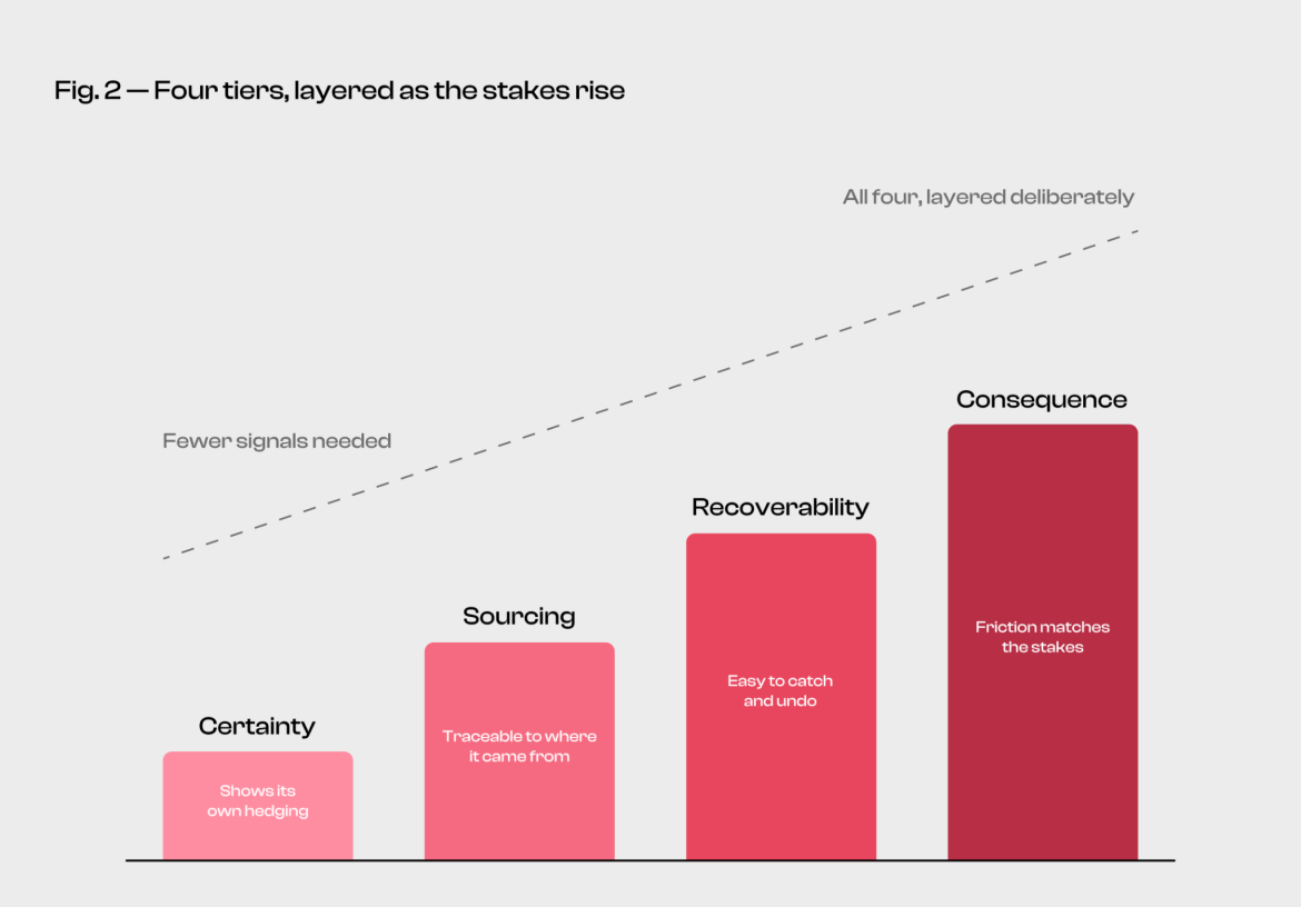
Each of these questions points to a different kind of uncertainty, and each one needs its own fix:
Combine all four into an “AI-generated content” disclaimer, and you’re right back to warning fatigue in every screen. Keep them separate, and each tier pulls its own weight, nothing more.
Most AI systems know when they are guessing. Almost none of them let the user know. The model flags a paragraph internally as low-confidence, then renders it in the exact same font as everything around it. In turn, these flags just quietly die in a log file nobody ever opens.
A warning banner at the top of the response is not the solution; it lives inline. To name a few: underlining the specific sentence the system is unsure about, softening the language when it is a guess rather than a fact, or just saying outright “I couldn’t verify this part.” In reality, certain signals only work when they are pinned to the specific text they are describing. One disclaimer on the whole text won’t do anything.
When an answer appears without a reference, it is asking to be trusted by faith. An answer that reveals its sources asks for nothing. Users can verify it in a matter of seconds, which is what should happen before anyone acts on it.
This is part of why citation-backed AI answers tend to earn more trust over time than plain generative text, even when they run on the same underlying model. Proof of work beats a confident tone. And sourcing hands the user something to actually do when a claim looks off. Users can check it rather than just take the system’s word for it.
Gmail’s “undo send” isn’t designed to make the email more accurate. It is a mechanism built to make mistakes cheaply, which changes how carefully people need to check before hitting send. That is the model AI interfaces should borrow.
Recoverability signals answer one question: if this thing turns out wrong, how much time does the user have to actually catch it? Just like a draft, it needs explicit approval before it can be sent. A preview that shows up before an AI edit overwrites the original file. Version history you can actually see and roll back. None of that prevents bad outputs. In effect, it makes the damage smaller, which is the most honest thing to aim for.
With Air Canada’s chatbot, it skipped this tier entirely. Pricing and refund eligibility are financial commitments that deserve the same weight. To avoid such errors, there should have been a confirmation step, a link to the actual written policy, or an escalation to a human agent for any money-related issues after the fact. Instead, the bot answered with the same confidence it would use for a question about baggage size.
The purpose of confidence signals isn’t about making the AI seem smarter. Their role is to make the interface honest about what’s on the line if it gets it wrong. The heavier the downstream cost, the more the interface owes the user a moment of friction before they act on what it just said.
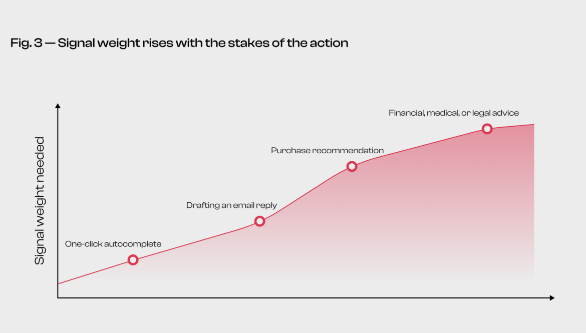
Not every output needs all four tiers, and slapping them everywhere is how you end up back in warning-fatigue territory. How much signaling does a moment need to track one thing: what it actually costs if the output turns out to be wrong?
It barely takes anything if a one-click autocomplete suggestion is sitting in a text field. Get it wrong, and the users catch it instantly and fix it in the same motion of typing. Bolting a confidence score or a sourcing link onto that moment is just friction for friction's sake.
All four tiers must be present when a recommendation involves topics of money, health, or legal standing. First, it should include language that flags an estimate as such. In terms of sources, they users can actually verify. Before anything gets locked in, it is best for users to have a way back out. Lastly, it should require human review before the action proceeds.
Enterprise AI assistants are a good test case for why this matters at scale. A build-vs-buy analysis of these tools makes the point plainly: they tend to fail in production "not because the model is wrong, but because the interface does not match how users think about the task." That's a consequence-tier failure as much as anything else, and it gets more expensive to fix the longer users have been relying on the assistant before anyone notices.
A useful tip: ask what the cost will be if this specific output is wrong, and who will bear it. If the honest answer is "the user notices and retypes a word," don't bother building out the signal architecture. If the answer involves money moving out of an account, a diagnosis, or a signed contract, it is important to build all four tiers before you ship.
Every AI surface can be audited against this framework without commissioning a study or waiting on user research. It's the same logic behind formal AI UX audits, where roughly 62% of users who disengage from an AI feature turn out to cite "it didn't understand me" as the reason, a communication failure more often than a model one. Pick one moment where your product hands a user an AI-generated output, and walk it through four questions:
Most teams find at least one tier missing entirely the first time they run this. That's not a failure of the product team; it's what happens when confidence signals are bolted on late rather than designed in from the start.
If you place side by side silent overconfidence and visible distrust, they may look like opposite problems. The truth is, these two come from the same place: an interface that doesn’t tell users what kind of moment they’re in. Confidence score doesn’t fix that, as people don’t know how to act based on these numbers. Signals are what constitute a clear answer. Certainty, sourcing, recoverability, and consequence give designers four concrete levers rather than a single catch-all disclaimer.
Sizing each one to what's actually at stake is what keeps a product from drowning users in unnecessary warnings while staying silent on the moments that genuinely deserve one.
Mata v. Avianca's lawyer needed a sourcing signal. Air Canada's customer needed a consequence signal. Neither of them needed a percentage.