Social Proof Placement: Where to Put Reviews, Ratings, and UGC for Maximum Conversions
Where you should be placing customer reviews, ratings, testimonials, and UGC to actually move the conversion needle — from the homepage to the product...
Updated February 14, 2026

Web animation helps bring a site to life by guiding attention, creating flow, adding visual interest, and boosting the overall engagement of a website. However, they only manage to do this when they are used right.
In fact, some animations can actually hurt your website's conversion rates. Between motion overload, slow-loading effects, and dizzying transitions, animation mistakes distract users rather than delight them.
Our guide discusses some web animations that often do more harm than good. You'll also find quick tips on using animations smartly so they support your goals instead of working against them.
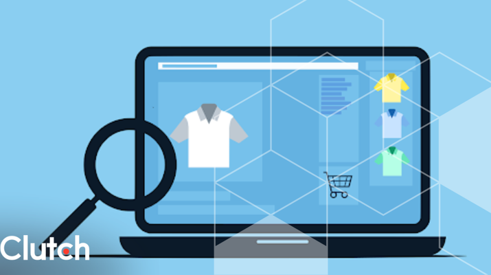
Looking for a Web Design agency?
Compare our list of top Web Design companies near you
A website animation can drag down performance and push visitors away when done poorly. Instead of helping users engage, bad animations create friction. And friction kills conversions.
Here's how that plays out.
Heavy animation files or poorly optimized code can bog down your site. Users won't wait around for a flashy entrance effect if your page takes forever to load. Laggy animations can frustrate users and make them leave your site before they even see your content.
Similarly, over-the-top transitions or confusing movements can annoy or disorient users. When people can't easily find what they need, they bounce.
Not everyone experiences animations the same way. Fast flickers or constant motion can be overwhelming or even harmful for users with motion sensitivity or cognitive challenges.
So, you may unintentionally lock people out by using such animations. It also goes against the principles of web accessibility, which aim to provide equal access and usability for all individuals.
Random or inconsistent animations can make your site feel unprofessional, primarily when used in a haphazard manner. It gives the impression that your design is not well thought out or lacks attention to detail.
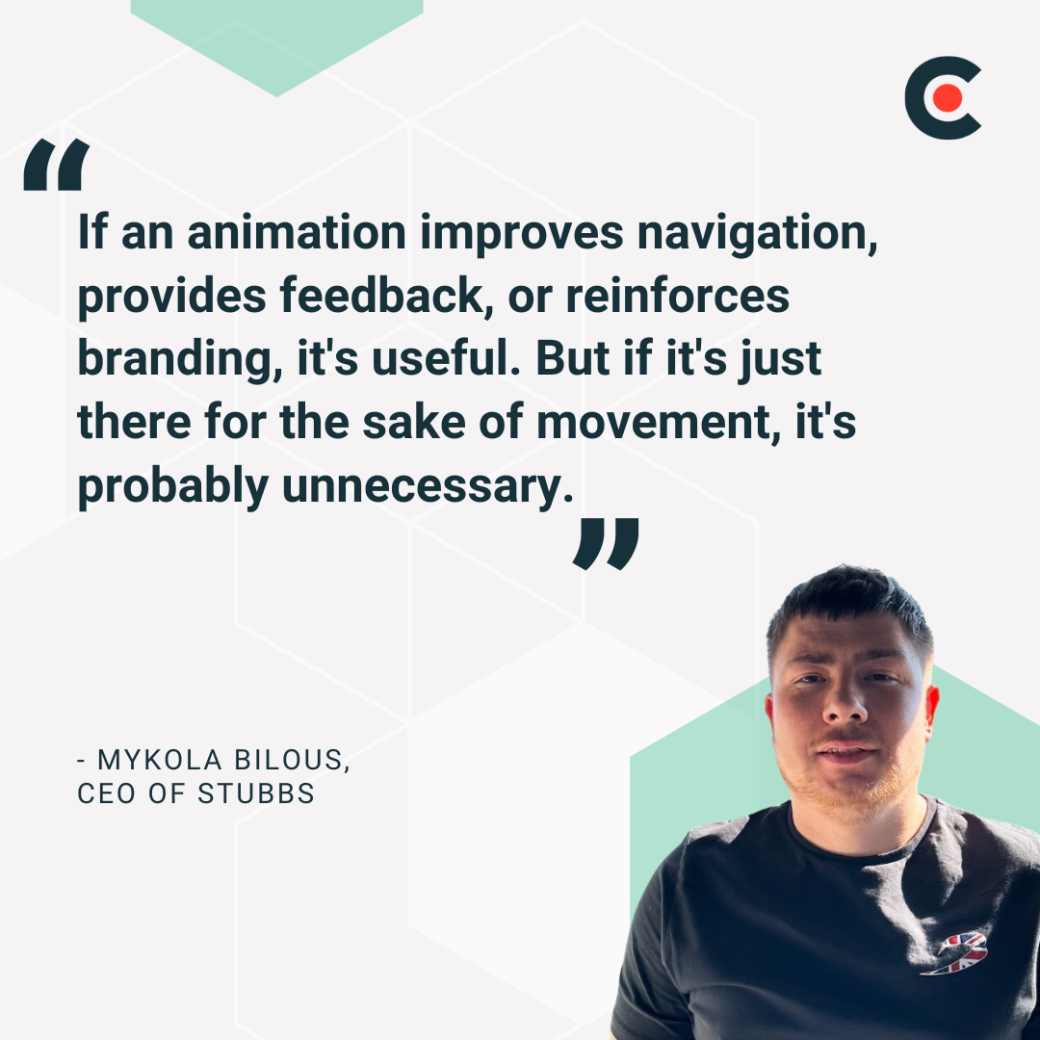
Users are quick to notice these things. That's why Mykola Bilous, CEO of Stubbs, recommends "using animations intentionally. If an animation improves navigation, provides feedback, or reinforces branding, it's useful. But if it's just there for the sake of movement, it's probably unnecessary."
Simply, web animations should enhance user experience and not distract from it.
Overdone or poorly executed animations can drag everything down on your website. Avoid the following web animation mistakes to keep your site's conversion rates from plummeting.
Fast motion might look slick during a design review, but it can be jarring for real users. When something is moving rapidly on your website, it can confuse visitors and make it hard for them to navigate the site. It may also trigger motion sensitivity issues in some users.
Bilous emphasizes, "Fast, aggressive motion can also be an issue for accessibility — some users are sensitive to movement, so smooth, subtle transitions are always a better choice." Ideally, your site animations should not feel like a rollercoaster ride.
Instead, keep transitions smooth and gentle. Use easing functions and shorter travel distances to reduce the visual chaos in your designs.
Fancy page transitions like slides or fades can feel impressive at first, but they quickly get disruptive when every interaction comes with an animation tax. Users want speed and clarity, and if a transition adds delay, you risk annoying them.
Only use page transitions when they help users understand context or flow. If you're animating every click, it's likely too much.
Animations that auto-play the second a page loads can feel intrusive. Some examples of these animations are bouncing icons and sliding text banners.
They not only take attention from the content that matters on your website but also confuse users, especially if they can't pause or stop them.
Instead, you should use user-triggered animations. Let people choose when they want to see the animation so it doesn't disrupt their reading or browsing experience.
Overuse of JavaScript-based motion can slow down load times, especially on mobile or low-powered devices. Bilous shares that "overly flashy animations that don't serve a purpose can slow down the site and make navigation frustrating."
It's best to optimize these web animations. Use CSS animations where you can since they're more efficient. Also, keep animations lightweight and compress the assets to reduce the overall file size.
Infinite scroll might sound like a good idea for content-heavy pages, but it's easy to overdo. When paired with constant entrance animations, it can overwhelm visitors and cause cognitive overload.
There's also the issue of control. Users might not know how far they've gone or how to get back.
You can avoid this issue by skipping the fancy animations unless they add clarity. Instead, add markers or "Load More" buttons to give users a break.
Intro animations and modals that block key content can delay access to what people came for. These animations can also tank your site's Core Web Vitals and mess with SEO.
Vladyslav Teplynskyi, Founder of Teplin, explains that "overly long intro animations can frustrate users rather than enhance the experience." It's even worse when users are in a hurry, such as on the pricing or product page.
You should get out of the user's way when designing animations and prioritize content visibility. If you must use an intro animation, make it short and skippable.
Animating just for the sake of it usually leads to clutter and distraction. "If an animation doesn't add to the experience, it's probably better to leave it out," recommends Bilous.
Ask yourself what the animation does. Does it highlight an action? Improve navigation? If not, it's probably unnecessary.
When used with intention, website animations can do more than just look cool. They can also guide users and boost conversions. Use the following tips to achieve these outcomes.
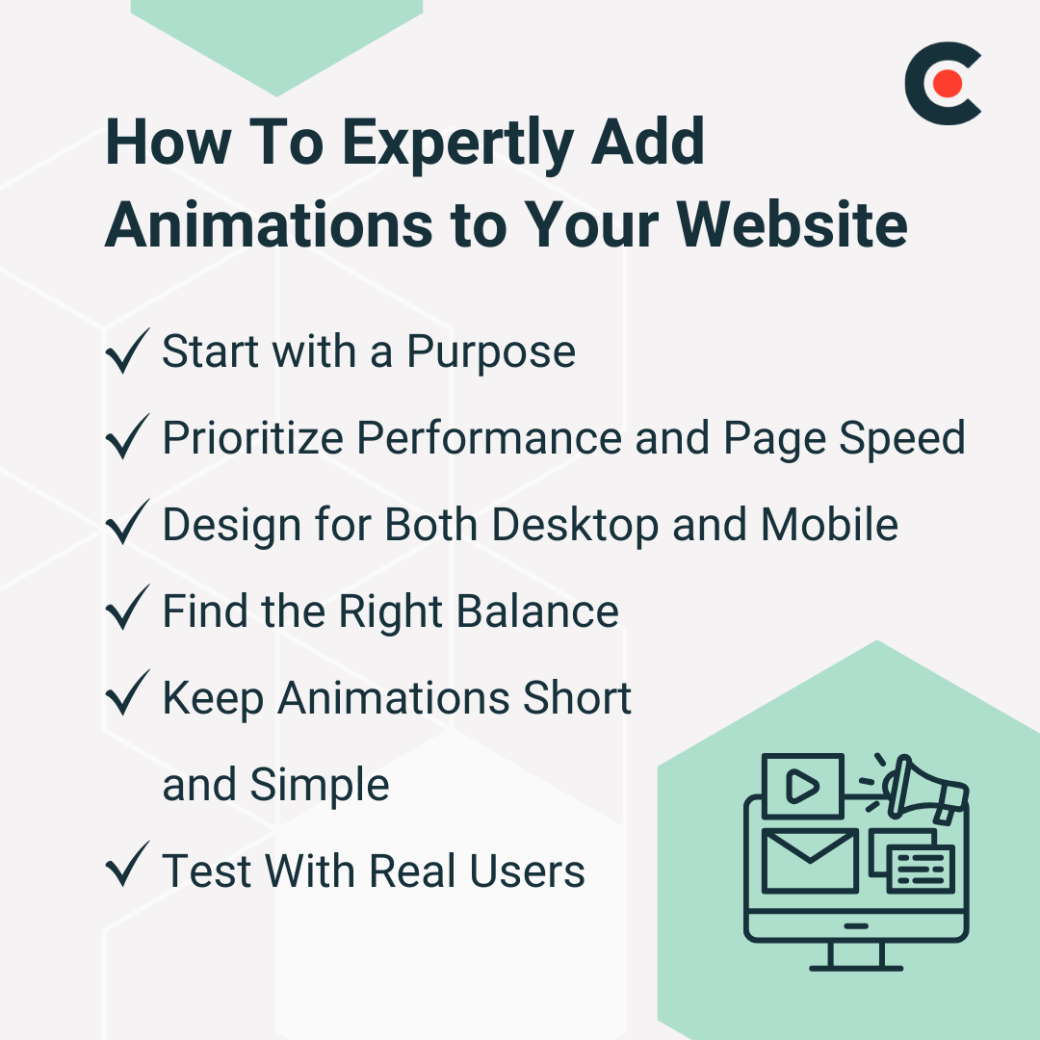
Before you animate anything, ask yourself why you're doing it. Alex Doda, Creator of Agent.so and Founder of Abruptive Studios, says, "Every element moving on a page is mental 'bandwidth' you take away from your clients' traffic."
So, you must have a purpose. If you want to emphasize content, then decide how much the animation should draw in your viewers. If it's only a slight emphasis, go for a subtle effect like enlarging an element by 5% and back down.
If you're trying to guide users toward a call-to-action button, use more aggressive animations like pulsing or flashing effects. Just don't overdo it and distract from the main message.
If animations slow down your website pages, the bounce rate will be higher, and that ultimately means lower conversions. Teplynskyi recommends prioritizing "performance, ensuring that animations don't affect speed."
Keep things lightweight and optimize every element possible. If you can do animations with CSS, that's even better.
What looks great on a desktop monitor might be too much on a smaller screen. Big animations or complex transitions can overwhelm mobile users or cause awkward delays.
When designing animations, keep both desktop and mobile users in mind. Also, test your animations on real devices and not just in browser development tools.
It can be tempting to animate everything, but restraint often creates a smoother and more polished experience. Teplynskyi explains that you can "maintain a user-friendly experience by keeping them subtle yet effective."
Many elements that you may want to animate can be better in their static form. Doda backs this: "A LOT of elements should actually be static. And by not animating them, you'll get better time-on-page, lower bounce rates, and ultimately get better conversions." If the animation doesn't serve a clear function, leave it out.
Bilous says they "focus on keeping animations lightweight, smooth, and aligned with the overall design" because that's what users expect. If you put too much focus on animations, they can distract and annoy users.
Doda warns: "Don't overcomplicate them to the point of these animations playing out against you." Go for quick fades and micro-interactions since these can make your site more interactive without overwhelming visitors.
You might like the animated button you've added to your website, but what about the users? What do they think?
Bilous explains that "testing with real users also helps ensure animations improve the experience rather than get in the way." Then, use the feedback to fine-tune the animations to enhance the overall user experience.
Animations can make or break a website, and the direction in which they go depends on how well you use them on your website. Animations can slow down your website and reduce conversion rates if things go wrong.
One way to avoid this is by outsourcing web design, especially the animation work, to experts who are well-versed in creating effective animations.
Doda shares, "When I think of web animations and micro-interactions, I see a gold mine… because it's not just an extra avenue for brand self-expression — it's an actual hack towards better conversions." It's best if experts handle this avenue.
When finding outsourcing partners, look for experts with a conversion-focused mindset. They must know how to keep things lightweight and SEO-friendly. Plus, you can request a mobile-first approach if the majority of your visitors come from mobile devices.
Before choosing a partner, check their animation portfolio, especially prior work they have done on websites like yours. Most importantly, select a team that's open to iteration since testing and feedback help make animations more user-friendly.
While poorly designed animations can result in slow load times and subpar user experience, well designed animations can improve your website’s success by boosting conversion rates and user satisfaction . Often, when doing web design in-house, it's easy to make animation mistakes that cost you user trust and revenue.
Instead, if you hand over this task to web design experts, there's a lower risk of this. Check out our web design directory to find vetted agencies that specialize in creating high-performing websites with thoughtful animations that do more than just move; they convert.