Social Proof Placement: Where to Put Reviews, Ratings, and UGC for Maximum Conversions
Where you should be placing customer reviews, ratings, testimonials, and UGC to actually move the conversion needle — from the homepage to the product...
Updated March 27, 2026

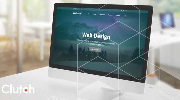
Web design is a core part of many company's brands, products, and communications. It's important that the design remains user-friendly and that both text and visuals effectively align with company goals. Take the first steps to revamp your website design using top web design examples from across industries.
When it comes to website design, knowing where to begin can be quite challenging. Everyone desires a visually appealing website, but lacking expertise in achieving that can make it challenging to arrange the necessary elements effectively.
This sentiment is commonly shared among business owners in the startup phase. Considering the staggering number of 1.13 billion websites already online, creating a site that truly stands out can be a complex task. In this article, we aim to showcase exemplary website designs that serve as great examples.
Looking for a Web Design agency?
Compare our list of top Web Design companies near you
Responsive websites have three defining features:
Media queries provide developers with the ability to modify web designs by applying condition checks that take into account the characteristics of the user's device.
This approach surpasses the mere definition of breakpoints in HTML/CSS, as it enables a more customized and personalized experience for the user.
By employing CSS to establish flexible grids, the columns effortlessly adapt to accommodate the screen or browser window dimensions, regardless of whether the user uses a 21-inch desktop computer, a 13-inch laptop, a 9.7-inch tablet, or a 5.5-inch mobile phone.
This capability empowers designers to uphold a consistent visual appearance and user experience across various devices.
Additionally, it brings about time and cost efficiency as designers can update a single version of the website instead of multiple versions.
With the staggering number of more than 8.48 billion distinct devices currently in existence, this functionality empowers teams to develop timeless designs that can seamlessly adapt to any device, regardless of size or shape.
By collectively leveraging these three types of functionality, designers can create responsive websites.
Here are six examples that transcend the basic requirements of responsive web design. These websites deliver a personalized experience tailored to the user's context.
Dropbox has effectively utilized a fluid grid and flexible visuals to create an outstanding responsive website design.
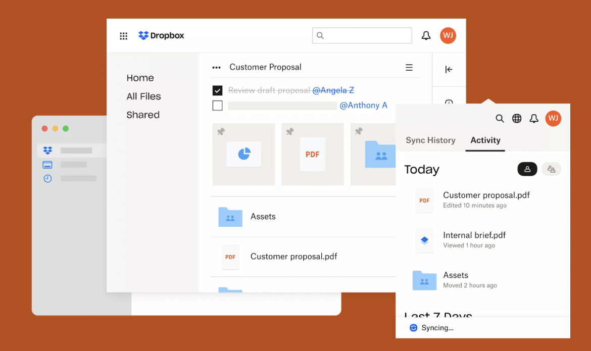
Source: Dropbox
Dropbox ensures a cohesive experience across different devices by making thoughtful adjustments. For instance, when transitioning from desktop to handheld devices, the font color adapt to the background color, and the image adjusts its orientation.
Considering contextual factors, Dropbox delivers a tailored experience for each device. To prevent users from bouncing, a subtle arrow prompts desktop users to scroll down for more content. However, this arrow is omitted from handheld devices, as it is presumed that users will naturally scroll on touch-enabled devices.
Additionally, the signup form remains visible on desktop devices but is concealed behind a call-to-action button on tablets and mobile devices where space is limited.
Dribbble's website showcases a key characteristic of responsive web design by incorporating a flexible grid. The grid seamlessly transitions from five columns on desktop and laptop computers to two columns on tablets and mobile phones, ensuring optimal viewing and usability across different devices.
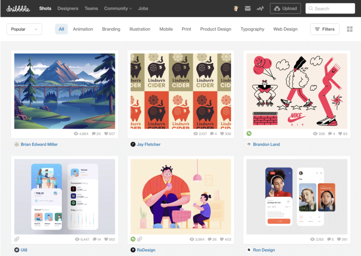
Source: Dribble
To maintain a clean and uncluttered appearance on mobile devices, Dribbble has made strategic modifications to its website. Notably, they have removed certain elements, such as attributions to shot creators and view, comment, and like counts, which are no longer displayed beneath each item.
Additionally, the menu has been concealed behind a hamburger icon, and the search bar has been omitted. These adjustments contribute to a streamlined and focused mobile experience on Dribbble's website.
GitHub's website delivers a consistent user experience across all devices.
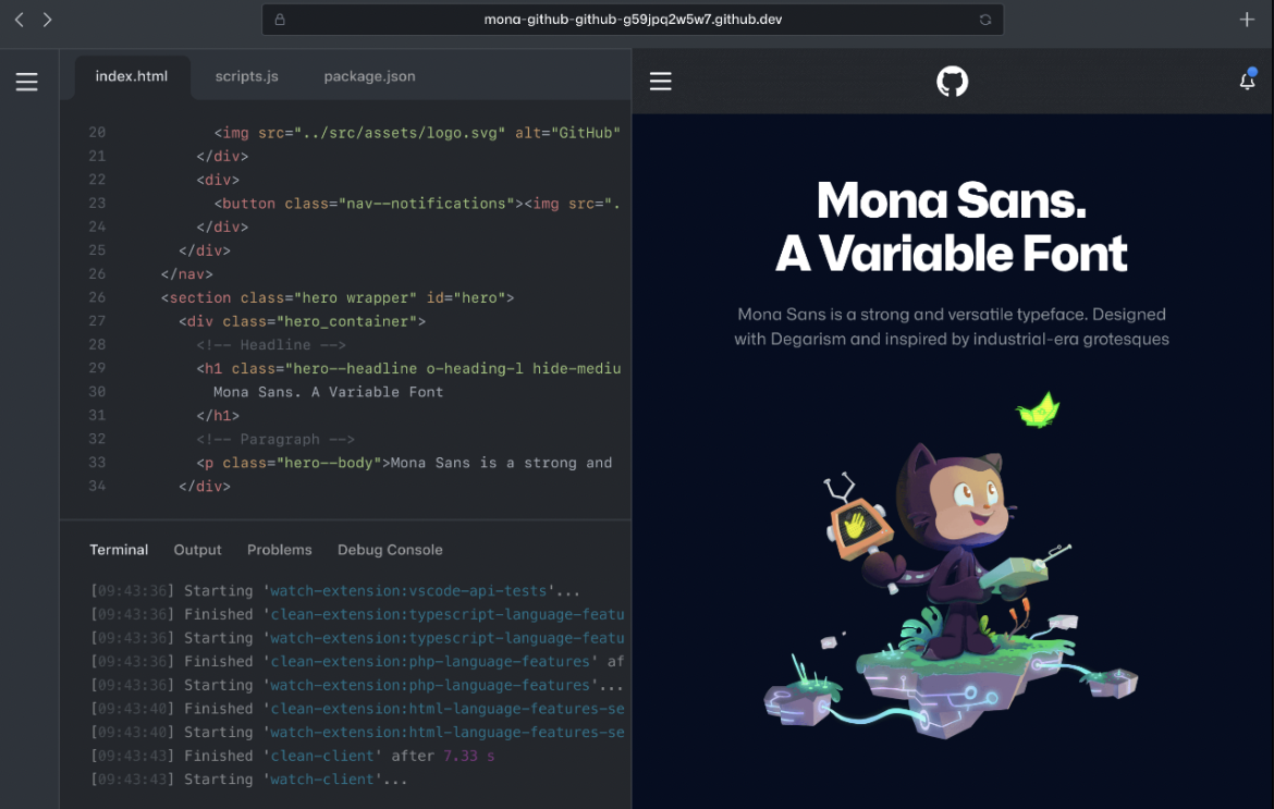
Source: GitHub
However, there are a few noticeable distinctions:
This serves as another outstanding illustration of mobile-responsive web design.

Source: Klientboost
Klientboost's website exhibits exceptional loading speed, with a remarkable four-second performance even on 3G connections. Moreover, they have achieved a consistent look and feel across all devices while customizing the user experience for each specific device.
On desktop and laptop computers, the full menu, featuring a prominent "Get Proposal" call-to-action button and a "We're hiring!" callout, is readily visible. However, tablet and mobile devices present condensed versions of the menu.
Tablet users encounter a hamburger menu icon and callout, while mobile phone users are presented with the menu icon alongside the call-to-action button.
Magic Leap has ingeniously crafted a mobile-first website that utilizes captivating parallax scrolling to breathe life into their exquisite illustrations. This strategic choice aligns with the fact that mobile devices currently account for a substantial 58.5% of global internet usage, making it a sensible approach.
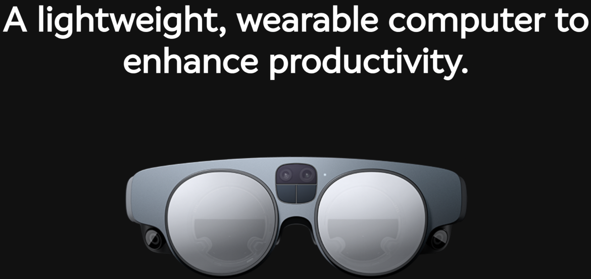
Source: Magic Leap
Magic Leap ensures a uniform user experience across all devices, except for one notable difference: the inclusion of microcopy guiding users to scroll. While present on desktop computers and tablets, this guidance is omitted from mobile devices, as scrolling is intuitive for users in that context.
Impressively, even with a 3G connection, their website loads within a swift seven seconds, well below the global average of 22 seconds. Considering the presence of responsive animations, this loading time is commendable.
Shopify ensures a harmonized user experience across all devices, maintaining its design and interface consistency.
The primary differences between desktop and mobile devices are observed in the call-to-action button and illustrations, which have been optimized to suit each device's specific requirements and constraints.
Source: Shopify
When accessed from personal computers and tablets, the call-to-action button on Shopify is positioned to the right of the form field. However, on mobile devices, it is placed beneath the form field.
Similarly, the illustrations are situated to the right of the accompanying copy on personal computers and tablets. Conversely, on mobile devices, the illustrations are positioned below the corresponding copy.
As is customary for many websites, Shopify replaces its menu with a hamburger icon on handheld devices. Despite utilizing image carousels to showcase their customers, Shopify has succeeded in maintaining a page load speed below five seconds, which is undoubtedly impressive.
Having a well-designed website is paramount for any business. It sets you apart from competitors and enhances your ability to attract customers and bolsters your overall profitability.
Drawing inspiration from the aforementioned website designs, you can embark on a journey of creativity and brainstorming, leading to the development of a visually appealing and functional online presence.
Throughout the design process, it is crucial to keep your target audience in mind and embrace experimentation until you discover the most effective approach to your objectives and brand identity.