
Agentic Commerce in Google Ads: What's Changed for Advertisers
Bidding and targeting in Google Ads now run mostly on autopilot. Here's what that shift means for advertisers and where to start adjusting.
Updated May 28, 2026

These well-known brands created unique typography ads to make their campaigns stand out. Learn how adjusting their typography helped them reemphasize their brand and call attention to their message.
Great advertising is all about catching your audience’s attention and delivering your message. It should portray your brand, demonstrate your business values, and most of all, be memorable.
Typography is a great tool for advertisers because it engages viewers and helps them process information. Whether you’re developing an online, TV, or print ad, typography ads are a great way to communicate with consumers and build brand recognition.
Looking for a Advertising agency?
Compare our list of top Advertising companies near you
Here are 5 ways that popular brands have used typography ads in their campaigns and why they were effective.
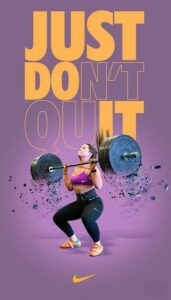
Nike’s slogan, “Just Do It” is a core component of their brand, and in this ad, they used their typographic layout to emphasize their recognizable slogan.
The background is purple, but they use bright yellow lettering to create contrast and make their typography pop.
The top two-thirds of the print ad is covered using a bold sans-serif font that reads “Just Don’t Quit.” However, only some of the letters are filled in, while the end of “Don’t” and the beginning of “Quit” are simply outlined. If viewers focus on the letters that are filled in, the text clearly spells out “Just Do It.”
Combined with the Nike swoosh at the bottom of the ad, this clever ad is clearly for Nike gear. By playing with the formatting of their text, they were able to reemphasize their brand and call attention to their message.
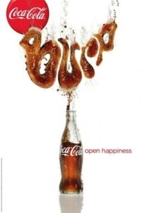
Coca-Cola got creative in this campaign by using its product to spell out sounds associated with drinking soda.
This ad, for example, spells out “Burp.” The designer used brown and shading to create the look of carbonated soda for each of the letters. Additionally, they created a fluid outline for each of the letters to make it look like the drink was flowing out of the bottle. Because it looks like the letters appear to float upwards, it appears refreshing and light, appealing to consumers.
Coca-Cola released several similar ads around the same time, using words and onomatopoeias such as “Gulp,” “Pssst,” and “Ahhhh.” The decorative script contrasts with the sans-serif font used for Coca-Cola’s slogan, “Open Happiness,” making it stand out even more.
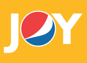
In this ad, Pepsi used a solid sans-serif font that is clean and crisp, just like their drink. The white letters are bold and evenly spaced, with the “O,” which is formed from Pepsi’s globe-shaped logo, perfectly centered. As a result, the viewer immediately knows what they’re advertising.
At the same time, this ad associates the soft drink brand with the feeling of “joy.”
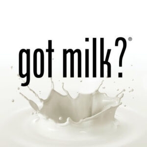
The iconic “Got Milk?” campaign was created by the advertising firm Goodby, Silverstein & Partners and premiered in 1993. Ever since, the slogan has been used to promote milk sales across the country. Because the campaign has been running for so long and is so widespread, it’s one of the most recognizable marketing campaigns in the United States. The slogan is so iconic that it has become a staple of their ads, often appearing under a picture of a celebrity with a milk mustache.
This ad, however, relies solely on the just-as-famous “Got Milk?” font. The font is a sans-serif typeface called Phenix-American. Known for its bold and sharp look, this font really stands out against an all-white background. Phenix-American has been associated with the “Got Milk?” campaign since its launch and is a major reason for its recognition. Because it’s so easy to read, it looks good on corporate stationery, in print ads, in magazines, and on packaging. By choosing a sleek and simple font like this, you will ensure viewers understand your message even if they only glimpse your ad.
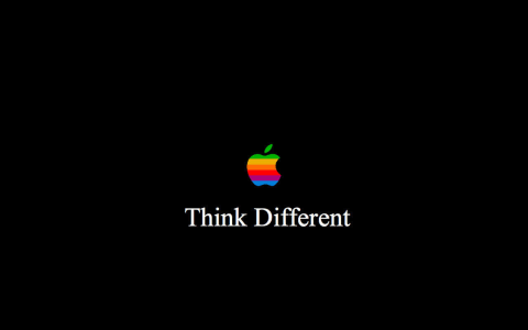
Apple’s “Think Different” campaign is a masterclass in using typography ads to make a statement. The ads rely almost entirely on strong, minimalist type to convey the brand’s values and messaging. A bold, sans-serif font sits on a simple background, letting the words themselves take center stage.
By focusing on letter spacing, weight, and alignment, Apple creates a rhythm and visual hierarchy that guides the viewer’s eye naturally. The typography communicates confidence, clarity, and innovation — all key aspects of Apple’s brand personality — without relying on imagery or other design elements.
This is a prime example of how typography in advertising can do more than decorate: it can carry the message, capture attention, and reinforce brand identity. For smaller brands or non-major agencies, studying Apple’s approach shows the power of simplicity, contrast, and deliberate type choice in ads that use typography to leave a lasting impression.
This approach will help you create a strong ad with typography and better understand the creative decisions that go into it. As you grow, a top-rated advertising agency can help translate this foundation into broader brand awareness and stronger campaign performance.
Before you think about fonts, get crystal-clear on what you’re trying to say. Pick one short idea you want people to remember. A powerful line, or even just a single word, is better than a paragraph.
Think about how you want your audience to feel. A bold sans serif can feel confident and modern, while a rounded serif can feel warm and friendly. If you’re not sure, test three different options side-by-side and see which one communicates the vibe you want.
Guide the viewer’s eye by changing size, weight, or spacing. Your headline should stand out first, your supporting text second, and any call-to-action last. If everything is loud, nothing is loud.
Typography only works if people can actually read it. Pair light text on dark backgrounds or dark text on a light background. Stay away from low-contrast overlays that sink your message.
You can change the mood of your ad just by adjusting letter spacing, line height, and alignment. Try stacking words vertically or breaking lines unexpectedly to create visual rhythm.
Typography advertising is memorable when text becomes the visual. You can play with shape, texture, or motion to make the words feel alive. Just keep it simple, as too many tricks compete for attention.
Create three quick variations, then ask your peers which one they understand fastest. Pay attention to where their eyes go first, and whether your key message lands in seconds.
Typography behaves differently everywhere:
Adjust sizing, spacing, and line breaks depending on where your ad will live.
Aim for a comfortable reading size, clear contrast, and plenty of breathing room around text. Your ad should be legible on small screens and from a distance.
Monitor click-through rate, dwell time, or engagement on platforms where your ad appears. If one style performs better, lean into it.
Typography ads use eye-catching fonts, colors, and text to grab their viewers’ attention. This is a great way to convey your message clearly and expand brand recognition. If you’re planning to develop your own typography ad, keep these well-known brand names in mind. By getting creative with the color, weight, and size of their text, they created unique and interesting ads that stand out.
If you’re ready to develop a typography-led campaign that not only looks great but also supports your broader marketing goals, consider partnering with an experienced advertising agency. They can help you refine your message, tailor your creative to each platform, and build a cohesive campaign that drives results.