
One Strategy, Two Systems: How to Build Link Authority That Reaches Both Search and AI
Over 76% of pages cited in AI Overviews already rank in the top 10 organically, but ranking alone no longer guarantees you'll be the brand AI names. Here's...
Updated September 17, 2025

This guide outlines eight lesser-known image SEO techniques, from using file formats and srcset attributes to implementing structured data and strategic lazy loading. By focusing on these tips, you can improve website performance, user experience, and overall search engine viability for your visual content.
SEO involves numerous moving parts, some of which are more technical than others. Optimizing images might sound complicated on the surface, and it’s a vital component that’s often overlooked, but when you break image SEO down marginally, it’s a relatively straightforward process.
If you’re running B2B lead generation campaigns, finding prospects via LinkedIn, or developing a SaaS SEO strategy, one of the best assets you can have in your repertoire is solid visuals. Images that work best for your B2B goals are ones that translate well in a variety of channels, ranging from websites and emails to social media platforms, all of which contribute to creating a solid and consistent brand identity. Website images are particularly important if you’re trying to maximize visibility.
Looking for a SEO agency?
Compare our list of top SEO companies near you
However, there are image optimization tips that you may not have been aware of until now. With Google’s emphasis on user experience (UX), page speed, and search intent, the image SEO tips outlined in this guide will prove useful in your attempts to create an engaging, visually enticing site that performs well and helps your audience overcome their pain points.
Images come in all sorts of formats, some of which can significantly boost website (and, by extension, inbound and outbound sales) performance, while others can hinder it. It’s essential to differentiate between and understand the nuances of certain file formats.
When looking at MPB's comprehensive guide on image file formats, every image is created by either a collection of pixels arranged in a grid (raster images) or mathematical equations and geometric shapes (vector images). These characteristics define the majority of file formats we know and use, allowing us to ensure images are displayed in the best possible way.
Here are some of the most common image formats and their purposes:
Most marketing and email automation platforms will support JPEG images as the primary format across the architecture. However, WebP files are not readable in most incumbent solutions. As such, the key is to strike the correct balance between quality and file size, and that might come in the form of different formats across tools.
The best way to optimize performance is to use a mixture of appropriately sized and quality imagery without compromising visual aesthetics or exerting too much pressure on the server to deliver large resources.
Many web developers will be familiar with the concept of responsive website design. At the risk of teaching you what you already know, it’s always wise to reassess whether responsive images have been implemented with proper srcset attributes, as this can be easily overlooked.
This technique essentially allows browsers to select the most appropriate image size based on the user’s device of choice, which can significantly improve load times, especially on mobile.
Put it this way - instead of resizing one large image across the whole estate with CSS, the site servers multiple versions of each image at different resolutions. Here is a basic rule of how to implement srcset properly in the site’s HTML:
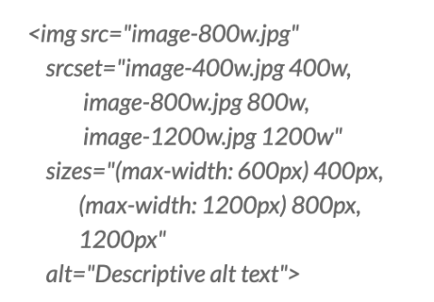
In simple terms, the code instructions above produce three image versions, letting the browser determine the most appropriate one based on the user’s screen size and resolution.
Delivering these results in reduced data consumption, faster page loading, and better UX overall, not to mention an improvement in Google’s Core Web Vitals (CWV) scores. But we will touch on this later.
Lazy loading ensures that images only load as they enter the user's viewpoint on a screen. It’s a particularly common tactic for websites, dynamic email content, and third-party software nowadays, but site owners can tweak their strategy to be a bit more strategic when it comes to lazy loading.
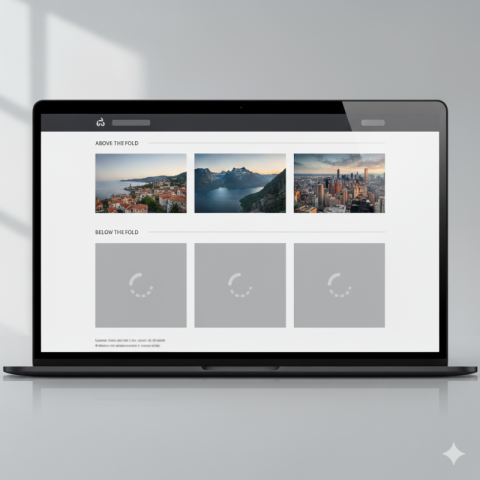
Source: Image generated by Google Gemini
For instance, rather than lazy loading every image, avoid implementing it for any critical images (e.g. hero or banner images) above the fold on the first load. If lazy loading is applied to all images in the initial viewport on a website, sometimes it can delay rendering and affect your LCP (Largest Contentful Paint) score in Core Web Vitals.
As an alternative, consider:
Most website page builders and themes now include lazy loading settings that are easily controllable at both widget and site levels.
For images that must appear immediately, consider adding this code:
img src="hero-image.jpg"alt="Hero description"loading="eager"
For everything else:
img src="below-fold-image.jpg" alt="Image description" loading="lazy"
Doing this ensures a rapid initial site render without wasting valuable resources loading images that the user doesn’t access.
Content Delivery Networks (CDNs) aren’t new to site owners. If you’re running an image-heavy website, specialized image CDNs can be an excellent solution for optimizing images, ensuring they load quickly and do not cause too much strain on host servers.
By dispersing resources into local servers and cache resources nearer to users, resources do not have to travel as far, and thus load times can be improved. These CDNs automatically serve WebP files to supporting browsers while falling back to JPEGs for others, for example. Images can be dynamically resized based on devices and server requests, while compression can be automatically applied through URL parameters.
Services like imgix, Cloudinary, and BunnyCDN’s Image Processing are worth considering.
It’s worth noting that implementation typically involves changing image URLs to point to the CDN or installing a plugin supported by WordPress or a plugin that can integrate seamlessly with the CMS through an API. Pairing this with modern page builders’ dynamic content features creates a powerful combination for improved site performance.
While basic image SEO focuses on alt text (alternative text), filenames, and captions, adding structured data can significantly improve their appearance in image search results.
Google supports several types of schema markup that can be added to image-heavy pages to enhance the visibility of images and content. This includes (but is not limited to):
Here is a basic example of ImageObject schema and how to implement it:
script type="application/ld+json"
{
"@context": "https://schema.org/",
"@type": "ImageObject",
"contentUrl": "https://example.com/images/image.jpg",
"description": "Detailed description of the image content",
"name": "Descriptive title for the image"
}
/script
For WordPress users, plugins like Rank Math or Yoast SEO can help implement this structured data without writing code.
When people conduct Google image searches, any relevant images that are served can dramatically improve traffic, particularly for sites with large amounts of visual content.
The order in which your images load can dramatically impact CWV metrics. DebugBear’s guide to measuring and optimizing CWV provides the optimal criteria for all three measuring points: the aforementioned LCP, CLS (Cumulative Layout Shift), and INP (Interaction to Next Paint).
As mentioned above, LCP refers to the amount of time taken to render the largest content element visible in the viewport following a browser request. INP is a metric that assesses a page’s overall responsiveness to user interactions by observing the time taken for the page to respond to all clicks, taps, and keyboard interactions throughout a visit. CLS measures the total of all individual layout shift scores for every unexpected layout shift that occurs during a visit.
Standard HTML parsing loads images in the order that they appear in the site’s source code. However, you can prioritize loading critical images with hints.
link rel="preload" href="critical-hero-image.jpg" as="image"
This command tells the browser to prioritize fetching this image before any other resources.
You can leverage this successfully in several ways:
What’s more, ensure proper image dimensions are specified in your HTML to prevent unexpected layout shifts. For example:
img src="image.jpg" width="800" height="600" alt="Description"
As far as image loading order goes, reviewing it to ensure that CWV metrics are all in the green can satisfy both search engines and users.
Regular XML sitemaps help search engines discover your pages, and these should be implemented from an early stage. However, dedicated image sitemaps help to ensure that all of your site’s visual content is properly crawled and indexed.
An image XML sitemap is crucial for image-heavy sites, where visual elements play a vital part in driving search traffic and increasing conversions.
Such a sitemap contains specific image information:
url
loc https://example.com/sample-page/
image:image
image:lochttps://example.com/images/sample.jpg
image:titleDescriptive Image Title
image:captionDetailed caption explaining the image
/image:image
/url
Once you’ve created the image sitemaps, they can be submitted through Google Search Console (GSC) to ensure complete crawlability and indexability.
Sites with larger image libraries or where visual content is added regularly will benefit dramatically from implementing a quality image sitemap. It will ensure that search engines do not miss potentially valuable images during the crawling process.
Image placement alongside related content, buttons, and text all dramatically improve or hinder UX, as well as SEO. While it doesn’t always cross webmasters’ minds when reviewing page performance, strategic positioning of images can improve:
As a result, bounce rates will likely be reduced, and click-through rates to other pages through internal links can be improved.
This is not an isolated case of breaking up text with images; it’s a case of reconsidering how they are positioned, which can add value and context to what is being discussed.
Ideally, each image should appear directly after a paragraph of text that introduces the concept it’s trying to illustrate. It should also contain keyword-rich filenames and alt text that match the surrounding text, along with a caption that extends the contextual relevance and provides accessibility for visually impaired users. All of these qualities are strong ranking signals for search engines when reviewing image inclusivity.
These lesser-known image SEO techniques can significantly improve your website's organic search performance and overall user experience.
Remember that image SEO isn’t exclusively about satisfying search engines’ evolving measurement criteria - it’s about providing a positive, enriching, and satisfying experience for users. As most users seek visual content nowadays, and with attention spans increasingly dwindling, proper image optimization will only grow in importance if recent trends are anything to go by.
Mobile also continues to dominate search traffic, and speed and performance are becoming increasingly important factors in keeping users engaged with sites. Therefore, there are numerous moving parts to ensure proper SEO hygiene.
However, the above techniques will give you the best possible chance of finding image SEO success in the evolving and increasingly unpredictable world of organic search.
What image SEO techniques have you found most effective for your website? Share your experiences in the comments below!