How App Companies Can Build Trust with Customers
Learn how app companies can build customer trust through better privacy practices, transparent communication, and stronger security to improve retention and...
Updated April 29, 2026

When it comes to mobile app onboarding, users want clarity, security, and ease – and, according to Clutch’s survey, they want it in 60 seconds or less.
Competition for mobile app users’ attention has always been fierce, but new data from Clutch shows it’s only intensifying thanks to growing app fatigue. Among 476 consumers surveyed, 63% resist or avoid downloading apps, and 54% of those who do are quick to delete them afterward.
“Some level of early drop‑off is inevitable,” explains Adam Grabek, the Lead Solution Consultant at Scalo. “What raises concern is a sharp or unusually high drop‑off after the first sessions. Teams tend to monitor this closely, as it often signals issues with onboarding, usability, or an unclear value proposition.”
Looking for a Mobile App Development agency?
Compare our list of top Mobile App Development companies near you

An efficient and reliable onboarding process can boost user retention by giving users a positive impression of your app from the start. How do you achieve efficient and reliable onboarding, though?
Clutch set out to answer that question by surveying 501 individuals who installed and used an app that prompted them to complete a profile, an account, and/or a tutorial (i.e., an onboarding process) within the past 3 months.
Based on the findings, here are five tactics to improve your mobile app onboarding flow to encourage users to open your app day after day.
Each time you use a device or application for the first time, you get onboarded: You fill out forms and complete tutorials. But onboarding isn’t only about form blanks.
“[Onboarding] is usually perceived as registration,” said Denys Skrypnyk, Co-Founder of The Gradient, a UX design agency. “Our vision is much wider and encompasses achieving the main user goals. More than registering, it’s about how the user decides to use the product, which is reflected in the landing page, the marketing messages, and so on.”
In other words, onboarding refers to the entire orientation process and takes into account what the app user wants to achieve, not just the product designers.
Since most mobile apps require some form of onboarding, following these five steps will ensure your onboarding process drives higher retention.
Potential app users are spoiled for choice, so companies must convince people of their app’s usefulness from the first possible moment. That’s why highlighting the app’s value proposition as quickly as possible is essential to user adoption.
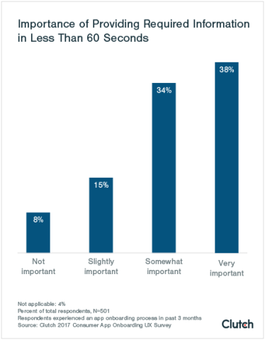
Almost three-quarters of respondents (72%) said completing all onboarding steps in less than a minute is important in their decision to keep using that app.
One minute may not seem like much time, but consider the sheer volume of available mobile applications.
According to 42matters, as of April 2026, there are approximately 2.3 million apps on Google Play and 2.25 million on the Apple App Store. With so many apps available, an app has to provide immediate value to retain users.
“The biggest mistake [a designer] can make is to not articulate the value to the user,” said Jordan DeVries, director of UX at UX/UI firm Brave UX. An immediate value proposition explains why users should sign up for your app.
If UX designers do this right, they can hook users into completing the rest of the onboarding process. Jenna Godfrey, a UX designer at Brave, noted that the news app Flipboard presents the value proposition particularly well.
“Flipboard has done a great job of both getting people into an account quickly (using either social sign-ons and email) … and using try-as-you-go tasks [so users can] learn about patterns step-by-step. For instance, users can swipe down to delve into a deeper topic and add tags to their reading feeds. Flipboard is a fairly complex application, but the onboarding does a great job of keeping it simple.”
The features Godfrey mentions, like try-as-you-go tasks, capture app users’ attention and keep them engaged.
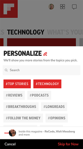
Image from Flipboard
Once users log into Flipboard with a social account, they can select topics and read stories. Flipboard’s value becomes clear in seconds.
The more frustrated users become during onboarding, the more likely they are to stop using your app.
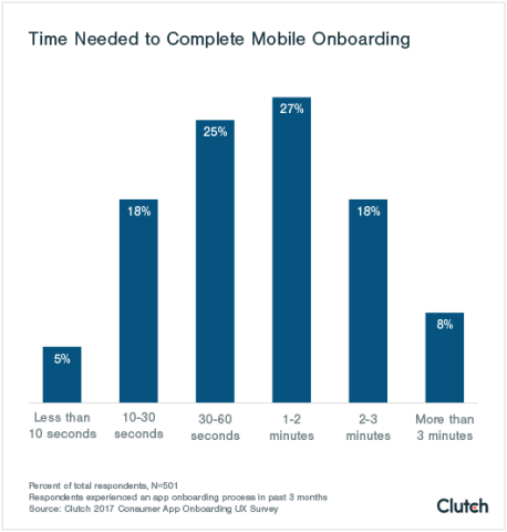
One minute may be the ideal amount of time for onboarding, but you have room on both sides. Over half (52%) of respondents said it took them between 30 seconds and 2 minutes to complete the onboarding process.
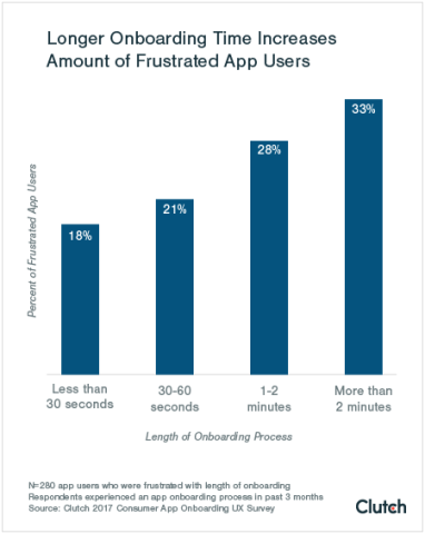
However, users became frustrated as the time needed to complete registration increased. More than 20% of app users were frustrated by a 30- to 60-second process, while 28% were frustrated by a 1- to 2-minute process. When onboarding increased to 2 or more minutes, 1 out of 3 respondents (33%) said they were frustrated.
If your users become impatient during a key moment like onboarding, they’re more likely to “churn,” or to stop using your app. Mobile engagement platform Localytics says 58% of users ditch a new app in the first month, and 75% churn within three months.
However, if users start 3 sessions in the first 3 days of using your app, there’s only a 29% chance they’ll churn. Localytics dubs this pattern the “3x3 rule.”
In light of those numbers, keep onboarding as short and friendly as possible while offering incentives to come back.
“Sometimes you have the marketing arm of an organization really trying to bolster that leads profile with as much data as possible - phone number, zip code, etc. But you always have to ask: ‘Is it really needed to create the account?’” said Christine Pillsbury, co-founder of design firm altr.
Prevent unnecessary steps from piling up by listing your app’s onboarding steps, then cutting anything you can ask for later (see the Scandy example in section 3).
There are exceptions to the 3x3 rule. Applications that support strenuous, data-intensive processes, such as tax filing, may well require more than two minutes to orient new users.
“A flashlight app asking for an email address is a zero-second patience situation. On the other hand, applying for a mortgage will engage users for much more than 60 seconds,” said DeVries. “60 seconds is a reasonable limit if the user is sitting there filling out questions about themselves, but if they decouple and break through the form-based onboarding experience … the threshold melts away entirely.”
For example, TurboTax asks for in-depth financial documentation moments after a new user creates an account.
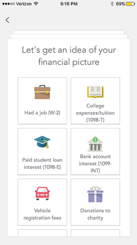
Image from TurboTax 2016
30 seconds, 60 seconds, and two minutes are useful benchmarks, but they won’t fit every app's needs. Onboarding tailored to users’ goals is the true objective, no matter how long or short it takes.
Additional reading: “Mobile App Strategy: Brands Leading the Way in User Engagement, Retention & Performance.”
App users want entertainment and enjoyment, and gamification can help from the very start, during onboarding.
The most common reason why respondents downloaded an app, at 44%, was “for fun.”
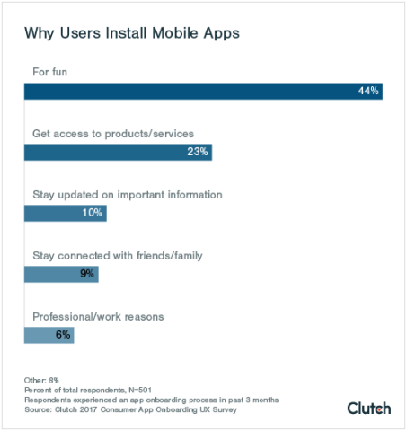
This corresponds with our finding that the most popular app categories are retail (19%) and online gaming (18%), with social networking and music apps at 8% each. In that light, it’s no surprise that the Android app marketplace is called “Google Play.”
The onboarding tone should match your app’s overall tone. For example, if your app is geared toward leisure or entertainment, keep your onboarding copy fresh and enjoyable.
Gamified elements like progress bars, point tallies, and badges/stickers provide an enjoyable tone, not only for leisure-focused apps but for all mobile applications, according to Brave’s Jordan DeVries.
“We abandoned the traditional heavy form signup and instead created applications which have a progressive display, or some level of gamification,” said DeVries.
He clarified: “Most people misunderstand what gamification is; it’s not about collecting points or coins, neither is it about turning any one experience into an actual game. Put short, gamification… [is saying], ‘Do this and you will get X or Y’ and following through on the reward.”
Coffee Meets Bagel, an online dating app, provides users with incentives to keep using the app by giving them ‘coffee beans’ for logging in again after they complete their first session. The more users open the app, the more beans they receive.
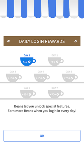
Image from Coffee Meets Bagel
Coffee beans serve as in-app currency, allowing users to buy more match opportunities or super-likes. By doling out coffee beans just for opening the app, Coffee Meets Bagel makes onboarding an organic, week-long procedure while giving users a reason to return. The app exemplifies gamification done right.
Another example of engaging onboarding is Scandy, a 3D scanning app with an onboarding process designed by Clay Global. Dmitry Tsozik, Clay’s design director, explained the difficult onboarding process for a 3D scanning app.
“The 3D scanning process is an activity you’re probably not very familiar with. It’s a technical process. You need to understand a lot of concepts,” Tsozik said.
Tsozik and his team decided to let users swipe through a few screens of copy when users first open the app. It looks like onboarding, but Tsozik said that, though the copy is helpful, it doesn’t actually matter if users forget it. They can browse the app’s scan directory to see Scandy’s value immediately.
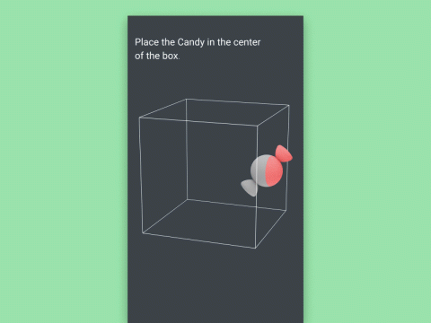
Image from clᴧy (Dribbble)
When users try to scan an object for the first time, the real onboarding begins.
“That’s where we placed a hidden second onboarding tutorial,” said Tsozik. “We created a simulated experience of making a 3D scan… with a virtual object. You do what the phone tells you to do, step by step. At the end of this experience, you understand how to do a proper 3D scan.”
By the time users finish the “hidden” onboarding, they understand how to use Scandy. It’s complex onboarding made simple and captivating.
Prepare app users for mobile device information requests to put their minds at ease.
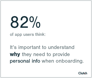
Over four-fifths of users said that clarity behind an app’s personal information requests was important to them.
It’s common for an app to request various permissions. For example, map apps require location services, whereas photo apps need access to a camera.
Remember that users are increasingly wary about granting all these permissions, though, and information security is becoming a top priority for app developers across all platforms.
Reece Franklin, the founder of Blink, uses Skype for business purposes. However, the new mobile update for Skype left him feeling uncomfortable. “It requested around eight individual permissions right from square one,” he said.
Franklin granted all permissions, but only because the app was created by Microsoft via Skype, two well-known companies. However, his image of both entities was soured. “I trust both companies just a little bit less now,” Franklin said.
Getting users to feel comfortable giving permissions is all about “the timeliness of the request,” said Christine Pillsbury. “Are you asking at the right time or did you just walk in on a blind date and say, ‘Let’s get married’?” That is, does your app ask for too much, too fast, or does it cultivate a sense of trust first?
Avoid app user discomfort by implementing ‘permission priming’: demonstrate what your app could do for users if it had the right permissions, then ask. That way, your users have context.
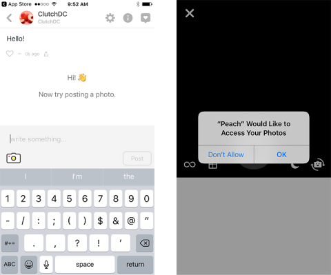
Image from Peach
In this example from social networking platform Peach, the app establishes a reason for making a request. The onboarding process invites new users to post a photo, but only asks for permission to access the photo gallery after they tap the photo icon.
Users are right to be concerned about giving away information included in permissions, according to Tsozik. “I personally am very careful about what to share with apps, and sometimes decide not to use an app at all if it asks for too much information,” he said.
To win over tech-savvy users like Tsozik, it’s imperative to consider the timing and necessity of permission requests.
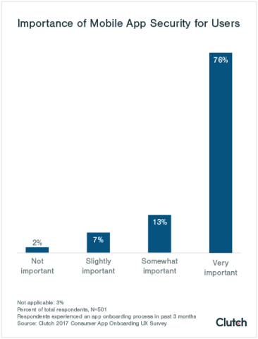
Security is an absolute must for mobile app users.
Nearly 9 out of 10 respondents said that information security was at least somewhat important in their decision to continue using an app, with three-quarters saying it was very important.
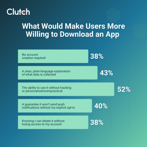
Since this survey was first published, growing concerns over data privacy have made consumers even more cautious. They're most likely to download an app if it works without tracking or personalization (52%), clearly discloses what data it collects (43%), requires explicit opt-in before sending push notifications (40%), and doesn't force them to create an account (38%).
Permission priming is a great start, but you can do more to gain users’ trust. For example, if you ask users to register an account with their email addresses, assure them through your copy that their information is safe.
Emphasizing security is especially important if your app requires sensitive financial information, such as credit cards or bank account numbers, to function.
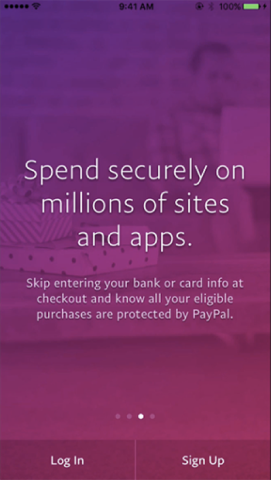
Image from PayPal
The PayPal app shows users the screen above during onboarding. The text assures people that a purchase made through PayPal is both safe and convenient – in other words, users don’t have to sacrifice anything for security.
Denys Skrypnyk of The Gradient walked us through the onboarding process of a financial technology app his team recently helped design for a UK-based bank. “Fintech is hard to make simple because of [all the] regulations, policies, and security points,” he said.
As a result, The Gradient designed an onboarding process that didn’t require users to provide checking account information. This eliminated many of the hurdles banking apps face during onboarding.
“The main point is for [users] to provide their identity,” Skrypnyk said when describing the app’s introductory steps. Not asking for checking account details helped The Gradient build trust.
Although building a secure interface should always be a part of app development, you may not have much control over security protocols if you’re a UX or UI designer. In that case, your job is to make the app look secure.
“Laying out the technical specifics… won’t actually make people feel as secure as they should feel,” DeVries from Brave pointed out. “Rather, the sense of security is much more of a long play.”
Designers should focus on the appearance of security rather than the hard security details since a clean design and reassuring copy can go a long way towards creating a secure look.
User onboarding is a key part of app design.
Clutch’s survey results show that app users want a registration process of a minute or less, and the more time they spend onboarding, the more frustrated they become. A fast, easy-to-navigate user interface is essential.
Furthermore, an onboarding experience should prime users for the fun they’re about to have by matching an app’s tone.
Finally, users are concerned about the information and permissions they give apps. They want to know why they’re sharing information, and they want that information to be secure.
The app market is only becoming more competitive, meaning businesses have to optimize every facet of their app’s user interface – especially the onboarding process. The saying “make a good first impression” is just as applicable to mobile apps, and the five suggestions in this article will help your app make the impression you want.
The survey respondents consisted of 501 individuals across the United States who have installed and subsequently used an app that required setting up an account within the past 3 months. Exactly half of respondents used the app on an iOS smartphone, while 47% used an Android. The remaining 3% used alternative systems such as Amazon Fire. In regards to gender, 60% of respondents were female and 40% were male.