

Updated December 20, 2024
Businesses rely on web forms to gather leads and sell products. However, many people who begin to fill out web forms never complete them. To improve conversion rates, experts encourage small businesses to make web forms as easy to complete as possible by implementing user experience best practices.
Updated August 26, 2022
Businesses rely on web forms to sell products, manage inbound leads, and more. But what impact does form design have on the quality of data gathered and rate of conversions?
Looking for a Web Design agency?
Compare our list of top Web Design companies near you
To learn more about how consumers interact with web forms, we surveyed 502 individuals who filled out a web form within the past month. Of these, over half (67%) filled out a web form within the last week.
Our survey found that businesses that put users first can generate more conversions while also increasing the quality of data they gather.
To strengthen their web forms, businesses should ask focused questions, offer features that reduce friction, and let users scroll through the whole form. Implementing these best practices can help businesses capture more conversions.
People are more likely to complete web forms that are intuitive, quick, and easy to complete. Best practices in user experience (UX) can help small businesses design forms that yield conversions, whether it’s a simple newsletter signup or an ecommerce transaction.
We found that the majority (86%) of people fill out at least one web form per week. More than one-third (34%) of consumers need to fill out one online form during an average week in order to complete a task online.
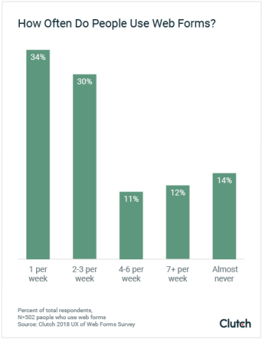
Roughly one-quarter (23%) of those surveyed encounter a web form 4-7 times per week.
However, not every user who encounters a web form will actually complete it.
Leeyen Rogers is vice president of marketing at JotForm, a web form builder tool. She points out that virtually every company that uses web forms strives to increase their conversion rates.
“It’s very easy to create a form. The hard part is getting people to actually fill it out,” said Rogers. “We’ve found that even very subtle features make a world of difference.”
Businesses that plan to improve their web forms should plan to test several iterations to determine the most beneficial changes in language and design.
Oliver Feakins is co-founder and president of Track5Media, a company that manages a portfolio of job board websites for niche industries.
One of Track5Media’s brands is AllTruckJobs, a website that aggregates information about employment opportunities in the trucking industry. Although traffic was very high and many users began filling out job applications on AllTruckJobs, Feakins noticed that not everyone completed the applications they started.
“Essentially, we needed to move our attention from simply the number of website visitors to the efficiency in which we convert visitors into job seekers or communities,” said Feakins.
For the past year, Feakins and his team have invested in improving the UX for web form design on AllTruckJobs in order to increase the number of completed job applications.
“It’s very easy to create a form. The hard part is getting people to actually fill it out." - Leeyen Rogers, vice president of marketing at JotForm
Poor web form UX can result in missed opportunities for companies. This can manifest in two key ways: lost revenue and weaker relationships with customers.
“The consequences of lower conversion rates can really affect the bottom line of businesses,” said Rogers. This can translate into lost potential for future purchases.
Mark Baldino agrees. He has worked in UX design since 2000, and in 2006 co-founded his own Chicago-based UX firm, Fuzzy Math.
“[A poorly designed web form] says to this potential customer that you don’t understand technology and you care a little bit less about them,” said Baldino. “It tells a story of the company’s attention to detail.”
Focusing on your web forms’ UX ensures they deliver the best customer experience possible, opening the door to long-lasting relationships and future conversions.
7 Tips for Designing Web Forms
Focused web forms are more likely to yield better results. Companies shouldn’t attempt to collect extraneous information, though it may be tempting.
“A lengthy form won’t necessarily have a lower conversion rate than a form that asks one question,” said Rogers, pointing out that some lengthy forms are unavoidable or required by law. “But if you look more on a minute level, length does have an effect.”
There are two benefits of streamlining web form design: higher conversion rates and better data.
Some complex web forms, such as job applications, promise enough value that users will spend significant time completing them. But in general, experts recommend that small businesses make web forms as quick and easy to fill out as possible.
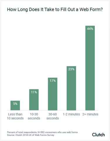
In our survey, we asked users how much time they spend filling out an online form on average. Roughly one-quarter (23%) reported spending at least 1 minute filling out an average web form, with an additional 44% estimating that an average web form requires 2 minutes or more.
At AllTruckJobs, Feakins and his team cut down the time it takes users to fill out job applications by pulling information from uploaded resumes and autofilling the web form.
“Essentially, users confirm their contact information, upload their resume, and away they go,” said Feakins.
Similarly, AllTruckJobs now features a Google Maps integration that automatically fills in the address, phone number, and other relevant location details when users begin typing in information about a past employer, reducing the amount of time it takes to fill out a job application.
In addition to using autofill tools, small businesses can deploy conditional logic to customize the questions users are asked, so they do not need to answer questions that don’t apply to them.
“For instance, if a form first asks for an age range, whatever that user answers, the subsequent questions should relate back to that,” said Rogers. “If someone says they’re 30 years old, the questions shouldn’t ask anything pertaining to a different age range.”
By using conditional logic, JotForm and other tools can reduce the number of questions users are asked, speeding up the process of filling out a web form.
In addition to losing conversions, companies that use unnecessarily lengthy web forms risk receiving unusable or inaccurate data.
Our survey found that web forms most commonly request an email address (79%), name (75%), and home address (60%). These basic pieces of information are often necessary in order to deliver the product or service a user is seeking through a web form.
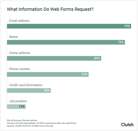
However, many businesses ask additional questions in an attempt to gather more data about their users. Web forms with too many questions or unclear wording risk frustrating users, who might end up selecting answer options at random or entering nonsensical text.
“You then have data inconsistencies, with people using work-arounds and guessing at information because they don’t understand what’s being asked,” explained Baldino.
At AllTruckJobs, Feakins noticed that with each extraneous question his team added, the number of people who completed the web form decreased. Instead of acquiring more information, each additional unrelated question resulted in more users abandoning the form.
When it comes to determining which questions to include, Feakins advises, “Know exactly what you need, not what you want.”
As long as companies collect users’ contact information, they can always follow up with an invitation to answer additional questions at a later date.
As small businesses design web forms, they should explore features that reduce common pain points.
Many UX designers describe this process as “reducing friction,” or cutting down on sticking points where people could become confused or run into difficulties. Minimizing this friction reduces the risk that someone will grow frustrated and abandon a web form.
Overall, people’s favorite features are ones that help them navigate a form and fill in information correctly.

The majority of people (90%) found status bars, inline validation, or password strength checkers to be among the most helpful.
Status bars help orient users by signalling how much time it will take to complete a web form.

Status bars do not necessarily have to calculate a time or percentage, although many do. For example, Ticketfly, a concert ticket distributor, uses a simple status bar that lets users know how many steps they will need to take before completing a purchase.
Inline validation instantly tells people whether the information they typed in is compatible with requirements coded into the web form.

Rather than allowing users to submit a password that fails to meet their security requirements, Twitter notifies users who enter unsuitable passwords as soon as they stop typing.
Password strength checkers provide insight into the approximate level of security a password will provide.

Password strength checkers would typically warn users that a password such as "1234" is very weak, while a password composed of random letters and numbers would be considered strong.
In addition to these features, small businesses can incorporate tools that autocomplete fields as people are typing.
For example, think of the last time you typed in your address while making an online purchase. Did the online form suggest your city and zip code as soon as you began typing in your address? If so, the form was likely using a Google Maps integration that recognized your location and did some of the work for you.
There is an added benefit to features that autocomplete information – better data.
Rogers explained the importance of tools that validate data while users complete a form.
For example, someone typing in their email address may forget to type the “@” symbol. JotForm’s web form building software would recognize this and prompt the user to immediately correct the problem, instead of letting the user submit the form with an error.
“The tool makes filling out the data as easy as possible for the customer” said Rogers, adding, “There are features built in that collect better and cleaner data.”
Implementing features that make it easier for people to complete web forms quickly and accurately can deliver a better experience and higher conversion rate.
While current trends suggest that small businesses design web forms with multiple pages of thematically grouped questions, our data indicates people actually prefer to scroll through the whole form.

Over 90% of users prefer web forms that allow them to scroll through all questions, compared to only 80% who prefer clicking through multiple screens.
Baldino suspects that our growing comfort with scrolling through long web forms is tied to the rise of mobile devices.
“I would imagine a larger form that has bigger fields, is clear to read, and is scrollable would perform much better on mobile than something that’s smaller,” said Baldino.
Forms that allow people to scroll and fill out all fields reduce users’ fears of a technical error that could erase or distort information as users click between screens. Instead, people have the opportunity to review their answers after completing a form, ensuring that they are confident in the information they submit.
For example, the job seekers who visit AllTruckJobs typically want to see a job application in its entirety so that they can estimate the time and level of effort it will take to complete.
“Showing [people] a journey before they get started in some sort of user flow is super important,” said Feakins.
Despite these general preferences, small businesses should still test different types of forms with their audiences. Age, location, industry, and other demographic factors can influence the type of format users are most comfortable with.
Above all, small businesses should observe how customers actually use their products and services when designing a web form.
At Fuzzy Math, Baldino invites executives to observe the way a customer interacts with a web form or website before making design decisions.
“When we can get people to physically sit down and understand the struggles that people go through to interact with the digital world, it’s really enlightening for everybody,” said Baldino.
Approaching users with empathy can help small businesses anticipate challenges and design web forms that offer helpful solutions.
“When we can get people to physically sit down and understand the struggles that people go through to interact with the digital world, it’s really enlightening for everybody." - Mark Baldino, co-founder of Fuzzy Math
For example, the majority of people surveyed (90%) said that they value the opportunity to save a web form and return to it later.
At JotForm, UX designers recognized that many small business owners work on designing web forms during downtime at trade shows, where they frequently lose their internet connection.
“When you lose service, you can actually continue creating your form or working within your dashboard,” said Rogers. “All your data is updated as soon as you gain service again.”
Designing forms that can also be completed offline can help ensure you don’t lose people along the way.
Similarly, at Track5Media, Feakins and his team noticed that some users sent in their resumes via email in addition to or instead of filling out the web forms. By accepting these resumes, Track5Media saw an additional 15% spike in conversions among users who would otherwise be likely to abandon the process.
“Happy users translate to happy customers which makes a healthier business overall,” said Baldino.
Thoughtfully designed web forms can support more than simple conversion goals.
People have 2 primary frustrations when browsing online:
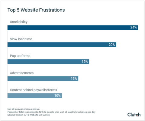
Pop-up forms (15%), advertisements (13%), and paywalls or forms (10%) also frustrate people when they browse online.
Unreliable pages disrupt people through frequent error messages, broken links, or glitchy tech. A common example is a 404 Error.

Page speed is another frustration, particularly for people who are browsing the web on smartphones and want access to information immediately.
“You can never control how someone is going to be able to connect; if they’re on 3G or on the metro,” said Brian Lacey, CEO at Mobomo, the design firm responsible for NASA’s Solar Eclipse Tracker in 2017. “With so many distractions out there, if someone has to wait more than 3 seconds, they’re going to exit out and do something else.”
The abundance of high-quality content online means that businesses need to meet their user's needs – and fast.
People’s top frustrations with websites can cause them to stop using a website permanently.
Most people would stop using a website for a particular session if it was unreliable (54%) or if it loaded slowly (53%).
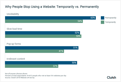
If these problems persist, it’s enough to deter people from returning to a site: Nearly two-thirds (63%) will permanently abandon a site if it's consistently unreliable.
Reducing load times and regular quality assurance checks can ensure that websites don’t lose traffic from preventable, but costly, UX mistakes.
By improving your site speed and reliability, you can improve the checkout process whenever a user is completing a form.
As small businesses strive to increase their web form conversions, UX best practices offer a formula for success.
People appreciate features that make it faster and easier for them to complete web forms. Examples include a status bar, inline validation, and a password strength checker. Experts also recommend integrations that autocomplete portions of web forms, such as address fields or information pulled from uploaded documents.
Keep web forms concise by limiting the number of questions. Not only will focused web forms achieve a higher conversion rate, but they can also provide more accurate data.
Above all, effective web forms anticipate users’ preferences and needs. Research and testing can reveal your audience’s preferences for form length, phrasing, and features.
Clutch surveyed 502 consumers who filled out an online form within the past month. The majority (67%) filled out an online form within the past week.
The survey included both male (38%) and female (62%) respondents. All age groups were represented: 10% were 18 to 34 years old, 24% were 35 to 54 years old, and 56% were 55 years or older.
All respondents were based in the United States and came from all regions, including the south (29%), midwest (29%), northeast (19%), and west (12%).


