
Agentic Commerce Is Here – How To Optimize Your Website for Sales
Agentic commerce is changing the digital shopping experience. Learn how to update your site for it and improve your bottom line.
Updated January 2, 2025

Designing for bootstrap? Learn about the key elements of responsive web design and why Bootstrap is a popular tool for developers working on all types of web design projects.
Updated April 22, 2022
Bootstrap is a surprisingly powerful and effective tool for developers building responsive websites and web applications.
Looking for a Web Design agency?
Compare our list of top Web Design companies near you
Bootstrap was launched as a mobile-first framework for web development. It is now one of the most stable and reliable responsive front-end frameworks with a market share of over 21% of all websites.
For those who are not familiar with the development frameworks, they are standalone starter themes offering a standard set of pre-built yet customizable features and functions to speed up the development of a website or application.
The main reason Bootstrap is so popular in the web design industry is its unique and compelling features that empower developers to build well-functioning, fully responsive websites without any hassle.
It is so easy to learn and use that even a novice developer with basic knowledge of HTML, CSS, and JavaScript can get started with it in minutes.
In this article, I discuss the reasons why Bootstrap is a clear favorite of developers for creating responsive websites.
Responsive web design (RWD) is a relatively new design approach aimed at making a web page look good on all devices and screen sizes – whether it’s a desktop, laptop, tablet, or smartphone.
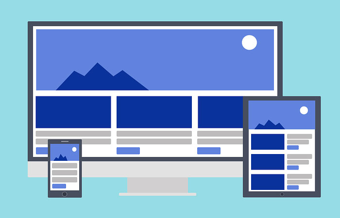
Websites built with this technique not only automatically adapt to whatever screen resolution users browse on, but they also require the least resizing, panning, and scrolling – delivering users an optimal viewing and interaction experience across different devices and screen sizes.
To put it even simpler, RWD is about creating a single layout that works on all devices, instead of creating multiple layouts for different devices.
Additional Reading: 'Website Redesign Checklist: 5 Trends to Consider'
RWD has three main features:
A fluid grid-based layout organizes elements on a web page in a user-readable way to make them render well on any kind of device or screen size.
This layout embraces relative units like percentages or EM units for page element sizing instead of absolute units like pixels or points.
In CSS, or how HTML elements are displayed on screen, paper, or in other media, an EM unit is equal to the computed value of the “font-size” property for the element to which it is applied.
In responsive web design, images are also given a size in relative units and placed on a grid with a maximum CSS width of 100%. The “width” property is used to specify the width of a device's content area in CSS.
This prevents them from displaying outside the element they have been placed inside. Thus, the image size can never be greater than the grid’s size in responsive design.
Read this: '8 Aesthetic Web Design Ideas for B2B Companies'
This technique uses the CSS @media rule to define different style rules for different devices and media types. The @media rule is a conditional rule in CSS that allows you to apply CSS styles depending on a device's general type, specific characteristics, or environment.
Using CSS Media Queries, you can specify when and where certain CSS rules must be applied on the basis of device characteristics – usually the width of the browser.
To sum it up, whenever you leverage the power of HTML5 and CSS3 to shrink, resize, move, hide, or enlarge the content on a web page to make it look presentable on any screen size, it is called responsive web design.
Bootstrap designers consider these factors and more while working on their projects.
Although the use of a framework is not obligatory to build a responsive website, it can save you development time and effort.
Below are some ways a framework, like Bootstrap, can help you in responsive web design:
Despite a number of advanced and efficient front-end frameworks available on the market today, Bootstrap is a top choice of developers for creating responsive websites, according to Google Trends.

Bootstrap is a market leader.
Let's take a look at some key factors that make Bootstrap a suitable framework for all types of responsive projects:
Along with being fully responsive, Bootstrap uses a special “mobile-first” approach to help you develop responsive, mobile-friendly websites.
With this approach, designers have to first build a website for small screen sizes and then scale its design up to render on large screens.
Also known as progressive enhancement, this design approach gives you the ability to understand and meet your mobile users’ requirements on the most basic level, which is arguably the first step to developing a responsive website the right way.
Bootstrap is equipped with a highly responsive 12-column fluid flexbox-based grid system (a grid system based on the flex display property, which allows you to display any content type in a fully customizable, responsive grid) that automatically scales up or down according to the screen resolution of a device. Bootstrap makes the entire process of creating responsive designs easy.
Use all 12 columns individually or group them together to create wider columns; the choice is yours.
Additionally, with its responsive utilities, you can easily hide or show a certain section of content on a specific screen size.
Taking responsive development to the simplest level, Bootstrap divides different devices into five predefined grid classes on the basis of viewport width: xs, sm, md, lg, and xl, from mobile devices (xs) up to smartphones (sm), tablets (md), desktops/laptops (lg), and desktops (xl).
This handy feature eliminates the need for defining your own breakpoints, as most of the devices available today fall under these five breakpoints.
Using the desired combination of these classes, you can easily create dynamic, flexible, and complex responsive layouts according to your project requirements.
Another main reason why people prefer using Bootstrap over other front-end frameworks is because it comes complete with everything you may require to develop a fully responsive website.
From responsive typography and menus to reusable CSS and JavaScript libraries, it comprehensively includes all the components a developer usually needs to code from scratch while building a responsive site.
Moreover, to further speed up your responsive development, you can also buy a pre-built Bootstrap template and customize it to meet your specific needs.
This is the core concept around which the Bootstrap framework was initially developed. Unlike other frameworks, Bootstrap focuses on creating a centralized development code that not only pairs designers with developers but also ensures uniform end results across all platforms.
Consequently, regardless of who is working on the project, you receive the same output everywhere, whether it’s on Chrome, Firefox, or even Internet Explorer.
Uniformity across all devices, browsers, and platforms is what differentiates Bootstrap from others, making it the most suitable framework for responsive websites.
As an open-source framework, Bootstrap brings a new level of customization.
Using the Bootstrap customize page, not only can you select what to include and exclude as per your project requirements, but you can also customize every variable to get your very own “custom” version of Bootstrap.
Thus, even if you're starting with a ready-made template, you can easily customize it for a more personal feel.
This feature proves extremely useful when you’re developing a unique responsive website using the PSD-to-Bootstrap conversion process. PSD, which stands for Photoshop Document, is the default file format of the image editing software Adobe Photoshop.
Bootstrap is designed to be adaptable.
Whether you’re working on a non-responsive website that is already live or building a responsive site from scratch, the integration of Bootstrap is the simplest and most hassle-free of all the front-end frameworks available.
Part of this reason is that you can even use a part of your custom-written Bootstrap code with any other existing or new markup.
Bootstrap can also be easily integrated with a variety of other popular frameworks and platforms such as WordPress, Magento, and Joomla.
Bootstrap is fully compatible, and its core developers update the framework at regular intervals in accordance with current and future web needs.
Every update in Bootstrap takes the future of web design and development into consideration, so you’re working with the latest and most advanced technology available in the industry.
Using a front-end framework essentially means that you don’t have to reinvent the wheel every time you develop a new theme or application.
Packed with numerous state-of-the-art features, Bootstrap helps you accomplish much more than starting everything from the scratch.
Since Bootstrap comes out of the box as responsive, you don't have to put in the extra work toward making your design responsive, and this is what makes Bootstrap an ideal choice for developing responsive websites.
Browse our directory of trusted service providers to find the right choice for your web design project.
Additional Reading:
Ashish is an experienced web developer working with XHTMLJunction - PSD to HTML Coder. He always tries to keep himself up with latest web development trends and technologies so he can boost his productivity and capabilities. Follow @xhtml_junction to get latest updates via Twitter.
See full profile