
Social Proof Placement: Where to Put Reviews, Ratings, and UGC for Maximum Conversions
Where you should be placing customer reviews, ratings, testimonials, and UGC to actually move the conversion needle — from the homepage to the product...
Updated January 2, 2025
Implementing responsive design techniques such as resizing images and consistently testing mobile-friendliness help improve your site's SEO.
These days, businesses are aware of the benefits of an effective SEO strategy. Landing on the first or second page of a search engine results page could be the difference in a company’s success or failure.
About three-quarters of U.S. adults own a smartphone. Because of this, mobile devices are an important tool for job searches, dating apps, reading e-books, and online shopping.
Looking for a Web Design agency?
Compare our list of top Web Design companies near you
As a result of growing mobile search, companies need to rank high on search engine results pages (SERPs) to become visible to consumers and grow their business.
With the increase in mobile search engine usage, optimizing for mobile SEO facilitates quick and easy viewing of important information about your company through mobile.
You need to optimize your website for mobile responsiveness. A responsive website at the same capacity across all browsers, operating systems, and devices.
This article explains mobile responsive design and provides tips to lay the framework for a mobile responsive site that helps to establish an effective mobile SEO strategy.
Responsive design serves all devices with the same code that adjusts for screen size. This means that the website will change to fit the screen sizes of the device while still displaying the same content as the desktop view. A website that isn’t mobile-friendly requires users to pinch, zoom in, or zoom out to read its content.
Google views mobile-friendly websites as those that will be viewed “correctly” on a mobile device. Google recommends a responsive website design because it makes it easier for users to share and link to your content with a single URL.
Responsive design requires less engineering and time to maintain multiple pages for the same content, which helps Google accurately assign indexing properties to your pages.

Source: Google
Finally, responsive design requires no redirection for users to have an optimized view, which reduces load time and enhances user-friendliness, both of which are factors that help your site's search engine rankings.
Reference the following four tips to lay the framework for your site’s responsive design.
Google constantly updates its ranking algorithm. It understands that the mobile interface is extremely important for modern users, and it now prioritizes mobile pages in its rankings.
Some reasons that your website may not be considered mobile-friendly to Google are because the text on your website is too small, links are too close together, or your mobile viewpoint is not set.
Use Google’s Mobile-Friendly Test Tool to see if your website is truly mobile-friendly. If your site is not fully mobile responsive or mobile-friendly, use the following three tips to successfully implement responsive website design.
Your website may have low search rankings if Google cannot detect that your website is mobile-friendly. You should program your website to keep resources crawlable to make your site successfully mobile-friendly.
A crawlable website means the resources on your site, such as links to and within your website, can be discovered and read by search engine bots.
If a search engine bot cannot follow a link to a page, the destination page may not be included in the web pages available on search results.
If Google does not have access to the resources presented on your website like CSS, JavaScript, or other content, it can’t determine that your website is built to work on a mobile platform.
Resize images, infographics, and other media in order to fit different viewports, or display screens (phone, tablet, desktop).
For example, a photo that is bigger than the viewport size may cause the viewer to scroll horizontally to see the full photo. In order to avoid these instances, you would need to resize the photo to fit inside the viewport.
Apply media query syntax, or rules used to define different style rules for different media devices, through the back end of your website to successfully resize media to apply to device characteristics.
If this syntax is implemented correctly, it constructs a responsive experience, which helps your website's search ranking because it helps implement a mobile-friendly website.
Create breakpoints based on content rather than on specific devices, products, or brands. When designing breakpoints, you should choose the smallest mobile devices first, then work your way up to larger screens.
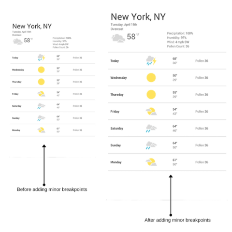
This will give you the advantage of optimizing breakpoints based on content and implement as little breakpoints as possible. Text content should be optimized for reading.
Never completely hide content because it cannot fit on the screen. For large screens, it's best to limit to the maximum width of the screen so it doesn't consume the whole screen width.
Use the above tips to inform your website’s SEO strategy. First, test your website on Google’s mobile-friendly tool. If your website is not mobile friendly, make sure to keep your resources crawlable, resize images, and choose the correct breakpoints for different devices.
By following these tips, you can increase the visibility and traffic to your company’s website. To complete these tips, consider hiring an experienced software developer or digital marketing agency to make your site is responsive, which ultimately enhances your website’s SEO. Ranking highly among search engines could be the difference in your company’s success or failure.

Cynexis is a professional SEO company located in Columbus, Ohio, but serves companies all over the world. It works with companies large and small and pride itself on keeping all clients heavily involved in their projects. Its level of focus and attention to detail has delivered amazing results for hundreds of clients.